How to Build a Restaurant Website with HTML, CSS and JavaScript
Published November 6, 2026 · 15 min read
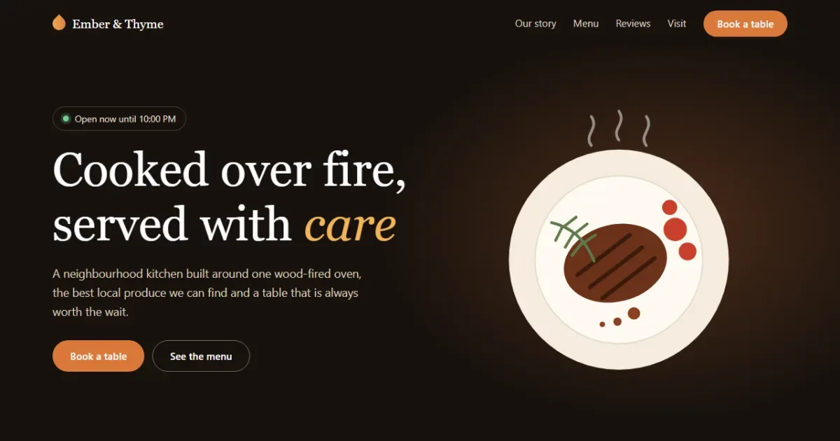
In this tutorial you'll build a complete website for a made-up restaurant, Ember & Thyme. It looks and works like a real one: the hero tells visitors whether the restaurant is open right now, the menu filters as you type, the booking form only offers times the kitchen is open, and the reviews swipe sideways on a phone.
Open the live demo
Try searching the menu for lamb, or picking a Monday in the booking form.
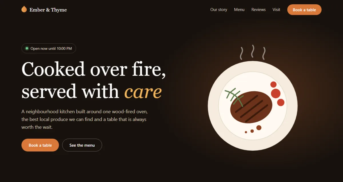
Everything is plain HTML, CSS and JavaScript, with no frameworks, no libraries and no image files. The tutorial has three parts, one per language, so you can stop after any part and still have something that works:
- Part 1, HTML: the structure and content of every section.
- Part 2, CSS: the warm dark theme, the menu layout and the responsive design.
- Part 3, JavaScript: the open-now status, menu filter, booking form and carousel.
What you'll learn
- how to work with times by turning them into plain numbers
- how to avoid the time zone bug that catches most date pickers
- how to filter content that already exists in the HTML
- how to show your own form errors with the browser's
validityobject - how to fill a
<select>from code withnew Option() - how to build a carousel with CSS scroll snap and almost no JavaScript
Project setup
Create a folder with three empty files:
restaurant-landing/
├── index.html   ← all the sections and their content
├── style.css    ← layout, colours, animation, mobile styles
└── script.js    ← open-now status, menu, booking, carousel
Each file is split into sections marked with comments like
/* ---------- HERO ---------- */. The code blocks below follow those markers from top to
bottom, so if you copy every block in order you'll rebuild each file exactly.
Plan the page first
People visit a restaurant website with very few questions: are you open, what's on the menu, can I get a table and where are you. A good page answers those fast and skips the rest. That gives us this order:
- Header with navigation and a booking button
- Hero with the live status
- A short story
- The menu, with filters
- Table booking
- Reviews
- Address and opening hours
Part 1: The HTML
In this part we write the content and structure only. Without CSS the page looks plain, but every dish, form field and opening time is already there and readable.
1.1 The head and the header
<!DOCTYPE html>
<html lang="en">
<head>
<meta charset="UTF-8">
<meta name="viewport" content="width=device-width, initial-scale=1">
<title>Ember & Thyme | Wood-Fired Kitchen</title>
<meta name="description" content="Ember & Thyme is a demo restaurant website built with plain HTML, CSS and JavaScript.">
<link rel="stylesheet" href="style.css">
</head>
<body><!-- ---------- HEADER ---------- -->
<header class="site-header" id="siteHeader">
<div class="wrap nav">
<a class="logo" href="#top"><span class="logo-mark" aria-hidden="true"></span>Ember & Thyme</a>
<button class="menu-btn" id="menuBtn" type="button" aria-label="Open menu" aria-controls="mainNav" aria-expanded="false"><span></span></button>
<nav class="main-nav" id="mainNav" aria-label="Main">
<a href="#story">Our story</a>
<a href="#menu">Menu</a>
<a href="#reviews">Reviews</a>
<a href="#visit">Visit</a>
<a class="btn btn-accent" href="#reserve">Book a table</a>
</nav>
</div>
</header>
<main id="top">The viewport meta tag makes the page use the phone's real width, which the mobile
styles depend on. The menu button is a real <button>:
aria-controls says what it opens, aria-expanded says whether it's open,
and aria-label gives it a name, because it only shows an icon.
1.2 The hero
<!-- ---------- HERO ---------- -->
<section class="hero">
  <div class="wrap hero-grid">
    <div class="hero-text">
      <p class="status" id="openStatus">Open Tuesday to Sunday</p>
      <h1>Cooked over fire, served with <em>care</em></h1>
      <p class="lead">A neighbourhood kitchen built around one wood-fired oven, the best local
         produce we can find and a table that is always worth the wait.</p>
      <div class="hero-actions">
        <a class="btn btn-accent" href="#reserve">Book a table</a>
        <a class="btn btn-line" href="#menu">See the menu</a>
      </div>
    </div>

    <div class="hero-art" aria-hidden="true">
      <svg viewBox="0 0 420 420">
        <g class="steam">
          <path d="M170 74c-12-16 12-24 0-42"/>
          <path d="M210 66c-12-16 12-24 0-42"/>
          <path d="M250 74c-12-16 12-24 0-42"/>
        </g>
        <circle class="plate" cx="210" cy="240" r="160"/>
        <circle class="plate-rim" cx="210" cy="240" r="122"/>
        <ellipse class="steak" cx="205" cy="245" rx="76" ry="56" transform="rotate(-14 205 245)"/>
        <g class="grill">
          <path d="M150 262l76-58"/>
          <path d="M168 280l76-58"/>
          <path d="M186 296l76-58"/>
        </g>
        <circle class="tomato" cx="292" cy="196" r="17"/>
        <circle class="tomato" cx="310" cy="228" r="13"/>
        <circle class="tomato" cx="284" cy="164" r="11"/>
        <g class="herb">
          <path d="M112 186q44 10 62 56"/>
          <path d="M128 192l-10 20M144 202l-12 20M156 216l-14 18M130 192l18-14M146 202l18-14M158 216l18-12"/>
        </g>
        <circle class="sauce" cx="232" cy="318" r="9"/>
        <circle class="sauce" cx="208" cy="330" r="6"/>
        <circle class="sauce" cx="186" cy="334" r="4"/>
      </svg>
    </div>
  </div>
</section>
The status line starts with a sensible sentence, Open Tuesday to Sunday, which stays true if JavaScript never runs. The script replaces it with the live status in Part 3.
The plate is an inline SVG made of circles, an ellipse for the steak and a few
paths. Because it's code rather than an image, it's tiny, sharp at any size and easy to recolour
with CSS. transform="rotate(-14 205 245)" tilts the steak around its own centre. The
art has aria-hidden="true" because it's decoration.
1.3 The story and the menu
<!-- ---------- STORY ---------- -->
<section class="story" id="story">
<div class="wrap story-grid">
<div>
<p class="eyebrow">Our story</p>
<h2>One oven, one street, twelve years</h2>
<p>We opened with four tables and a secondhand oven. The tables have multiplied, but the idea
has not: buy well, cook simply and let the fire do the work.</p>
<p>Everything on the menu spends at least a moment over oak and thyme, from the bread we bake
each morning to the peaches we blacken for dessert.</p>
</div>
<ul class="facts">
<li class="reveal"><strong>12</strong><span>years on Mill Lane</span></li>
<li class="reveal"><strong>40 km</strong><span>furthest supplier</span></li>
<li class="reveal"><strong>480°C</strong><span>oven at full heat</span></li>
</ul>
</div>
</section><!-- ---------- MENU ---------- -->
<section class="menu-section" id="menu">
<div class="wrap">
<p class="eyebrow">The menu</p>
<h2>What's on the fire</h2>
<div class="menu-tools">
<div class="tabs" id="menuTabs" role="group" aria-label="Filter by course">
<button type="button" class="tab" data-filter="all" aria-pressed="true">All</button>
<button type="button" class="tab" data-filter="starter" aria-pressed="false">Starters</button>
<button type="button" class="tab" data-filter="main" aria-pressed="false">Mains</button>
<button type="button" class="tab" data-filter="dessert" aria-pressed="false">Desserts</button>
</div>
<div class="menu-search">
<label class="sr-only" for="menuSearch">Search the menu</label>
<input id="menuSearch" type="search" placeholder="Search, e.g. lamb">
<label class="check"><input id="vegOnly" type="checkbox"> Vegetarian only</label>
</div>
</div>
<p class="menu-count" id="menuCount" aria-live="polite">12 dishes</p>
<ul class="dishes" id="dishes">
<li class="dish" data-course="starter" data-veg="true">
<h3>Hearth bread <span class="tag">V</span></h3><span class="price">$7</span>
<p>Sourdough from the oven, smoked butter, sea salt.</p>
</li>
<li class="dish" data-course="starter" data-veg="true">
<h3>Charred leeks <span class="tag">V</span></h3><span class="price">$12</span>
<p>Whipped feta, hazelnut crumb, lemon oil.</p>
</li>
<li class="dish" data-course="starter" data-veg="false">
<h3>Oak-smoked trout</h3><span class="price">$15</span>
<p>Pickled fennel, dill cream, rye crisp.</p>
</li>
<li class="dish" data-course="starter" data-veg="false">
<h3>Grilled octopus</h3><span class="price">$18</span>
<p>Paprika potatoes, salsa verde, burnt lemon.</p>
</li>
<li class="dish" data-course="main" data-veg="false">
<h3>Ember ribeye</h3><span class="price">$38</span>
<p>Dry-aged beef, thyme butter, roast tomatoes.</p>
</li>
<li class="dish" data-course="main" data-veg="false">
<h3>Slow lamb shoulder</h3><span class="price">$32</span>
<p>Twelve hours in the coals, mint yoghurt, flatbread.</p>
</li>
<li class="dish" data-course="main" data-veg="false">
<h3>Whole sea bream</h3><span class="price">$29</span>
<p>Fennel, capers, brown butter.</p>
</li>
<li class="dish" data-course="main" data-veg="true">
<h3>Wood-roast cauliflower <span class="tag">V</span></h3><span class="price">$24</span>
<p>Tahini, pomegranate, toasted almonds.</p>
</li>
<li class="dish" data-course="main" data-veg="true">
<h3>Wild mushroom orzo <span class="tag">V</span></h3><span class="price">$23</span>
<p>Thyme, aged parmesan, truffle oil.</p>
</li>
<li class="dish" data-course="dessert" data-veg="true">
<h3>Blackened peaches <span class="tag">V</span></h3><span class="price">$11</span>
<p>Vanilla mascarpone, honey, oat crumble.</p>
</li>
<li class="dish" data-course="dessert" data-veg="true">
<h3>Dark chocolate tart <span class="tag">V</span></h3><span class="price">$12</span>
<p>Smoked salt, creme fraiche.</p>
</li>
<li class="dish" data-course="dessert" data-veg="true">
<h3>Burnt basque cheesecake <span class="tag">V</span></h3><span class="price">$11</span>
<p>Baked hard and fast, with sherry cherries.</p>
</li>
</ul>
<p class="menu-empty" id="menuEmpty" hidden>Nothing matches that search.
<button type="button" class="link-btn" id="menuReset">Show the whole menu</button></p>
</div>
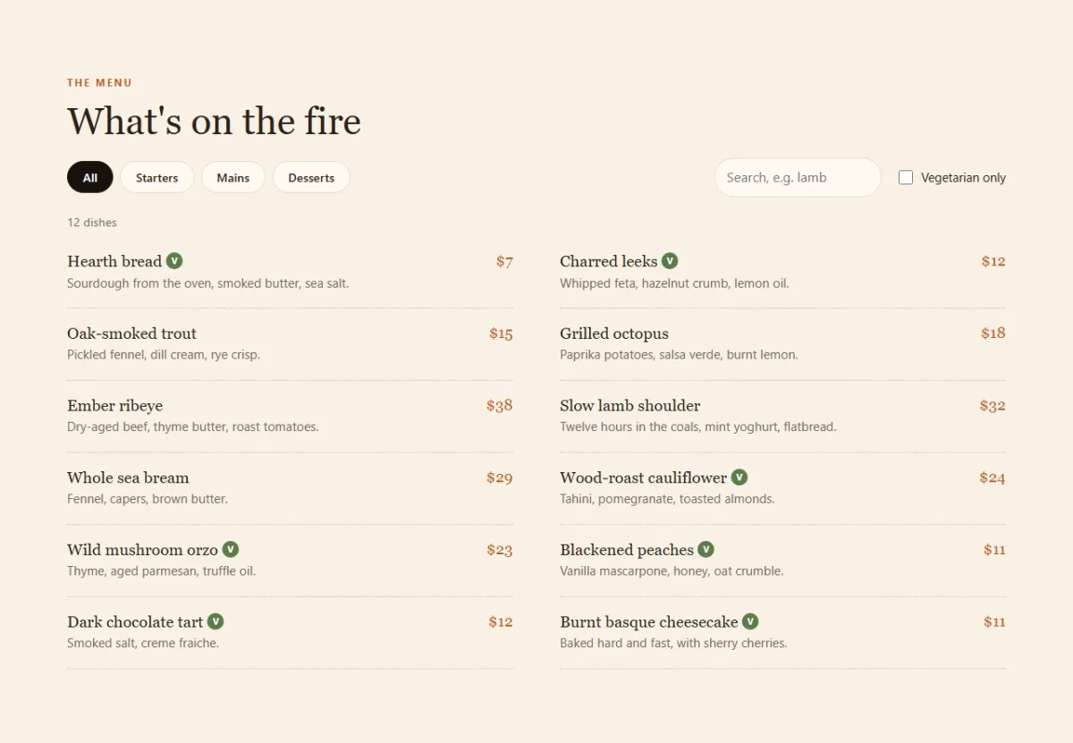
</section>This is the most important decision on the page: the dishes are written in the HTML, not built by JavaScript. The menu is the content people and search engines came for, so it should be there even if the script fails. JavaScript will only show and hide what's already on the page.
Each dish carries the facts the filter needs as data- attributes:
data-course="main" and data-veg="true". The tabs use
aria-pressed, which tells screen readers which one is switched on. The dish count has
aria-live="polite", so a screen reader announces the new number after each search.
1.4 The booking form
<!-- ---------- RESERVE ---------- -->
<section class="reserve" id="reserve">
<div class="wrap reserve-grid">
<div class="reserve-intro">
<p class="eyebrow">Reservations</p>
<h2>Book a table</h2>
<p>Tables are held for 15 minutes. For parties of more than eight, call us and we'll
work something out.</p>
<p class="reserve-phone"><a href="tel:+15550142">(555) 0142</a></p>
</div>
<form class="reserve-form" id="reserveForm" novalidate>
<div class="field">
<label for="guestName">Your name</label>
<input id="guestName" name="name" type="text" autocomplete="name" required minlength="2" aria-describedby="guestNameError">
<p class="error" id="guestNameError"></p>
</div>
<div class="field">
<label for="guestEmail">Email</label>
<input id="guestEmail" name="email" type="email" autocomplete="email" required aria-describedby="guestEmailError">
<p class="error" id="guestEmailError"></p>
</div>
<div class="field">
<label for="bookDate">Date</label>
<input id="bookDate" name="date" type="date" required aria-describedby="bookDateError">
<p class="error" id="bookDateError"></p>
</div>
<div class="field">
<label for="bookTime">Time</label>
<select id="bookTime" name="time" required disabled aria-describedby="bookTimeError">
<option value="">Pick a date first</option>
</select>
<p class="error" id="bookTimeError"></p>
</div>
<div class="field">
<span class="label" id="guestsLabel">Guests</span>
<div class="stepper" role="group" aria-labelledby="guestsLabel">
<button type="button" id="guestsDown" aria-label="One guest fewer">−</button>
<output id="guestsValue">2</output>
<button type="button" id="guestsUp" aria-label="One guest more">+</button>
</div>
</div>
<div class="field">
<label for="occasion">Occasion (optional)</label>
<select id="occasion" name="occasion">
<option value="">None</option>
<option>Birthday</option>
<option>Anniversary</option>
<option>Business dinner</option>
</select>
</div>
<button class="btn btn-accent full" type="submit">Request my table</button>
</form>
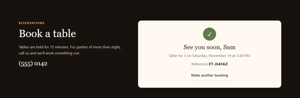
<div class="confirm" id="confirmBox" hidden tabindex="-1">
<span class="confirm-tick" aria-hidden="true">✓</span>
<h3>See you soon, <span id="confirmName"></span></h3>
<p id="confirmText"></p>
<p class="confirm-ref">Reference <strong id="confirmRef"></strong></p>
<button type="button" class="btn btn-line-dark" id="confirmReset">Make another booking</button>
</div>
</div>
</section>The form has novalidate because we'll show our own friendlier messages. We still add
required, type="email" and minlength: the browser checks
those rules for us, and novalidate only turns off its pop-up bubbles.
Each field points at its error paragraph with aria-describedby, so a screen reader
reads the error along with the field. The time list starts disabled because the
available times depend on the date. The confirmation box starts hidden, with
tabindex="-1" so we can move keyboard focus to it later.
1.5 Reviews, visit and footer
<!-- ---------- REVIEWS ---------- -->
<section class="reviews" id="reviews">
<div class="wrap">
<div class="reviews-head">
<div>
<p class="eyebrow">Reviews</p>
<h2>People keep coming back</h2>
</div>
<div class="car-btns">
<button type="button" id="prevReview" aria-label="Previous review">←</button>
<button type="button" id="nextReview" aria-label="Next review">→</button>
</div>
</div>
<div class="review-track" id="reviewTrack" tabindex="0" role="region" aria-label="Customer reviews">
<figure class="review">
<blockquote>The lamb shoulder fell apart at the touch of a fork. We ordered a second portion of bread just to finish the sauce.</blockquote>
<figcaption>Priya N.</figcaption>
</figure>
<figure class="review">
<blockquote>Warm room, kind staff and a menu with no filler. It's our first choice for birthdays now.</blockquote>
<figcaption>Tom A.</figcaption>
</figure>
<figure class="review">
<blockquote>As a vegetarian I usually get one sad option. Here I had trouble choosing. That cauliflower!</blockquote>
<figcaption>Elena R.</figcaption>
</figure>
<figure class="review">
<blockquote>You can smell the oak from down the street. The blackened peaches are worth the trip by themselves.</blockquote>
<figcaption>Marcus B.</figcaption>
</figure>
<figure class="review">
<blockquote>They remembered our anniversary without being reminded, and the cheesecake arrived with a candle.</blockquote>
<figcaption>Hana S.</figcaption>
</figure>
</div>
</div>
</section><!-- ---------- VISIT ---------- -->
<section class="visit" id="visit">
<div class="wrap visit-grid">
<div>
<p class="eyebrow">Visit</p>
<h2>Find us on Mill Lane</h2>
<address>18 Mill Lane, Riverside<br><a href="tel:+15550142">(555) 0142</a><br><a href="mailto:hello@example.com">hello@example.com</a></address>
</div>
<table class="hours">
<caption class="sr-only">Opening hours</caption>
<tbody id="hoursBody">
<tr data-day="1"><th scope="row">Monday</th><td>Closed</td></tr>
<tr data-day="2"><th scope="row">Tuesday</th><td>5:00 PM – 10:00 PM</td></tr>
<tr data-day="3"><th scope="row">Wednesday</th><td>5:00 PM – 10:00 PM</td></tr>
<tr data-day="4"><th scope="row">Thursday</th><td>5:00 PM – 10:00 PM</td></tr>
<tr data-day="5"><th scope="row">Friday</th><td>5:00 PM – 11:00 PM</td></tr>
<tr data-day="6"><th scope="row">Saturday</th><td>12:00 PM – 11:00 PM</td></tr>
<tr data-day="0"><th scope="row">Sunday</th><td>12:00 PM – 9:00 PM</td></tr>
</tbody>
</table>
</div>
</section>
</main><!-- ---------- FOOTER ---------- -->
<footer class="site-footer">
<div class="wrap footer-row">
<span class="logo"><span class="logo-mark" aria-hidden="true"></span>Ember & Thyme</span>
<p>Demo restaurant for a coding tutorial. Not a real business.</p>
</div>
</footer>
<script src="script.js"></script>
</body>
</html>The review track has tabindex="0" so keyboard users can focus it and scroll with the
arrow keys. Each review is a <figure> with a <blockquote> and
a <figcaption>, the standard markup for a quote and who said it.
Opening hours belong in a real <table>. Each row has
data-day, matching the numbers JavaScript uses for days, where Sunday is 0. Open
index.html in a browser now. It's unstyled, but the whole page is there. That's the end
of Part 1.
Part 2: The CSS
Now we turn the plain document into a warm, dark restaurant site, section by section.
2.1 Variables and shared styles
/* ---------- BASE ---------- */
:root {
  --ink: #17110d;
  --ink-2: #241a14;
  --cream: #f8f1e6;
  --paper: #fffaf2;
  --accent: #d9783a;
  --accent-dark: #b95d23;
  --herb: #5d7a4a;
  --text: #2c2119;
  --muted: #75675a;
  --line: #e7dbc9;
  --serif: Georgia, "Times New Roman", serif;
  --sans: -apple-system, BlinkMacSystemFont, "Segoe UI", Roboto, Helvetica, Arial, sans-serif;
}

*, *::before, *::after { box-sizing: border-box; }

html { scroll-behavior: smooth; scroll-padding-top: 84px; }

body {
  margin: 0;
  background: var(--paper);
  color: var(--text);
  font-family: var(--sans);
  line-height: 1.65;
}

h1, h2, h3 { font-family: var(--serif); font-weight: 400; line-height: 1.15; margin: 0; }
h2 { font-size: clamp(1.9rem, 4vw, 2.8rem); margin-bottom: 18px; }

.wrap { width: min(1120px, 100% - 40px); margin-inline: auto; }

section { padding: 88px 0; }

.eyebrow {
  margin: 0 0 10px;
  color: var(--accent-dark);
  font-size: .78rem;
  font-weight: 700;
  letter-spacing: .14em;
  text-transform: uppercase;
}

.btn {
  display: inline-block;
  padding: 13px 26px;
  border: 1px solid transparent;
  border-radius: 999px;
  font: 600 .95rem var(--sans);
  text-decoration: none;
  cursor: pointer;
  transition: background .2s, color .2s, transform .2s;
}
.btn:hover { transform: translateY(-2px); }
.btn-accent { background: var(--accent); color: #fff; }
.btn-accent:hover { background: var(--accent-dark); }
.btn-line { border-color: rgba(255, 255, 255, .4); color: #fff; }
.btn-line:hover { background: rgba(255, 255, 255, .1); }
.btn-line-dark { border-color: var(--line); background: none; color: var(--text); }
.full { width: 100%; grid-column: 1 / -1; }

:focus-visible { outline: 3px solid var(--accent); outline-offset: 2px; }

.sr-only {
  position: absolute;
  width: 1px;
  height: 1px;
  overflow: hidden;
  clip-path: inset(50%);
  white-space: nowrap;
}
All the colours live in :root, so changing the brand takes a few lines. We also define
two font stacks. A serif for headings gives the page its restaurant feel, and Georgia is
installed almost everywhere, so there's no web font to download.
.wrapuseswidth: min(1120px, 100% - 40px): at most 1120px wide, and always 20px from each edge on small screens.scroll-padding-top: 84pxstops the sticky header from covering the heading you jump to.:focus-visibledraws a clear ring for keyboard users without showing it on mouse clicks.
2.2 The header
/* ---------- HEADER ---------- */
.site-header {
  position: sticky;
  top: 0;
  z-index: 20;
  background: var(--ink);
  color: #fff;
  transition: box-shadow .2s;
}
.site-header.scrolled { box-shadow: 0 8px 24px rgba(0, 0, 0, .35); }

.nav { display: flex; align-items: center; justify-content: space-between; height: 72px; }

.logo {
  display: inline-flex;
  align-items: center;
  gap: 10px;
  color: inherit;
  font: 1.2rem var(--serif);
  text-decoration: none;
}

/* A flame cut from a circle with border-radius */
.logo-mark {
  width: 20px;
  height: 20px;
  background: linear-gradient(135deg, #f2b45a, var(--accent));
  border-radius: 50% 0 50% 50%;
  transform: rotate(-45deg);
}

.main-nav { display: flex; align-items: center; gap: 26px; }
.main-nav a:not(.btn) { color: #dcd0c2; font-size: .95rem; text-decoration: none; }
.main-nav a:not(.btn):hover { color: #fff; }
.main-nav .btn { padding: 9px 20px; }

.menu-btn { display: none; }
The logo flame is one square. border-radius: 50% 0 50% 50% rounds three corners and
leaves one sharp, which makes a drop shape, and rotate(-45deg) points the tip upward.
.main-nav a:not(.btn) styles the plain links without touching the button.
2.3 The hero, status pill and steam
/* ---------- HERO ---------- */
.hero {
  padding: 72px 0 96px;
  background:
    radial-gradient(600px 420px at 78% 45%, rgba(217, 120, 58, .28), transparent 70%),
    var(--ink);
  color: #fff;
  overflow: hidden;
}

.hero-grid {
  display: grid;
  grid-template-columns: 1.1fr 1fr;
  align-items: center;
  gap: 40px;
}

.hero h1 { font-size: clamp(2.6rem, 6vw, 4.5rem); margin: 18px 0; }
.hero h1 em { color: #f2b45a; }
.lead { max-width: 30rem; margin: 0 0 30px; color: #d9cdbf; font-size: 1.1rem; }
.hero-actions { display: flex; flex-wrap: wrap; gap: 12px; }

/* The status pill: its dot colour comes from the data-state attribute */
.status {
  display: inline-flex;
  align-items: center;
  gap: 9px;
  margin: 0;
  padding: 6px 15px;
  border: 1px solid rgba(255, 255, 255, .2);
  border-radius: 999px;
  color: #eadfd2;
  font-size: .86rem;
}
.status::before {
  content: "";
  width: 9px;
  height: 9px;
  border-radius: 50%;
  background: #a89888;
}
.status[data-state="open"]::before { background: #6fd08c; box-shadow: 0 0 0 4px rgba(111, 208, 140, .22); }
.status[data-state="soon"]::before { background: #f2b45a; box-shadow: 0 0 0 4px rgba(242, 180, 90, .22); }
.status[data-state="closed"]::before { background: #e0736a; }

.hero-art svg { display: block; width: 100%; max-width: 440px; margin-inline: auto; }
.plate { fill: #f5ecdf; }
.plate-rim { fill: #fffaf2; stroke: #e7dbc9; stroke-width: 2; }
.steak { fill: #6b3219; }
.grill path { fill: none; stroke: #3a1a0c; stroke-width: 6; stroke-linecap: round; }
.tomato { fill: #c9402c; }
.herb path { fill: none; stroke: var(--herb); stroke-width: 4; stroke-linecap: round; }
.sauce { fill: #8f3f1f; }

.steam path {
  fill: none;
  stroke: rgba(255, 255, 255, .5);
  stroke-width: 4;
  stroke-linecap: round;
  animation: steam 3.2s ease-in-out infinite;
}
.steam path:nth-child(2) { animation-delay: .6s; }
.steam path:nth-child(3) { animation-delay: 1.2s; }

@keyframes steam {
  0%   { opacity: 0; transform: translateY(14px); }
  40%  { opacity: 1; }
  100% { opacity: 0; transform: translateY(-14px); }
}
The background is a soft orange radial-gradient placed behind the plate, on top of the
dark colour, which looks like firelight. The headline uses
clamp(2.6rem, 6vw, 4.5rem), so it scales with the screen between a minimum and a
maximum, with no media query.
The status dot is a nice example of styling by attribute. JavaScript only sets
data-state="open", "soon" or "closed", and rules like
.status[data-state="open"]::before pick the colour. The script never mentions a
colour, so design and logic stay apart.
The steam is three paths running the same animation. The animation-delay on the second
and third path means they rise one after another, not all together.
2.4 The story
/* ---------- STORY ---------- */
.story-grid {
  display: grid;
  grid-template-columns: 1.2fr 1fr;
  align-items: center;
  gap: 60px;
}
.story p:not(.eyebrow) { color: var(--muted); }

.facts { display: grid; gap: 14px; margin: 0; padding: 0; list-style: none; }
.facts li {
  display: flex;
  align-items: baseline;
  justify-content: space-between;
  gap: 16px;
  padding: 16px 0;
  border-bottom: 1px solid var(--line);
}
.facts strong { color: var(--accent-dark); font: 2rem var(--serif); }
.facts span { color: var(--muted); font-size: .92rem; text-align: right; }
A two-column grid with a simple list of facts. align-items: baseline lines up the big
numbers and the small labels along the bottom of their text, which looks tidier than centring.
2.5 The menu
/* ---------- MENU ---------- */
.menu-section { background: var(--cream); }

.menu-tools {
  display: flex;
  flex-wrap: wrap;
  align-items: center;
  justify-content: space-between;
  gap: 16px;
  margin-top: 12px;
}

.tabs { display: flex; flex-wrap: wrap; gap: 8px; }
.tab {
  padding: 8px 18px;
  border: 1px solid var(--line);
  border-radius: 999px;
  background: var(--paper);
  color: var(--text);
  font: 600 .9rem var(--sans);
  cursor: pointer;
}
.tab[aria-pressed="true"] { border-color: var(--ink); background: var(--ink); color: #fff; }

.menu-search { display: flex; flex-wrap: wrap; align-items: center; gap: 16px; }
.menu-search input[type="search"] {
  width: 200px;
  padding: 9px 14px;
  border: 1px solid var(--line);
  border-radius: 999px;
  background: var(--paper);
  font: inherit;
}
.check { display: inline-flex; align-items: center; gap: 7px; font-size: .92rem; cursor: pointer; }
.check input { accent-color: var(--herb); width: 17px; height: 17px; }

.menu-count { margin: 18px 0 6px; color: var(--muted); font-size: .9rem; }

.dishes {
  display: grid;
  grid-template-columns: repeat(2, 1fr);
  gap: 0 56px;
  margin: 0;
  padding: 0;
  list-style: none;
}

/* h3 and price share the first row; the description spans both columns */
.dish {
  display: grid;
  grid-template-columns: 1fr auto;
  gap: 2px 16px;
  padding: 18px 0;
  border-bottom: 1px dotted #cdbfaa;
  animation: dishIn .3s ease backwards;
}
.dish[hidden] { display: none; }
.dish h3 { font-size: 1.2rem; }
.dish p { grid-column: 1 / -1; margin: 0; color: var(--muted); font-size: .94rem; }
.price { color: var(--accent-dark); font: 1.15rem var(--serif); }

.tag {
  display: inline-block;
  width: 20px;
  height: 20px;
  border-radius: 50%;
  background: var(--herb);
  color: #fff;
  font: 700 .66rem/20px var(--sans);
  text-align: center;
  vertical-align: 3px;
}

@keyframes dishIn {
  from { opacity: 0; transform: translateY(8px); }
}

.menu-empty { padding: 36px 0; color: var(--muted); text-align: center; }
.link-btn {
  border: 0;
  background: none;
  color: var(--accent-dark);
  font: inherit;
  text-decoration: underline;
  cursor: pointer;
}
Each dish is its own small grid. grid-template-columns: 1fr auto gives the name all
the spare room and the price only what it needs, so prices line up on the right. The description
uses grid-column: 1 / -1 to run across both columns.
There's one line here that's easy to miss: .dish[hidden] { display: none; }. The
browser's own rule for hidden is a weak display: none, so our
display: grid beats it and the dish stays visible. Whenever you put
display on something you plan to hide with hidden, add this rule.
The dishIn animation has only a from step. The browser fills in the end
from the element's normal style, so a dish fades in every time the filter shows it again.
2.6 The booking form
/* ---------- RESERVE ---------- */
.reserve { background: var(--ink); color: #fff; }

.reserve-grid {
  display: grid;
  grid-template-columns: 1fr 1.35fr;
  align-items: start;
  gap: 56px;
}
.reserve .eyebrow { color: #f2b45a; }
.reserve-intro p:not(.eyebrow) { color: #d9cdbf; }
.reserve-phone a { color: #fff; font: 1.6rem var(--serif); text-decoration: none; }

.reserve-form, .confirm {
  padding: 30px;
  border-radius: 14px;
  background: var(--paper);
  color: var(--text);
}

.reserve-form { display: grid; grid-template-columns: 1fr 1fr; gap: 16px 18px; }
.confirm[hidden], .reserve-form[hidden] { display: none; }

.field { min-width: 0; }
.field label, .label { display: block; margin-bottom: 5px; font-size: .88rem; font-weight: 600; }
.field input, .field select {
  width: 100%;
  height: 46px;
  padding: 0 12px;
  border: 1px solid var(--line);
  border-radius: 8px;
  background: #fff;
  color: var(--text);
  font: inherit;
}
.field select:disabled { background: #f3ece1; color: var(--muted); }
.field [aria-invalid="true"] { border-color: #c5392b; }

.error { min-height: 1.2em; margin: 4px 0 0; color: #b42f22; font-size: .82rem; line-height: 1.2; }

.stepper {
  display: flex;
  align-items: center;
  justify-content: space-between;
  height: 46px;
  border: 1px solid var(--line);
  border-radius: 8px;
  background: #fff;
}
.stepper button {
  width: 46px;
  height: 100%;
  border: 0;
  background: none;
  color: var(--accent-dark);
  font-size: 1.3rem;
  cursor: pointer;
}
.stepper button:disabled { color: #ccc; cursor: not-allowed; }
.stepper output { font-weight: 700; font-variant-numeric: tabular-nums; }

.confirm { text-align: center; }
.confirm:focus { outline: none; }
.confirm h3 { margin: 12px 0 8px; font-size: 1.7rem; }
.confirm p { margin: 0 0 10px; color: var(--muted); }
.confirm-ref strong { color: var(--text); letter-spacing: .06em; }
.confirm-tick {
  display: inline-grid;
  place-items: center;
  width: 56px;
  height: 56px;
  border-radius: 50%;
  background: var(--herb);
  color: #fff;
  font-size: 1.5rem;
}
The form is a two-column grid, and the submit button uses grid-column: 1 / -1 to span
both. .error has a min-height, which reserves a line for each message, so
the form doesn't jump when an error appears.
.field [aria-invalid="true"] turns the border red. As with the status pill, the CSS
reads the same attribute that screen readers use, so what people see and what they hear always
agree.
2.7 The reviews carousel
/* ---------- REVIEWS ---------- */
.reviews-head { display: flex; align-items: flex-end; justify-content: space-between; gap: 20px; }
.car-btns { display: flex; gap: 8px; margin-bottom: 20px; }
.car-btns button {
  width: 46px;
  height: 46px;
  border: 1px solid var(--line);
  border-radius: 50%;
  background: #fff;
  font-size: 1.1rem;
  cursor: pointer;
}
.car-btns button:disabled { opacity: .35; cursor: default; }

/* Native scrolling does the work; snap settles each card into place */
.review-track {
  display: grid;
  grid-auto-flow: column;
  grid-auto-columns: calc((100% - 40px) / 3);
  gap: 20px;
  padding-bottom: 12px;
  overflow-x: auto;
  scroll-snap-type: x mandatory;
  scrollbar-width: none;
}
.review-track::-webkit-scrollbar { display: none; }

.review {
  display: flex;
  flex-direction: column;
  margin: 0;
  padding: 26px;
  border: 1px solid var(--line);
  border-radius: 14px;
  background: #fff;
  scroll-snap-align: start;
}
.review blockquote { flex: 1; margin: 0 0 16px; font: 1.05rem/1.55 var(--serif); }
.review figcaption { color: var(--muted); font-size: .9rem; }
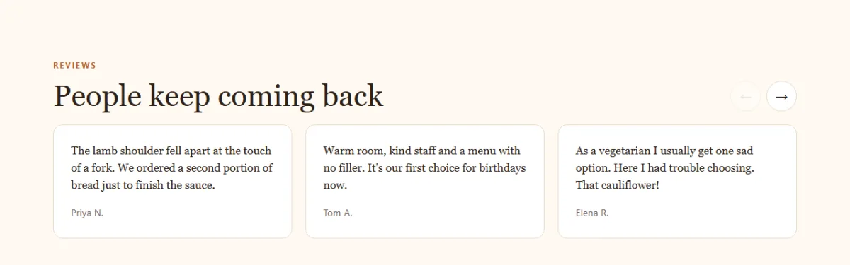
This carousel is mostly CSS. grid-auto-flow: column puts every card in one long row,
and overflow-x: auto makes that row scroll. Then two lines do the rest:
scroll-snap-type: x mandatory on the track, and
scroll-snap-align: start on each card, so a card always settles neatly in place.
Swiping on a phone, trackpad scrolling and keyboard scrolling all work for free.
The width calc((100% - 40px) / 3) fits exactly three cards with their two 20px gaps.
2.8 Visit and footer
/* ---------- VISIT AND FOOTER ---------- */
.visit { background: var(--cream); }
.visit-grid { display: grid; grid-template-columns: 1fr 1fr; align-items: center; gap: 56px; }
address { color: var(--muted); font-style: normal; font-size: 1.05rem; }
address a { color: var(--accent-dark); }

.hours { width: 100%; border-collapse: collapse; }
.hours th, .hours td { padding: 11px 10px; border-bottom: 1px solid var(--line); text-align: left; }
.hours th { font-weight: 600; }
.hours td { color: var(--muted); text-align: right; }
.hours tr.today { background: #fff; }
.hours tr.today th, .hours tr.today td { color: var(--accent-dark); font-weight: 700; }

.site-footer { padding: 28px 0; background: var(--ink); color: #b8aa9b; }
.site-footer .logo { color: #fff; }
.footer-row { display: flex; flex-wrap: wrap; align-items: center; justify-content: space-between; gap: 12px; }
.footer-row p { margin: 0; font-size: .86rem; }
The .today class highlights the current day in the hours table. JavaScript adds it in
Part 3.
2.9 Animations, phones and reduced motion
/* ---------- ANIMATIONS ---------- */
.js .reveal:not(.visible) { opacity: 0; }
.js .reveal.visible { animation: rise .55s ease both; }
.js .reveal.visible:nth-child(2) { animation-delay: .1s; }
.js .reveal.visible:nth-child(3) { animation-delay: .2s; }

@keyframes rise {
  from { opacity: 0; transform: translateY(16px); }
  to   { opacity: 1; transform: none; }
}
.js .reveal:not(.visible) only hides an item when the script has loaded and hasn't
revealed it yet. If the script fails, or the animation never runs, the content still shows. Always
build scroll effects this way.
/* ---------- SMALL SCREENS ---------- */
@media (max-width: 900px) {
  section { padding: 64px 0; }
  .hero { padding: 48px 0 64px; }
  .hero-grid, .story-grid, .reserve-grid, .visit-grid { grid-template-columns: 1fr; gap: 36px; }
  .hero-art svg { max-width: 300px; }
  .dishes { grid-template-columns: 1fr; }
  .review-track { grid-auto-columns: calc((100% - 20px) / 2); }

  .menu-btn {
    display: block;
    position: relative;
    width: 44px;
    height: 44px;
    border: 0;
    background: none;
    cursor: pointer;
  }
  .menu-btn span, .menu-btn span::before, .menu-btn span::after {
    position: absolute;
    left: 10px;
    width: 24px;
    height: 2px;
    background: #fff;
    transition: transform .2s, background .2s;
  }
  .menu-btn span { top: 21px; }
  .menu-btn span::before, .menu-btn span::after { content: ""; left: 0; }
  .menu-btn span::before { top: -7px; }
  .menu-btn span::after { top: 7px; }
  .menu-btn[aria-expanded="true"] span { background: transparent; }
  .menu-btn[aria-expanded="true"] span::before { transform: translateY(7px) rotate(45deg); }
  .menu-btn[aria-expanded="true"] span::after { transform: translateY(-7px) rotate(-45deg); }

  .main-nav {
    display: none;
    position: absolute;
    top: 72px;
    left: 0;
    right: 0;
    flex-direction: column;
    align-items: stretch;
    gap: 4px;
    padding: 12px 20px 22px;
    background: var(--ink);
    box-shadow: 0 16px 24px rgba(0, 0, 0, .35);
  }
  .main-nav.open { display: flex; }
  .main-nav a:not(.btn) { padding: 10px 0; }
  .main-nav .btn { margin-top: 8px; text-align: center; }
}

@media (max-width: 600px) {
  .reserve-form { grid-template-columns: 1fr; padding: 22px; }
  .review-track { grid-auto-columns: 86%; }
  .menu-search, .menu-search input[type="search"] { width: 100%; }
  .hero-actions .btn { flex: 1; text-align: center; }
}
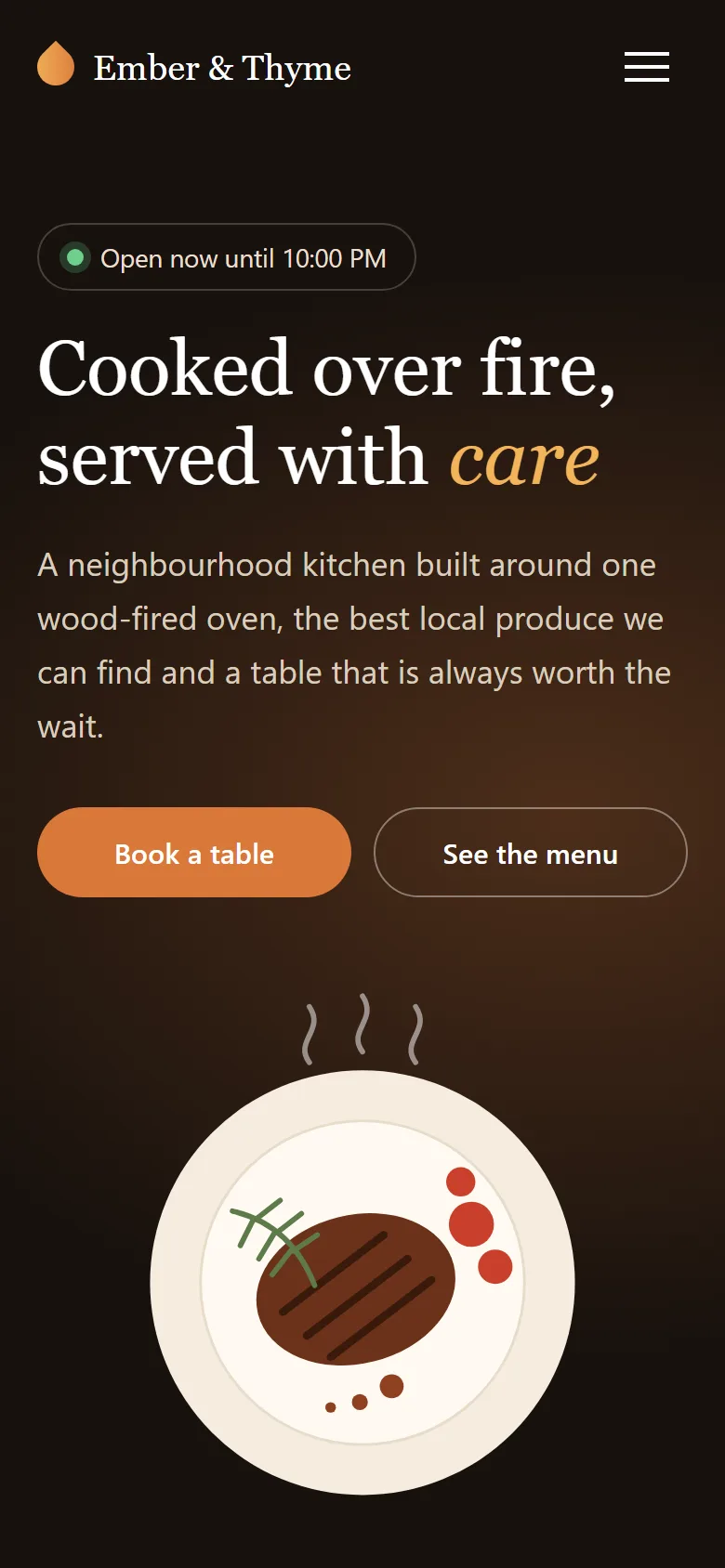
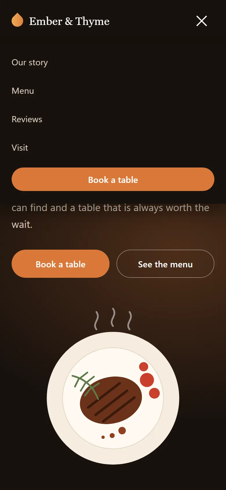
At 900px the two-column sections stack, and the links hide behind a hamburger. The three bars are
one <span> plus its ::before and ::after. When
aria-expanded="true", the middle bar goes transparent and the other two rotate into an
X. At 600px the form becomes one column, and each review takes 86% of the width, so the next card
peeks in and shows people they can swipe.
/* ---------- REDUCED MOTION ---------- */
@media (prefers-reduced-motion: reduce) {
  html { scroll-behavior: auto; }
  *, *::before, *::after {
    animation-duration: .01ms !important;
    animation-delay: 0ms !important;
    animation-iteration-count: 1 !important;
    transition-duration: .01ms !important;
  }
  .steam path { opacity: .5; }
}
Some people turn off motion in their system settings because it makes them dizzy. This block makes every animation finish instantly for them. That's the end of Part 2: the page looks finished, and only the live parts are missing.
Part 3: The JavaScript
The script has seven small, separate jobs. Most of the interesting ideas here are about dates and times, so we'll start there.
3.1 Settings and time helpers
/* ---------- SETTINGS ---------- */
// Opening hours in 24-hour time. The index is the same as Date.getDay(): 0 is Sunday.
const HOURS = [
  { open: '12:00', close: '21:00' }, // Sunday
  null,                              // Monday: closed
  { open: '17:00', close: '22:00' }, // Tuesday
  { open: '17:00', close: '22:00' }, // Wednesday
  { open: '17:00', close: '22:00' }, // Thursday
  { open: '17:00', close: '23:00' }, // Friday
  { open: '12:00', close: '23:00' }  // Saturday
];
const DAY_NAMES = ['Sunday', 'Monday', 'Tuesday', 'Wednesday', 'Thursday', 'Friday', 'Saturday'];
const LAST_BOOKING = 60;   // minutes before closing
const SLOT_LENGTH = 30;    // minutes between booking times
const MAX_GUESTS = 8;
const BOOK_AHEAD_DAYS = 60;

// '17:30' becomes 1050, the number of minutes since midnight
const toMinutes = (time) => {
  const [hours, minutes] = time.split(':').map(Number);
  return hours * 60 + minutes;
};

// 1050 becomes '5:30 PM'
const toLabel = (total) => {
  const hours = Math.floor(total / 60);
  const minutes = String(total % 60).padStart(2, '0');
  return `${hours % 12 || 12}:${minutes} ${hours < 12 ? 'AM' : 'PM'}`;
};

// YYYY-MM-DD in the visitor's own time zone. toISOString() would give the UTC date,
// which is the wrong day for part of every evening or morning in many countries.
const toDateValue = (date) => [
  date.getFullYear(),
  String(date.getMonth() + 1).padStart(2, '0'),
  String(date.getDate()).padStart(2, '0')
].join('-');

// new Date('2026-11-06') is read as UTC, so split the value and build a local date
const fromDateValue = (value) => {
  const [year, month, day] = value.split('-').map(Number);
  return new Date(year, month - 1, day);
};
HOURS has seven entries in the same order as Date.getDay(), where Sunday
is 0, so HOURS[new Date().getDay()] gives today's hours directly. A closed day is
null.
The key idea is toMinutes(). Comparing '17:30' and
'9:00' as text gives the wrong answer, because text compares letter by letter. Turn
both into minutes since midnight and you can compare, add and subtract them like any number.
toLabel() converts back for display. hours % 12 || 12 is a neat trick:
12 and 0 both give 0, which || replaces with 12.
The last two helpers avoid a time zone bug that catches nearly everyone:
date.toISOString()looks like the easy way to get2026-11-06, but it gives the date in UTC. In the evening in New York, or the morning in Sydney, that's a different day from the one on the visitor's calendar.new Date('2026-11-06')has the opposite problem: it reads that text as midnight UTC. West of Greenwich that's still the 5th, sogetDay()gives the wrong weekday.
toDateValue() and fromDateValue() build the date from its parts in local
time, which fixes both.
3.2 Menu button, header and reveal
/* ---------- MOBILE MENU ---------- */
const menuBtn = document.getElementById('menuBtn');
const mainNav = document.getElementById('mainNav');

function setMenu(open) {
  menuBtn.setAttribute('aria-expanded', open);
  menuBtn.setAttribute('aria-label', open ? 'Close menu' : 'Open menu');
  mainNav.classList.toggle('open', open);
}

menuBtn.addEventListener('click', () => {
  setMenu(menuBtn.getAttribute('aria-expanded') !== 'true');
});
mainNav.addEventListener('click', (e) => {
  if (e.target.closest('a')) setMenu(false);
});
document.addEventListener('keydown', (e) => {
  if (e.key === 'Escape') setMenu(false);
});/* ---------- STICKY HEADER ---------- */
const siteHeader = document.getElementById('siteHeader');
window.addEventListener('scroll', () => {
siteHeader.classList.toggle('scrolled', window.scrollY > 10);
}, { passive: true });/* ---------- SCROLL REVEAL ---------- */
document.documentElement.classList.add('js');
const revealer = new IntersectionObserver((entries) => {
entries.forEach((entry) => {
if (!entry.isIntersecting) return;
entry.target.classList.add('visible');
revealer.unobserve(entry.target);
});
}, { threshold: 0.2 });
document.querySelectorAll('.reveal').forEach((el) => revealer.observe(el));setMenu() is the single place that opens or closes the menu, so the attribute, the
label and the class can never disagree. classList.toggle(name, condition) replaces an
if/else. IntersectionObserver tells us when an item scrolls
into view, which is far cheaper than measuring positions on every scroll event.
3.3 The open-now status
/* ---------- OPEN NOW ---------- */
const openStatus = document.getElementById('openStatus');

function nextOpening(now) {
  // Look up to seven days ahead for the next day with opening hours
  for (let i = 1; i <= 7; i++) {
    const day = (now.getDay() + i) % 7;
    if (HOURS[day]) {
      const name = i === 1 ? 'tomorrow' : DAY_NAMES[day];
      return `${name} at ${toLabel(toMinutes(HOURS[day].open))}`;
    }
  }
  return 'soon';
}

function updateStatus() {
  const now = new Date();
  const today = HOURS[now.getDay()];
  const minutes = now.getHours() * 60 + now.getMinutes();

  if (today && minutes >= toMinutes(today.open) && minutes < toMinutes(today.close)) {
    const left = toMinutes(today.close) - minutes;
    openStatus.dataset.state = left <= 60 ? 'soon' : 'open';
    openStatus.textContent = left <= 60
      ? `Closing soon, at ${toLabel(toMinutes(today.close))}`
      : `Open now until ${toLabel(toMinutes(today.close))}`;
  } else if (today && minutes < toMinutes(today.open)) {
    openStatus.dataset.state = 'closed';
    openStatus.textContent = `Closed, opens today at ${toLabel(toMinutes(today.open))}`;
  } else {
    openStatus.dataset.state = 'closed';
    openStatus.textContent = `Closed, opens ${nextOpening(now)}`;
  }
}

updateStatus();
setInterval(updateStatus, 60000); // keep it right if the tab stays open

// Highlight today's row in the opening hours table
const todayRow = document.querySelector(`#hoursBody tr[data-day="${new Date().getDay()}"]`);
todayRow.classList.add('today');
updateStatus() gets the current time in minutes and handles three cases:
- Between opening and closing: open. With 60 minutes or less to go, it switches to the amber "closing soon" state.
- Before today's opening: closed, opening later today.
- After closing, or a closed day:
nextOpening()looks forward through the week.(now.getDay() + i) % 7wraps Saturday (6) back round to Sunday (0). On Sunday night it skips Monday and says "opens Tuesday at 5:00 PM".
The same check runs every minute with setInterval, so the status stays right on a tab
left open. The last two lines find today's row with a template literal in the selector and add the
today class.
3.4 Filtering the menu
/* ---------- MENU FILTER ---------- */
const dishes = [...document.querySelectorAll('.dish')];
const menuTabs = document.getElementById('menuTabs');
const menuSearch = document.getElementById('menuSearch');
const vegOnly = document.getElementById('vegOnly');
const menuCount = document.getElementById('menuCount');
const menuEmpty = document.getElementById('menuEmpty');

// One object holds every filter, and filterMenu() is the only place that reads it
const filters = { course: 'all', query: '', veg: false };

function filterMenu() {
  let shown = 0;

  dishes.forEach((dish) => {
    const matchesCourse = filters.course === 'all' || dish.dataset.course === filters.course;
    const matchesVeg = !filters.veg || dish.dataset.veg === 'true';
    const matchesQuery = dish.textContent.toLowerCase().includes(filters.query);

    dish.hidden = !(matchesCourse && matchesVeg && matchesQuery);
    if (!dish.hidden) shown++;
  });

  menuCount.textContent = `${shown} ${shown === 1 ? 'dish' : 'dishes'}`;
  menuEmpty.hidden = shown > 0;
}

menuTabs.addEventListener('click', (e) => {
  const tab = e.target.closest('.tab');
  if (!tab) return;
  menuTabs.querySelectorAll('.tab').forEach((t) => t.setAttribute('aria-pressed', t === tab));
  filters.course = tab.dataset.filter;
  filterMenu();
});

menuSearch.addEventListener('input', () => {
  filters.query = menuSearch.value.trim().toLowerCase();
  filterMenu();
});

vegOnly.addEventListener('change', () => {
  filters.veg = vegOnly.checked;
  filterMenu();
});

document.getElementById('menuReset').addEventListener('click', () => {
  menuSearch.value = '';
  vegOnly.checked = false;
  filters.query = '';
  filters.veg = false;
  menuTabs.querySelector('[data-filter="all"]').click();
});
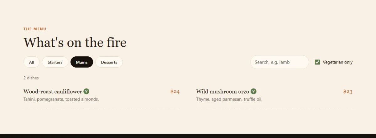
There are three filters that all work together, so they share one filters object.
Every control does the same two things: update that object, then call
filterMenu(). No control needs to know about the others.
Inside filterMenu(), a dish must pass all three checks.
!filters.veg || dish.dataset.veg === 'true' reads as "either the box is off, or this
dish is vegetarian". dish.textContent holds the name, price and description together,
so searching for mint finds the lamb from its description alone. Lowercasing both
sides makes the search ignore capitals.
[...document.querySelectorAll('.dish')] copies the results into a real array, because
we'll want array methods on it. The tabs use event delegation: one listener on the
group, with closest('.tab') finding which tab was clicked.
3.5 The booking form
/* ---------- RESERVATION ---------- */
const reserveForm = document.getElementById('reserveForm');
const bookDate = document.getElementById('bookDate');
const bookTime = document.getElementById('bookTime');
const confirmBox = document.getElementById('confirmBox');

// Limit the date picker to today and the next 60 days
const firstDay = new Date();
const lastDay = new Date();
lastDay.setDate(lastDay.getDate() + BOOK_AHEAD_DAYS);
bookDate.min = toDateValue(firstDay);
bookDate.max = toDateValue(lastDay);

// Guests stepper
let guests = 2;
const guestsValue = document.getElementById('guestsValue');
const guestsDown = document.getElementById('guestsDown');
const guestsUp = document.getElementById('guestsUp');

function setGuests(value) {
  guests = value;
  guestsValue.textContent = guests;
  guestsDown.disabled = guests <= 1;
  guestsUp.disabled = guests >= MAX_GUESTS;
}
guestsDown.addEventListener('click', () => setGuests(guests - 1));
guestsUp.addEventListener('click', () => setGuests(guests + 1));

// Every bookable time on a given date
function slotsFor(date) {
  const hours = HOURS[date.getDay()];
  if (!hours) return [];

  const slots = [];
  const last = toMinutes(hours.close) - LAST_BOOKING;
  for (let t = toMinutes(hours.open); t <= last; t += SLOT_LENGTH) slots.push(t);

  // For a booking today, drop the times that have already passed
  const now = new Date();
  if (toDateValue(date) !== toDateValue(now)) return slots;
  const minutesNow = now.getHours() * 60 + now.getMinutes();
  return slots.filter((t) => t > minutesNow);
}

function fillTimes() {
  bookTime.innerHTML = '';
  const slots = bookDate.value ? slotsFor(fromDateValue(bookDate.value)) : [];

  bookTime.disabled = slots.length === 0;
  bookTime.add(new Option(slots.length ? 'Choose a time' : 'No times on this day', ''));
  slots.forEach((t) => bookTime.add(new Option(toLabel(t), toLabel(t))));
}

function setError(field, message) {
  document.getElementById(field.id + 'Error').textContent = message;
  if (message) field.setAttribute('aria-invalid', 'true');
  else field.removeAttribute('aria-invalid');
}

// Returns the message for one field, or '' if it's fine
function messageFor(field) {
  const v = field.validity;

  if (field === bookDate) {
    if (v.valueMissing) return 'Choose a date.';
    if (v.rangeUnderflow) return 'That date has passed.';
    if (v.rangeOverflow) return `You can book up to ${BOOK_AHEAD_DAYS} days ahead.`;
    if (!HOURS[fromDateValue(field.value).getDay()]) return 'We are closed on Mondays.';
    if (slotsFor(fromDateValue(field.value)).length === 0) return 'No times are left today.';
    return '';
  }
  if (v.valueMissing) return field === bookTime ? 'Choose a time.' : 'This field is required.';
  if (v.tooShort) return 'Please enter your full name.';
  if (v.typeMismatch) return 'Enter a valid email address.';
  return '';
}

const checkField = (field) => {
  const message = messageFor(field);
  setError(field, message);
  return message === '';
};

const requiredFields = [...reserveForm.querySelectorAll('[required]')];

// Check a field when the visitor leaves it, not on every key press
requiredFields.forEach((field) => field.addEventListener('blur', () => checkField(field)));

bookDate.addEventListener('change', () => {
  fillTimes();
  checkField(bookDate);
});

// A readable reference, skipping letters that look like numbers
function makeReference() {
  const letters = 'ABCDEFGHJKMNPQRSTUVWXYZ23456789';
  let ref = 'ET-';
  for (let i = 0; i < 5; i++) ref += letters[Math.floor(Math.random() * letters.length)];
  return ref;
}

reserveForm.addEventListener('submit', (e) => {
  e.preventDefault();

  const results = requiredFields.map(checkField);
  if (results.includes(false)) {
    requiredFields[results.indexOf(false)].focus();
    return;
  }

  const data = new FormData(reserveForm);
  const when = fromDateValue(data.get('date')).toLocaleDateString('en-US', {
    weekday: 'long', month: 'long', day: 'numeric'
  });

  // textContent treats the typed name as plain text, so it can never run as code
  document.getElementById('confirmName').textContent = data.get('name').trim().split(' ')[0];
  document.getElementById('confirmText').textContent =
    `Table for ${guests} on ${when} at ${data.get('time')}.`;
  document.getElementById('confirmRef').textContent = makeReference();

  reserveForm.hidden = true;
  confirmBox.hidden = false;
  confirmBox.focus();
});

document.getElementById('confirmReset').addEventListener('click', () => {
  reserveForm.reset();
  setGuests(2);
  fillTimes();
  bookTime.options[0].textContent = 'Pick a date first';
  confirmBox.hidden = true;
  reserveForm.hidden = false;
  document.getElementById('guestName').focus();
});
This is the longest block, so let's take it in order.
- Date limits. Setting
minandmaxgreys out past dates in the picker.setDate(getDate() + 60)is safe across months, because theDateobject rolls over by itself. - Time slots.
slotsFor()builds the list for a date: from opening time to one hour before closing, every 30 minutes. If the date is today, it drops the times that have passed.fillTimes()then adds each one withnew Option(text, value), which is safer and cleaner than writing HTML strings. - Validation. Every input has a built-in
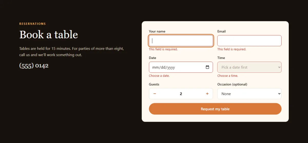
validityobject with flags likevalueMissing,typeMismatchandrangeUnderflow. The browser does the checking, andmessageFor()only turns each flag into friendly words. Our own rule, closed on Mondays, sits alongside them. - When to complain. A field is checked on
blur, when the visitor leaves it. Showing "invalid email" after the first letter they type is rude. - Submitting.
map(checkField)checks every field, so all the errors show at once, and focus moves to the first bad one.
The confirmation shows the visitor's name with textContent, never
innerHTML. Whatever someone types into the form appears as plain text and can never run
as code. Moving focus to the confirmation box means keyboard and screen reader users land on the
result, not on a form that just vanished.
3.6 The carousel arrows
/* ---------- REVIEWS CAROUSEL ---------- */
const track = document.getElementById('reviewTrack');
const prevReview = document.getElementById('prevReview');
const nextReview = document.getElementById('nextReview');

function moveReviews(direction) {
  const gap = parseFloat(getComputedStyle(track).columnGap) || 0;
  track.scrollBy({ left: direction * (track.firstElementChild.offsetWidth + gap), behavior: 'smooth' });
}

function updateArrows() {
  const end = track.scrollWidth - track.clientWidth;
  prevReview.disabled = track.scrollLeft <= 2;
  nextReview.disabled = track.scrollLeft >= end - 2;
}

prevReview.addEventListener('click', () => moveReviews(-1));
nextReview.addEventListener('click', () => moveReviews(1));
track.addEventListener('scroll', updateArrows, { passive: true });
window.addEventListener('resize', updateArrows);
updateArrows();
Swiping already works from the CSS, so the arrows only need to scroll by one card.
getComputedStyle reads the gap from the stylesheet, so nothing here breaks if you
change it. updateArrows() disables an arrow at each end of the track, and the
2px of slack allows for browsers that stop a fraction of a pixel short of the end.
Test it yourself
- Look at the status pill, then check it against the opening hours table at the bottom.
- Type
LAMBin the menu search. Capitals don't matter. - Click Mains, then tick Vegetarian only. You should see 2 dishes.
- Search for
zzzand use the link that appears to reset everything. - In the booking form, pick a Monday. You should get a message, and no times.
- Submit the empty form. All the errors should appear, and focus should jump to the name field.
- Make a booking with a name, a Saturday and a time, and check the confirmation.
- Make the window narrow and swipe or scroll the reviews.
Using it on a real site
- Real bookings: in the submit handler, send the data with
fetch('/api/book', { method: 'POST', body: new FormData(reserveForm) }). Check on the server that the table is free and that the date and time are valid, because anyone can bypass checks that run in the browser. The reference should come from the server too. - Holidays: add a list of closed dates and check it in
messageFor()andslotsFor(). - Time zones: this demo uses the time on the visitor's device. If people book from
abroad, get the restaurant's local time with
Intl.DateTimeFormatand itstimeZoneoption. - Search results: add
Restaurantstructured data from schema.org with your address and hours, so they can appear directly in search. - Food photos: real photos sell food. Swap the SVG for an
<img>withwidth,heightand usefulalttext.
Share your version
Built a site for your own favourite restaurant? Share a screenshot as a link with sshot.online, or share your code with the free code sharing tool. No account needed. For another project in the same style, try the real estate website tutorial, which builds its listings from data and adds a mortgage calculator.
Conclusion
You've built a complete, responsive restaurant website in three parts. Along the way you used:
- minutes since midnight to make times easy to compare
- local date helpers to avoid the UTC date bug
data-attributes and one shared filter object for a combined menu filter- the
validityobject andnew Option()for a smart booking form - CSS scroll snap for a carousel that works with touch, trackpad and keyboard
- ARIA attributes, focus management and reduced motion, so the site works for everyone
Frequently asked questions
Do I need a framework to build a restaurant website?
No. This whole site is one HTML file, one CSS file and one JavaScript file, with no frameworks, libraries or image files.
How does the open-now status work?
The opening hours are stored in an array indexed by day of the week. The script turns the current time into minutes since midnight and compares it with that day's opening and closing times.
Does the booking form actually send a reservation?
Not in this demo. It validates the form and shows a confirmation on the page. To take real bookings, send the form data to your server or a booking service with fetch(), and check the table is free there.
Why is the menu written in the HTML instead of a JavaScript array?
A restaurant menu is the content people and search engines come for. Keeping it in the HTML means it is readable with JavaScript turned off, and the script only shows or hides dishes.
How do I use the visitor's time zone correctly?
This demo uses the visitor's device time, which is correct for local customers. If tourists book from abroad, work out the time in the restaurant's own zone with Intl.DateTimeFormat and its timeZone option.
Related articles
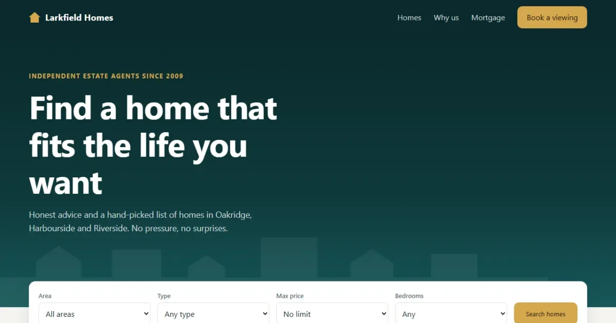
How to Build a Real Estate Website with HTML, CSS and JavaScript
A property site in 3 parts: search and sort listings built from data, saved homes, a native details popup and a mortgage calculator with a live donut chart.
Read More →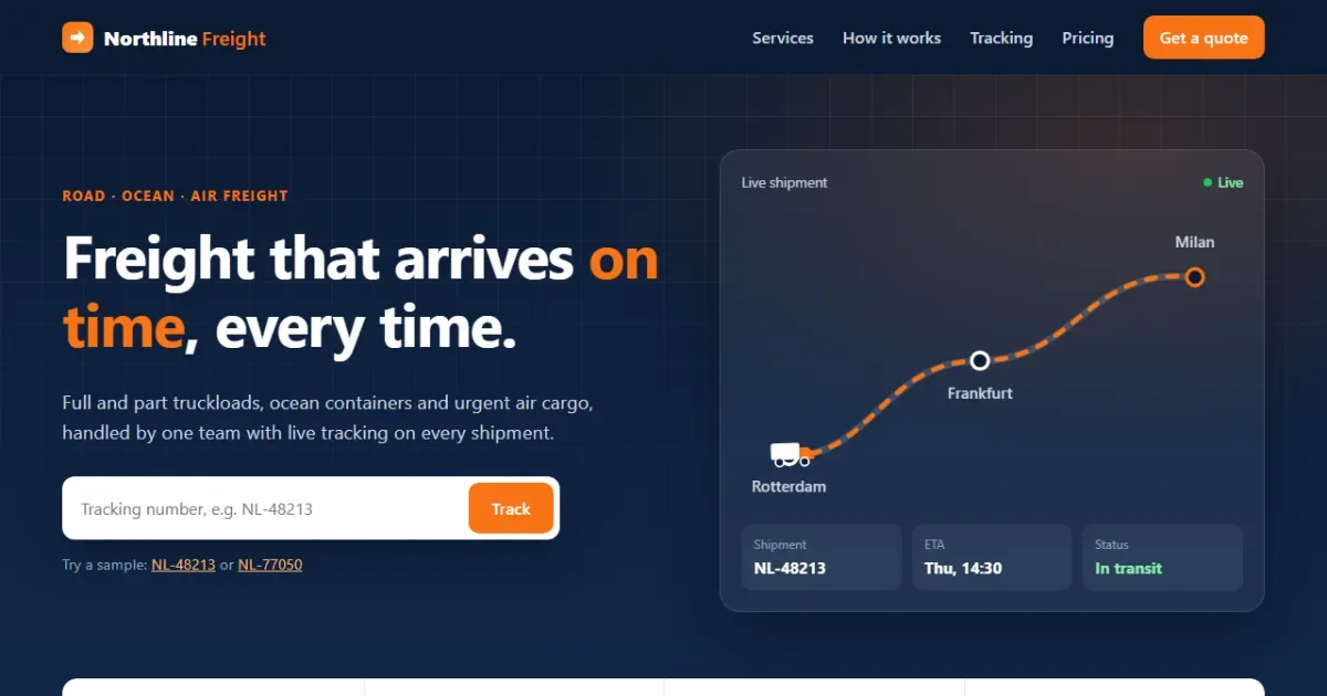
How to Build a Freight Logistics Landing Page with HTML, CSS and JavaScript
A professional logistics landing page in 3 parts: a truck driving along an SVG route, animated stats, live shipment tracking and an instant quote calculator.
Read More →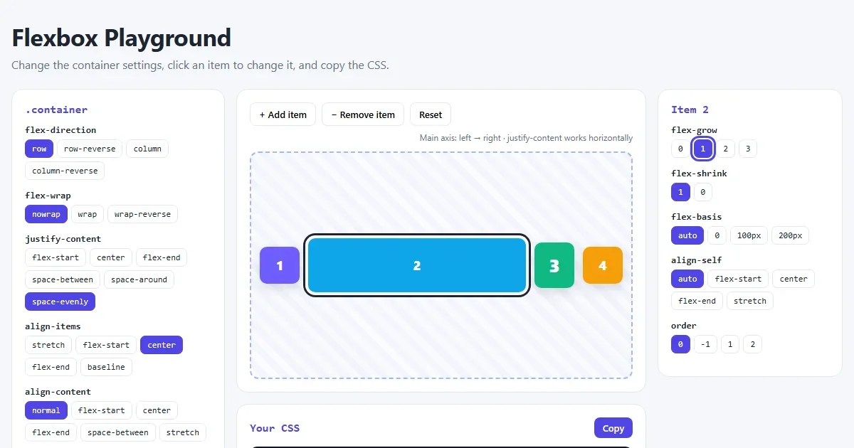
CSS Flexbox Explained: A Visual Guide with Examples
Every Flexbox property in pictures: direction, justify-content, align-items, wrap, gap, flex-grow, plus a navbar, equal-height cards and a sticky footer.
Read More →