CSS Flexbox Explained: A Visual Guide with Examples
Published November 5, 2026 · 14 min read
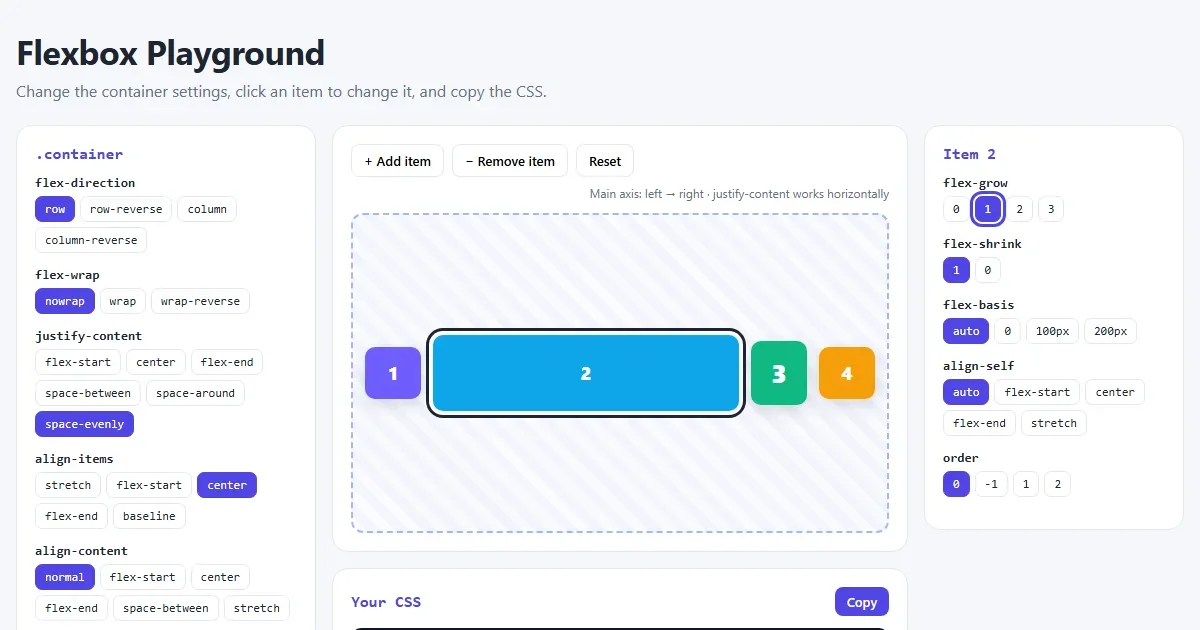
Flexbox is the CSS tool for lining things up in a row or a column: navigation bars, button groups, card rows, form layouts, centering. Once it clicks, you'll use it every day. This guide explains every Flexbox property with a picture, so you can see what each value does instead of guessing.
Open the Flexbox playground Try every property live and copy the CSS.
Flexbox in 30 seconds
Flexbox always involves two kinds of element:
- The flex container: the parent, which gets
display: flex. - The flex items: its direct children, which are laid out automatically.
<div class="container">
  <div class="item">1</div>
  <div class="item">2</div>
  <div class="item">3</div>
</div>.container {
display: flex; /* that's it: the children now sit in a row */
gap: 12px; /* space between them */
}Most Flexbox properties go on the container and affect all the items. A few go on an item to change just that one. This guide covers both, in that order.
The key idea: main axis and cross axis
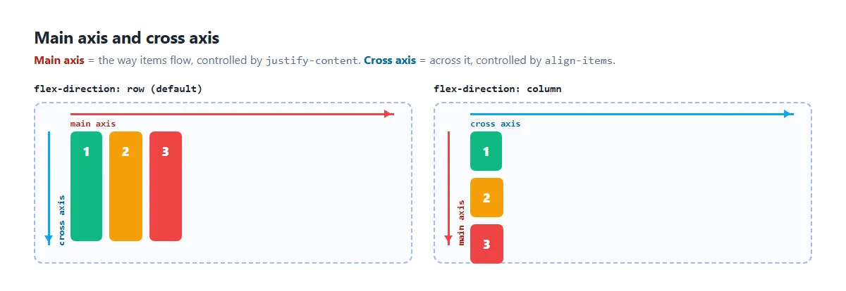
Every flex container has two directions:
- The main axis is the direction the items flow. In a row, that's left to right.
- The cross axis runs across it. In a row, that's top to bottom.
Why does this matter? Because justify-content always works on the
main axis and align-items always works on the cross axis. When you
switch to a column, the axes turn, and so do those two properties. This one fact explains most
“Flexbox isn't working” moments.
Container properties
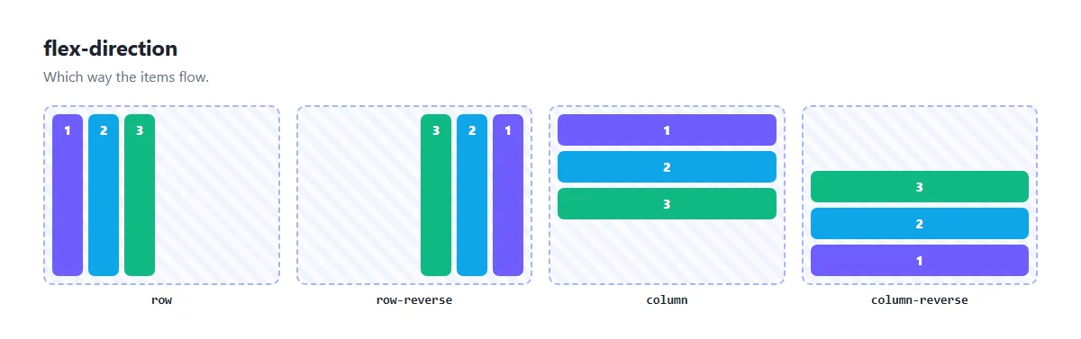
flex-direction: which way items flow
.container {
  display: flex;
  flex-direction: row;   /* row | row-reverse | column | column-reverse */
}
row is the default. column stacks items vertically, which is great for
forms, sidebars and mobile layouts. The -reverse values flip the order on screen
without changing the HTML.
justify-content: spread items along the main axis
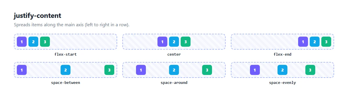
flex-start(default): items pack at the start.center: items gather in the middle.flex-end: items pack at the end.space-between: the first and last items touch the edges, and the space is shared between the rest. Perfect for a logo on the left and a menu on the right.space-around: equal space around each item, so the edges get half as much.space-evenly: exactly equal gaps everywhere, including the edges.
align-items: line items up on the cross axis
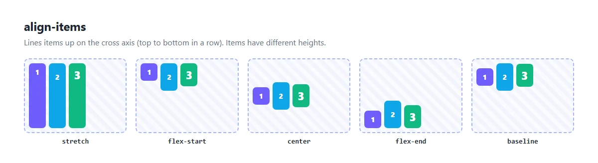
stretch(default): items stretch to fill the container's height. This is why cards in a flex row are all the same height.flex-start,center,flex-end: top, middle or bottom.baseline: lines up the bottom of the text in each item, even if the font sizes differ. Useful for a big price next to a small label.
Put justify-content: center and align-items: center together and you
have perfect centering. More on that in
how to center a div.
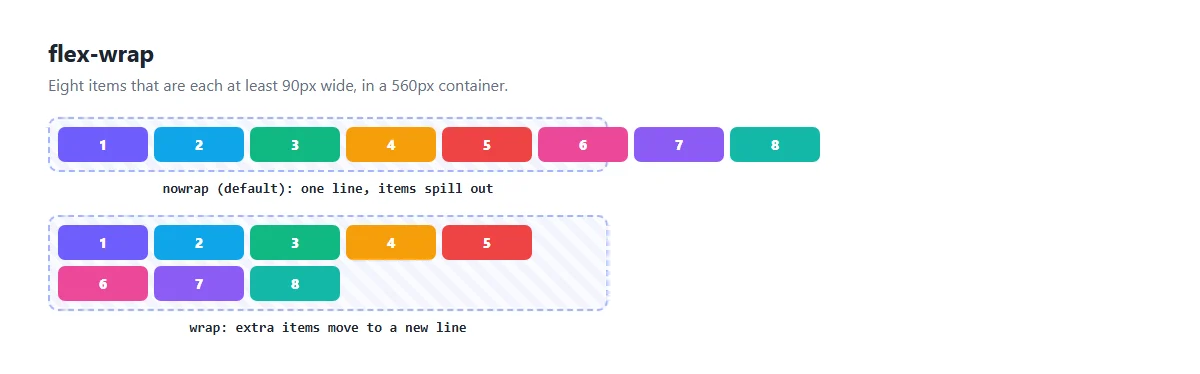
flex-wrap: allow a new line
.tags {
  display: flex;
  flex-wrap: wrap;   /* nowrap (default) | wrap | wrap-reverse */
  gap: 8px;
}
By default, Flexbox squeezes everything onto one line, shrinking items, and lets them overflow if
they can't shrink any further. flex-wrap: wrap lets them move to a new line instead.
Use it for tags, photo galleries and any list that should flow onto more lines on small
screens.
When items wrap onto several lines, align-content controls the space
between those lines. It takes the same values as justify-content, and it
does nothing on a single line.
gap: space between items
.container {
  display: flex;
  gap: 16px;          /* same gap in both directions */
  /* gap: 24px 12px;     row gap, then column gap */
}
gap adds space between items only, never at the outer edges. It's much
simpler than adding margins to items and then removing the margin from the last one.
Item properties
flex-grow: who gets the spare space?
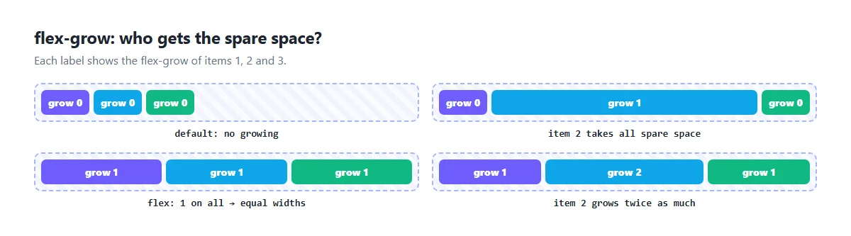
If the container is wider than the items need, there's spare space. flex-grow shares
it out:
0(default): the item doesn't grow.1on one item: that item takes all the spare space. Handy for a search box that fills a toolbar.1on every item: the space is shared equally.2on one item and1on the others: that item gets twice as big a share.
flex-shrink and flex-basis
flex-basisis the item's starting size before growing or shrinking, like a width along the main axis.automeans “use my width, or my content's size”.flex-shrinkcontrols how much an item shrinks when there isn't enough room. The default is1. Set it to0for things that must keep their size, like an icon or an avatar.
The flex shorthand
In real code you'll usually write all three at once with flex:
.item { flex: 1; }          /* grow 1, shrink 1, basis 0: equal widths */
.item { flex: auto; }       /* grow 1, shrink 1, basis auto: grow from content size */
.item { flex: none; }       /* grow 0, shrink 0: never change size */
.item { flex: 0 0 200px; }  /* exactly 200px, no growing or shrinking */
flex: 1 is by far the most common. It makes items share the row equally, no matter
how much text is inside each one.
order and align-self
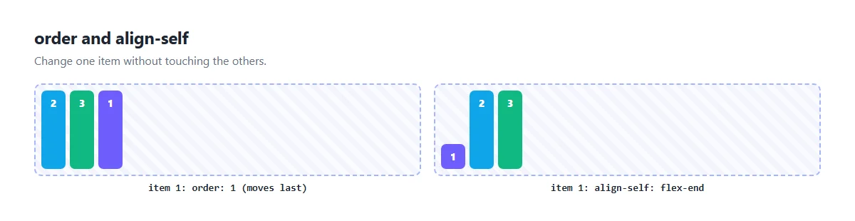
orderchanges where an item appears. All items start at0, and higher numbers go later. Use it carefully: screen readers and the Tab key still follow the HTML order.align-selfoverridesalign-itemsfor one item. It takes the same values.
Three real layouts
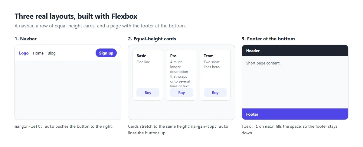
1. A navbar
.nav {
  display: flex;
  align-items: center;   /* line everything up vertically */
  gap: 16px;
}
.nav .signup {
  margin-left: auto;     /* push this item, and anything after it, to the right */
}
In a flex container, an auto margin soaks up all the free space. That's the
cleanest way to split a row into a left group and a right group.
2. Equal-height cards with aligned buttons
.cards {
  display: flex;
  gap: 16px;
}
.card {
  flex: 1;                  /* equal widths */
  display: flex;
  flex-direction: column;   /* each card is a column too */
}
.card .button {
  margin-top: auto;         /* push the button to the bottom of the card */
}
Cards are the same height thanks to the default align-items: stretch. Making each
card a column and giving the button margin-top: auto lines up all the buttons, however
long the text is.
3. Footer at the bottom of the page
body {
  margin: 0;
  min-height: 100vh;
  display: flex;
  flex-direction: column;
}
main {
  flex: 1;   /* take all the spare height, pushing the footer down */
}
On short pages, the footer no longer floats halfway up the screen.
Flexbox cheat sheet
| Property | Goes on | Does |
|---|---|---|
display: flex | container | Turns on Flexbox for the children |
flex-direction | container | Row or column |
justify-content | container | Spacing along the main axis |
align-items | container | Alignment on the cross axis |
flex-wrap | container | Allow items to wrap to a new line |
align-content | container | Spacing between wrapped lines |
gap | container | Space between items |
flex (grow shrink basis) | item | How the item grows and shrinks |
align-self | item | Cross-axis alignment for one item |
order | item | Visual order of one item |
Common mistakes
display: flexon the wrong element. It goes on the parent. It only affects direct children, not grandchildren.- Mixing up the axes in a column. With
flex-direction: column,justify-contentworks vertically andalign-itemshorizontally. - Vertical centering does nothing. The container is only as tall as its
content. Give it a height or
min-height. - Text overflowing a flex item. Flex items won't shrink below their content's
width by default. Add
min-width: 0to the item so long text can wrap or be cut off. - Using Flexbox for a two-dimensional grid. For rows and columns that line up, like a photo grid or a page layout, CSS Grid is the better tool.
Practise in the playground
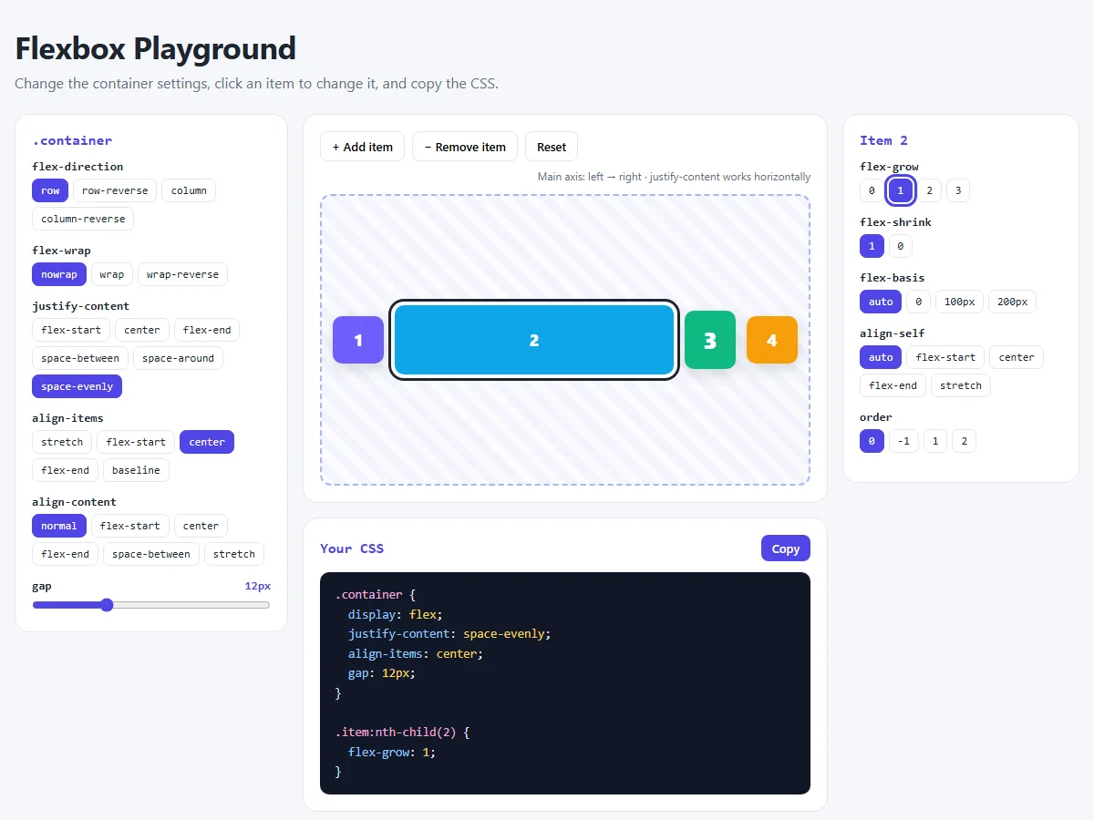
In the Flexbox playground you can
click through every container value, add and remove items, and select an item to change its
flex-grow, flex-basis, align-self or order.
The CSS panel only shows the properties you've changed, so you can copy exactly what you
need.
Try this: set flex-direction to column and watch the note above the
preview. It tells you that justify-content now works vertically.
Share your layout
Built something with Flexbox? Share a screenshot as a link with sshot.online, or share your code with the free code sharing tool. No account needed.
Frequently asked questions
What is the difference between justify-content and align-items?
justify-content positions items along the main axis, the direction they flow.
align-items positions them on the cross axis. In a row,
justify-content is horizontal and align-items is vertical; in a
column they swap.
What does flex: 1 mean?
flex: 1 is short for flex-grow: 1, flex-shrink: 1 and
flex-basis: 0. Items with flex: 1 share the available space
equally, whatever their content.
Should I use Flexbox or CSS Grid?
Use Flexbox to line things up in one direction, like a navbar, a button group or a row of cards. Use Grid when you need rows and columns that line up together, like a photo grid or a full page layout. They work well together.
Why are my flex items not wrapping?
The default is flex-wrap: nowrap, which keeps all items on one line. Add
flex-wrap: wrap to the container.
How do I add space between flex items?
Use the gap property on the container, for example gap: 16px. It
adds space between items only, not at the edges.
Does Flexbox work in all browsers?
Yes. Flexbox, including the gap property, works in all modern browsers on
desktop and mobile.
Related articles
How to Center a Div in CSS: 7 Easy Ways (with Examples)
Center a div horizontally and vertically with Flexbox, Grid, margin auto and absolute positioning. Pictures of every method, copy-paste code and a live playground.
Read More →
CSS Margin vs Padding vs Border: The Box Model Explained with Examples
A picture-by-picture lesson on margin, padding and border: shorthand order, border styles, box-sizing, margin collapse and centering, plus a live playground.
Read More →
CSS Position Explained: static, relative, absolute, fixed and sticky
The five CSS position values with pictures: what each is placed from, whether it scrolls, z-index, and why sticky or absolute sometimes does not work.
Read More →