CSS Position Explained: static, relative, absolute, fixed and sticky
Published November 5, 2026 · 11 min read
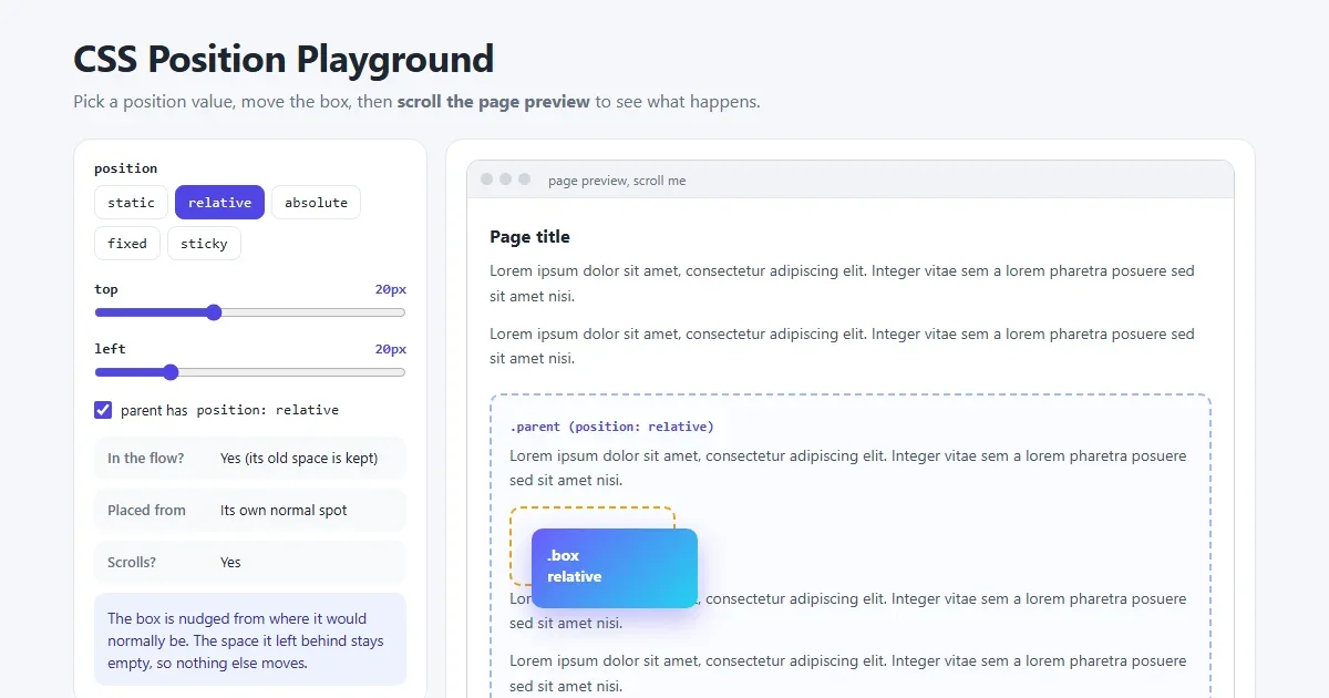
The position property decides how an element is placed on the page:
where it sits, what it's measured from, and whether it moves when you scroll. It's behind sticky
headers, notification badges, dropdown menus, popups and chat buttons.
There are five values. This guide shows each one with a picture, explains the rule behind it, and gives you real examples to copy.
Open the position playground Switch values and scroll a real page to see the difference.
The short version
| Value | Placed from | Takes up space? | Moves when you scroll? |
|---|---|---|---|
static | Normal page flow | Yes | Yes |
relative | Its own normal spot | Yes (its original space) | Yes |
absolute | Nearest positioned ancestor | No | Yes, with that ancestor |
fixed | The browser window | No | No |
sticky | Normal flow, then its scroll container | Yes | Until it reaches its offset |
First: top, right, bottom, left
Positioned elements are moved with four offset properties:
top, right, bottom and left. Each one is a
distance from an edge. top: 20px means “20px down from the
top”, and right: 0 means “touching the right edge”.
The shorthand inset sets all four at once: inset: 0 is the same as
top: 0; right: 0; bottom: 0; left: 0. What the offsets are measured
from depends on the position value, which is what the rest of this guide is about.
1. static: the default
Every element starts as position: static. It sits wherever it falls in the normal
flow of the page, one block after another. Offsets and z-index are
ignored. You'll rarely write static yourself, except to undo another
value.
2. relative: nudged from its normal spot
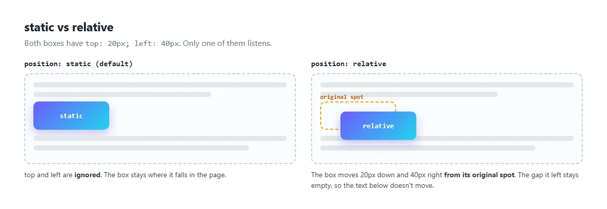
.box {
  position: relative;
  top: 20px;    /* 20px down from where it would be */
  left: 40px;   /* 40px right from where it would be */
}
A relative element is laid out normally first, then shifted by its offsets. The important part: the space it originally took stays reserved. Nothing around it moves, so it may overlap its neighbours.
In practice, position: relative is mostly used with no offsets at
all, as an anchor for absolutely positioned children. That's the next value.
3. absolute: placed inside a positioned parent
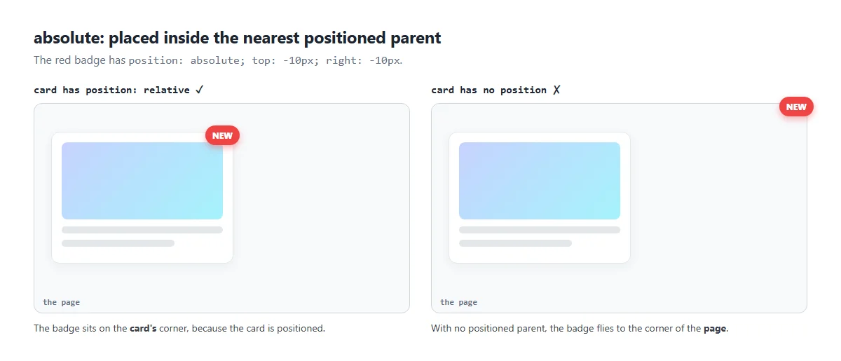
.card {
  position: relative;   /* the anchor */
}
.badge {
  position: absolute;
  top: -10px;
  right: -10px;         /* hang just over the top-right corner */
}
An absolute element is removed from the normal flow. The other elements close the
gap as if it weren't there. It's then placed using its offsets, measured from its
containing block: the nearest ancestor whose position is anything
other than static.
If no ancestor is positioned, it's placed against the page itself. That's the #1 absolute
positioning bug: the badge ends up in the corner of the screen instead of the corner of the card.
The fix is almost always position: relative on the parent.
Some other things to know:
- An absolute element shrinks to fit its content, unless you give it a width.
- Setting both
leftandright(or usinginset: 0) stretches it between them. That's handy for overlays that cover their parent. - Percentages are relative to the containing block.
top: 50%means halfway down the parent.
.photo { position: relative; }
.photo::after {
  content: "";
  position: absolute;
  inset: 0;                         /* cover the whole parent */
  background: rgba(0, 0, 0, .4);
}
4. fixed: pinned to the window
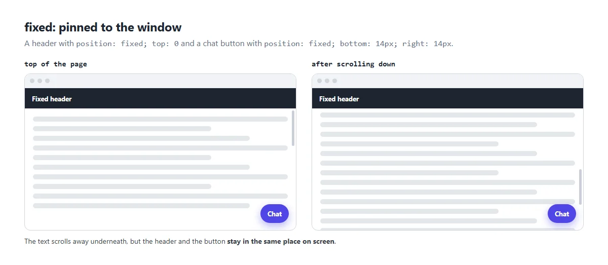
.site-header {
  position: fixed;
  top: 0;
  left: 0;
  right: 0;
  z-index: 100;
}
body {
  padding-top: 64px;   /* the header's height, so it doesn't cover the content */
}

.chat-button {
  position: fixed;
  bottom: 20px;
  right: 20px;
}
A fixed element is placed relative to the browser window (the viewport) and doesn't move when the page scrolls. Like absolute, it leaves the normal flow, so the content slides underneath it. That's why the example adds padding to the body: otherwise the top of the page hides behind the header.
Watch out: if any ancestor has a transform, filter or
perspective, the fixed element is placed relative to that ancestor instead of the
window, and it scrolls with it. If a fixed element suddenly scrolls, look for a transform higher
up.
5. sticky: normal, then stuck
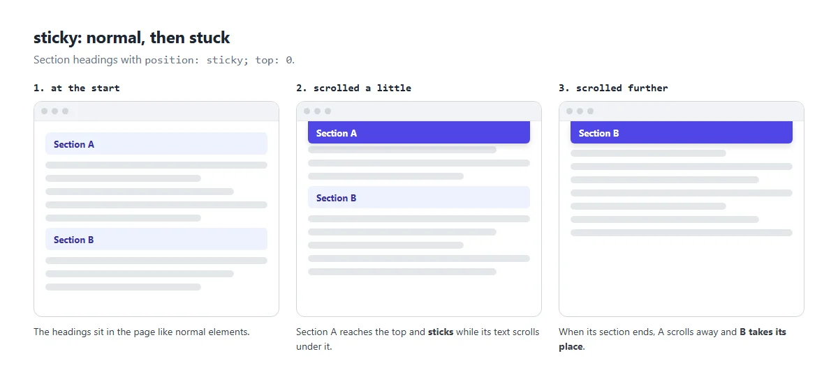
.section h2 {
  position: sticky;
  top: 0;              /* stick when it reaches the top */
  background: #fff;    /* so the text scrolling under it is hidden */
}
Sticky is a mix of relative and fixed. The element behaves normally until scrolling brings it to its
offset (here top: 0), then it sticks there. It stays stuck only while its
parent is still on screen. When the parent scrolls away, the sticky element goes with
it.
That's what makes the “one heading replaces another” effect in the picture: each heading is inside its own section.
Sticky not working? Check these three things:
- You set an offset.
position: stickydoes nothing withouttop(orbottom,left,right). - The parent is taller than the element. If the parent is the same height, there's no room to stick.
- No ancestor has
overflow: hidden,autoorscroll. That ancestor becomes the scroll container, and the element sticks inside it instead of the page.
z-index: which element is on top?
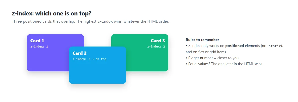
When positioned elements overlap, z-index decides the order front to back. Higher
numbers come forward. With equal values, or no z-index, the element that comes later in the HTML
is on top.
.menu {
  position: relative;
}
.menu .dropdown {
  position: absolute;
  top: 100%;    /* just below the menu button */
  left: 0;
  z-index: 10;  /* above the content that follows */
}
Two rules cause most z-index confusion:
z-indexdoes nothing onposition: staticelements. It does work on flex and grid items.- Each element with a z-index (and some other properties, like
opacitybelow 1 or atransform) creates a stacking context. Children can't escape it: a child withz-index: 9999can still be behind something if its parent is.
Tip: use small, planned numbers, for example 10 for dropdowns, 100 for the header and 1000 for modals, instead of an arms race of 99999s.
Which position should I use?
| I want to… | Use |
|---|---|
| Put a badge or icon on the corner of a card | absolute inside a relative parent |
| Cover an image with a dark overlay or caption | absolute + inset: 0 |
| Open a dropdown under a button | absolute, top: 100% |
| Keep a header visible while scrolling | sticky (or fixed) |
| Show a chat or “back to top” button | fixed |
| Make a popup cover the whole screen | fixed + inset: 0 |
| Nudge an icon down by 2px | relative + top: 2px |
| Lay out a page or a row of items | none: use Flexbox or Grid |
Position is for special placement. For general page layout, use Flexbox or Grid. Layouts built with absolute positioning break as soon as the content or screen size changes.
Common mistakes
- Absolute element in the wrong place: add
position: relativeto the parent you want it inside. - Fixed header covering the content: add
padding-topto the body equal to the header's height, or usestickyinstead. - Sticky doesn't stick: missing
top, a parent that's too short, or an ancestor withoverflowset. - z-index ignored: the element is
static, or it's trapped in a parent's stacking context. - Building whole layouts with absolute: it looks fine on your screen and breaks on others. Use Flexbox or Grid.
Try it in the playground
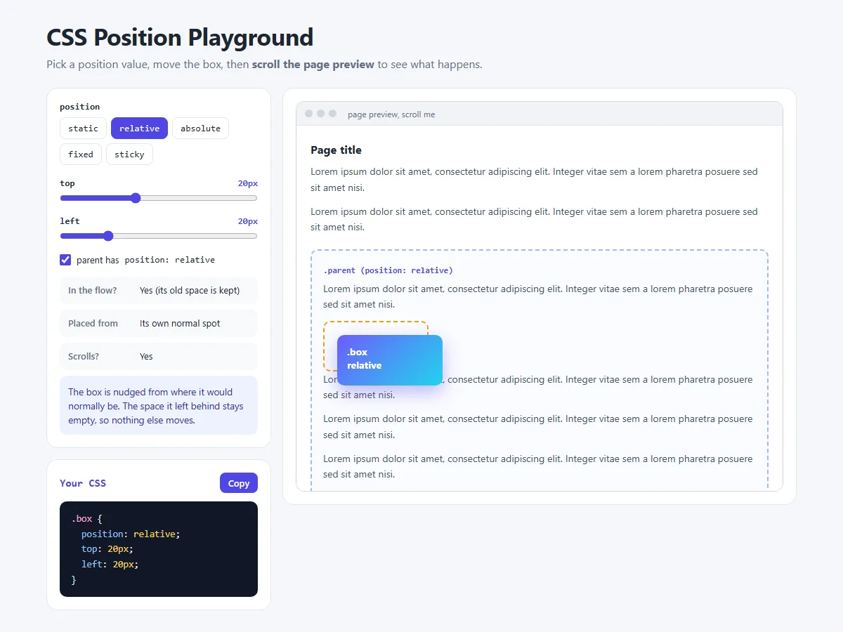
The position playground shows a real, scrollable page with a box inside a parent. Try these experiments:
- Choose relative and move the sliders. The dashed outline shows the space it still keeps.
- Choose absolute, then untick “parent has position: relative”. The box jumps to the corner of the page.
- Choose fixed and scroll the preview. The box stays put.
- Choose sticky and scroll slowly. The box sticks, then leaves with its parent.
Share your work
Built a sticky header or a badge? Share a screenshot as a link with sshot.online, or share your code with the free code sharing tool. No account needed.
Frequently asked questions
What is the difference between position relative and absolute?
A relative element stays in the page flow and is shifted from its normal spot, keeping its original space. An absolute element is taken out of the flow and placed inside its nearest positioned ancestor, so other elements close the gap.
Why is my absolute element positioned relative to the page?
None of its ancestors has a position other than static, so it uses the page
instead. Add position: relative to the parent you want it placed
inside.
What is the difference between fixed and sticky?
A fixed element is always pinned to the browser window and leaves the page flow. A sticky element stays in the flow, scrolls normally, and only sticks once it reaches its offset, and only while its parent is visible.
Why is position sticky not working?
Usually the element has no top value, its parent is not taller than it, or an
ancestor has overflow set to hidden, auto or scroll.
Why does z-index not work?
z-index has no effect on position: static elements, except flex and
grid items. It can also be limited by a parent that creates a stacking context, for example
with its own z-index, opacity or transform.
What does inset: 0 mean?
inset is shorthand for top, right,
bottom and left. inset: 0 sets all four to 0, which
stretches an absolute or fixed element to cover its containing block.
Related articles
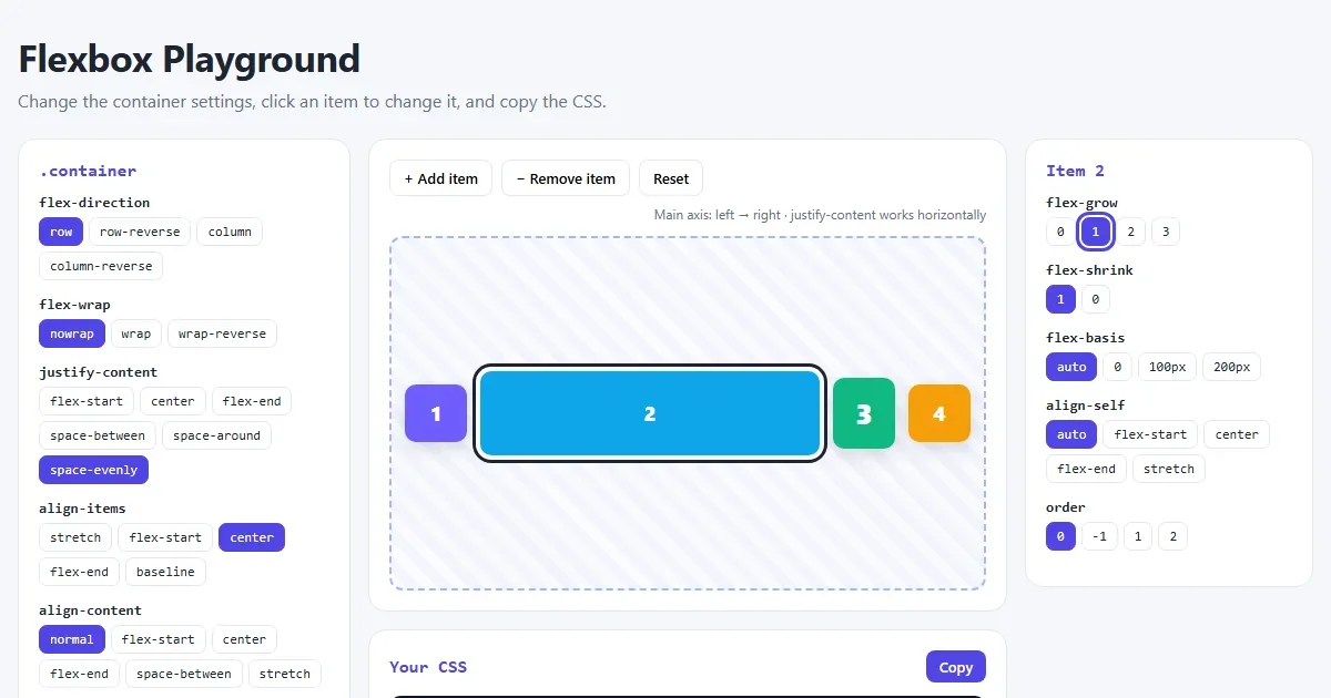
CSS Flexbox Explained: A Visual Guide with Examples
Every Flexbox property in pictures: direction, justify-content, align-items, wrap, gap, flex-grow, plus a navbar, equal-height cards and a sticky footer.
Read More →
How to Center a Div in CSS: 7 Easy Ways (with Examples)
Center a div horizontally and vertically with Flexbox, Grid, margin auto and absolute positioning. Pictures of every method, copy-paste code and a live playground.
Read More →
CSS Margin vs Padding vs Border: The Box Model Explained with Examples
A picture-by-picture lesson on margin, padding and border: shorthand order, border styles, box-sizing, margin collapse and centering, plus a live playground.
Read More →