CSS Margin vs Padding vs Border: The Box Model Explained with Examples
Published November 5, 2026 · 12 min read
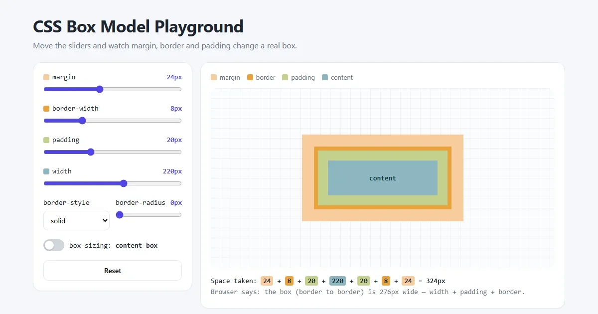
Margin, padding and border are the first CSS properties almost everyone learns, and the ones people mix up the most. Should the gap be padding or margin? Why is my box wider than the width I set? Why did two margins turn into one?
This lesson answers all of that with pictures. Every image below was drawn with the same CSS it shows, and you can try everything yourself in the live playground.
Open the box model playground Move the sliders and watch a real box change.
What you'll learn
- the four layers of every box: content, padding, border and margin
- the difference between padding and margin, and when to use each
- the 1, 2, 3 and 4-value shorthand, and how to remember the order
- border styles, rounded corners, and border vs outline
box-sizing, the reason boxes come out wider than expected- margin collapsing and centering with
margin: 0 auto
1. The box model: every element is a box
To the browser, every element on a page is a rectangle: a paragraph, a button, an image, even a single link. Each rectangle is made of four layers, from the inside out:
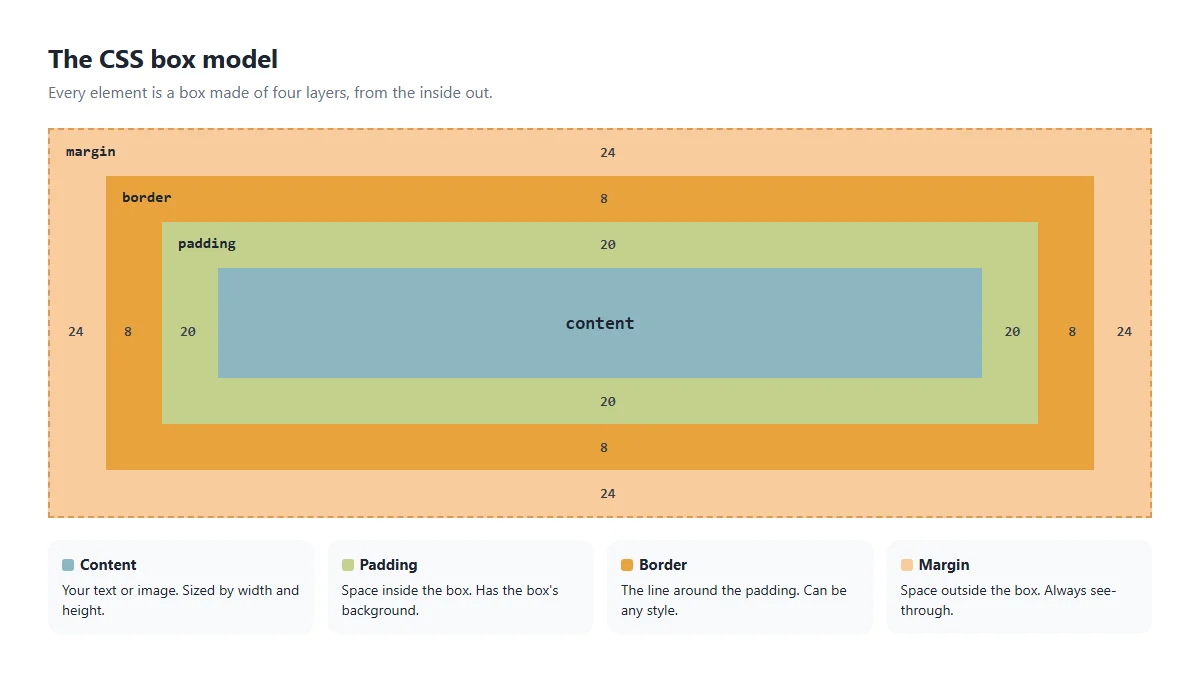
- Content: the text, image or other elements inside. Its size comes from
widthandheight, or from what's inside it. - Padding: empty space inside the box, between the content and the border.
- Border: a line around the padding.
- Margin: empty space outside the box, between it and its neighbours.
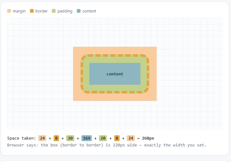
Here's CSS that builds a box like the one in the picture:
.box {
  width: 300px;
  padding: 20px;                /* inside space */
  border: 8px solid #e8a33d;    /* the line */
  margin: 24px;                 /* outside space */
}
Tip: you can see these layers on any website. Right-click an element, choose Inspect, and look at the box diagram in the Styles or Computed panel. Hovering an element paints its padding green and its margin orange on the page.
2. Padding: space inside the box
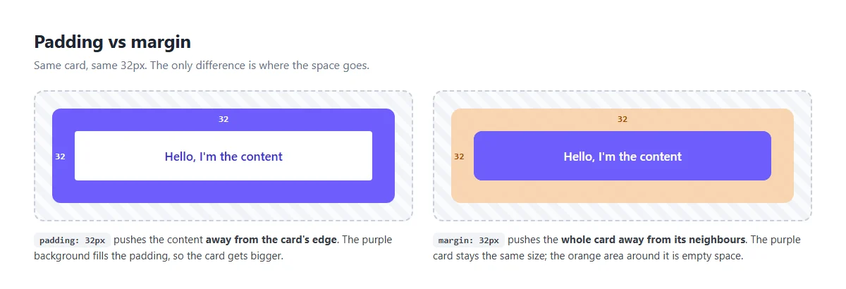
Padding pushes the content away from the box's edges. Most importantly, the box's background fills the padding. Add padding to a coloured button and the coloured area gets bigger.
.button {
  background: #6d5dfc;
  color: #fff;
  padding: 12px 24px;   /* 12px top and bottom, 24px left and right */
}
Padding is why buttons are comfortable to click: the clickable area is the content plus the padding.
One side at a time
Each side has its own property:
.box {
  padding-top: 10px;
  padding-right: 20px;
  padding-bottom: 10px;
  padding-left: 20px;
}
The shorthand: 1, 2, 3 or 4 values
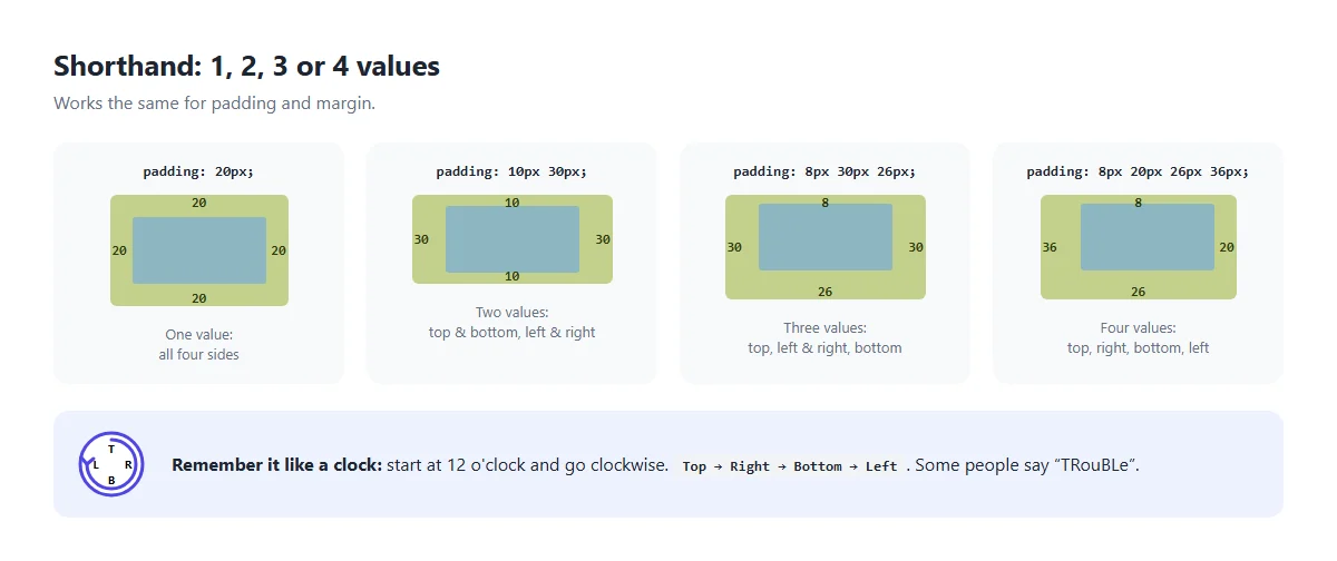
Writing four lines gets tiring, so padding accepts up to four values in one line. The
same rules work for margin.
| You write | Top | Right | Bottom | Left |
|---|---|---|---|---|
padding: 20px | 20 | 20 | 20 | 20 |
padding: 10px 30px | 10 | 30 | 10 | 30 |
padding: 8px 30px 26px | 8 | 30 | 26 | 30 |
padding: 8px 20px 26px 36px | 8 | 20 | 26 | 36 |
With four values, the order is always top, right, bottom, left: clockwise from 12 o'clock. Many developers remember it as TRouBLe. When a value is missing, the browser copies it from the opposite side.
Good to know: padding can't be negative. Percentages like
padding: 5% are worked out from the parent's width, even for top and
bottom padding.
3. Margin: space outside the box
Margin pushes the whole box away from the things around it. Unlike padding, margin is always transparent. The box's background never fills it; you see the parent's background through it.
.card {
  margin-bottom: 24px;   /* a gap under every card */
}
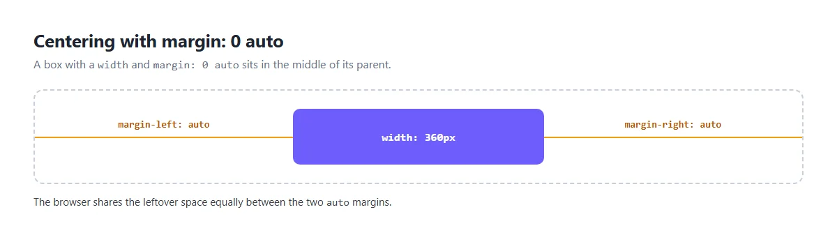
Centering a box with margin: 0 auto
A block element with a width (or max-width) can be centred
horizontally by setting its left and right margins to auto. The browser splits the
leftover space equally between them.
.container {
  max-width: 960px;
  margin: 0 auto;      /* 0 top and bottom, auto left and right */
  padding: 0 16px;     /* keeps text off the screen edge on phones */
}
This only works on block elements with a width smaller than their parent. It doesn't centre things vertically; for that, use Flexbox or Grid.
Negative margins
Margins, unlike padding, can be negative. margin-top: -20px pulls the element 20px
up, overlapping whatever is above it. It's handy for small overlaps, like an avatar that sits half
over a banner, but use it sparingly; it makes layouts harder to follow.
Margin collapsing
This surprises everyone at least once. When two block elements are stacked, their vertical margins don't add up. They overlap, and only the larger one is used.
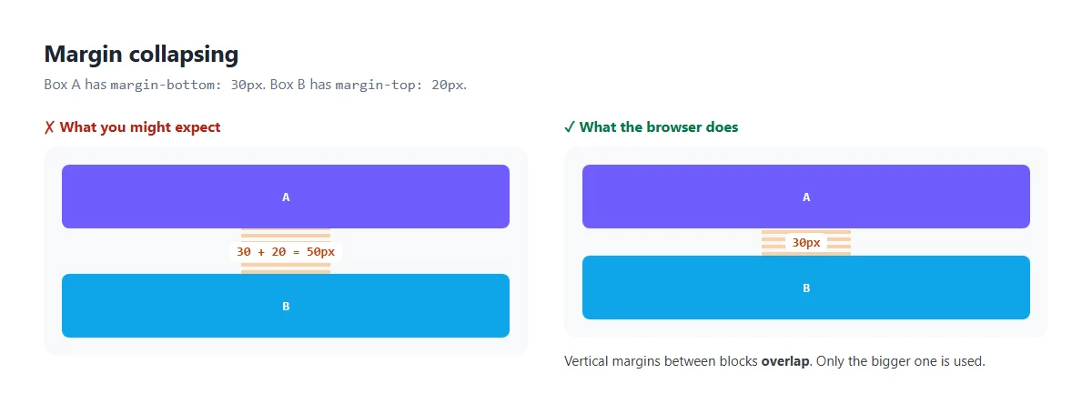
.a { margin-bottom: 30px; }
.b { margin-top: 20px; }
/* the gap between .a and .b is 30px, not 50px */
A few things to remember:
- It only happens to vertical margins (top and bottom). Left and right margins never collapse.
- It doesn't happen inside Flexbox or Grid containers.
- A child's top margin can also collapse through its parent and push the parent down
instead. Giving the parent padding, a border, or
display: flow-rootstops this.
The simplest way to avoid surprises: put spacing on one side only (for example, always
margin-bottom), or use gap in Flexbox and Grid layouts.
4. Border: the line around the box
The border sits between the padding and the margin. The border shorthand takes three
things: width, style and colour.
.box {
  border: 2px solid #6d5dfc;
  /*      width style colour */
}
The style is required. Without it there's no border at all, because the default style is
none. There are eight visible styles:
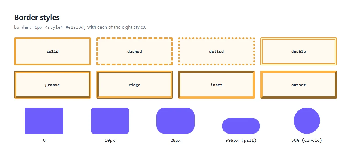
In real projects you'll mostly use solid, sometimes dashed (for drop
zones and placeholders) and dotted.
One side only
Like padding and margin, each side can be set on its own. A thick left border is a classic way to style a quote or a tip:
.tip {
  border-left: 4px solid #6d5dfc;
  padding: 12px 16px;
  background: #eef2ff;
}
Rounded corners with border-radius
border-radius rounds the corners. It works even if the box has no border at all; it
also rounds the background.
.card   { border-radius: 12px; }   /* gently rounded */
.pill   { border-radius: 999px; }  /* round ends, any width */
.avatar {
  width: 96px;
  height: 96px;
  border-radius: 50%;              /* a circle (when width = height) */
}
Border vs outline
outline looks like a border, but there's one big difference: a border
takes up space, while an outline is drawn on top without moving anything.
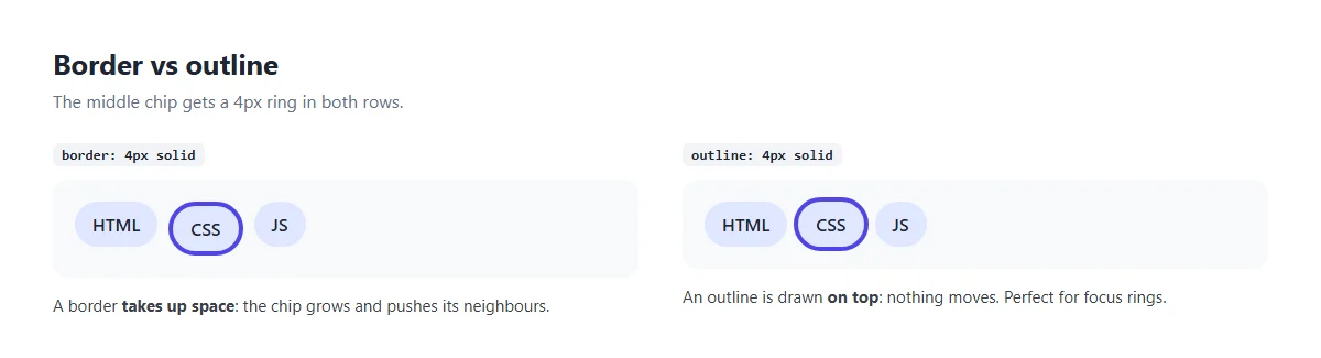
That's why outlines are used for keyboard focus rings: they appear and disappear without making the page jump.
button:focus-visible {
  outline: 3px solid #6d5dfc;
  outline-offset: 3px;   /* a small gap between the button and the ring */
}
5. box-sizing: why is my box too wide?
Here's the most common box model surprise. You set width: 300px, add some padding
and a border, and the box comes out 360px wide.
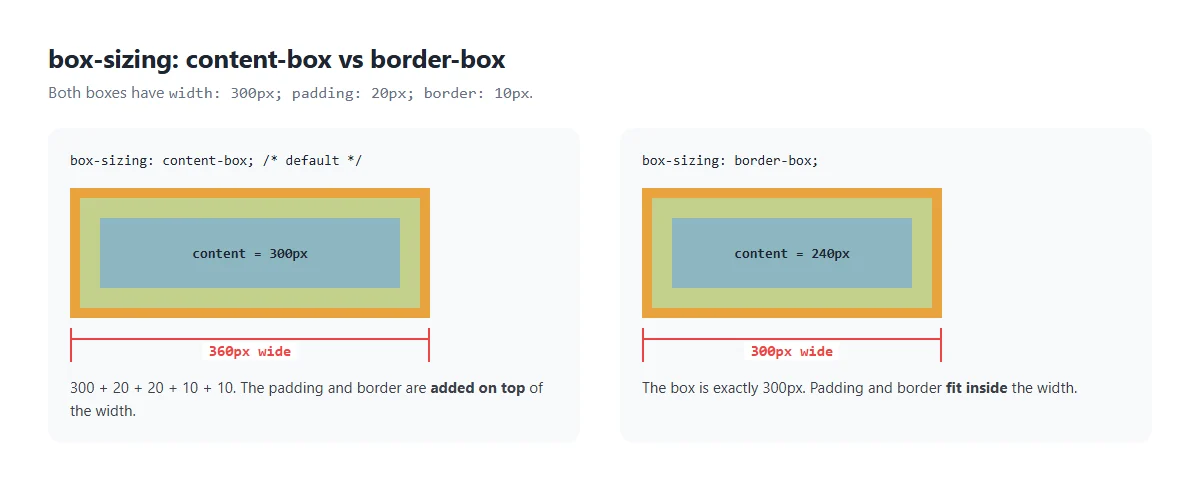
By default, width only sets the content area. Padding and border are added
on top:
300 + 20 + 20 + 10 + 10 = 360px
With box-sizing: border-box, the width includes padding and border. The box is
exactly 300px, and the content shrinks to fit (240px). This is much easier to work with, so
almost every modern website starts with this rule:
*,
*::before,
*::after {
  box-sizing: border-box;
}
Margin is never part of the width in either mode. It's always outside.
6. Margin or padding? A quick guide
| Padding | Margin | |
|---|---|---|
| Where the space goes | Inside the box | Outside the box |
| Background colour | Fills it | Never fills it |
| Clickable | Yes, part of the element | No |
| Can be negative | No | Yes |
Can be auto | No | Yes (for centering) |
| Collapses | Never | Vertical margins can |
A simple rule of thumb:
- Use padding when you want space inside something: around the text in a button, card or input.
- Use margin when you want space between things: between paragraphs, cards or sections.
- In Flexbox and Grid layouts, prefer
gapfor space between items. It never collapses and doesn't add space at the edges.
7. Practice: build a profile card
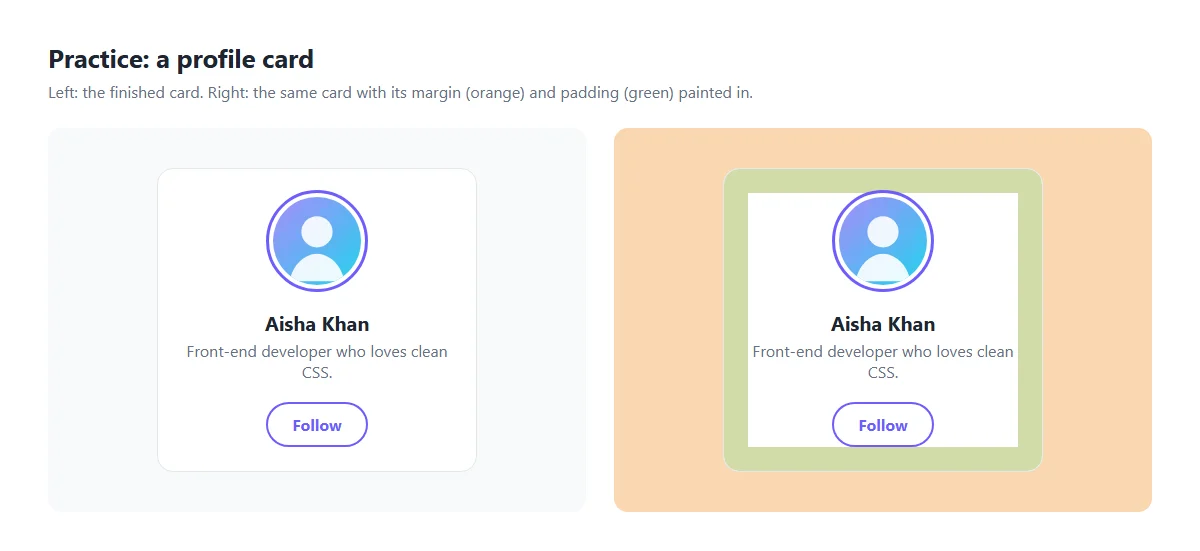
Let's use everything in one small component.
<article class="profile">
  <img src="avatar.jpg" alt="Aisha Khan">
  <h3>Aisha Khan</h3>
  <p>Front-end developer who loves clean CSS.</p>
  <a class="btn" href="#">Follow</a>
</article>.profile {
max-width: 320px;
margin: 40px auto; /* space outside, and centred */
padding: 24px; /* space inside */
border: 1px solid #e4e7ec; /* a thin line around */
border-radius: 16px;
text-align: center;
box-sizing: border-box;
}
.profile img {
width: 96px;
height: 96px;
border-radius: 50%; /* a circle */
border: 4px solid #fff; /* a white ring... */
outline: 3px solid #6d5dfc; /* ...inside a purple ring */
}
.profile h3 { margin: 16px 0 4px; }
.profile p { margin: 0 0 20px; color: #667085; }
.btn {
display: inline-block; /* lets padding push the button bigger */
padding: 10px 24px; /* a comfortable click area */
border: 2px solid #6d5dfc;
border-radius: 999px; /* pill shape */
color: #6d5dfc;
font-weight: 700;
text-decoration: none;
}Notice how each property does one job:
- The card's margin centres it and keeps it away from other content.
- Its padding keeps the text off the edges.
- Its border draws a subtle frame.
- The avatar uses a border and an outline together for a double ring.
The button needs display: inline-block. Links are inline by default, and
vertical padding on inline elements doesn't push the lines around them away.
8. Common mistakes
- Forgetting the border style.
border: 2px #000shows nothing. Addsolid. - Using margin for space inside a button. The button doesn't get bigger, and the empty space isn't clickable. Use padding.
- Boxes that are too wide. Add the
box-sizing: border-boxreset at the top of your CSS. - Margins on inline elements. Top and bottom margins don't work on
<span>or<a>. Make theminline-blockorblockfirst. - Mystery gaps. If a gap is smaller than expected, it's probably margin
collapsing. If it's bigger, check the default margins on
<h1>,<p>and<body>. Inspecting the element in DevTools shows exactly where the space comes from.
Try it in the playground
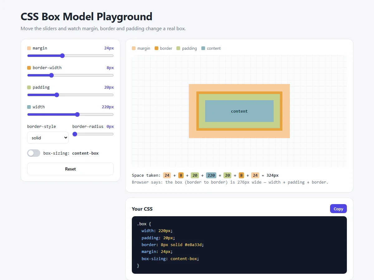
The box model playground lets you try everything from this lesson:
- Drag the padding slider and watch the green area grow inside the border.
- Drag the margin slider and watch the orange space grow outside it.
- Turn on border-box and see the total width stay the same while the content shrinks.
- Try each border-style and some border-radius.
- Copy the generated CSS into your own project.
The sum under the box adds up every layer, and the line below it shows what the browser actually measured, so you can check your maths.
Share your work
Built your first card? Share a screenshot as a link with sshot.online, or share your code with the free code sharing tool. No account needed.
Summary
- Padding is space inside the box. The background fills it.
- Border is the line around the padding: width, style and colour.
- Margin is transparent space outside the box. It can be
autoor negative, and vertical margins can collapse. - Shorthand order is top, right, bottom, left.
- Use
box-sizing: border-boxsowidthmeans the whole box.
Frequently asked questions
What is the difference between margin and padding in CSS?
Padding is space inside an element, between its content and its border, and it is filled by the element's background. Margin is transparent space outside the border that separates the element from its neighbours.
What order do the four values in padding and margin go in?
Top, right, bottom, left: clockwise starting at 12 o'clock. With two values the first is top and bottom and the second is left and right. With three values they are top, left and right, then bottom.
Why is my element wider than the width I set?
By default, width only sets the content area, and padding and border are added on
top. Set box-sizing: border-box so the width includes padding and
border.
Why does the gap between two elements not equal both margins added together?
Vertical margins between block elements collapse: they overlap and only the larger margin is used. This does not happen with left and right margins or inside Flexbox and Grid containers.
Does border-radius need a border?
No. border-radius rounds the element's corners, including its background and any
image inside, even when it has no border.
What is the difference between border and outline?
A border is part of the box and takes up space, so adding one can move nearby elements. An outline is drawn on top of the box without taking space, which makes it ideal for focus rings.
Related articles
How to Center a Div in CSS: 7 Easy Ways (with Examples)
Center a div horizontally and vertically with Flexbox, Grid, margin auto and absolute positioning. Pictures of every method, copy-paste code and a live playground.
Read More →
How to Build a Lamp Login Page with a Pull Cord in HTML, CSS and JavaScript
A dark room, a cute lamp and a cord you can actually pull. The light flickers on, the login form appears, and the lamp frowns or grins at what you type.
Read More →
How to Build an Add to Cart Animation and Shopping Cart with HTML, CSS and JavaScript
Products that fly into the cart in an arc, a slide-out cart drawer, a free shipping progress bar, counting totals and a delivery truck checkout button.
Read More →