How to Build an Add to Cart Animation and Shopping Cart with HTML, CSS and JavaScript
Published November 4, 2026 · 15 min read
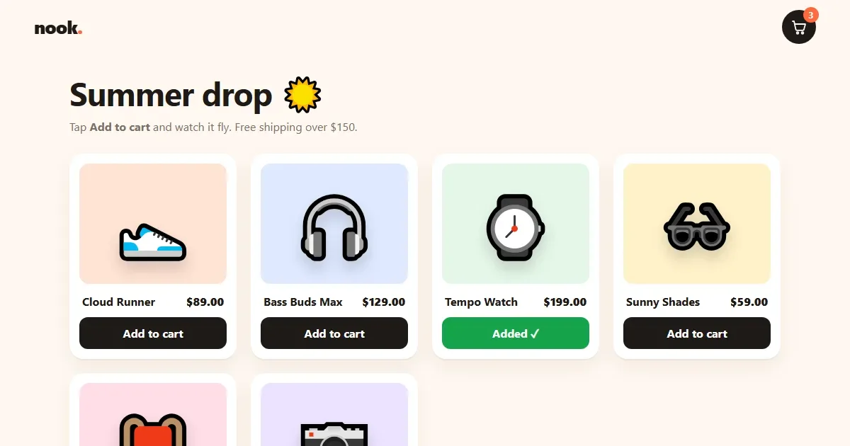
Clicking “Add to cart” and seeing only a number change from 2 to 3 feels flat. In this tutorial, the product itself leaps off its card, flies in a curve to the cart icon, shrinks and spins on the way, and the cart wiggles when it lands. People see exactly where their item went.
Then we build the rest of a small shop around it:
- a cart drawer that slides in from the side
- quantity buttons, and rows that slide away when removed
- a subtotal that counts up to the new amount
- a free shipping bar that fills up and turns green
- a checkout button with a delivery truck driving across it
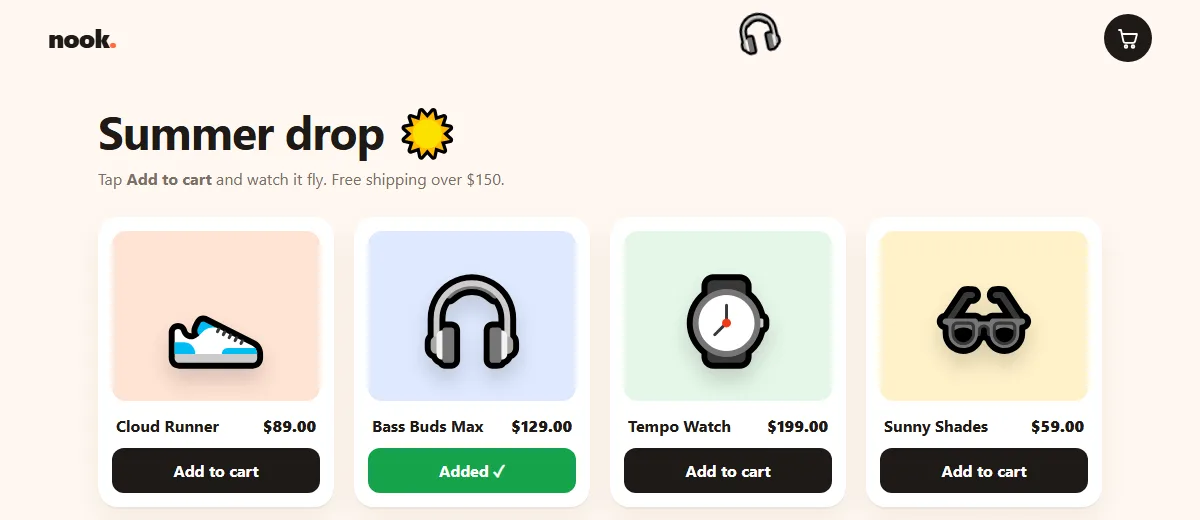
Try the live demo Add a few products, then open the cart.
It's built with plain HTML, CSS and JavaScript, with no libraries and no image files. The products are emoji on coloured tiles, so you can swap in real photos later.
Project setup
shopping-cart/
├── index.html   ← header, empty product grid, cart drawer
├── style.css    ← cards, flight layers, drawer, truck
└── script.js    ← products, flight, cart state, drawer
The code blocks below follow each file from top to bottom. Copy them in order and you'll have the complete files.
Step 1: The HTML
1.1 Head and header
<!DOCTYPE html>
<html lang="en">
<head>
  <meta charset="UTF-8">
  <meta name="viewport" content="width=device-width, initial-scale=1">
  <title>Animated Shopping Cart – Add to Cart Animation</title>
  <link rel="stylesheet" href="style.css">
</head>
<body> <!-- ---------- HEADER ---------- -->
<header class="top">
<a href="#" class="brand">nook<span>.</span></a>
<button type="button" class="cart-btn" aria-expanded="false" aria-controls="drawer" aria-label="Open cart, 0 items">
<svg viewBox="0 0 24 24" aria-hidden="true"><path d="M3 4h2l2.4 11.2a2 2 0 0 0 2 1.6h7.7a2 2 0 0 0 2-1.5L21 8H6.2"/><circle cx="10" cy="20.5" r="1.3"/><circle cx="17" cy="20.5" r="1.3"/></svg>
<span class="badge" aria-hidden="true">0</span>
</button>
</header>
<!-- ---------- END HEADER ---------- -->
<main class="shop">
<h1>Summer drop <span aria-hidden="true">☀️</span></h1>
<p class="sub">Tap <b>Add to cart</b> and watch it fly. Free shipping over $150.</p>
<!-- script.js fills this grid from the PRODUCTS list -->
<ul class="grid"></ul>
</main>The cart button has aria-expanded, which tells screen readers whether the drawer is
open, and an aria-label that we'll keep updated with the item count, like “Open
cart, 3 items”. The badge itself is hidden from screen readers, because the label already
says the number.
The product list is an empty <ul>. JavaScript fills it from a list of products,
the same way a real shop would render products from its database.
1.2 The cart drawer
  <!-- ---------- CART DRAWER ---------- -->
  <div class="backdrop" hidden></div>
  <aside class="drawer" id="drawer" role="dialog" aria-modal="true" aria-labelledby="cart-title" inert>
    <div class="drawer-head">
      <h2 id="cart-title">Your cart</h2>
      <button type="button" class="close" aria-label="Close cart">✕</button>
    </div>

    <div class="ship">
      <p class="ship-text"></p>
      <div class="ship-bar"><span></span></div>
    </div>

    <ul class="items"></ul>

    <div class="empty">
      <span class="empty-bag" aria-hidden="true">🛍️</span>
      <p>Your cart is empty.</p>
      <button type="button" class="keep">Keep shopping</button>
    </div>

    <div class="drawer-foot">
      <div class="total"><span>Subtotal</span><b class="subtotal">$0.00</b></div>
      <button type="button" class="checkout">
        <span class="label">Checkout</span>
        <span class="truck" aria-hidden="true">🚚</span>
      </button>
    </div>
  </aside>
  <!-- ---------- END CART DRAWER ---------- -->

  <p class="sr-only" role="status" aria-live="polite"></p>

  <script src="script.js"></script>
</body>
</html>
The drawer is a dialog: role="dialog", aria-modal="true" and a label
taken from its heading. It starts inert, so nobody can tab into it while it's off
screen. Inside are the shipping bar, the item list, an empty state, and the footer with the total
and checkout button.
The last paragraph is visually hidden with .sr-only but read aloud by screen readers.
We'll write messages like “Trail Pack added to cart.” into it.
Step 2: The CSS
2.1 Base and header
/* ---------- BASE ---------- */
* { box-sizing: border-box; margin: 0; padding: 0; }

:root {
  --bg: #fff8f1;
  --ink: #1f1a17;
  --muted: #7a6f66;
  --card: #ffffff;
  --accent: #ff6a3d;
  --accent-dark: #e24e22;
  --ok: #16a34a;
  --radius: 20px;
}

body {
  min-height: 100vh;
  background: var(--bg);
  color: var(--ink);
  font-family: system-ui, -apple-system, "Segoe UI", Roboto, sans-serif;
  overflow-x: hidden;
}
body.locked { overflow: hidden; }   /* stop the page scrolling behind the open cart */

button { font: inherit; color: inherit; cursor: pointer; }
button:focus-visible, a:focus-visible { outline: 3px solid var(--accent); outline-offset: 3px; }

.sr-only { position: absolute; width: 1px; height: 1px; overflow: hidden; clip: rect(0 0 0 0); white-space: nowrap; }
/* ---------- END BASE ---------- *//* ---------- HEADER ---------- */
.top {
position: sticky;
top: 0;
z-index: 5;
display: flex;
justify-content: space-between;
align-items: center;
padding: 14px clamp(16px, 4vw, 48px);
background: rgba(255, 248, 241, .85);
backdrop-filter: blur(10px);
}
.brand { font-size: 26px; font-weight: 800; color: var(--ink); text-decoration: none; letter-spacing: -1px; }
.brand span { color: var(--accent); }
.cart-btn {
position: relative;
width: 48px;
height: 48px;
border: 0;
border-radius: 50%;
background: var(--ink);
display: grid;
place-items: center;
}
.cart-btn svg { width: 24px; height: 24px; fill: none; stroke: #fff; stroke-width: 1.8; stroke-linecap: round; stroke-linejoin: round; }
.cart-btn.wiggle { animation: wiggle .5s ease; }
.badge {
position: absolute;
top: -4px;
right: -4px;
min-width: 22px;
height: 22px;
padding: 0 6px;
border-radius: 11px;
background: var(--accent);
color: #fff;
font-size: 12px;
font-weight: 700;
line-height: 22px;
text-align: center;
transform: scale(0);
transition: transform .3s cubic-bezier(.3, 1.6, .5, 1);
}
.badge.has { transform: scale(1); }
.badge.bump { animation: bump .4s ease; }
/* ---------- END HEADER ---------- */The header is position: sticky, so the cart icon stays visible while you scroll.
That matters here: the product always needs somewhere to fly to.
The badge starts at scale(0) and grows to full size once there's something in the
cart. Its curve, cubic-bezier(.3, 1.6, .5, 1), has a value above 1, which makes it
overshoot and settle, a little bounce. .wiggle rocks the cart left and right, and
.bump briefly enlarges the number.
2.2 Product cards
/* ---------- PRODUCT GRID ---------- */
.shop { max-width: 1100px; margin: 0 auto; padding: 24px clamp(16px, 4vw, 48px) 60px; }
.shop h1 { font-size: clamp(30px, 5vw, 46px); letter-spacing: -1px; }
.sub { color: var(--muted); margin: 6px 0 28px; }

.grid {
  list-style: none;
  display: grid;
  grid-template-columns: repeat(auto-fill, minmax(220px, 1fr));
  gap: 20px;
}

.product {
  background: var(--card);
  border-radius: var(--radius);
  padding: 14px;
  box-shadow: 0 2px 0 rgba(0, 0, 0, .04), 0 12px 30px rgba(80, 40, 10, .07);
  transition: transform .3s cubic-bezier(.2, .9, .3, 1.3), box-shadow .3s;
  animation: enter .6s cubic-bezier(.2, .9, .3, 1.2) both;
  animation-delay: calc(var(--i) * 80ms);   /* cards arrive one after another */
}
.product:hover { transform: translateY(-6px); box-shadow: 0 20px 40px rgba(80, 40, 10, .14); }

.thumb {
  height: 170px;
  border-radius: 14px;
  display: grid;
  place-items: center;
  background: var(--tint);
  overflow: hidden;
}
.emoji {
  font-size: 84px;
  line-height: 1;
  transition: transform .4s cubic-bezier(.2, .9, .3, 1.4);
  filter: drop-shadow(0 12px 10px rgba(0, 0, 0, .15));
}
.product:hover .emoji { transform: scale(1.12) rotate(-8deg); }

.info { display: flex; justify-content: space-between; align-items: baseline; margin: 14px 4px 12px; gap: 8px; }
.info h3 { font-size: 16px; }
.price { font-weight: 800; }

.add {
  position: relative;
  width: 100%;
  padding: 12px;
  border: 0;
  border-radius: 12px;
  background: var(--ink);
  color: #fff;
  font-weight: 700;
  overflow: hidden;
  transition: background .3s, transform .15s;
}
.add:hover { background: var(--accent); }
.add:active { transform: scale(.97); }
.add.added { background: var(--ok); }
/* ---------- END PRODUCT GRID ---------- */
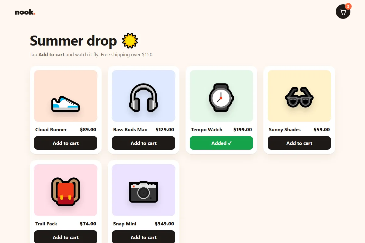
repeat(auto-fill, minmax(220px, 1fr)) makes as many columns as fit, each at least
220px wide: four on a laptop, two on a phone, with no media queries.
Each card gets its number in --i and its tile colour in --tint.
animation-delay: calc(var(--i) * 80ms) makes the cards arrive one after another when
the page loads. Hovering lifts the card and tilts the product a little.
2.3 Two layers for a curved flight
/* ---------- FLYING ITEM ---------- */
/* Two layers: .fly moves left-right at a steady speed,
   .fly-inner moves up-down with easing. Together they draw an arc. */
.fly, .fly-inner { position: fixed; top: 0; left: 0; pointer-events: none; z-index: 50; }
.fly-inner { position: static; display: block; width: 60px; height: 60px; font-size: 52px; line-height: 60px; text-align: center; }
/* ---------- END FLYING ITEM ---------- */
This is the key idea of the whole tutorial. A straight line from the product to the cart looks robotic. Things thrown through the air move in an arc: steady sideways, while going up and then down.
So the flying item is two nested elements:
- The outer
.flyonly moves sideways, at a steady speed. - The inner
.fly-inneronly moves up and down, with easing: it slows near the top, then speeds up as it falls.
Each layer runs its own simple animation. Combined, they trace a smooth curve, which is very hard to do with one element and one animation.
2.4 The cart drawer
/* ---------- CART DRAWER ---------- */
.backdrop {
  position: fixed;
  inset: 0;
  z-index: 20;
  background: rgba(31, 26, 23, .45);
  backdrop-filter: blur(3px);
  opacity: 0;
  transition: opacity .3s;
}
.backdrop.show { opacity: 1; }

.drawer {
  position: fixed;
  top: 0;
  right: 0;
  bottom: 0;
  z-index: 30;
  width: min(400px, 100%);
  display: flex;
  flex-direction: column;
  background: var(--bg);
  box-shadow: -20px 0 60px rgba(0, 0, 0, .2);
  transform: translateX(calc(100% + 80px));   /* + 80px hides the shadow too */
  transition: transform .45s cubic-bezier(.2, .9, .3, 1);
}
.drawer.open { transform: none; }

.drawer-head { display: flex; justify-content: space-between; align-items: center; padding: 20px 22px 10px; }
.drawer-head h2 { font-size: 22px; }
.close { width: 38px; height: 38px; border: 0; border-radius: 50%; background: rgba(0, 0, 0, .06); font-size: 15px; transition: transform .3s; }
.close:hover { transform: rotate(90deg); }

.ship { padding: 6px 22px 14px; border-bottom: 1px solid rgba(0, 0, 0, .07); }
.ship-text { font-size: 13px; color: var(--muted); margin-bottom: 8px; }
.ship-text b { color: var(--ink); }
.ship-bar { height: 8px; border-radius: 4px; background: rgba(0, 0, 0, .08); overflow: hidden; }
.ship-bar span {
  display: block;
  height: 100%;
  width: var(--p, 0%);
  border-radius: 4px;
  background: linear-gradient(90deg, #ffb547, var(--accent));
  transition: width .6s cubic-bezier(.2, .9, .3, 1), background .4s;
}
.ship.done .ship-bar span { background: linear-gradient(90deg, #4ade80, var(--ok)); }
.ship.done .ship-text { color: var(--ok); font-weight: 600; }

.items { list-style: none; flex: 1; overflow-y: auto; padding: 8px 22px; }
.item {
  display: grid;
  grid-template-columns: 58px 1fr auto;
  gap: 12px;
  align-items: center;
  padding: 12px 0;
  border-bottom: 1px solid rgba(0, 0, 0, .06);
  animation: slide-in .4s cubic-bezier(.2, .9, .3, 1.2);
}
.item-thumb { width: 58px; height: 58px; border-radius: 12px; display: grid; place-items: center; font-size: 32px; background: var(--tint); }
.item h3 { font-size: 15px; }
.item .each { font-size: 13px; color: var(--muted); }

.qty { display: inline-flex; align-items: center; gap: 2px; margin-top: 6px; border-radius: 10px; background: rgba(0, 0, 0, .05); }
.qty button { width: 28px; height: 28px; border: 0; background: none; font-size: 16px; font-weight: 700; border-radius: 8px; }
.qty button:hover { background: rgba(0, 0, 0, .07); }
.qty output { min-width: 20px; text-align: center; font-weight: 700; font-variant-numeric: tabular-nums; }
.qty output.tick { animation: tick .3s ease; }

.item-right { text-align: right; }
.line { display: block; font-weight: 800; font-variant-numeric: tabular-nums; }
.remove { margin-top: 6px; border: 0; background: none; font-size: 12px; color: var(--muted); text-decoration: underline; }
.remove:hover { color: var(--accent-dark); }

.empty { display: none; flex: 1; flex-direction: column; align-items: center; justify-content: center; gap: 12px; color: var(--muted); }
.drawer.is-empty .empty { display: flex; }
.drawer.is-empty .items, .drawer.is-empty .drawer-foot, .drawer.is-empty .ship { display: none; }
.empty-bag { font-size: 64px; animation: float 2.4s ease-in-out infinite; }
.keep { padding: 10px 18px; border: 2px solid var(--ink); border-radius: 12px; background: none; font-weight: 700; }

.drawer-foot { padding: 16px 22px 22px; border-top: 1px solid rgba(0, 0, 0, .07); }
.total { display: flex; justify-content: space-between; margin-bottom: 14px; font-size: 17px; }
.subtotal { font-variant-numeric: tabular-nums; }

.checkout {
  position: relative;
  width: 100%;
  height: 54px;
  border: 0;
  border-radius: 14px;
  background: var(--accent);
  color: #fff;
  font-weight: 800;
  font-size: 16px;
  overflow: hidden;
  transition: background .3s;
}
.checkout:hover { background: var(--accent-dark); }
.checkout .truck {
  position: absolute;
  top: 50%;
  left: -40px;
  font-size: 26px;
  transform: translateY(-50%) scaleX(-1);   /* the emoji faces left; flip it to drive right */
}
.checkout .label { transition: opacity .2s; }
.checkout.going { background: var(--ink); }
.checkout.going .label { opacity: 0; }           /* the truck is the message now */
.checkout.going .truck { animation: drive 1.6s cubic-bezier(.5, 0, .5, 1) forwards; }
.checkout.done { background: var(--ok); }
/* ---------- END CART DRAWER ---------- */
The drawer waits at translateX(calc(100% + 80px)). The extra 80px also pushes its big
shadow off screen; with just 100%, a dark edge would peek in at the side of the page.
Adding .open slides it to none.
The shipping bar's width comes from var(--p), which JavaScript sets as a percentage.
Its transition makes it grow smoothly, and .ship.done switches it to green.
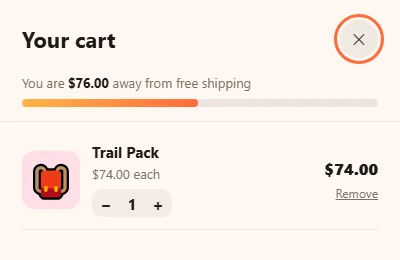
The empty state uses a neat trick: one class on the drawer, .is-empty, shows the
empty message and hides the list, shipping bar and footer. JavaScript only toggles that class.
The checkout truck sits just off the left edge of the button. During .going, the
label fades out and the drive animation moves the truck to the right edge. The truck
emoji faces left on most systems, so scaleX(-1) mirrors it.
2.5 Keyframes and reduced motion
/* ---------- KEYFRAMES ---------- */
@keyframes enter { from { opacity: 0; transform: translateY(30px) scale(.95); } }
@keyframes wiggle { 0%, 100% { transform: rotate(0); } 25% { transform: rotate(-14deg) scale(1.1); } 50% { transform: rotate(10deg) scale(1.1); } 75% { transform: rotate(-6deg); } }
@keyframes bump { 50% { transform: scale(1.5); } }
@keyframes tick { 0% { transform: translateY(-8px); opacity: 0; } }
@keyframes slide-in { from { opacity: 0; transform: translateX(40px); } }
@keyframes float { 50% { transform: translateY(-10px) rotate(4deg); } }
@keyframes drive { to { left: calc(100% + 40px); } }
/* ---------- END KEYFRAMES ---------- */

/* ---------- REDUCED MOTION ---------- */
@media (prefers-reduced-motion: reduce) {
  *, *::before, *::after {
    animation-duration: .01ms !important;
    animation-iteration-count: 1 !important;
    animation-delay: 0s !important;
    transition-duration: .01ms !important;
  }
}
/* ---------- END REDUCED MOTION ---------- */
Step 3: The JavaScript
3.1 Products as data
// ---------- SETTINGS ----------
const FREE_SHIPPING = 150;   // dollars
const PRODUCTS = [
  { id: 'sneaker',  name: 'Cloud Runner',  price: 89,  emoji: '👟', tint: '#ffe3d3' },
  { id: 'phones',   name: 'Bass Buds Max', price: 129, emoji: '🎧', tint: '#dfe9ff' },
  { id: 'watch',    name: 'Tempo Watch',   price: 199, emoji: '⌚', tint: '#e5f7e8' },
  { id: 'shades',   name: 'Sunny Shades',  price: 59,  emoji: '🕶️', tint: '#fff1c9' },
  { id: 'pack',     name: 'Trail Pack',    price: 74,  emoji: '🎒', tint: '#ffdde6' },
  { id: 'camera',   name: 'Snap Mini',     price: 349, emoji: '📷', tint: '#ece3ff' }
];
// ---------- END SETTINGS ----------

// ---------- ELEMENTS ----------
const grid = document.querySelector('.grid');
const cartBtn = document.querySelector('.cart-btn');
const badge = document.querySelector('.badge');
const drawer = document.querySelector('.drawer');
const backdrop = document.querySelector('.backdrop');
const list = document.querySelector('.items');
const subtotalEl = document.querySelector('.subtotal');
const ship = document.querySelector('.ship');
const shipText = document.querySelector('.ship-text');
const shipBar = document.querySelector('.ship-bar span');
const checkout = document.querySelector('.checkout');
const live = document.querySelector('[role="status"]');
const reduceMotion = matchMedia('(prefers-reduced-motion: reduce)').matches;

const money = (n) => '$' + n.toFixed(2);
const find = (id) => PRODUCTS.find((p) => p.id === id);
// ---------- END ELEMENTS ----------
Every product is an object with an id, name, price, emoji and tile colour. To add a product to the
shop, add a line to PRODUCTS; nothing else needs to change. money() formats
numbers as dollars, and find() looks up a product by its id.
3.2 Rendering the grid
// ---------- PRODUCT GRID ----------
grid.innerHTML = PRODUCTS.map((p, i) => `
  <li class="product" style="--i:${i}; --tint:${p.tint}">
    <div class="thumb"><span class="emoji" aria-hidden="true">${p.emoji}</span></div>
    <div class="info"><h3>${p.name}</h3><span class="price">${money(p.price)}</span></div>
    <button type="button" class="add" data-id="${p.id}">Add to cart</button>
  </li>`).join('');

grid.addEventListener('click', (e) => {
  const btn = e.target.closest('.add');
  if (!btn) return;
  const product = find(btn.dataset.id);
  const emoji = btn.closest('.product').querySelector('.emoji');

  // Button feedback: "Added ✓" for a moment.
  btn.classList.add('added');
  btn.textContent = 'Added ✓';
  clearTimeout(btn.timer);
  btn.timer = setTimeout(() => { btn.classList.remove('added'); btn.textContent = 'Add to cart'; }, 1200);

  flyToCart(emoji, () => add(product.id));
  live.textContent = `${product.name} added to cart.`;
});
// ---------- END PRODUCT GRID ----------
The grid is built from PRODUCTS with a template string. Instead of one listener per
button, a single listener on the grid catches every click and uses
e.target.closest('.add') to find which button was pressed. This is event
delegation, and it keeps working even if you add products later.
The button turns green and says “Added ✓” for 1.2 seconds. Saving the timer on the
button (btn.timer) means fast repeat clicks restart the countdown instead of stacking
up.
3.3 The flight
// ---------- FLY TO CART ----------
function flyToCart(fromEl, done) {
  if (reduceMotion) { done(); return; }
  const from = fromEl.getBoundingClientRect();
  const to = cartBtn.getBoundingClientRect();

  const fly = document.createElement('span');
  fly.className = 'fly';
  const inner = document.createElement('span');
  inner.className = 'fly-inner';
  inner.textContent = fromEl.textContent;
  fly.appendChild(inner);
  document.body.appendChild(fly);

  // Start where the product picture is, end on the cart (30 = half the 60px emoji).
  const x1 = from.left + from.width / 2 - 30, y1 = from.top + from.height / 2 - 30;
  const x2 = to.left + to.width / 2 - 30,    y2 = to.top + to.height / 2 - 30;
  const time = 800;

  // Left-right: steady speed.
  fly.animate(
    [{ transform: `translateX(${x1}px)` }, { transform: `translateX(${x2}px)` }],
    { duration: time, easing: 'linear', fill: 'forwards' }
  );
  // Up-down: rise first, then drop into the cart. Shrink and spin on the way.
  // The top of the arc stays inside the window (never above 0).
  const peak = Math.max(0, Math.min(y1 - 120, y2 - 40));
  inner.animate([
    { transform: `translateY(${y1}px) scale(1) rotate(0)` },
    { transform: `translateY(${peak}px) scale(.8) rotate(-20deg)`, offset: 0.4, easing: 'ease-in' },
    { transform: `translateY(${y2}px) scale(.25) rotate(20deg)` }
  ], { duration: time, easing: 'ease-out', fill: 'forwards' }).onfinish = () => {
    fly.remove();
    done();
    cartBtn.classList.remove('wiggle');
    void cartBtn.offsetWidth;
    cartBtn.classList.add('wiggle');
  };
}
// ---------- END FLY TO CART ----------
Step by step:
getBoundingClientRect()gives the screen position of the product picture and the cart button.- A copy of the emoji is created as the two-layer
.flyelement. - The outer layer animates sideways from
x1tox2withlineartiming. - The inner layer animates through three keyframes: the start, a peak above both points at 40% of the time, and the cart. It shrinks to a quarter of its size and spins on the way.
- When it lands,
onfinishremoves the copy, adds the product to the cart and wiggles the cart.
The peak is Math.max(0, …), which keeps it inside the window. The cart is near the top
of the screen, so without this the item would fly off the top and drop back in.
These use element.animate(), the Web Animations API: keyframes written in JavaScript,
so each flight can use its own start and end points. With reduced motion turned on, the flight is
skipped and the item goes straight into the cart.
3.4 Cart state
// ---------- CART STATE ----------
// cart looks like { sneaker: 2, watch: 1 }
let cart = {};

function add(id) { cart[id] = (cart[id] || 0) + 1; render(id); }
function change(id, by) {
  cart[id] += by;
  if (cart[id] <= 0) removeItem(id);
  else render(id);
}
function removeItem(id) {
  const row = list.querySelector(`[data-id="${id}"]`);
  delete cart[id];
  if (!row || reduceMotion) { render(); return; }
  // Measure the row, then shrink it to nothing while it slides away.
  const h = row.offsetHeight;
  row.animate([
    { height: h + 'px', opacity: 1, transform: 'none' },
    { height: '0px', opacity: 0, transform: 'translateX(60px)', paddingTop: 0, paddingBottom: 0 }
  ], { duration: 320, easing: 'ease-in' }).onfinish = () => render();
}

const count = () => Object.values(cart).reduce((a, b) => a + b, 0);
const subtotal = () => Object.entries(cart).reduce((sum, [id, q]) => sum + find(id).price * q, 0);
// ---------- END CART STATE ----------
The whole cart is one plain object: { sneaker: 2, watch: 1 }. Every action changes
that object, then calls render() to update the screen. Keeping one source of truth
like this is how frameworks such as React work, and it avoids the screen and the data ever
disagreeing.
Removing an item animates first. The row's height is measured with offsetHeight,
because CSS can't animate from height: auto. The animation goes from that exact pixel
height to 0, while fading and sliding right, so the rows below glide up instead of jumping.
3.5 Drawing the cart
// ---------- DRAW THE CART ----------
// `changed` is the product whose number just changed, so only that one animates.
function render(changed) {
  const ids = Object.keys(cart);
  drawer.classList.toggle('is-empty', ids.length === 0);

  // Add rows that are new, update rows that exist, drop rows that are gone.
  ids.forEach((id) => {
    const p = find(id);
    let row = list.querySelector(`[data-id="${id}"]`);
    if (!row) {
      row = document.createElement('li');
      row.className = 'item';
      row.dataset.id = id;
      row.innerHTML = `
        <span class="item-thumb" style="--tint:${p.tint}" aria-hidden="true">${p.emoji}</span>
        <div>
          <h3>${p.name}</h3>
          <span class="each">${money(p.price)} each</span><br>
          <span class="qty">
            <button type="button" data-by="-1" aria-label="One fewer ${p.name}">−</button>
            <output aria-label="Quantity"></output>
            <button type="button" data-by="1" aria-label="One more ${p.name}">+</button>
          </span>
        </div>
        <div class="item-right">
          <span class="line"></span>
          <button type="button" class="remove">Remove</button>
        </div>`;
      list.appendChild(row);
    }
    const out = row.querySelector('output');
    out.textContent = cart[id];
    row.querySelector('.line').textContent = money(p.price * cart[id]);
    if (id === changed) { out.classList.remove('tick'); void out.offsetWidth; out.classList.add('tick'); }
  });
  list.querySelectorAll('.item').forEach((row) => { if (!(row.dataset.id in cart)) row.remove(); });

  // Badge in the header.
  const n = count();
  badge.textContent = n;
  badge.classList.toggle('has', n > 0);
  badge.classList.remove('bump'); void badge.offsetWidth; if (n) badge.classList.add('bump');
  cartBtn.setAttribute('aria-label', `Open cart, ${n} item${n === 1 ? '' : 's'}`);

  // Money.
  const total = subtotal();
  countUp(subtotalEl, total);
  const left = FREE_SHIPPING - total;
  ship.classList.toggle('done', left <= 0);
  shipText.innerHTML = left > 0
    ? `You are <b>${money(left)}</b> away from free shipping`
    : '🎉 You unlocked free shipping!';
  shipBar.style.setProperty('--p', Math.min(100, (total / FREE_SHIPPING) * 100) + '%');
}

// Roll the number from its old value to the new one.
function countUp(el, to) {
  const from = parseFloat(el.textContent.replace(/[^0-9.]/g, '')) || 0;
  cancelAnimationFrame(el.raf);
  if (reduceMotion) { el.textContent = money(to); return; }
  const start = performance.now(), time = 450;
  const step = (now) => {
    const t = Math.min(1, (now - start) / time);
    const eased = 1 - Math.pow(1 - t, 3);
    el.textContent = money(from + (to - from) * eased);
    if (t < 1) el.raf = requestAnimationFrame(step);
  };
  el.raf = requestAnimationFrame(step);
}

list.addEventListener('click', (e) => {
  const row = e.target.closest('.item');
  if (!row) return;
  const id = row.dataset.id;
  if (!(id in cart)) return;            // already sliding away
  const step = e.target.closest('[data-by]');
  if (step) change(id, Number(step.dataset.by));
  if (e.target.closest('.remove')) {
    live.textContent = `${find(id).name} removed.`;
    removeItem(id);
  }
});
// ---------- END DRAW THE CART ----------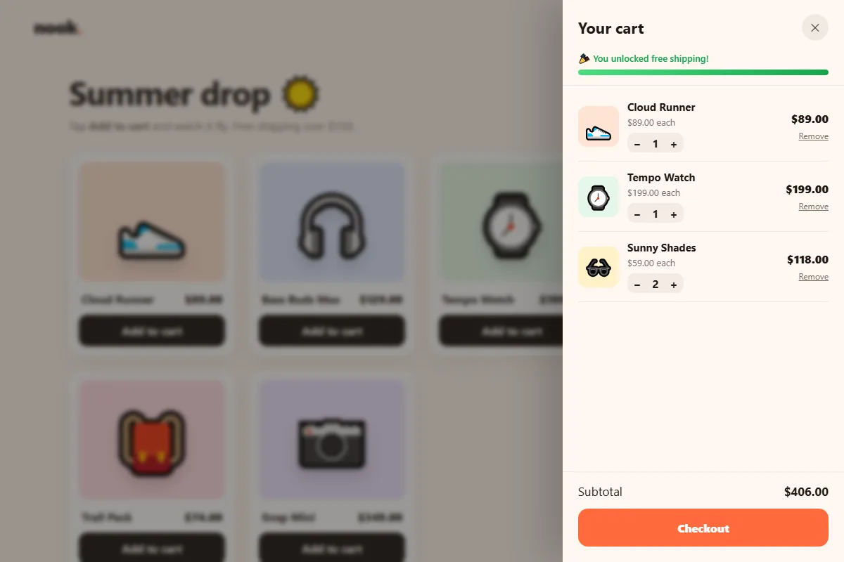
render() doesn't rebuild the whole list each time. It adds rows that are new, updates
the numbers in rows that already exist, and removes rows that are gone. That way, a row that's
still on screen keeps its focus and isn't re-animated. Only the quantity that changed gets the
little tick animation.
It also updates the badge, the button label, the free shipping message and the bar width.
countUp() rolls the subtotal from its old value to the new one over 450ms. The easing
1 - (1 - t)³ starts fast and slows down at the end, so the final number settles
gently.
The quantity buttons use the same delegation idea: one listener on the list reads
data-by (+1 or -1) from the button that was clicked. The check
if (!(id in cart)) return ignores clicks on a row that's already sliding away.
3.6 Opening and closing the drawer
// ---------- OPEN AND CLOSE THE DRAWER ----------
let lastFocus = null;

function openCart() {
  lastFocus = document.activeElement;
  backdrop.hidden = false;
  drawer.inert = false;
  document.body.classList.add('locked');
  requestAnimationFrame(() => { backdrop.classList.add('show'); drawer.classList.add('open'); });
  cartBtn.setAttribute('aria-expanded', 'true');
  drawer.querySelector('.close').focus();
}

function closeCart() {
  backdrop.classList.remove('show');
  drawer.classList.remove('open');
  drawer.inert = true;
  document.body.classList.remove('locked');
  cartBtn.setAttribute('aria-expanded', 'false');
  setTimeout(() => { backdrop.hidden = true; }, reduceMotion ? 0 : 300);
  if (lastFocus) lastFocus.focus();
}

cartBtn.addEventListener('click', openCart);
backdrop.addEventListener('click', closeCart);
drawer.querySelector('.close').addEventListener('click', closeCart);
drawer.querySelector('.keep').addEventListener('click', closeCart);

// Esc closes; Tab stays inside the drawer while it is open.
document.addEventListener('keydown', (e) => {
  if (drawer.inert) return;             // cart is closed
  if (e.key === 'Escape') closeCart();
  if (e.key === 'Tab') {
    const f = [...drawer.querySelectorAll('button')].filter((b) => b.offsetParent !== null);
    const first = f[0], last = f[f.length - 1];
    if (e.shiftKey && document.activeElement === first) { e.preventDefault(); last.focus(); }
    else if (!e.shiftKey && document.activeElement === last) { e.preventDefault(); first.focus(); }
  }
});
// ---------- END OPEN AND CLOSE THE DRAWER ----------
A good drawer behaves like a dialog:
- Opening remembers which element had focus, removes
inert, locks page scrolling, and moves focus to the close button. - Closing undoes all of that and puts focus back where it was.
- Esc closes it. Clicking the dark backdrop closes it too.
- Tab is trapped: from the last button, Tab wraps to the first, and Shift+Tab from the first wraps to the last, so keyboard users can't wander behind the drawer.
The classes are added inside requestAnimationFrame so the browser draws the backdrop
once before it fades in, otherwise the transition would be skipped.
3.7 The truck checkout
// ---------- CHECKOUT ----------
checkout.addEventListener('click', () => {
  if (checkout.classList.contains('going')) return;
  const label = checkout.querySelector('.label');
  checkout.classList.add('going');
  label.textContent = 'Placing order…';

  // Replace this timeout with a fetch() to your payment or order API.
  setTimeout(() => {
    checkout.classList.remove('going');
    checkout.classList.add('done');
    label.textContent = 'Order placed ✓';
    live.textContent = 'Order placed. Thank you!';
    setTimeout(() => {
      cart = {};
      render();
      drawer.querySelector('.keep').focus();   // the checkout button is hidden now
      checkout.classList.remove('done');
      label.textContent = 'Checkout';
    }, 1500);
  }, reduceMotion ? 300 : 1700);
});
// ---------- END CHECKOUT ----------

render();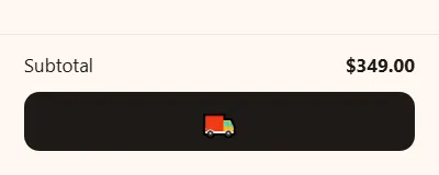
Clicking Checkout adds .going, which starts the truck. When it reaches the other side,
the button turns green with “Order placed ✓”, and the message is announced to screen
readers. 1.5 seconds later the cart empties. Focus moves to the “Keep shopping” button,
because the checkout button has just disappeared and focus must never be left on a hidden
element.
Test it yourself
- Add the sunglasses. They fly into the cart and the badge pops to 1.
- Add the sneakers too, then open the cart. Free shipping is unlocked.
- Press minus on the sunglasses until the row slides away. The bar drops back to orange.
- Press Tab repeatedly. Focus stays inside the drawer. Press Esc to close it.
- Add the camera and check out. Watch the truck.
Using it on a real site
- Save the cart. Store
carton your server for logged-in users, or inlocalStorage, so it survives a page reload. - Prices come from the server. The browser total is only for display. When checking out, send product ids and quantities, and let the server calculate the real price. Never trust a price sent from the browser.
- Real photos: replace the emoji with
<img>tags. The flight copiestextContent, so for images, clone the image withcloneNode()instead.
Share your shop
Built your own store page? Share a screenshot as a link with sshot.online, or share your code with the free code sharing tool. No account needed.
Conclusion
Small animations make a shop feel alive, and each one here also tells people something useful:
- the flying item shows where the product went
- the counting total shows what changed
- the shipping bar shows how close they are to free delivery
Underneath, it's a few reusable ideas: two layers for a curved path, one object as the source of truth, event delegation, and a drawer that treats keyboard users properly.
Frequently asked questions
How do I make a product fly into the cart in a curve?
Use two nested elements. Animate the outer one sideways at a steady speed and the inner one up and then down with easing. Together the two movements trace a smooth arc.
Does the add to cart animation need a library?
No. It uses the built-in Web Animations API, element.animate(), which works in all
modern browsers.
How do I animate removing an item from a list?
Measure the row with offsetHeight, then animate from that pixel height to 0 while
fading it out. CSS cannot animate from height: auto, so the measured height is
needed.
How do I make the cart drawer accessible?
Give it role="dialog" and aria-modal, keep it inert while
closed, move focus into it when it opens, trap Tab inside it, close it with Escape and return
focus to where it was.
Can I use real product photos instead of emoji?
Yes. Put an <img> tag in each card and clone the image for the flying
element instead of copying the emoji text. The rest of the code stays the same.
Related articles
How to Build an Animated OTP Verification Page with HTML, CSS and JavaScript
Six digit boxes that pop, paste and autofill, a fake text message with the code, a resend countdown ring, a wrong-code shake and a confetti finish.
Read More →
How to Build a Lamp Login Page with a Pull Cord in HTML, CSS and JavaScript
A dark room, a cute lamp and a cord you can actually pull. The light flickers on, the login form appears, and the lamp frowns or grins at what you type.
Read More →
How to Build an Animated Ocean Login Page with HTML, CSS and JavaScript
Build an underwater login page with SVG fish that flee your cursor, schools of sardines, a leaping dolphin, splashes, bubbles and a frosted glass form.
Read More →