How to Build an Animated Ocean Login Page with HTML, CSS and JavaScript
Published November 4, 2026 · 16 min read
Most animated login pages move one character. This one fills the whole screen with life: an underwater scene with clownfish, blue and yellow tangs and schools of silver sardines that swim at different depths and dart away from your cursor. A dolphin cruises by, leaps out of the water with a splash, does a somersault and dives back in. Bubbles rise all the time, and a few float out of the field you're typing in.
On top sits a frosted glass login form. When you log in successfully, the dolphin jumps to celebrate.
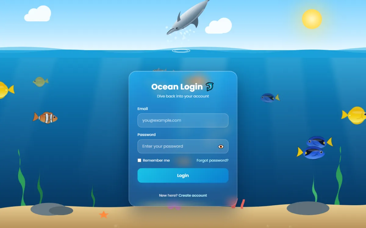
Try the live demo Move your mouse near the fish and watch them flee.
It's built with plain HTML, CSS and JavaScript, with no libraries and no image files. The fish and dolphin are SVG drawn by JavaScript. This is a bigger project, so it's a great way to learn real animation techniques:
- a game-style animation loop
- simple behaviours, like fleeing and schooling
- curve maths for a natural jump
- particles with gravity
How the page is layered
Think of the page as a stack of transparent sheets, each one fixed to the screen. From back to
front, each sheet with its z-index:
- z-index 0: sky and water, the background, with sunbeams inside the water.
- z-index 1: waves at the water line, and the far-away fish.
- z-index 2: the dolphin, the splash canvas and the seaweed.
- z-index 3: sand, rocks and coral.
- z-index 4: bubbles.
- z-index 6: the near fish, which swim in front of the seabed.
- z-index 10: the login form, always on top.
Putting fish on two different layers is what creates the feeling of depth.
Project setup
ocean-login/
├── index.html   ← sky, water, seabed, form
├── style.css    ← scenery animation and the glass form
└── script.js    ← fish, dolphin, splashes, bubbles, form
The code blocks below follow each file from top to bottom. Copy them in order and you'll have the complete files.
Step 1: The HTML
1.1 Head, sky and water
<!DOCTYPE html>
<html lang="en">
<head>
  <meta charset="UTF-8">
  <meta name="viewport" content="width=device-width, initial-scale=1.0">
  <title>Ocean Login</title>
  <link rel="preconnect" href="https://fonts.googleapis.com">
  <link rel="preconnect" href="https://fonts.gstatic.com" crossorigin>
  <link href="https://fonts.googleapis.com/css2?family=Poppins:wght@400;500;600;700&display=swap" rel="stylesheet">
  <link rel="stylesheet" href="style.css">
</head>
<body>

<!-- ========== SKY ========== -->
<div class="sky" aria-hidden="true">
  <div class="sun"></div>
  <div class="cloud" style="top:28%; width:90px; animation-duration:60s; animation-delay:-10s"></div>
  <div class="cloud" style="top:52%; width:70px; animation-duration:80s; animation-delay:-45s"></div>
</div>

<!-- ========== WATER + LIGHT RAYS ========== -->
<div class="water" id="water" aria-hidden="true">
  <div class="ray" style="left:8%;  --r:18deg"></div>
  <div class="ray" style="left:30%; --r:10deg; animation-delay:-2s"></div>
  <div class="ray" style="left:52%; --r:4deg;  animation-delay:-4s"></div>
  <div class="ray" style="left:72%; --r:-6deg; animation-delay:-1s"></div>
  <div class="ray" style="left:90%; --r:-14deg; animation-delay:-3s"></div>
</div>
The sky holds a sun and two clouds. Each cloud has its own animation-duration and a
negative animation-delay in its style attribute. A
negative delay starts the animation partway through, so the clouds are already spread across the
sky when the page loads instead of all starting at the left edge.
The five sunbeams each set a CSS variable inline: style="--r:18deg". The CSS uses
var(--r) to tilt each beam differently with one shared rule. Inline custom properties
are a neat way to give many elements a different value without writing a class for each.
1.2 Waves, splash canvas and seabed
<!-- ========== WAVES ========== -->
<div class="waves back" aria-hidden="true">
  <svg viewBox="0 0 1200 40" preserveAspectRatio="none"><path fill="#36b5e5" d="M0 20 Q 75 0 150 20 T 300 20 T 450 20 T 600 20 T 750 20 T 900 20 T 1050 20 T 1200 20 V40 H0 Z"/></svg>
</div>
<div class="waves front" aria-hidden="true">
  <svg viewBox="0 0 1200 40" preserveAspectRatio="none"><path fill="#1aa0d8" d="M0 18 Q 50 6 100 18 T 200 18 T 300 18 T 400 18 T 500 18 T 600 18 T 700 18 T 800 18 T 900 18 T 1000 18 T 1100 18 T 1200 18 V40 H0 Z"/></svg>
</div>

<!-- Water splashes are drawn on this canvas -->
<canvas id="splash" aria-hidden="true"></canvas>

<!-- ========== SEABED ========== -->
<svg class="weed" aria-hidden="true" style="left:4%;  animation-duration:3.2s" width="60" height="230" viewBox="0 0 60 230"><path d="M30 230 C10 190 50 160 28 120 C8 85 46 60 30 20 C26 10 30 0 30 0 C40 30 20 60 40 95 C58 130 22 160 40 195 C46 210 36 230 36 230 Z" fill="#2e9e5b"/></svg>
<svg class="weed" aria-hidden="true" style="left:9%;  animation-duration:4s; animation-delay:-1s" width="50" height="170" viewBox="0 0 50 170"><path d="M25 170 C8 140 40 120 22 88 C8 62 36 40 24 4 C34 30 18 56 32 82 C46 110 18 132 32 160 Z" fill="#1f7a45"/></svg>
<svg class="weed" aria-hidden="true" style="right:6%; animation-duration:3.6s; animation-delay:-2s" width="60" height="250" viewBox="0 0 60 230"><path d="M30 230 C10 190 50 160 28 120 C8 85 46 60 30 20 C26 10 30 0 30 0 C40 30 20 60 40 95 C58 130 22 160 40 195 C46 210 36 230 36 230 Z" fill="#2e9e5b"/></svg>
<svg class="weed" aria-hidden="true" style="right:12%; animation-duration:2.8s" width="44" height="150" viewBox="0 0 50 170"><path d="M25 170 C8 140 40 120 22 88 C8 62 36 40 24 4 C34 30 18 56 32 82 C46 110 18 132 32 160 Z" fill="#3fb36d"/></svg>
<svg class="weed" aria-hidden="true" style="left:24%; animation-duration:3.4s; animation-delay:-.5s" width="40" height="120" viewBox="0 0 50 170"><path d="M25 170 C8 140 40 120 22 88 C8 62 36 40 24 4 C34 30 18 56 32 82 C46 110 18 132 32 160 Z" fill="#1f7a45"/></svg>

<div class="sand" aria-hidden="true">
  <svg viewBox="0 0 1200 120" preserveAspectRatio="none">
    <defs>
      <linearGradient id="sandG" x1="0" y1="0" x2="0" y2="1"><stop offset="0" stop-color="#e9cf95"/><stop offset="1" stop-color="#b8935a"/></linearGradient>
    </defs>
    <path d="M0 40 C150 10 300 50 450 30 C600 10 750 50 900 28 C1020 12 1120 34 1200 26 V120 H0 Z" fill="url(#sandG)"/>
    <!-- rocks -->
    <ellipse cx="160" cy="44" rx="60" ry="26" fill="#6b7c86"/>
    <ellipse cx="200" cy="50" rx="40" ry="18" fill="#56666f"/>
    <ellipse cx="1010" cy="40" rx="70" ry="28" fill="#5f707a"/>
    <!-- coral -->
    <g fill="#ff6f61">
      <path d="M760 40 C756 20 744 14 742 0 L750 0 C752 12 760 16 764 30 C766 18 772 8 772 -6 L780 -6 C780 10 774 22 770 40 Z"/>
      <path d="M790 42 C786 26 796 16 796 4 L803 4 C803 18 795 28 797 42 Z"/>
    </g>
    <g fill="#ff9ecb"><circle cx="560" cy="34" r="10"/><circle cx="574" cy="28" r="8"/><circle cx="584" cy="38" r="9"/></g>
    <!-- starfish -->
    <path transform="translate(340 66) scale(.55)" fill="#ff8a3d" d="M0 -30 L9 -9 L31 -8 L13 6 L20 28 L0 15 L-20 28 L-13 6 L-31 -8 L-9 -9 Z"/>
  </svg>
</div>
Two SVG wave strips sit on the water line. Their paths use Q and T
commands: Q draws one curved bump, and every T repeats a matching bump,
so a whole row of smooth waves takes one short line.
preserveAspectRatio="none" lets the SVG stretch to any screen width.
The empty <canvas> is where JavaScript draws water droplets. The seaweed is five
SVG strands with different sizes and sway speeds. The seabed is one SVG with a sand gradient,
rocks (ellipses), coral (paths and circles) and a starfish, a 10-point polygon.
1.3 The login form
<!-- ========== LOGIN FORM ========== -->
<main class="wrap">
  <form class="card" id="form" novalidate>
    <h1>Ocean Login 🐬</h1>
    <p class="sub">Dive back into your account</p>

    <div class="field">
      <label for="email">Email</label>
      <input type="email" id="email" name="email" autocomplete="username" placeholder="you@example.com">
    </div>
    <div class="field">
      <label for="password">Password</label>
      <input type="password" id="password" name="password" autocomplete="current-password" placeholder="Enter your password">
      <button type="button" class="toggle" id="toggle" aria-label="Show password" aria-pressed="false">👁️</button>
    </div>

    <div class="row">
      <label><input type="checkbox" name="remember"> Remember me</label>
      <a href="#">Forgot password?</a>
    </div>

    <button type="submit" class="btn">Login</button>
    <div class="msg" id="msg" role="status" aria-live="polite"></div>
    <p class="foot">New here? <a href="#">Create account</a></p>
  </form>
</main>

<script src="script.js"></script>
</body>
</html>
The form sits in a <main> wrapper on the top layer. All the scenery has
aria-hidden="true", so screen readers go straight to the form. The fields have
autocomplete hints for password managers, and the message area has
role="status" so results are read aloud.
Notice there are no fish in the HTML. JavaScript creates them, because their positions change every frame.
Step 2: The CSS
2.1 Page, sky and clouds
/* ========== PAGE ========== */
:root {
  --surface: max(22vh, 150px);   /* where the sky ends and the water starts */
}
* { box-sizing: border-box; margin: 0; padding: 0; }
html, body { min-height: 100%; }
body {
  font-family: 'Poppins', sans-serif;
  background: #0a3d66;
  color: #fff;
  overflow-x: hidden;
}

/* ========== SKY ========== */
.sky {
  position: fixed;
  left: 0; right: 0; top: 0;
  height: var(--surface);
  background: linear-gradient(#7fd3ff 0%, #bfe9ff 70%, #e6f7ff 100%);
  z-index: 0;
}
.sun {
  position: absolute;
  top: 18%; right: 12%;
  width: 70px; height: 70px;
  border-radius: 50%;
  background: radial-gradient(circle, #fff9c4 0%, #ffe066 55%, #ffd23f 100%);
  box-shadow: 0 0 60px 20px rgba(255, 230, 120, .55);
}
/* A cloud = one rounded bar + two circles (::before and ::after) */
.cloud {
  position: absolute;
  height: 26px;
  border-radius: 30px;
  background: #fff;
  opacity: .9;
  animation: drift linear infinite;
}
.cloud::before, .cloud::after {
  content: '';
  position: absolute;
  background: #fff;
  border-radius: 50%;
}
.cloud::before { width: 40px; height: 40px; top: -20px; left: 14px; }
.cloud::after  { width: 54px; height: 54px; top: -30px; left: 40px; }
@keyframes drift {
  from { transform: translateX(-200px); }
  to   { transform: translateX(110vw); }
}
--surface is the height of the sky, and so the position of the water line.
max(22vh, 150px) means “22% of the screen height, but never less than
150px”. Many layers use this one variable, so changing it moves the whole horizon.
Each cloud is one rounded bar plus two circles drawn by ::before and
::after. That's three shapes, but only one HTML element.
2.2 Water and light rays
/* ========== WATER + LIGHT RAYS ========== */
.water {
  position: fixed;
  left: 0; right: 0; top: var(--surface); bottom: 0;
  background: linear-gradient(#1aa0d8 0%, #0d6fa8 30%, #0a4c7e 65%, #062d52 100%);
  z-index: 0;
  overflow: hidden;
}
/* Sunbeams: blurred white strips that fade downwards, each with its own angle (--r) */
.ray {
  position: absolute;
  top: -10%;
  width: 120px; height: 120%;
  background: linear-gradient(rgba(255,255,255,.28), rgba(255,255,255,0) 75%);
  transform-origin: top center;
  filter: blur(6px);
  animation: ray 7s ease-in-out infinite alternate;
}
@keyframes ray {
  from { opacity: .25; transform: rotate(var(--r)) scaleX(1); }
  to   { opacity: .7;  transform: rotate(calc(var(--r) + 4deg)) scaleX(1.4); }
}
The water is a four-step gradient from bright turquoise near the surface to deep navy at the
bottom, like real light fading with depth. Each ray is a blurred white strip that fades out
downwards. It rotates from its top (transform-origin: top center) between its own
angle var(--r) and four degrees more, while widening and brightening.
alternate plays the animation forwards, then backwards, so it never jumps.
2.3 Endless waves
/* ========== WAVES ========== */
/* Each wave strip is twice the screen width and slides left by half,
   so the pattern loops with no visible jump */
.waves {
  position: fixed;
  left: 0;
  width: 200%; height: 40px;
  top: calc(var(--surface) - 22px);
  z-index: 1;
  pointer-events: none;
}
.waves svg { display: block; width: 100%; height: 100%; }
.waves.back  { animation: waves 9s linear infinite; opacity: .55; }
.waves.front { animation: waves 6s linear infinite reverse; top: calc(var(--surface) - 14px); }
@keyframes waves {
  from { transform: translateX(0); }
  to   { transform: translateX(-50%); }
}
The classic seamless-loop trick: each wave strip is twice as wide as the screen, and its pattern repeats exactly halfway along. Sliding it left by 50% brings it to a frame that looks identical to the start, so when the animation restarts nobody can see the jump. The two strips move in opposite directions at different speeds, which makes the surface look choppy.
2.4 Seabed, seaweed and bubbles
/* ========== SEABED ========== */
.sand {
  position: fixed;
  left: 0; right: 0; bottom: 0;
  height: 13vh;
  z-index: 3;
}
.sand svg { display: block; width: 100%; height: 100%; }
/* Seaweed sways from its base */
.weed {
  position: fixed;
  bottom: 6vh;
  z-index: 2;
  transform-origin: bottom center;
  animation: sway ease-in-out infinite alternate;
}
@keyframes sway {
  from { transform: rotate(-5deg); }
  to   { transform: rotate(6deg); }
}

/* ========== BUBBLES ========== */
.bubble {
  position: fixed;
  bottom: -20px;
  border-radius: 50%;
  z-index: 4;
  pointer-events: none;
  background: radial-gradient(circle at 30% 30%, rgba(255,255,255,.95), rgba(255,255,255,.25) 40%, rgba(255,255,255,.08) 70%);
  border: 1px solid rgba(255,255,255,.45);
  animation: rise linear forwards;
}
@keyframes rise {
  0%   { transform: translate(0, 0); opacity: 0; }
  10%  { opacity: 1; }
  50%  { transform: translate(14px, -50vh); }
  100% { transform: translate(-10px, -100vh); opacity: .9; }
}
Seaweed sways from its base (transform-origin: bottom center). A bubble is a circle
with a radial gradient whose bright centre is set off to one side
(circle at 30% 30%), which looks like light reflecting on its surface. The
rise keyframes move it up the full screen height while drifting left and right.
forwards keeps it at the end state until JavaScript removes it.
2.5 Fins that flap
/* ========== FISH + DOLPHIN ========== */
.fish, .dolphin {
  position: fixed;
  left: 0; top: 0;
  pointer-events: none;
  will-change: transform;
}
.fish svg { display: block; overflow: visible; }
/* transform-box: fill-box makes the origin relative to the fin itself, not the whole SVG */
.fish .tail { transform-box: fill-box; transform-origin: 100% 50%; animation: wag var(--wag, .35s) ease-in-out infinite alternate; }
.fish .pec  { transform-box: fill-box; transform-origin: 100% 0%;  animation: pec .5s ease-in-out infinite alternate; }
@keyframes wag { from { transform: rotate(-16deg) scaleX(.92); } to { transform: rotate(16deg) scaleX(1); } }
@keyframes pec { from { transform: rotate(-12deg); } to { transform: rotate(14deg); } }

.dolphin { z-index: 2; }
.dolphin .flukes { transform-box: fill-box; transform-origin: 100% 50%; animation: kick .42s ease-in-out infinite alternate; }
@keyframes kick { from { transform: rotate(-13deg); } to { transform: rotate(13deg); } }

#splash { position: fixed; inset: 0; z-index: 2; pointer-events: none; }
The fish body is moved by JavaScript, but the tail and fins are animated by CSS.
The key property is transform-box: fill-box. By default, transforms inside an SVG
rotate around the corner of the whole SVG. With fill-box, percentages in
transform-origin refer to the fin's own shape, so 100% 50% hinges the
tail where it meets the body.
The wag speed comes from a variable, var(--wag, .35s), which JavaScript sets per
fish. Close fish flap faster than distant ones.
2.6 The frosted glass form
/* ========== GLASS FORM ========== */
.wrap {
  position: relative;
  z-index: 10;
  min-height: 100vh;
  min-height: 100dvh;
  display: grid;
  place-items: center;
  padding: calc(var(--surface) + 20px) 16px 24px;
  pointer-events: none;           /* only the card itself catches clicks */
}
.card {
  pointer-events: auto;
  width: min(380px, 100%);
  padding: 34px 30px 28px;
  border-radius: 26px;
  background: rgba(255,255,255,.13);
  border: 1px solid rgba(255,255,255,.35);
  backdrop-filter: blur(14px) saturate(140%);
  -webkit-backdrop-filter: blur(14px) saturate(140%);
  box-shadow: 0 25px 60px rgba(0, 20, 50, .45), inset 0 1px 0 rgba(255,255,255,.4);
}
.card.shake { animation: shake .45s ease; }
@keyframes shake {
  20%, 60% { transform: translateX(-10px); }
  40%, 80% { transform: translateX(10px); }
}
.card h1 { font-size: 28px; font-weight: 700; text-align: center; letter-spacing: .3px; }
.card .sub { text-align: center; font-size: 13px; opacity: .85; margin: 2px 0 24px; }
.field { position: relative; margin-bottom: 16px; }
.field label { display: block; font-size: 13px; font-weight: 500; margin-bottom: 6px; opacity: .95; }
.field input {
  width: 100%;
  padding: 13px 46px 13px 16px;
  border-radius: 14px;
  border: 1.5px solid rgba(255,255,255,.35);
  background: rgba(255,255,255,.12);
  color: #fff;
  font: inherit;
  font-size: 14px;
  outline: none;
  transition: border-color .2s, background .2s, box-shadow .2s;
}
.field input::placeholder { color: rgba(255,255,255,.65); }
.field input:focus {
  border-color: #7ff3ff;
  background: rgba(255,255,255,.2);
  box-shadow: 0 0 0 4px rgba(127,243,255,.18);
}
.field input[aria-invalid="true"] {
  border-color: #ff8f8f;
  background: rgba(255, 120, 120, .16);
  box-shadow: 0 0 0 4px rgba(255, 120, 120, .22);
}
.toggle {
  position: absolute;
  right: 10px; bottom: 10px;
  padding: 4px;
  border: none;
  border-radius: 6px;
  background: none;
  font-size: 18px;
  line-height: 1;
  cursor: pointer;
}
.toggle:focus-visible { outline: 2px solid #7ff3ff; }
.row { display: flex; justify-content: space-between; align-items: center; gap: 8px; flex-wrap: wrap; font-size: 12.5px; margin: 2px 0 18px; }
.row label { display: flex; gap: 6px; align-items: center; cursor: pointer; }
.row input { accent-color: #19c3e6; }
.row a, .foot a { color: #bff8ff; text-decoration: none; }
.row a:hover, .foot a:hover { text-decoration: underline; }
.btn {
  width: 100%;
  padding: 14px;
  border: none;
  border-radius: 14px;
  cursor: pointer;
  font: inherit;
  font-weight: 600;
  font-size: 15px;
  color: #fff;
  background: linear-gradient(135deg, #19c3e6, #0b7fd0);
  box-shadow: 0 10px 24px rgba(11, 127, 208, .45);
  transition: transform .15s, filter .2s;
}
.btn:hover { filter: brightness(1.08); }
.btn:active { transform: scale(.97); }
.btn:focus-visible { outline: 3px solid #fff; outline-offset: 2px; }
.msg { text-align: center; font-size: 13px; font-weight: 500; min-height: 18px; margin-top: 12px; }
.foot { text-align: center; font-size: 12.5px; margin-top: 6px; opacity: .9; }
.foot a { font-weight: 600; }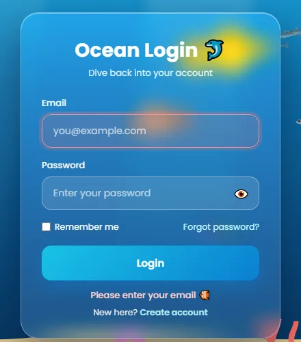
The “glass” is three ingredients:
- a white background at only 13% opacity,
- a thin semi-transparent white border,
backdrop-filter: blur(14px) saturate(140%), which blurs and slightly brightens whatever swims behind the card.
An inset shadow adds a highlight along the top edge, like light catching glass.
The wrapper uses min-height: 100dvh to fill the screen, but it can grow if the screen
is short, so the form is always reachable by scrolling. dvh is the dynamic
viewport height, which accounts for mobile browser toolbars. Fields with
aria-invalid="true" get a red tint.
2.7 Reduced motion
/* ========== REDUCED MOTION ========== */
@media (prefers-reduced-motion: reduce) {
  .fish .tail, .fish .pec, .dolphin .flukes, .weed, .cloud, .waves, .ray { animation: none !important; }
  .card.shake { animation: none; }
}
For people who turn off animations, CSS stops the fins, waves, clouds, seaweed and rays. JavaScript handles the rest, as you'll see below.
Step 3: The JavaScript
3.1 Helpers and the pointer
// ========== HELPERS ==========
const rand = (a, b) => a + Math.random() * (b - a);
const reduceMotion = matchMedia('(prefers-reduced-motion: reduce)').matches;
const splash = document.getElementById('splash');
const sctx = splash.getContext('2d');
let W = innerWidth, H = innerHeight, SURF = 0;   // screen size and the water line (px)

function measure() {
  W = innerWidth; H = innerHeight;
  SURF = document.getElementById('water').getBoundingClientRect().top;
  splash.width = W; splash.height = H;
}

// Fish flee from the mouse (or a finger)
const mouse = { x: -999, y: -999 };
addEventListener('mousemove', (e) => { mouse.x = e.clientX; mouse.y = e.clientY; });
addEventListener('touchmove', (e) => { mouse.x = e.touches[0].clientX; mouse.y = e.touches[0].clientY; }, { passive: true });
document.addEventListener('mouseleave', () => { mouse.x = mouse.y = -999; }); // cursor left the window
rand(a, b) returns a random number in a range. We'll use it everywhere to make each
fish a little different. measure() reads the screen size and where the water starts
(SURF), and resizes the canvas.
The pointer position is stored in mouse for both mouse and touch. When the cursor
leaves the window, it's moved far away (-999), so the fish calm down instead of
fleeing an invisible cursor forever.
3.2 Fish as data: species recipes
// ========== FISH SPECIES ==========
// Each species is a recipe of SVG paths: body, tail, fins, a side fin, an overlay pattern and the eye.
let uid = 0;
const SPECIES = {
  clown: {
    w: 120, h: 60,
    grad: ['#d9480f', '#ff8a1f', '#ffb15c'],
    body: 'M30,30 C38,10 70,6 96,16 C110,22 114,28 114,31 C113,36 108,42 96,46 C70,56 38,50 30,30 Z',
    tail: 'M33,30 C24,20 16,12 7,10 C12,20 12,40 7,50 C16,48 24,40 33,30 Z',
    fins: ['M48,14 C54,2 70,0 78,6 C84,2 92,6 94,15 Z', 'M58,47 C64,58 78,58 84,46 Z'],
    pec: 'M84,34 C80,42 74,46 68,48 C76,47 84,42 88,36 Z',
    finColor: '#ff7b16', finEdge: '#1b1b1b', tailColor: '#ff7b16',
    overlay: (id) => `<g clip-path="url(#c${id})">
      <path d="M84,6 C79,20 79,40 85,56 L95,56 C89,40 89,20 94,6 Z" fill="#fff" stroke="#111" stroke-width="2"/>
      <path d="M57,2 C64,20 64,40 57,58 L69,58 C76,40 76,20 69,2 Z" fill="#fff" stroke="#111" stroke-width="2"/>
      <path d="M31,16 L37,16 L37,44 L31,44 Z" fill="#fff" stroke="#111" stroke-width="1.6"/></g>`,
    eye: [100, 25, 4.2]
  },
  blueTang: {
    w: 120, h: 60,
    grad: ['#1238a8', '#2563eb', '#5f9dff'],
    body: 'M32,30 C36,8 66,2 92,12 C106,18 114,26 115,31 C114,36 106,44 92,48 C66,58 36,52 32,30 Z',
    tail: 'M34,30 C26,22 18,14 8,10 C14,22 14,38 8,50 C18,46 26,38 34,30 Z',
    fins: ['M40,17 C56,-2 92,0 106,18 L100,20 C86,9 58,9 42,21 Z', 'M44,43 C60,58 86,58 100,42 L94,41 C80,50 60,50 46,40 Z'],
    pec: 'M84,32 C80,40 74,44 68,46 C76,45 84,40 88,34 Z',
    finColor: '#1d3fb8', finEdge: '#071640', tailColor: '#ffd400',
    overlay: () => `<path d="M42,22 C58,11 84,11 100,21 C88,17 72,19 63,28 C57,34 50,41 38,41 C46,34 48,28 42,22 Z" fill="#0b0f24"/>
                    <path d="M40,30 C44,24 48,28 46,33 C44,36 41,35 40,30 Z" fill="#ffd400"/>`,
    eye: [101, 25, 4]
  },
  yellowTang: {
    w: 120, h: 70,
    grad: ['#f5b700', '#ffd60a', '#fff176'],
    body: 'M34,35 C38,8 68,0 94,18 C102,24 112,30 117,34 C112,38 104,44 96,50 C70,70 38,62 34,35 Z',
    tail: 'M36,35 C28,27 20,21 11,19 C15,29 15,41 11,51 C20,49 28,43 36,35 Z',
    fins: ['M42,24 C50,-4 84,-6 96,18 C80,10 60,12 44,28 Z', 'M42,46 C50,74 84,74 96,50 C80,58 60,58 44,42 Z'],
    pec: 'M86,38 C82,46 76,50 70,52 C78,51 86,46 90,40 Z',
    finColor: '#ffcf00', finEdge: '#d9a400', tailColor: '#ffcf00',
    overlay: () => `<path d="M38,35 L44,33 L44,37 Z" fill="#fff"/>`,
    eye: [100, 29, 4]
  },
  sardine: {
    w: 120, h: 60,
    grad: ['#2a6178', '#8fbccc', '#f3f8fb'],
    body: 'M24,30 C40,18 80,16 108,26 C112,28 114,30 112,32 C100,40 60,42 24,30 Z',
    tail: 'M27,30 L6,16 L13,30 L6,44 Z',
    fins: ['M60,19 L68,9 L75,19 Z', 'M70,38 L76,45 L82,38 Z'],
    pec: 'M88,31 C84,35 80,37 76,38 C82,37 88,35 91,32 Z',
    finColor: '#8fb3c2', finEdge: '#5c8697', tailColor: '#7fa6b6',
    overlay: () => `<path d="M30,29 C60,26 90,26 108,28" stroke="#1f4f66" stroke-width="1.4" fill="none" opacity=".6"/>
                    <circle cx="86" cy="25" r="1.6" fill="#1f4f66" opacity=".6"/><circle cx="78" cy="25" r="1.3" fill="#1f4f66" opacity=".5"/>`,
    eye: [102, 28, 3.4]
  }
};

// Build the SVG for one fish. Every fish gets unique ids so gradients and clip paths don't clash.
function fishSVG(type) {
  const s = SPECIES[type], id = uid++;
  const [ex, ey, er] = s.eye;
  return `<svg viewBox="0 0 ${s.w} ${s.h}" width="${s.w}" height="${s.h}">
    <defs>
      <linearGradient id="g${id}" x1="0" y1="0" x2="0" y2="1">
        <stop offset="0" stop-color="${s.grad[0]}"/><stop offset=".55" stop-color="${s.grad[1]}"/><stop offset="1" stop-color="${s.grad[2]}"/>
      </linearGradient>
      <pattern id="p${id}" width="5" height="5" patternUnits="userSpaceOnUse">
        <path d="M0,2.5 Q2.5,0 5,2.5" fill="none" stroke="#000" stroke-width=".45"/>
      </pattern>
      <clipPath id="c${id}"><path d="${s.body}"/></clipPath>
    </defs>
    <path class="tail" d="${s.tail}" fill="${s.tailColor}" stroke="${s.finEdge}" stroke-width="1" opacity=".95"/>
    ${s.fins.map((f) => `<path d="${f}" fill="${s.finColor}" stroke="${s.finEdge}" stroke-width="1" opacity=".9"/>`).join('')}
    <path d="${s.body}" fill="url(#g${id})"/>
    ${s.overlay(id)}
    <path d="${s.body}" fill="url(#p${id})" opacity=".14"/>
    <ellipse cx="${s.w * .62}" cy="${s.h * .33}" rx="${s.w * .2}" ry="${s.h * .07}" fill="#fff" opacity=".22" clip-path="url(#c${id})"/>
    <path d="M${ex - 10},${ey - 8} C${ex - 15},${ey} ${ex - 15},${ey + 10} ${ex - 9},${ey + 16}" stroke="rgba(0,0,0,.25)" stroke-width="1.3" fill="none"/>
    <path class="pec" d="${s.pec}" fill="${s.finColor}" stroke="${s.finEdge}" stroke-width=".8" opacity=".75"/>
    <circle cx="${ex}" cy="${ey}" r="${er + 1.2}" fill="#fff" opacity=".9"/>
    <circle cx="${ex}" cy="${ey}" r="${er}" fill="#111"/>
    <circle cx="${ex - er * .35}" cy="${ey - er * .35}" r="${er * .35}" fill="#fff"/>
  </svg>`;
}
Instead of drawing four fish by hand in the HTML, each species is a recipe: SVG
path data for the body, tail and fins, three gradient colours, an overlay function
for markings (the clownfish's white bands, the blue tang's black swoosh), and the eye
position.
fishSVG() turns a recipe into SVG markup. Each layer adds something:
- the tail and fins behind,
- the body filled with a linear gradient, darker on the back and pale on the belly, the way real fish are coloured,
- markings clipped to the body shape with a
clipPath, so the clownfish's stripes never spill over the edge, - a faint scale pattern of tiny arcs, and a white shine,
- a gill line, the side fin and a glossy eye.
Every fish gets a unique number (uid) added to its gradient and clip-path ids. SVG ids
are shared across the whole page, so without this, all fish would end up using the first fish's
gradient.
3.3 Making a fish with depth
// ========== MAKE A FISH ==========
const fishes = [];
function makeFish(type, opts = {}) {
  const el = document.createElement('div');
  el.className = 'fish';
  el.setAttribute('aria-hidden', 'true');
  el.innerHTML = fishSVG(type);
  document.body.appendChild(el);

  const depth = opts.depth ?? rand(0, 1);   // 0 = far away, 1 = close
  const f = {
    el, type, depth,
    scale: opts.scale ?? (0.42 + depth * 0.55),
    dir: opts.dir ?? (Math.random() < .5 ? 1 : -1),
    speed: opts.speed ?? rand(40, 80) * (0.6 + depth * 0.6),
    amp: rand(6, 18), freq: rand(.6, 1.3), phase: rand(0, 6.28),
    x: opts.x ?? rand(0, W), baseY: 0, offY: 0, boost: 1, y: 0, rot: 0,
    leader: opts.leader, ox: opts.ox || 0, oy: opts.oy || 0
  };
  f.baseY = opts.y ?? rand(SURF + 60, H * .85);

  // Depth of field: far fish are smaller, blurrier, paler, and swim behind the seaweed
  el.style.zIndex = depth > .55 ? 6 : 1;
  el.style.filter = `blur(${(1 - depth) * 1.4}px) saturate(${.65 + depth * .35}) brightness(${.75 + depth * .25})`;
  el.style.opacity = .6 + depth * .4;
  el.style.setProperty('--wag', (0.42 - depth * .12) + 's');   // near fish wag faster
  fishes.push(f);
  return f;
}
Each fish gets a random depth between 0 (far) and 1 (near), and almost everything
follows from it, a trick called atmospheric perspective:
- Size: far fish are smaller (
scale). - Speed: far fish move more slowly across the screen.
- Blur and colour: far fish are blurrier, less saturated and darker, as if seen through water.
- Layer: near fish go on the front layer, in front of the seaweed. Far fish go behind it.
Each fish also gets its own wobble (amp, freq, phase), so no
two swim in sync.
3.4 The dolphin's jump
// ========== DOLPHIN ==========
const dolphin = document.createElement('div');
dolphin.className = 'dolphin';
dolphin.setAttribute('aria-hidden', 'true');
dolphin.innerHTML = `
<svg viewBox="0 0 300 110" width="250" height="92" style="overflow:visible">
  <defs>
    <linearGradient id="dg" x1="0" y1="0" x2="0" y2="1">
      <stop offset="0" stop-color="#40586b"/><stop offset=".45" stop-color="#7b93a5"/>
      <stop offset=".72" stop-color="#bccbd6"/><stop offset="1" stop-color="#eef4f7"/>
    </linearGradient>
  </defs>
  <g class="flukes">
    <path d="M80,57 C62,57 46,59 30,60 L30,65 C46,66 62,68 80,67 Z" fill="#5d7487"/>
    <path d="M34,62 C24,47 14,39 2,37 C10,48 14,56 12,62 C14,68 10,76 2,87 C14,85 24,77 34,63 Z" fill="#4b6274"/>
  </g>
  <path d="M150,33 C160,14 170,6 184,2 C178,14 178,24 192,33 Z" fill="#4b6274"/>
  <path d="M72,60 C100,38 150,28 200,32 C228,34 248,42 262,50 C272,52 286,54 296,58 C298,60 296,63 290,64 C282,66 272,66 264,66 C250,76 220,84 182,84 C134,84 100,76 72,64 Z" fill="url(#dg)"/>
  <path d="M110,44 C150,34 200,32 240,42" stroke="#fff" stroke-opacity=".28" stroke-width="5" fill="none" stroke-linecap="round"/>
  <path d="M212,70 C208,84 198,94 186,100 C204,96 220,86 228,72 Z" fill="#5d7487"/>
  <ellipse cx="226" cy="37" rx="3" ry="1.6" fill="#2d3e4b"/>
  <path d="M292,63 C280,66 268,66 257,61" stroke="#2d3e4b" stroke-width="2" fill="none" stroke-linecap="round"/>
  <circle cx="246" cy="53" r="3.6" fill="#16232d"/><circle cx="245" cy="52" r="1.2" fill="#fff"/>
</svg>`;
document.body.appendChild(dolphin);

// u runs from 0 to 1 over one swim across the screen
const D = { u: 1, dir: 1, dur: 11, wait: 0, flips: 1, wasAir: false };
const DW = 250, DH = 92;

// Hermite curve: a smooth path between two heights that also matches the slope at each end
function hermite(p0, m0, p1, m1, t) {
  const t2 = t * t, t3 = t2 * t;
  return (2 * t3 - 3 * t2 + 1) * p0 + (t3 - 2 * t2 + t) * m0 + (-2 * t3 + 3 * t2) * p1 + (t3 - t2) * m1;
}
// Height of the dolphin at progress u: swim, dive up, leap (a parabola), splash down, swim on
function dolphinY(u) {
  const y0 = SURF + Math.min(160, (H - SURF) * .25);
  const jumpH = Math.min(SURF * .78, 200);
  const ua = .42, ub = .60, L = ub - ua;
  const s = 4 * jumpH / L;   // slope at the water exit/entry, so the curve joins the parabola smoothly
  if (u < .2)  return y0 + Math.sin(u * 30) * 6;
  if (u < ua)  { const k = ua - .2;  return hermite(y0, 0, SURF, -s * k, (u - .2) / k); }
  if (u < ub)  { const t = (u - ua) / L; return SURF - jumpH * 4 * t * (1 - t); }
  if (u < .72) { const k = .72 - ub; return hermite(SURF, s * k, y0 + 70, 0, (u - ub) / k); }
  if (u < .86) { const k = .14;      return hermite(y0 + 70, 0, y0, 0, (u - .72) / k); }
  return y0 + Math.sin(u * 30) * 6;
}
// Extra rotation in the air: a full somersault, eased in and out
function dolphinFlip(u) {
  const ua = .44, ub = .58;
  if (u < ua || u > ub) return 0;
  const t = (u - ua) / (ub - ua);
  const e = t < .5 ? 2 * t * t : 1 - Math.pow(-2 * t + 2, 2) / 2;
  return -360 * D.flips * e;
}
function startDolphin(fast) {
  if (reduceMotion) return;
  D.u = 0; D.wait = 0;
  D.dir = fast ? 1 : (Math.random() < .5 ? 1 : -1);
  D.dur = fast ? 7 : rand(9, 12);
  D.flips = Math.random() < .3 ? 2 : 1;   // sometimes a double flip
}
This is the cleverest part. The dolphin's trip across the screen is described by one number,
u, that goes from 0 to 1. dolphinY(u) works out its height in
stages:
- 0 to 0.2: cruise underwater with a gentle wave (
Math.sin). - 0.2 to 0.42: rise to the surface along a smooth Hermite curve.
- 0.42 to 0.6: the leap, a parabola (
4t(1 - t)), the same shape as anything thrown into the air. - 0.6 to 0.86: dive deep, then swim back up to cruising depth.
- 0.86 to 1: cruise away.
A Hermite curve joins two points and matches a chosen slope at each end. We pass in the
parabola's slope at the water line (s), so the rise flows into the leap without a
visible kink.
To point the dolphin the way it's moving, the code measures the height a tiny step ahead
(u + du) and uses Math.atan2 to turn that slope into an angle. During
the leap, dolphinFlip() adds a full 360-degree spin, sometimes two, with ease-in-out
timing, so it starts and finishes the somersault slowly.
3.5 Splash particles
// ========== SPLASHES ==========
const drops = [], ripples = [];
function doSplash(x, big) {
  const n = big ? 40 : 26;
  for (let i = 0; i < n; i++) {
    drops.push({ x: x + rand(-25, 25), y: SURF, vx: rand(-160, 160), vy: rand(-380, -140) * (big ? 1.15 : 1), r: rand(2, 5), life: 1 });
  }
  ripples.push({ x, r: 10, a: .8 }, { x, r: 2, a: .6 });
}
function drawSplash(dt) {
  sctx.clearRect(0, 0, W, H);
  for (let i = drops.length - 1; i >= 0; i--) {
    const d = drops[i];
    d.vy += 900 * dt;   // gravity
    d.x += d.vx * dt; d.y += d.vy * dt; d.life -= dt * .9;
    if (d.y > SURF + 6 || d.life <= 0) { drops.splice(i, 1); continue; }
    sctx.beginPath();
    sctx.fillStyle = `rgba(225,248,255,${Math.max(d.life, 0)})`;
    sctx.ellipse(d.x, d.y, d.r * .8, d.r, Math.atan2(d.vy, d.vx), 0, Math.PI * 2);
    sctx.fill();
  }
  for (let i = ripples.length - 1; i >= 0; i--) {
    const r = ripples[i];
    r.r += 90 * dt; r.a -= dt * .6;
    if (r.a <= 0) { ripples.splice(i, 1); continue; }
    sctx.beginPath();
    sctx.strokeStyle = `rgba(255,255,255,${r.a})`;
    sctx.lineWidth = 2;
    sctx.ellipse(r.x, SURF + 2, r.r, r.r * .18, 0, 0, Math.PI * 2);
    sctx.stroke();
  }
}
When the dolphin leaves or re-enters the water, doSplash() creates 26 to 40 droplets
shooting upwards with random speeds, plus two expanding ripple rings. Each frame,
drawSplash() moves them with simple physics:
- Gravity adds downward speed:
vy += 900 * dt. - Position follows speed:
x += vx * dt. - Life fades from 1 to 0, and it's used as the opacity.
Droplets that fall back below the surface or fade out are removed. Each droplet is drawn as an
ellipse stretched along its direction of travel, so fast drops look like streaks. The loops run
backwards through the arrays, so removing an item with splice doesn't skip
the next one.
3.6 Bubbles
// ========== BUBBLES ==========
function bubble(x, y, size) {
  if (reduceMotion) return;
  const b = document.createElement('div');
  b.className = 'bubble';
  b.setAttribute('aria-hidden', 'true');
  const s = size ?? rand(6, 18);
  b.style.width = b.style.height = s + 'px';
  b.style.left = x + 'px';
  if (y != null) { b.style.bottom = 'auto'; b.style.top = y + 'px'; }
  const dur = rand(6, 11);
  b.style.animationDuration = dur + 's';
  document.body.appendChild(b);
  setTimeout(() => b.remove(), dur * 1000);   // remove it once it has risen
}
if (!reduceMotion) {
  setInterval(() => bubble(rand(0, W)), 700);
  setInterval(() => {   // every few seconds, a little trail of four bubbles
    const x = rand(.05, .95) * W;
    for (let i = 0; i < 4; i++) setTimeout(() => bubble(x + rand(-6, 6), null, rand(4, 9)), i * 160);
  }, 3200);
}
Bubbles are regular <div>s animated by the CSS rise keyframes.
JavaScript only creates one with a random size, position and duration, then removes it when the
animation is done. One bubble appears every 0.7 seconds, plus a trail of four every 3.2 seconds.
With reduced motion, no bubbles are created.
3.7 The main loop
// ========== MAIN LOOP ==========
let last = performance.now(), T = 0;
function tick(now) {
  const dt = Math.min((now - last) / 1000, .05);   // seconds since last frame, capped
  last = now; T += dt;

  // ---- fish ----
  for (const f of fishes) {
    const L = f.leader;
    if (L) {
      // a school member keeps its offset from the leader
      f.dir = L.dir; f.boost = L.boost;
      f.x = L.x + f.ox * L.dir * -1 + Math.sin(T * 2 + f.phase) * 4;
      f.baseY = L.y + f.oy;
    } else {
      // flee: speed up and swerve away when the pointer is close
      const dx = f.x - mouse.x, dy = f.y - mouse.y, dist = Math.hypot(dx, dy);
      if (dist < 160) {
        f.boost = Math.min(f.boost + dt * 8, 3.5);
        f.offY += (dy / (dist || 1)) * 220 * dt;
        if (Math.sign(dx) !== f.dir && dist < 110) f.dir = Math.sign(dx) || 1;
      } else f.boost += (1 - f.boost) * dt * 1.5;
      f.offY *= (1 - dt * .4);
      f.x += f.dir * f.speed * f.boost * dt;
      const margin = 160 * f.scale;
      if (f.x > W + margin || f.x < -margin) {   // swam off screen: come back from a random side
        f.dir = Math.random() < .5 ? 1 : -1;
        f.x = f.dir === 1 ? -margin + 10 : W + margin - 10;
        f.baseY = rand(SURF + 60, H * .85); f.offY = 0;
      }
    }
    const prevY = f.y;
    f.y = f.baseY + f.offY + Math.sin(T * f.freq * (L ? 1.4 : 1) + f.phase) * f.amp;
    f.y = Math.max(SURF + 30, Math.min(H - 70, f.y));
    const vy = (f.y - prevY) / (dt || 1);
    f.rot += (Math.atan2(vy, f.speed * f.boost) * 57.3 * .6 - f.rot) * .1;   // tilt nose up/down
    f.el.style.transform = `translate(${f.x - 60}px, ${f.y - 30}px) scale(${f.dir * f.scale}, ${f.scale}) rotate(${f.rot}deg)`;
  }

  // ---- dolphin ----
  if (D.u >= 1) {
    D.wait += dt;
    if (D.wait > 2.5) startDolphin();
    dolphin.style.opacity = 0;
  } else {
    dolphin.style.opacity = 1;
    D.u += dt / D.dur;
    const u = Math.min(D.u, 1), du = .002;
    const span = W + 2 * DW;
    const xAt = (v) => (D.dir === 1 ? -DW + v * span : W + DW - v * span);
    const x = xAt(u), y = dolphinY(u);
    const y2 = dolphinY(Math.min(u + du, 1));
    const ang = Math.atan2(y2 - y, span * du) * 57.3 + dolphinFlip(u);   // face the direction of travel
    dolphin.style.transform = `translate(${x - DW / 2}px, ${y - DH / 2}px) scale(${D.dir}, 1) rotate(${ang}deg)`;
    const inAir = y < SURF - 8;
    if (inAir !== D.wasAir) doSplash(x, !inAir);   // splash on leaving and re-entering the water
    D.wasAir = inAir;
  }

  drawSplash(dt);
  if (!reduceMotion) requestAnimationFrame(tick);
}
tick() runs once per screen refresh through requestAnimationFrame, the
same way games work. The most important line is the first one: dt,
the time since the last frame in seconds. Every movement is multiplied by dt, so the
fish swim at the same speed on a 60Hz laptop and a 120Hz phone. It's capped at 0.05, so switching
back to the tab after a while doesn't make everything teleport.
For each fish:
- Schooling: a sardine with a
leadersimply stays at its offset from the leader, plus a tiny wobble. Thirteen fish move as one group, but never perfectly in line. - Fleeing: other fish check their distance to the pointer with
Math.hypot. Within 160px they speed up (up to 3.5 times), get pushed away vertically, and turn around if the pointer is ahead of them. Outside that range,boosteases back to 1. - Wrapping: a fish that leaves the screen comes back from a random side at a random height, so the aquarium never empties.
- Tilt: the fish points its nose up or down based on its vertical speed.
Finally, one CSS transform places it. scale(dir * scale, scale) flips the
fish horizontally when it swims left, since a negative scale mirrors it. The dolphin works the
same way, and when it crosses the water line in either direction, it triggers a splash.
3.8 Filling the aquarium
// ========== BUILD THE AQUARIUM ==========
function populate() {
  measure();
  const big = W > 700;   // fewer fish on small screens
  const plan = [
    ['clown', 1], ['clown', 1], ['blueTang', 1], ['blueTang', 0], ['yellowTang', 1], ['yellowTang', 0],
    ...(big ? [['clown', 0], ['blueTang', 1], ['yellowTang', 1]] : [])
  ];
  plan.forEach(([t, near]) => makeFish(t, { depth: near ? rand(.6, 1) : rand(0, .45) }));

  // small schools of silver sardines following a leader
  for (let s = 0; s < (big ? 2 : 1); s++) {
    const depth = s === 0 ? .35 : .7;
    const leader = makeFish('sardine', { depth, scale: .38 + depth * .2, speed: rand(70, 95), y: rand(SURF + 80, H * .7) });
    leader.amp = 10;
    const n = big ? 12 : 8;
    for (let i = 0; i < n; i++) {
      makeFish('sardine', { depth, scale: .34 + depth * .2 + rand(-.03, .03), leader, ox: rand(20, 160), oy: rand(-45, 45), x: leader.x });
    }
  }

  if (reduceMotion) { dolphin.style.opacity = 0; last = performance.now(); tick(last); return; }   // one still frame
  startDolphin();
  D.u = .05;
  requestAnimationFrame((t) => { last = t; requestAnimationFrame(tick); });
}
addEventListener('resize', measure);
document.fonts.ready.then(populate);
populate() creates six or nine tropical fish (fewer on small screens, which helps
performance on phones), a mix of near and far. Then it adds one or two schools of sardines, each
a leader plus 8 to 12 followers.
It waits for document.fonts.ready, so measurements are taken after the page layout
settles. With reduced motion, it draws a single still frame and never starts the loop, so the
fish are visible but motionless.
3.9 The form
// ========== FORM ==========
const form = document.getElementById('form');
const email = document.getElementById('email');
const pass = document.getElementById('password');
const toggle = document.getElementById('toggle');
const msg = document.getElementById('msg');
const EMAIL = /^[^\s@]+@[^\s@]+\.[^\s@]{2,}$/;

toggle.addEventListener('click', () => {
  const show = pass.type === 'password';
  pass.type = show ? 'text' : 'password';
  toggle.textContent = show ? '🙈' : '👁️';
  toggle.setAttribute('aria-label', show ? 'Hide password' : 'Show password');
  toggle.setAttribute('aria-pressed', String(show));
  pass.focus();
});

// Little bubbles rise out of the field you're typing in
form.addEventListener('input', (e) => {
  if (e.target !== email && e.target !== pass) return;
  e.target.removeAttribute('aria-invalid');
  const r = e.target.getBoundingClientRect();
  bubble(r.left + rand(20, r.width - 30), r.top - 4, rand(4, 8));
});

function fail(text, input) {
  msg.style.color = '#ffd1d1';
  msg.textContent = text;
  input.setAttribute('aria-invalid', 'true');
  form.classList.remove('shake');
  void form.offsetWidth;   // restart the shake animation
  form.classList.add('shake');
}

form.addEventListener('submit', (e) => {
  e.preventDefault();
  email.removeAttribute('aria-invalid');
  pass.removeAttribute('aria-invalid');
  if (!email.value.trim()) return fail('Please enter your email 🐠', email);
  if (!EMAIL.test(email.value.trim())) return fail('That email looks a bit fishy 🐠', email);
  if (!pass.value.trim()) return fail('Please enter your password 🐠', pass);

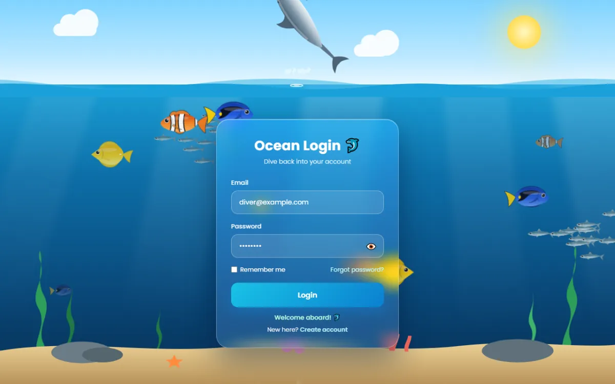
  msg.style.color = '#b9ffe0';
  msg.textContent = 'Welcome aboard! 🐬';
  for (let i = 0; i < 18; i++) setTimeout(() => bubble(rand(.2, .8) * W, null, rand(6, 16)), i * 60);
  startDolphin(true);   // the dolphin celebrates with a jump
  // In a real app, send the form to your server here.
});
- Show/hide password switches the input type, swaps the emoji, and updates
aria-labelandaria-pressed. - Typing bubbles: one listener on the whole form catches
inputevents from both fields (event delegation) and releases a small bubble from the top of the field. fail()shows the message, marks the field witharia-invalid, and restarts the shake animation using theoffsetWidthreflow trick.- On success, 18 bubbles burst upwards and
startDolphin(true)sends the dolphin on a quick celebratory jump.
Test it yourself
- Move your mouse near a clownfish. It speeds away.
- Wait for the dolphin to leap, and watch the splash and ripples.
- Type in the email field. Little bubbles rise from it.
- Submit with empty fields, then with
nemo@reef. The card shakes and the field turns red. - Log in with a valid email and any password. The dolphin jumps.
- Turn on “Reduce motion” in your system settings and reload. The scene becomes a still picture.
Performance tips
- Transforms only: fish move with
transform, which the browser can animate on the graphics card without recalculating the layout.will-change: transformhints at this ahead of time. - Fewer fish on phones:
populate()already reduces the count below 700px. You can lower it further. - Blur is expensive: if older devices struggle, remove the
blur()from far fish first, or thebackdrop-filteron the card.
Using it on a real site
The form only checks the fields in the browser. Send the details to your server over HTTPS and
check them there, then show the success state only if the server agrees. Reuse
fail() to show server errors such as “Wrong email or password”.
Share your aquarium
Added a shark or an octopus? Share a screenshot as a link with sshot.online, or share your code with the free code sharing tool. No account needed.
Conclusion
This project packs a lot of real animation programming into three files:
- a frame-rate independent loop driven by
dt - data-driven SVG characters
- depth faked with size, blur and layers
- simple flocking and fleeing
- a jump built from curves that join smoothly
- particles with gravity
The same ideas power browser games and interactive ads, so try adding your own species to
SPECIES. It's the easiest place to start.
Frequently asked questions
Does the ocean login page use any images or libraries?
No. The fish, dolphin, waves, seaweed and seabed are SVG and CSS, and the animation is plain
JavaScript with requestAnimationFrame. Only an optional Google Font is
loaded.
How do the fish run away from the mouse?
Every frame, each fish measures its distance to the pointer. Within 160 pixels it speeds up, is pushed away vertically and turns around if needed. Further away, its speed eases back to normal.
How is the dolphin jump calculated?
Its height is a function of progress from 0 to 1, built in stages: a gentle swim, a Hermite curve up to the surface, a parabola for the leap, then curves back down. The angle comes from the slope of that path, plus a somersault during the leap.
How do I make the waves loop without a jump?
Make the wave strip twice the screen width with a pattern that repeats halfway, then animate
it from translateX(0) to translateX(-50%). The last frame matches
the first, so the loop is seamless.
Will it slow down phones?
It uses fewer fish on small screens and moves everything with transforms. If a device struggles, remove the blur filter on distant fish or the backdrop blur on the form. With reduced motion turned on, nothing animates at all.
Related articles

How to Build a Cyberpunk Login Page with HTML, CSS and JavaScript
A full tutorial for a neon login page with sign in, sign up and recovery views: glitch text, a spinning neon border, particles, validation and a loading screen.
Read More →
How to Build an Animated Wind Login Page with a Bird Mascot, Lockout and 2FA Code
A full tutorial for a breezy login flow: letters that fly in as leaves, a windsock strength meter, a storm lockout after three tries and a six-digit code step.
Read More →
How to Build an Animated Panda Login Page with HTML, CSS and JavaScript
A step-by-step tutorial: build a login form where a CSS panda follows your typing, covers its eyes for the password, peeks, and reacts. Full code and live demo.
Read More →