How to Build a Cyberpunk Login Page with HTML, CSS and JavaScript
Published November 4, 2026 · 18 min read
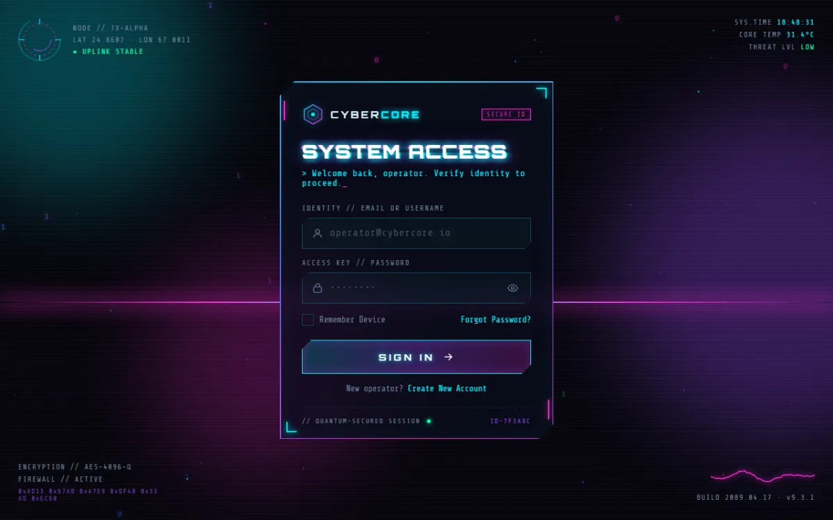
In this tutorial we'll build a login screen that looks like it belongs in a sci-fi movie: neon colours, a glowing border that spins around the panel, glitching headings, floating particles, a moving grid floor and a heads-up display (HUD) in the corners.
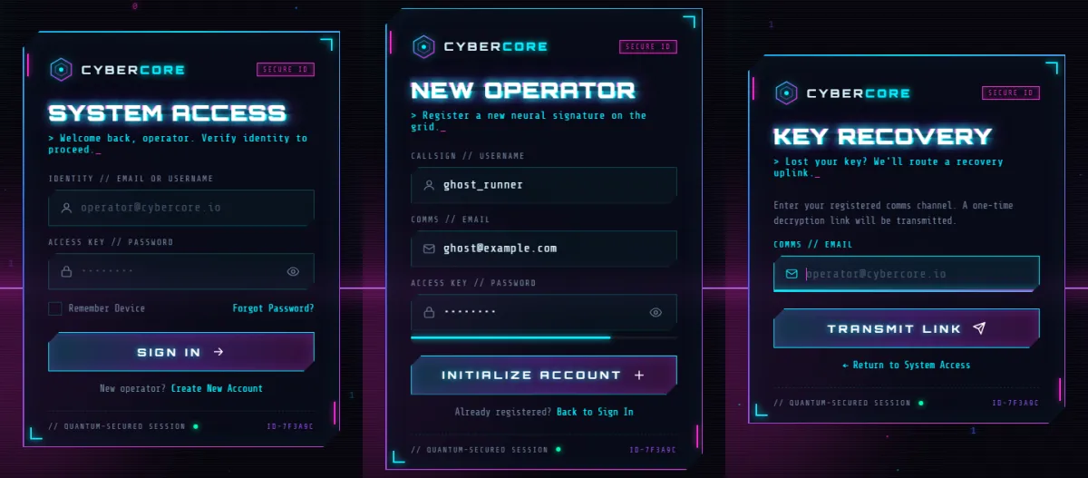
It's not just decoration. The panel has three working views (Sign In, Create Account and Forgot Password), real form validation with error messages, a password strength meter, a loading screen and a success screen. Everything is built with plain HTML, CSS and JavaScript, in three files, with no libraries.
This project is bigger than a basic login form, so take it one step at a time. If you're newer to CSS animation, try our smaller animated panda login page first. It uses the same “JavaScript adds a class, CSS animates” idea.
What we're building
- Animated background: blurred glowing orbs, a 3D grid floor that scrolls towards you, a neon horizon line, scanlines, a sweeping light beam and an occasional screen glitch.
- Particles: tiny squares and floating
0s and1s, drawn on a<canvas>. - HUD corners: spinning rings, a live clock, a changing hex stream, an equaliser and a wavy signal line.
- The panel: cut corners, a frosted-glass background and a neon border that rotates through cyan, purple and magenta.
- Glitch heading that splits into coloured slices, plus a typewriter message under it.
- Three views that switch with a sliding, glitchy transition.
- Validation: red fields that shake, clear error messages, and a pop-up message (a “toast”) at the bottom.
- A loading screen with spinning rings, a progress bar and changing status messages, then a success screen where a checkmark draws itself.
- Accessible: works with the keyboard and screen readers, works with password managers, and calms down for people who turn off animations.
Project setup
cybercore-login/
├── index.html   ← structure (views, overlays, HUD)
├── style.css    ← neon look and every animation
└── script.js    ← views, validation, loader, particles
Create the folder and the three empty files, then open index.html in your browser.
Every code block below follows the files from top to bottom, so if you paste them in order you end
up with the complete files. Each block has a Copy button.
Step 1: The HTML (index.html)
1.1 The head and the background layers
<!DOCTYPE html>
<html lang="en">
<head>
  <meta charset="UTF-8" />
  <meta name="viewport" content="width=device-width, initial-scale=1.0" />
  <title>CYBERCORE // System Access</title>
  <link rel="preconnect" href="https://fonts.googleapis.com" />
  <link rel="preconnect" href="https://fonts.gstatic.com" crossorigin />
  <link href="https://fonts.googleapis.com/css2?family=Orbitron:wght@500;700;900&family=Share+Tech+Mono&display=swap" rel="stylesheet" />
  <link rel="stylesheet" href="style.css" />
</head>
<body>
  <!-- ================= BACKGROUND LAYERS ================= -->
  <div class="bg" aria-hidden="true">
    <div class="orb orb--cyan"></div>
    <div class="orb orb--purple"></div>
    <div class="orb orb--magenta"></div>
    <div class="horizon"></div>
    <div class="grid-floor"><div class="grid-plane"></div></div>
    <canvas id="particles"></canvas>
    <div class="scanlines"></div>
    <div class="scan-beam"></div>
    <div class="noise-glitch"></div>
  </div>
We load two fonts from Google Fonts: Orbitron for the big futuristic headings
and Share Tech Mono, a computer-terminal font, for everything else. The
preconnect links let the browser start connecting to the font servers early, so the
fonts show up sooner.
The background is a stack of empty <div>s. Each one becomes one visual effect
in the CSS: three coloured orbs, the horizon line, the grid floor, a <canvas>
for particles, scanlines, a light beam and a glitch layer. Splitting effects into separate layers
keeps each one simple. aria-hidden="true" hides all of it from screen readers,
because it's pure decoration.
1.2 The HUD corners
  <!-- ================= HUD ================= -->
  <div class="hud" aria-hidden="true">
    <div class="hud__corner hud__corner--tl">
      <svg viewBox="0 0 120 120" class="hud-ring">
        <circle cx="60" cy="60" r="52" class="ring ring--outer" />
        <circle cx="60" cy="60" r="40" class="ring ring--dash" />
        <circle cx="60" cy="60" r="28" class="ring ring--inner" />
        <path d="M60 8 V22 M60 98 V112 M8 60 H22 M98 60 H112" class="ring-ticks" />
      </svg>
      <div class="hud__text">
        <span>NODE // 7X-ALPHA</span>
        <span>LAT 24.8607 · LON 67.0011</span>
        <span class="blink">● UPLINK STABLE</span>
      </div>
    </div>

    <div class="hud__corner hud__corner--tr">
      <span>SYS.TIME <b id="clock">00:00:00</b></span>
      <span>CORE TEMP <b>31.4°C</b></span>
      <span>THREAT LVL <b class="ok">LOW</b></span>
      <div class="bars"><i></i><i></i><i></i><i></i><i></i><i></i><i></i></div>
    </div>

    <div class="hud__corner hud__corner--bl">
      <span>ENCRYPTION // AES-4096-Q</span>
      <span>FIREWALL // ACTIVE</span>
      <div class="hex-stream" id="hexStream">0x00</div>
    </div>

    <div class="hud__corner hud__corner--br">
      <svg viewBox="0 0 160 40" class="wave">
        <polyline id="waveLine" points="" />
      </svg>
      <span>BUILD 2089.04.17 · v9.3.1</span>
    </div>
  </div>
Four corner blocks of sci-fi readouts. The ring is an inline SVG with three
circles that CSS will spin at different speeds. Elements with an id
(clock, hexStream, waveLine) get updated by JavaScript. The
seven empty <i> tags become equaliser bars.
All this text is made-up flavour. “AES-4096-Q” isn't a real encryption standard, and nothing here actually protects anything. It just sets the mood.
1.3 The panel, brand and heading
  <!-- ================= AUTH PANEL ================= -->
  <main class="stage">
    <section class="panel" id="panel">
      <span class="panel__border"></span>
      <span class="panel__corner c1"></span><span class="panel__corner c2"></span>
      <span class="panel__corner c3"></span><span class="panel__corner c4"></span>

      <header class="brand">
        <svg class="brand__logo" viewBox="0 0 48 48" aria-hidden="true">
          <defs>
            <linearGradient id="lg" x1="0" y1="0" x2="1" y2="1">
              <stop offset="0" stop-color="#00f0ff" />
              <stop offset=".5" stop-color="#9d4dff" />
              <stop offset="1" stop-color="#ff2bd6" />
            </linearGradient>
          </defs>
          <polygon points="24,3 43,14 43,34 24,45 5,34 5,14" fill="none" stroke="url(#lg)" stroke-width="2" />
          <polygon points="24,12 35,18.5 35,29.5 24,36 13,29.5 13,18.5" fill="none" stroke="url(#lg)" stroke-width="1.5" opacity=".6" />
          <circle cx="24" cy="24" r="4" fill="#00f0ff" />
        </svg>
        <span class="brand__name">CYBER<b>CORE</b></span>
        <span class="brand__tag">SECURE ID</span>
      </header>

      <h1 class="glitch" id="viewTitle" data-text="SYSTEM ACCESS">SYSTEM ACCESS</h1>
      <p class="typed"><span id="typed"></span><span class="caret">_</span></p>
The empty <span>s at the top of the panel are decoration: one for the spinning
neon border and four for the glowing corner marks. The logo is two hexagons and a dot drawn in
SVG, coloured with a linearGradient from cyan through purple to magenta.
Look at the heading: data-text="SYSTEM ACCESS" repeats the visible text. The CSS
glitch effect reads that attribute to draw two coloured copies of the heading. The
<span id="typed"> below it starts empty. JavaScript types a message into it one
letter at a time.
1.4 The three forms
      <!-- ===== Views ===== -->
      <div class="views" id="views">

        <!-- LOGIN -->
        <form class="view is-active" id="loginForm" data-view="login" data-title="SYSTEM ACCESS" novalidate>
          <div class="field">
            <label for="loginId">IDENTITY // EMAIL OR USERNAME</label>
            <div class="input">
              <svg viewBox="0 0 24 24"><path d="M12 12a4 4 0 1 0 0-8 4 4 0 0 0 0 8Zm-8 8c0-3.3 3.6-6 8-6s8 2.7 8 6" /></svg>
              <input id="loginId" name="id" type="text" placeholder="operator@cybercore.io" autocomplete="username" />
            </div>
            <small class="error"></small>
          </div>

          <div class="field">
            <label for="loginPass">ACCESS KEY // PASSWORD</label>
            <div class="input">
              <svg viewBox="0 0 24 24"><rect x="4" y="10" width="16" height="11" rx="2" /><path d="M8 10V7a4 4 0 0 1 8 0v3" /></svg>
              <input id="loginPass" name="password" type="password" placeholder="••••••••" autocomplete="current-password" />
              <button type="button" class="eye" aria-label="Show password" aria-pressed="false">
                <svg class="eye-open" viewBox="0 0 24 24"><path d="M2 12s3.6-7 10-7 10 7 10 7-3.6 7-10 7S2 12 2 12Z" /><circle cx="12" cy="12" r="3" /></svg>
                <svg class="eye-closed" viewBox="0 0 24 24"><path d="M3 3l18 18M10.6 5.1A10 10 0 0 1 12 5c6.4 0 10 7 10 7a17 17 0 0 1-3.2 4M6.6 6.6A17 17 0 0 0 2 12s3.6 7 10 7a9.6 9.6 0 0 0 5.4-1.6" /></svg>
              </button>
            </div>
            <small class="error"></small>
          </div>

          <div class="row">
            <label class="check">
              <input type="checkbox" id="remember" />
              <span class="check__box"><svg viewBox="0 0 24 24"><path d="M5 12l5 5 9-10" /></svg></span>
              Remember Device
            </label>
            <a href="#" class="link" data-goto="recover">Forgot Password?</a>
          </div>

          <button type="submit" class="btn">
            <span class="btn__label">SIGN IN</span>
            <svg class="btn__icon" viewBox="0 0 24 24"><path d="M5 12h14M13 6l6 6-6 6" /></svg>
          </button>

          <p class="switch">New operator? <a href="#" class="link" data-goto="signup">Create New Account</a></p>
        </form>
Each view is its own <form> with a data-view name and a
data-title that the heading switches to. Only the form with
class="is-active" is visible.
Each field follows the same pattern, which keeps the CSS and JavaScript simple:
.field
├── label
├── .input  (icon + input + optional eye button)
└── small.error  (empty until there's a problem)
Other things to notice:
- Links that switch views carry
data-goto="signup"ordata-goto="recover". One JavaScript listener handles all of them. - The custom checkbox keeps a real
<input type="checkbox">(hidden with CSS) inside the label. That way clicking, the keyboard and screen readers all still work, and the.check__boxspan is only the look. autocomplete="username"and"current-password"tell password managers what to fill in.novalidateturns off the browser's own error bubbles, because we show our own styled errors.
        <!-- SIGNUP -->
        <form class="view" id="signupForm" data-view="signup" data-title="NEW OPERATOR" novalidate>
          <div class="field">
            <label for="suName">CALLSIGN // USERNAME</label>
            <div class="input">
              <svg viewBox="0 0 24 24"><path d="M12 12a4 4 0 1 0 0-8 4 4 0 0 0 0 8Zm-8 8c0-3.3 3.6-6 8-6s8 2.7 8 6" /></svg>
              <input id="suName" name="username" type="text" placeholder="ghost_runner" autocomplete="username" />
            </div>
            <small class="error"></small>
          </div>
          <div class="field">
            <label for="suEmail">COMMS // EMAIL</label>
            <div class="input">
              <svg viewBox="0 0 24 24"><rect x="3" y="5" width="18" height="14" rx="2" /><path d="M3 7l9 6 9-6" /></svg>
              <input id="suEmail" name="email" type="email" placeholder="operator@cybercore.io" autocomplete="email" />
            </div>
            <small class="error"></small>
          </div>
          <div class="field">
            <label for="suPass">ACCESS KEY // PASSWORD</label>
            <div class="input">
              <svg viewBox="0 0 24 24"><rect x="4" y="10" width="16" height="11" rx="2" /><path d="M8 10V7a4 4 0 0 1 8 0v3" /></svg>
              <input id="suPass" name="new-password" type="password" placeholder="min 8 chars, 1 number" autocomplete="new-password" />
              <button type="button" class="eye" aria-label="Show password" aria-pressed="false">
                <svg class="eye-open" viewBox="0 0 24 24"><path d="M2 12s3.6-7 10-7 10 7 10 7-3.6 7-10 7S2 12 2 12Z" /><circle cx="12" cy="12" r="3" /></svg>
                <svg class="eye-closed" viewBox="0 0 24 24"><path d="M3 3l18 18M10.6 5.1A10 10 0 0 1 12 5c6.4 0 10 7 10 7a17 17 0 0 1-3.2 4M6.6 6.6A17 17 0 0 0 2 12s3.6 7 10 7a9.6 9.6 0 0 0 5.4-1.6" /></svg>
              </button>
            </div>
            <div class="strength"><i></i></div>
            <small class="error"></small>
          </div>
          <button type="submit" class="btn">
            <span class="btn__label">INITIALIZE ACCOUNT</span>
            <svg class="btn__icon" viewBox="0 0 24 24"><path d="M12 5v14M5 12h14" /></svg>
          </button>
          <p class="switch">Already registered? <a href="#" class="link" data-goto="login">Back to Sign In</a></p>
        </form>
The sign-up form uses autocomplete="new-password". This tells password managers to
offer to generate a strong password instead of filling in an old one. The empty
.strength bar under the password becomes the strength meter.
        <!-- RECOVER -->
        <form class="view" id="recoverForm" data-view="recover" data-title="KEY RECOVERY" novalidate>
          <p class="hint">Enter your registered comms channel. A one-time decryption link will be transmitted.</p>
          <div class="field">
            <label for="recEmail">COMMS // EMAIL</label>
            <div class="input">
              <svg viewBox="0 0 24 24"><rect x="3" y="5" width="18" height="14" rx="2" /><path d="M3 7l9 6 9-6" /></svg>
              <input id="recEmail" name="email" type="email" placeholder="operator@cybercore.io" autocomplete="email" />
            </div>
            <small class="error"></small>
          </div>
          <button type="submit" class="btn">
            <span class="btn__label">TRANSMIT LINK</span>
            <svg class="btn__icon" viewBox="0 0 24 24"><path d="M22 2L11 13M22 2l-7 20-4-9-9-4 20-7Z" /></svg>
          </button>
          <p class="switch"><a href="#" class="link" data-goto="login">← Return to System Access</a></p>
        </form>
      </div>
The recovery view is the simplest: one email field. Notice the closing
</div> at the end. It closes #views, the wrapper around all
three forms.
1.5 The loading screen, success screen and toast
      <!-- LOADING OVERLAY -->
      <div class="loader" id="loader">
        <svg class="loader__ring" viewBox="0 0 100 100">
          <circle cx="50" cy="50" r="44" class="lr lr--a" />
          <circle cx="50" cy="50" r="34" class="lr lr--b" />
        </svg>
        <p class="loader__msg" id="loaderMsg">AUTHENTICATING</p>
        <div class="progress"><i id="progressBar"></i></div>
        <p class="loader__pct" id="loaderPct">0%</p>
      </div>

      <!-- SUCCESS OVERLAY -->
      <div class="granted" id="granted">
        <svg class="granted__icon" viewBox="0 0 120 120">
          <circle cx="60" cy="60" r="52" class="g-ring" />
          <path d="M38 62l15 15 30-34" class="g-check" />
        </svg>
        <h2 class="glitch glitch--ok" id="grantedTitle" data-text="ACCESS GRANTED">ACCESS GRANTED</h2>
        <p class="granted__sub" id="grantedSub">Welcome back, operator.</p>
        <button type="button" class="btn btn--ghost" id="resetBtn"><span class="btn__label">LOG OUT</span></button>
      </div>

      <footer class="panel__foot">
        <span>// QUANTUM-SECURED SESSION</span>
        <span class="dot"></span>
        <span>ID-7F3A9C</span>
      </footer>
    </section>
  </main>

  <div class="toast" id="toast" role="status" aria-live="polite"></div>

  <script src="script.js"></script>
</body>
</html>
The two overlays sit inside the panel, on top of the forms, and start hidden. The loader has two SVG circles that will spin in opposite directions and a progress bar. The success screen has a circle and a checkmark path that CSS will “draw” on.
The toast has role="status" and aria-live="polite", so screen readers
read out messages like “ACCESS DENIED” the moment they appear. The script tag comes
last, so every element exists before the JavaScript runs.
Step 2: The CSS (style.css)
2.1 Colours and page basics
/* =========================================================
   CYBERCORE // 2089 Authentication Interface
   ========================================================= */
:root {
  --bg: #05050b;
  --cyan: #00f0ff;
  --purple: #9d4dff;
  --magenta: #ff2bd6;
  --blue: #2f6bff;
  --red: #ff3b5c;
  --green: #00ffa3;
  --text: #d8f6ff;
  --muted: #6f86a3;
  --panel: rgba(10, 12, 28, 0.72);
  --line: rgba(0, 240, 255, 0.25);
  --display: "Orbitron", "Segoe UI", sans-serif;
  --mono: "Share Tech Mono", "Consolas", monospace;
}

*,
*::before,
*::after { box-sizing: border-box; margin: 0; padding: 0; }

html, body { min-height: 100%; }

body {
  background: var(--bg);
  color: var(--text);
  font-family: var(--mono);
  overflow-x: hidden; /* no sideways scroll, but short screens can still scroll down */
  -webkit-font-smoothing: antialiased;
}
All the neon colours live in CSS variables, so you can change the whole theme from one place.
Try swapping --cyan for an orange to see the entire page change.
--panel uses rgba with 72% opacity, so the background glows through the
panel.
overflow-x: hidden stops the blurred orbs from causing a sideways scrollbar, while
still letting the page scroll down on short phone screens.
2.2 The animated background
/* ================= BACKGROUND ================= */
.bg { position: fixed; inset: 0; overflow: hidden; z-index: 0; }

.orb {
  position: absolute;
  border-radius: 50%;
  filter: blur(70px);
  opacity: 0.45;
  animation: float 14s ease-in-out infinite alternate;
}
.orb--cyan    { width: 420px; height: 420px; background: var(--cyan);    top: -120px; left: -100px; opacity: .25; }
.orb--purple  { width: 520px; height: 520px; background: var(--purple);  top: 20%;    right: -180px; animation-delay: -5s; opacity: .3; }
.orb--magenta { width: 360px; height: 360px; background: var(--magenta); bottom: 8%;  left: 18%; animation-delay: -9s; opacity: .22; }

@keyframes float {
  0%   { transform: translate(0, 0) scale(1); }
  100% { transform: translate(60px, -40px) scale(1.15); }
}

.horizon {
  position: absolute;
  left: 0; right: 0; top: 58%;
  height: 2px;
  background: linear-gradient(90deg, transparent, var(--magenta), var(--cyan), var(--magenta), transparent);
  box-shadow: 0 0 30px 6px rgba(255, 43, 214, 0.45);
}

.grid-floor {
  position: absolute;
  left: -50%; right: -50%; top: 58%; bottom: -10%;
  perspective: 320px;
  overflow: hidden;
  -webkit-mask-image: linear-gradient(to bottom, transparent, #000 25%);
          mask-image: linear-gradient(to bottom, transparent, #000 25%);
}
.grid-plane {
  position: absolute;
  inset: -100% 0 0 0;
  transform: rotateX(68deg);
  transform-origin: center top;
  background-image:
    linear-gradient(rgba(0, 240, 255, .55) 1px, transparent 1px),
    linear-gradient(90deg, rgba(157, 77, 255, .55) 1px, transparent 1px);
  background-size: 60px 60px;
  animation: gridMove 2.4s linear infinite;
}
@keyframes gridMove {
  from { background-position: 0 0, 0 0; }
  to   { background-position: 0 60px, 0 0; }
}

#particles { position: absolute; inset: 0; width: 100%; height: 100%; }

.scanlines {
  position: absolute; inset: 0;
  background: repeating-linear-gradient(to bottom, rgba(255,255,255,.035) 0 1px, transparent 1px 3px);
  animation: scanShift 8s linear infinite;
  pointer-events: none;
}
@keyframes scanShift { to { background-position: 0 300px; } }

.scan-beam {
  position: absolute; left: 0; right: 0; height: 140px; top: -140px;
  background: linear-gradient(to bottom, transparent, rgba(0, 240, 255, .08), transparent);
  animation: beam 6s linear infinite;
}
@keyframes beam { to { transform: translateY(calc(100vh + 140px)); } }

.noise-glitch {
  position: absolute; inset: 0;
  background: linear-gradient(transparent 0 48%, rgba(255, 43, 214, .18) 48% 49%, transparent 49% 70%, rgba(0, 240, 255, .14) 70% 70.6%, transparent 70.6%);
  opacity: 0;
  animation: screenGlitch 7s steps(1) infinite;
  mix-blend-mode: screen;
}
@keyframes screenGlitch {
  0%, 91%, 100% { opacity: 0; transform: none; }
  92% { opacity: 1; transform: translateX(-12px); }
  93% { opacity: 0; }
  95% { opacity: 1; transform: translateX(16px) skewX(-6deg); }
  96% { opacity: 0; }
}
Each layer is one technique you can reuse:
- Orbs: big circles with
filter: blur(70px)become soft clouds of light.alternatemakes the float animation go back and forth, and different negativeanimation-delays start each orb at a different point, so they never move in sync. - Grid floor: two
linear-gradients draw 1px lines every 60px.perspectiveon the parent plusrotateX(68deg)tilts the grid away from you, like a floor. Animatingbackground-positionby exactly one grid square (60px) makes it scroll forever with no visible jump. - Fade out:
mask-imagewith a gradient fades the top of the grid into the horizon. - Scanlines: a
repeating-linear-gradientof faint 1px lines gives the old-monitor look. - Screen glitch: two thin coloured bands that are invisible most of the time.
steps(1)makes the animation jump between keyframes instead of fading, so for a split second around 92% to 96% they flash and shift sideways.
2.3 The HUD
/* ================= HUD ================= */
.hud { position: fixed; inset: 0; pointer-events: none; z-index: 1; font-size: 11px; letter-spacing: .12em; color: var(--muted); }
.hud__corner { position: absolute; display: flex; flex-direction: column; gap: 6px; }
.hud__corner b { color: var(--cyan); font-weight: normal; }
.hud__corner--tl { top: 24px; left: 24px; flex-direction: row; align-items: center; gap: 14px; }
.hud__corner--tr { top: 28px; right: 28px; text-align: right; align-items: flex-end; }
.hud__corner--bl { bottom: 28px; left: 28px; }
.hud__corner--br { bottom: 28px; right: 28px; align-items: flex-end; }
.hud__text { display: flex; flex-direction: column; gap: 5px; }

.hud-ring { width: 74px; height: 74px; }
.ring { fill: none; stroke-width: 1.5; transform-origin: 60px 60px; }
.ring--outer { stroke: rgba(0, 240, 255, .5); stroke-dasharray: 220 107; animation: spin 9s linear infinite; }
.ring--dash  { stroke: var(--magenta); stroke-dasharray: 4 8; animation: spin 14s linear infinite reverse; }
.ring--inner { stroke: var(--purple); stroke-dasharray: 60 116; animation: spin 4s linear infinite; }
.ring-ticks  { stroke: var(--cyan); stroke-width: 2; }
@keyframes spin { to { transform: rotate(360deg); } }

.blink { color: var(--green); animation: blink 1.4s steps(2) infinite; }
@keyframes blink { 50% { opacity: .25; } }
.ok { color: var(--green) !important; }

.bars { display: flex; gap: 3px; align-items: flex-end; height: 22px; }
.bars i { width: 4px; background: var(--cyan); box-shadow: 0 0 6px var(--cyan); animation: eq 1.2s ease-in-out infinite; }
.bars i:nth-child(2) { animation-delay: -.2s; } .bars i:nth-child(3) { animation-delay: -.5s; background: var(--purple); }
.bars i:nth-child(4) { animation-delay: -.8s; } .bars i:nth-child(5) { animation-delay: -.3s; background: var(--magenta); }
.bars i:nth-child(6) { animation-delay: -.6s; } .bars i:nth-child(7) { animation-delay: -.9s; }
@keyframes eq { 0%, 100% { height: 20%; } 50% { height: 100%; } }

.hex-stream { color: var(--purple); font-size: 10px; max-width: 220px; word-break: break-all; opacity: .8; }

.wave { width: 160px; height: 40px; }
.wave polyline { fill: none; stroke: var(--magenta); stroke-width: 1.5; filter: drop-shadow(0 0 4px var(--magenta)); }
pointer-events: none lets clicks pass straight through the HUD to the page beneath.
The rings use stroke-dasharray to turn full circles into dashed arcs. Setting
transform-origin: 60px 60px (the centre of the SVG) makes them spin in place. The
equaliser bars all share one animation, and different delays make them bounce out of step.
2.4 The panel and its spinning neon border
/* ================= STAGE + PANEL ================= */
.stage { position: relative; z-index: 2; min-height: 100vh; min-height: 100dvh; display: grid; place-items: center; padding: 24px 16px; }

.panel {
  position: relative;
  width: min(420px, 100%);
  padding: 34px 34px 22px;
  background: var(--panel);
  backdrop-filter: blur(14px);
  -webkit-backdrop-filter: blur(14px);
  clip-path: polygon(22px 0, 100% 0, 100% calc(100% - 22px), calc(100% - 22px) 100%, 0 100%, 0 22px);
  box-shadow: inset 0 0 40px rgba(0, 240, 255, .06);
  animation: panelIn 1s cubic-bezier(.2, .9, .2, 1) both;
  overflow: hidden;
}
@keyframes panelIn {
  0%   { opacity: 0; transform: translateY(30px) scale(.96); filter: blur(8px); }
  60%  { opacity: 1; filter: blur(0); }
  70%  { transform: translateX(-4px); }
  75%  { transform: translateX(4px); }
  100% { transform: none; }
}

/* animated neon border: rotating conic gradient masked to a ring */
.panel__border {
  position: absolute; inset: 0;
  padding: 1.5px;
  clip-path: inherit;
  background: conic-gradient(from var(--angle, 0deg), var(--cyan), var(--purple), var(--magenta), var(--blue), var(--cyan));
  -webkit-mask: linear-gradient(#000 0 0) content-box, linear-gradient(#000 0 0);
  -webkit-mask-composite: xor;
          mask-composite: exclude;
  animation: borderSpin 4s linear infinite;
  pointer-events: none;
  z-index: 6;
}
@property --angle { syntax: "<angle>"; inherits: false; initial-value: 0deg; }
@keyframes borderSpin { to { --angle: 360deg; } }

.panel__corner { position: absolute; width: 16px; height: 16px; border-color: var(--cyan); border-style: solid; border-width: 0; filter: drop-shadow(0 0 4px var(--cyan)); }
.c1 { top: 10px; right: 10px; border-top-width: 2px; border-right-width: 2px; }
.c2 { bottom: 10px; left: 10px; border-bottom-width: 2px; border-left-width: 2px; }
.c3 { top: 30px; left: 6px; width: 2px; height: 30px; background: var(--magenta); border: 0; filter: drop-shadow(0 0 4px var(--magenta)); }
.c4 { bottom: 30px; right: 6px; width: 2px; height: 30px; background: var(--magenta); border: 0; filter: drop-shadow(0 0 4px var(--magenta)); }
This is the most interesting CSS in the project:
- Cut corners:
clip-path: polygon(…)lists six points that cut off the top-left and bottom-right corners. This chamfered shape appears all over the design. - Frosted glass:
backdrop-filter: blur(14px)blurs whatever is behind the semi-transparent panel. - A gradient ring:
.panel__borderfills the panel with aconic-gradient(colours going around a circle). Then a mask withmask-composite: excludecuts out everything except the 1.5px padding. What's left is a thin gradient outline. - Making it spin: browsers can't normally animate a variable inside a gradient.
@property --angleregisters--angleas a real angle, so theborderSpinkeyframes can animate it from 0 to 360 degrees, and the colours flow around the edge. - Entrance:
panelInfades the panel in from blurry and lower, then adds a tiny left-right shake at 70% to 75%, like a hologram locking into place.
2.5 Brand and glitch heading
/* ================= BRAND ================= */
.brand { display: flex; align-items: center; gap: 10px; margin-bottom: 22px; }
.brand__logo { width: 34px; height: 34px; flex: none; animation: spin 18s linear infinite; filter: drop-shadow(0 0 6px rgba(0, 240, 255, .7)); }
.brand__name { font-family: var(--display); font-weight: 700; letter-spacing: .22em; font-size: 15px; }
.brand__name b { color: var(--cyan); font-weight: 900; text-shadow: 0 0 10px var(--cyan); }
.brand__tag { margin-left: auto; font-size: 9px; letter-spacing: .2em; padding: 3px 7px; border: 1px solid var(--magenta); color: var(--magenta); box-shadow: 0 0 8px rgba(255, 43, 214, .35) inset; }

/* ================= GLITCH HEADING ================= */
.glitch {
  position: relative;
  font-family: var(--display);
  font-weight: 900;
  font-size: clamp(22px, 7vw, 29px);
  letter-spacing: .06em;
  white-space: nowrap;
  color: #fff;
  text-shadow: 0 0 12px rgba(0, 240, 255, .8), 0 0 30px rgba(157, 77, 255, .5);
  animation: glitchSkew 4s infinite steps(1);
}
.glitch::before,
.glitch::after {
  content: attr(data-text);
  position: absolute; inset: 0;
  overflow: hidden;
}
.glitch::before { color: var(--magenta); transform: translate(-2px, 0); clip-path: inset(0 0 60% 0); animation: glitchTop 2.6s infinite steps(1); mix-blend-mode: screen; }
.glitch::after  { color: var(--cyan);    transform: translate(2px, 0);  clip-path: inset(55% 0 0 0); animation: glitchBot 3.1s infinite steps(1); mix-blend-mode: screen; }

@keyframes glitchTop {
  0%, 86%, 100% { transform: translate(-2px, 0); clip-path: inset(0 0 60% 0); }
  87% { transform: translate(-7px, -2px); clip-path: inset(10% 0 70% 0); }
  89% { transform: translate(5px, 1px);  clip-path: inset(30% 0 40% 0); }
  92% { transform: translate(-3px, 0);   clip-path: inset(0 0 85% 0); }
}
@keyframes glitchBot {
  0%, 80%, 100% { transform: translate(2px, 0); clip-path: inset(55% 0 0 0); }
  81% { transform: translate(8px, 2px);  clip-path: inset(65% 0 10% 0); }
  84% { transform: translate(-6px, 0);   clip-path: inset(45% 0 30% 0); }
  87% { transform: translate(3px, -1px); clip-path: inset(80% 0 0 0); }
}
@keyframes glitchSkew {
  0%, 94%, 100% { transform: none; }
  95% { transform: skewX(-12deg); }
  97% { transform: skewX(8deg) translateX(3px); }
}
.glitch.is-swapping { animation: swapGlitch .45s steps(2); }
@keyframes swapGlitch {
  0%   { transform: translateX(-10px) skewX(20deg); opacity: .3; filter: hue-rotate(90deg); }
  50%  { transform: translateX(8px)  skewX(-15deg); opacity: 1; }
  100% { transform: none; }
}
The glitch effect works like this. ::before and ::after both use
content: attr(data-text) to draw a copy of the heading, one magenta and one cyan,
nudged 2px apart. Each copy shows only a slice of itself through clip-path: inset(…).
Their keyframes jump (steps(1)) to different offsets and slices for a moment, which
looks like a corrupted signal. Because the three loops have different lengths (2.6s, 3.1s, 4s),
the glitches rarely line up, so it never looks repetitive.
.is-swapping is a stronger one-off glitch that JavaScript triggers whenever the
heading changes.
2.6 Typed message and view transitions
/* ================= TYPED MESSAGE ================= */
.typed { margin: 8px 0 26px; min-height: 18px; font-size: 13px; color: var(--cyan); letter-spacing: .06em; }
.caret { animation: blink .8s steps(2) infinite; color: var(--magenta); }

/* ================= VIEWS / TRANSITIONS ================= */
.views { position: relative; }
.view { display: none; flex-direction: column; gap: 16px; }
.view.is-active { display: flex; animation: viewIn .55s cubic-bezier(.2, .9, .2, 1) both; }
.view.is-leaving { display: flex; animation: viewOut .3s ease-in both; }
@keyframes viewIn {
  0%   { opacity: 0; transform: translateX(28px); filter: blur(6px) hue-rotate(60deg); clip-path: inset(0 0 100% 0); }
  100% { opacity: 1; transform: none; filter: none; clip-path: inset(0 0 0 0); }
}
@keyframes viewOut {
  to { opacity: 0; transform: translateX(-28px); filter: blur(6px); clip-path: inset(100% 0 0 0); }
}

.hint { font-size: 12.5px; line-height: 1.6; color: var(--muted); }
Hidden views use display: none, so they take no space and can't be tabbed into.
Switching uses two classes:
.is-leavingkeeps the old view visible just long enough to playviewOut: it slides left, blurs and wipes away from the top..is-activeshows the new view withviewIn: it slides in from the right with a colour shift (hue-rotate) and wipes open from the top usingclip-path.
2.7 Input fields and error states
/* ================= FIELDS ================= */
.field label { display: block; font-size: 10.5px; letter-spacing: .18em; color: var(--muted); margin-bottom: 8px; transition: color .25s; }
.input {
  position: relative;
  display: flex; align-items: center; gap: 10px;
  padding: 0 14px;
  height: 48px;
  background: rgba(0, 240, 255, .03);
  border: 1px solid var(--line);
  clip-path: polygon(10px 0, 100% 0, 100% calc(100% - 10px), calc(100% - 10px) 100%, 0 100%, 0 10px);
  transition: border-color .25s, box-shadow .25s, background .25s;
}
.input::after {
  content: "";
  position: absolute; left: 0; bottom: 0; height: 2px; width: 0;
  background: linear-gradient(90deg, var(--cyan), var(--magenta));
  box-shadow: 0 0 10px var(--cyan);
  transition: width .4s ease;
}
.input svg { width: 18px; height: 18px; flex: none; fill: none; stroke: var(--muted); stroke-width: 1.6; stroke-linecap: round; stroke-linejoin: round; transition: stroke .25s; }
.input input {
  flex: 1; min-width: 0;
  background: transparent; border: 0; outline: 0;
  color: var(--text);
  font: 15px var(--mono);
  letter-spacing: .05em;
  caret-color: var(--magenta);
}
.input input::placeholder { color: rgba(111, 134, 163, .55); }

.field:focus-within label { color: var(--cyan); }
.input:focus-within {
  border-color: var(--cyan);
  background: rgba(0, 240, 255, .07);
  box-shadow: 0 0 18px rgba(0, 240, 255, .35), inset 0 0 14px rgba(0, 240, 255, .12);
}
.input:focus-within::after { width: 100%; }
.input:focus-within svg { stroke: var(--cyan); }

.eye { background: none; border: 0; cursor: pointer; display: grid; place-items: center; padding: 4px; }
.eye svg { width: 18px; height: 18px; }
.eye .eye-closed { display: none; }
.eye.is-on .eye-open { display: none; }
.eye.is-on .eye-closed { display: block; stroke: var(--magenta); }
.eye:hover svg { stroke: var(--cyan); }

/* error state */
.error { display: block; height: 0; overflow: hidden; font-size: 11.5px; color: var(--red); letter-spacing: .05em; transition: height .25s; }
.field.has-error .error { height: 18px; margin-top: 6px; animation: errIn .35s ease both; }
.field.has-error .input { border-color: var(--red); box-shadow: 0 0 16px rgba(255, 59, 92, .35); animation: shake .4s; }
.field.has-error .input svg { stroke: var(--red); }
.field.has-error label { color: var(--red); }
@keyframes errIn { from { opacity: 0; transform: translateX(-8px); } to { opacity: 1; transform: none; } }
@keyframes shake {
  20%, 60% { transform: translateX(-6px); }
  40%, 80% { transform: translateX(6px); }
}

.field.is-valid .input { border-color: rgba(0, 255, 163, .55); }

/* strength meter */
.strength { height: 3px; margin-top: 8px; background: rgba(255, 255, 255, .06); }
.strength i { display: block; height: 100%; width: 0; transition: width .3s, background .3s; }
Highlights worth copying:
:focus-withinstyles the whole box (border, glow and icon colour) when the input inside it is focused, and even the label above it via.field:focus-within label. No JavaScript needed.- The underline:
.input::afteris a gradient line withwidth: 0that grows to 100% on focus. - The eye icon has both SVGs in the HTML, and CSS shows one or the other based
on the
.is-onclass. - Errors use a
.has-errorclass on the field: a red border and glow, a shake, and the message sliding open fromheight: 0.
2.8 Checkbox and links
/* ================= ROW / CHECKBOX ================= */
.row { display: flex; justify-content: space-between; align-items: center; font-size: 12.5px; gap: 10px; flex-wrap: wrap; }
.check { display: flex; align-items: center; gap: 9px; cursor: pointer; color: var(--muted); user-select: none; }
.check input { position: absolute; opacity: 0; pointer-events: none; }
.check__box { width: 18px; height: 18px; border: 1px solid var(--line); display: grid; place-items: center; transition: .25s; }
.check__box svg { width: 14px; height: 14px; fill: none; stroke: var(--bg); stroke-width: 3; stroke-dasharray: 24; stroke-dashoffset: 24; transition: stroke-dashoffset .3s .1s; }
.check input:checked + .check__box { background: var(--cyan); border-color: var(--cyan); box-shadow: 0 0 12px var(--cyan); }
.check input:checked + .check__box svg { stroke-dashoffset: 0; }
.check input:focus-visible + .check__box { outline: 1px solid var(--magenta); outline-offset: 2px; }

.link { color: var(--cyan); text-decoration: none; position: relative; transition: color .2s, text-shadow .2s; }
.link::after { content: ""; position: absolute; left: 0; bottom: -2px; width: 100%; height: 1px; background: currentColor; transform: scaleX(0); transform-origin: right; transition: transform .3s; }
.link:hover { color: var(--magenta); text-shadow: 0 0 8px var(--magenta); }
.link:hover::after { transform: scaleX(1); transform-origin: left; }
The tick is an SVG path with stroke-dasharray: 24 and
stroke-dashoffset: 24, which hides the whole line. When the checkbox is checked, the
offset animates to 0 and the tick draws itself. The selector
input:checked + .check__box means “the box right after a checked
input”. That's why the real checkbox sits directly before the span in the HTML.
The link underline grows from the left on hover and shrinks to the right on leave, by switching
transform-origin.
2.9 The neon button
/* ================= BUTTON ================= */
.btn {
  position: relative;
  height: 52px;
  margin-top: 6px;
  display: flex; align-items: center; justify-content: center; gap: 12px;
  font: 700 14px var(--display);
  letter-spacing: .3em;
  color: #fff;
  background: linear-gradient(90deg, rgba(0, 240, 255, .18), rgba(157, 77, 255, .28), rgba(255, 43, 214, .18));
  border: 1px solid var(--cyan);
  cursor: pointer;
  overflow: hidden;
  clip-path: polygon(14px 0, 100% 0, 100% calc(100% - 14px), calc(100% - 14px) 100%, 0 100%, 0 14px);
  text-shadow: 0 0 8px var(--cyan);
  box-shadow: 0 0 22px rgba(0, 240, 255, .35), inset 0 0 18px rgba(157, 77, 255, .3);
  transition: transform .2s, box-shadow .3s, letter-spacing .3s;
}
.btn::before {
  content: "";
  position: absolute; top: 0; left: -75%;
  width: 50%; height: 100%;
  background: linear-gradient(110deg, transparent, rgba(255, 255, 255, .55), transparent);
  transform: skewX(-20deg);
  transition: none;
}
.btn:hover::before, .btn.is-hover::before { left: 130%; transition: left .7s ease; }
.btn:hover, .btn.is-hover { letter-spacing: .36em; box-shadow: 0 0 34px rgba(0, 240, 255, .6), 0 0 60px rgba(255, 43, 214, .3), inset 0 0 22px rgba(157, 77, 255, .5); }
.btn:active { transform: scale(.98); }
.btn__icon { width: 18px; height: 18px; fill: none; stroke: currentColor; stroke-width: 2; stroke-linecap: round; stroke-linejoin: round; transition: transform .3s; }
.btn:hover .btn__icon, .btn.is-hover .btn__icon { transform: translateX(5px); }
.btn--ghost { background: transparent; border-color: var(--green); color: var(--green); text-shadow: 0 0 8px var(--green); box-shadow: 0 0 18px rgba(0, 255, 163, .3); padding: 0 28px; }

.switch { text-align: center; font-size: 12.5px; color: var(--muted); }
The shine is a skewed white gradient (::before) parked off the left edge. On hover
it slides across to left: 130%. Its transition only exists in the hover state, so it
sweeps across once when you hover and jumps back instantly when you leave. The letters also spread
apart (letter-spacing) and the arrow nudges right, so the button feels alive.
2.10 Loading and success screens
/* ================= LOADER ================= */
.loader, .granted {
  position: absolute; inset: 0;
  display: flex; flex-direction: column; align-items: center; justify-content: center;
  gap: 16px;
  background: rgba(5, 5, 11, .96);
  backdrop-filter: blur(6px);
  opacity: 0; visibility: hidden;
  transition: opacity .4s, visibility .4s;
  z-index: 5;
}
.loader.is-on, .granted.is-on { opacity: 1; visibility: visible; }

.loader__ring { width: 110px; height: 110px; }
.lr { fill: none; stroke-width: 3; stroke-linecap: round; transform-origin: 50% 50%; }
.lr--a { stroke: var(--cyan); stroke-dasharray: 180 100; animation: spin 1.1s linear infinite; filter: drop-shadow(0 0 6px var(--cyan)); }
.lr--b { stroke: var(--magenta); stroke-dasharray: 60 154; animation: spin .8s linear infinite reverse; filter: drop-shadow(0 0 6px var(--magenta)); }
.loader__msg { font-family: var(--display); font-size: 12px; letter-spacing: .3em; color: var(--cyan); }
.progress { width: 70%; height: 6px; border: 1px solid var(--line); padding: 1px; }
.progress i { display: block; height: 100%; width: 0; background: linear-gradient(90deg, var(--cyan), var(--purple), var(--magenta)); box-shadow: 0 0 10px var(--cyan); transition: width .12s linear; }
.loader__pct { font-size: 12px; color: var(--muted); }

/* ================= GRANTED ================= */
.granted__icon { width: 120px; height: 120px; }
.g-ring { fill: none; stroke: var(--green); stroke-width: 3; stroke-dasharray: 327; stroke-dashoffset: 327; filter: drop-shadow(0 0 10px var(--green)); }
.g-check { fill: none; stroke: var(--green); stroke-width: 6; stroke-linecap: round; stroke-linejoin: round; stroke-dasharray: 80; stroke-dashoffset: 80; filter: drop-shadow(0 0 10px var(--green)); }
.granted.is-on .g-ring { animation: draw .8s ease forwards; }
.granted.is-on .g-check { animation: draw .5s .7s ease forwards; }
.granted.is-on .granted__icon { animation: pulse 1.6s 1.2s ease-in-out infinite; }
@keyframes draw { to { stroke-dashoffset: 0; } }
@keyframes pulse { 50% { transform: scale(1.06); filter: drop-shadow(0 0 20px var(--green)); } }

.glitch--ok { color: var(--green); font-size: 26px; text-shadow: 0 0 14px var(--green); opacity: 0; }
.granted.is-on .glitch--ok { animation: grantIn .6s 1s both, glitchSkew 4s 1.6s infinite steps(1); }
@keyframes grantIn { 0% { opacity: 0; letter-spacing: .6em; filter: blur(8px); } 100% { opacity: 1; letter-spacing: .08em; filter: none; } }
.granted__sub { color: var(--muted); font-size: 13px; opacity: 0; }
.granted.is-on .granted__sub { animation: errIn .5s 1.4s both; }
.granted .btn { opacity: 0; }
.granted.is-on .btn { animation: errIn .5s 1.8s both; }

.panel.is-granted .panel__border { background: conic-gradient(from var(--angle, 0deg), var(--green), var(--cyan), var(--green)); animation-duration: 1.5s; }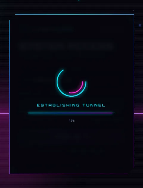
Both overlays use opacity: 0; visibility: hidden and fade in when they get
.is-on. visibility matters: an element with only
opacity: 0 is still clickable, but visibility: hidden takes it out of
the way completely.
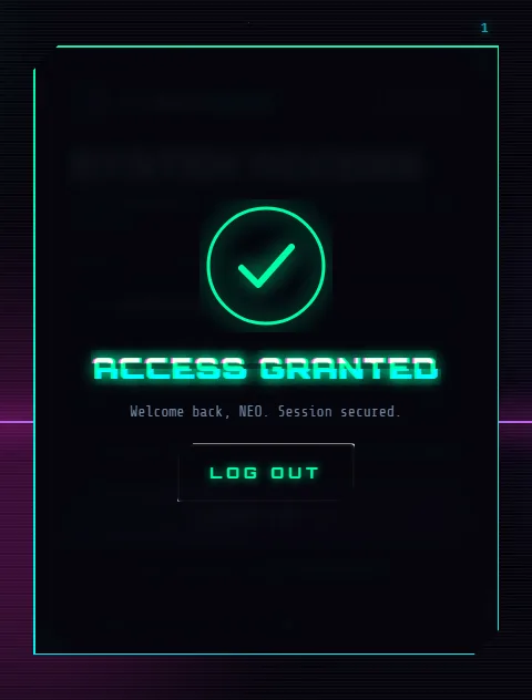
The success animation is a little film, timed with animation-delay:
- 0s: the ring draws itself (the same dash trick as the checkbox).
- 0.7s: the checkmark draws.
- 1s: “ACCESS GRANTED” arrives with its letters pulling together out of a blur.
- 1.4s: the welcome line slides in.
- 1.8s: the Log Out button appears.
The panel's border also switches to green and spins faster.
2.11 Footer, toast and responsive rules
/* ================= FOOTER ================= */
.panel__foot { display: flex; align-items: center; gap: 10px; margin-top: 22px; padding-top: 14px; border-top: 1px dashed rgba(0, 240, 255, .15); font-size: 10px; letter-spacing: .16em; color: var(--muted); }
.panel__foot span:last-child { margin-left: auto; color: var(--purple); }
.dot { width: 6px; height: 6px; border-radius: 50%; background: var(--green); box-shadow: 0 0 8px var(--green); animation: blink 1s steps(2) infinite; }

/* ================= TOAST ================= */
.toast {
  position: fixed; left: 50%; bottom: 32px; z-index: 10;
  transform: translate(-50%, 30px);
  padding: 12px 20px;
  font-size: 12.5px; letter-spacing: .08em;
  background: rgba(10, 12, 28, .9);
  border: 1px solid var(--cyan);
  box-shadow: 0 0 20px rgba(0, 240, 255, .35);
  opacity: 0;
  transition: .35s;
}
.toast.is-on { opacity: 1; transform: translate(-50%, 0); }

/* ================= RESPONSIVE ================= */
@media (max-width: 760px) {
  .hud__corner--tl .hud__text, .hud__corner--bl, .hud__corner--br { display: none; }
  .hud-ring { width: 54px; height: 54px; }
  .panel { padding: 28px 22px 18px; }
}

/* small phones: the HUD would overlap the panel, and wide letter-spacing wraps */
@media (max-width: 480px) {
  .hud { display: none; }
  .brand__tag { white-space: nowrap; }
  .btn { letter-spacing: .16em; font-size: 13px; }
  .btn:hover, .btn.is-hover { letter-spacing: .2em; }
  .panel__foot { font-size: 9px; letter-spacing: .08em; }
}

@media (prefers-reduced-motion: reduce) {
  *, *::before, *::after { animation-duration: .01ms !important; animation-iteration-count: 1 !important; transition-duration: .01ms !important; }
}
The toast waits 30px below its spot, invisible, and slides up when it gets .is-on.
The media queries handle smaller screens:
- Below 760px, most of the HUD is hidden.
- Below 480px, the whole HUD goes so it can't overlap the panel, and the wide letter-spacing is reduced so labels like “INITIALIZE ACCOUNT” stay on one line.
The prefers-reduced-motion block makes every CSS animation finish almost instantly
for people who switch animations off. With this much movement, it's important.
Step 3: The JavaScript (script.js)
3.1 Setup and helpers
/* =========================================================
   CYBERCORE // Interaction layer
   ========================================================= */
(() => {
  "use strict";

  const $ = (s, el = document) => el.querySelector(s);
  const $$ = (s, el = document) => [...el.querySelectorAll(s)];
  const sleep = (ms) => new Promise((r) => setTimeout(r, ms));

  const panel = $("#panel");
  const title = $("#viewTitle");
  const typedEl = $("#typed");
  const loader = $("#loader");
  const granted = $("#granted");
  const views = $("#views");
  const reduceMotion = matchMedia("(prefers-reduced-motion: reduce)").matches;
Everything is wrapped in (() => { … })(), a function that runs immediately. This keeps
our variables private, so they can't clash with other scripts on the page.
"use strict" turns some silent mistakes into visible errors.
Three tiny helpers save a lot of typing: $ finds one element, $$ finds
all matching elements as a real array, and sleep(ms) returns a Promise, so we can
write await sleep(280) to pause inside an async function.
reduceMotion checks the visitor's motion setting once, for the JavaScript
animations later.
3.2 The typewriter effect
  /* ---------- Typing effect ---------- */
  const messages = {
    login: "> Welcome back, operator. Verify identity to proceed.",
    signup: "> Register a new neural signature on the grid.",
    recover: "> Lost your key? We'll route a recovery uplink.",
  };
  let typeToken = 0;

  async function typeText(text) {
    const token = ++typeToken;
    typedEl.textContent = "";
    for (const ch of text) {
      if (token !== typeToken) return;
      typedEl.textContent += ch;
      await sleep(ch === " " ? 18 : 28 + Math.random() * 30);
    }
  }
typeText adds one character at a time, with a small random pause so it feels like a
person typing. Spaces are faster.
The clever part is the token. If you switch views while a message is still
typing, a new typeText call starts and increases typeToken. The old
loop notices its token is out of date and stops. Without this, two messages would type over each
other.
3.3 Switching between views
  /* ---------- View switching ---------- */
  let current = "login";
  let switching = false; // ignore clicks while a switch is animating

  async function switchView(name) {
    if (name === current || switching) return;
    switching = true;
    const from = $(`.view[data-view="${current}"]`);
    const to = $(`.view[data-view="${name}"]`);

    from.classList.add("is-leaving");
    from.classList.remove("is-active");
    await sleep(280);
    from.classList.remove("is-leaving");
    clearErrors(from);

    title.textContent = to.dataset.title;
    title.dataset.text = to.dataset.title;
    title.classList.remove("is-swapping");
    void title.offsetWidth;
    title.classList.add("is-swapping");

    to.classList.add("is-active");
    current = name;
    switching = false;
    typeText(messages[name]);
    const first = $("input", to);
    if (first) first.focus({ preventScroll: true });
  }

  document.addEventListener("click", (e) => {
    const link = e.target.closest("[data-goto]");
    if (!link) return;
    e.preventDefault();
    switchView(link.dataset.goto);
  });
The steps:
- Give the old view
is-leaving. - Wait 280ms for the exit animation.
- Change the heading and its
data-text, so the glitch copies match. - Replay the swap glitch.
- Show the new view, type its message, and put the cursor in its first input.
The switching flag ignores clicks while a switch is running. Without it, quickly
clicking “Forgot Password?” and then “Create New Account” would start two
switches at once and leave two forms on screen.
void title.offsetWidth is the classic trick for replaying a CSS animation. Removing
a class and adding it straight back does nothing, because the browser merges the two changes.
Reading offsetWidth forces the browser to apply the removal first.
Instead of a listener on every link, one listener on document catches all clicks and
uses closest("[data-goto]") to see if a view link was clicked. This is called
event delegation.
3.4 Show and hide password
  /* ---------- Password visibility ---------- */
  $$(".eye").forEach((btn) => {
    btn.addEventListener("click", () => {
      const input = btn.parentElement.querySelector("input");
      const show = input.type === "password";
      input.type = show ? "text" : "password";
      btn.classList.toggle("is-on", show);
      btn.setAttribute("aria-label", show ? "Hide password" : "Show password");
      btn.setAttribute("aria-pressed", String(show));
    });
  });
One loop sets up both eye buttons. Each one finds the input next to it, switches its
type between password and text, and toggles
is-on so CSS swaps the icon. aria-label and aria-pressed
keep screen reader users informed.
3.5 Validation and the strength meter
  /* ---------- Validation ---------- */
  const EMAIL = /^[^\s@]+@[^\s@]+\.[^\s@]{2,}$/;
  const USERNAME = /^[a-zA-Z0-9_.-]{3,24}$/;

  function setError(input, msg) {
    const field = input.closest(".field");
    field.classList.remove("has-error", "is-valid");
    void field.offsetWidth; // restart shake animation
    input.setAttribute("aria-invalid", String(!!msg)); // screen readers hear "invalid"
    if (msg) {
      field.classList.add("has-error");
      $(".error", field).textContent = "⚠ " + msg;
    } else {
      field.classList.add("is-valid");
      $(".error", field).textContent = "";
    }
    return !msg;
  }

  function clearErrors(scope) {
    $$(".field", scope).forEach((f) => f.classList.remove("has-error", "is-valid"));
    $$("input", scope).forEach((i) => i.removeAttribute("aria-invalid"));
  }

  // after a failed submit, put the cursor in the first field that needs fixing
  function focusFirstError(form) {
    const bad = $(".field.has-error input", form);
    if (bad) bad.focus();
  }

  const rules = {
    identity(v) {
      if (!v) return "Identity required";
      if (v.includes("@") ? !EMAIL.test(v) : !USERNAME.test(v)) return "Invalid email or username format";
      return "";
    },
    email(v) {
      if (!v) return "Email required";
      if (!EMAIL.test(v)) return "Invalid email signature";
      return "";
    },
    password(v) {
      if (!v) return "Access key required";
      if (v.length < 8) return "Access key must be at least 8 characters";
      return "";
    },
    newPassword(v) {
      const base = rules.password(v);
      if (base) return base;
      if (!/\d/.test(v)) return "Include at least one number";
      return "";
    },
    username(v) {
      if (!v) return "Callsign required";
      if (!USERNAME.test(v)) return "3–24 chars: letters, numbers, _ . -";
      return "";
    },
  };

  // clear error while typing
  $$(".input input").forEach((inp) =>
    inp.addEventListener("input", () => {
      inp.closest(".field").classList.remove("has-error");
      inp.removeAttribute("aria-invalid");
    })
  );

  // password strength meter (signup)
  const suPass = $("#suPass");
  const meter = $(".strength i");
  suPass.addEventListener("input", () => {
    const v = suPass.value;
    let s = 0;
    if (v.length >= 8) s++;
    if (/\d/.test(v)) s++;
    if (/[A-Z]/.test(v) && /[a-z]/.test(v)) s++;
    if (/[^A-Za-z0-9]/.test(v)) s++;
    const colors = ["#ff3b5c", "#ff2bd6", "#9d4dff", "#00f0ff", "#00ffa3"];
    meter.style.width = (v ? Math.max(s, 1) * 25 : 0) + "%";
    meter.style.background = colors[s];
    meter.style.boxShadow = `0 0 8px ${colors[s]}`;
  });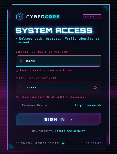
The validation is split into small pieces:
- Regular expressions:
EMAILchecks for something@something.something.USERNAMEallows 3 to 24 letters, numbers,_,.or-. - A
rulesobject: each rule takes a value and returns an error message, or an empty string if it's fine. Theidentityrule checks for an email if the value contains@, and a username otherwise. setError: addshas-error(oris-valid), writes the message, setsaria-invalidfor screen readers, and returnstruewhen the field is OK.focusFirstError: moves the cursor to the first field that needs fixing.- Errors clear as you type in that field, so the red doesn't nag while you fix it.
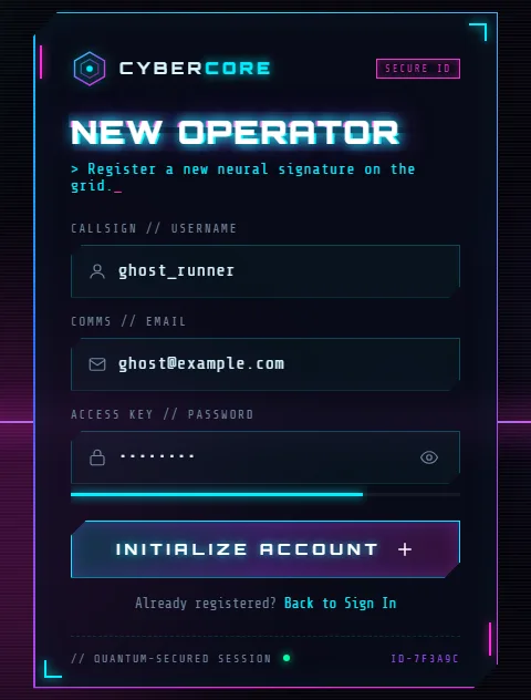
The strength meter awards one point for each of four checks:
- 8 or more characters
- a number
- both upper and lower case letters
- a symbol
Each point fills 25% of the bar, and the colour moves from red to green.
3.6 The loader, success screen and submitting
  /* ---------- Loading + success ---------- */
  const steps = [
    "AUTHENTICATING",
    "DECRYPTING KEYS",
    "VERIFYING BIOMETRICS",
    "ESTABLISHING TUNNEL",
  ];

  async function runLoader(labels = steps, duration = 2200) {
    const bar = $("#progressBar");
    const pct = $("#loaderPct");
    const msg = $("#loaderMsg");
    views.inert = true; // the form behind the overlay can't be clicked or tabbed into
    loader.classList.add("is-on");
    $("#toast").classList.remove("is-on");
    const start = performance.now();
    return new Promise((resolve) => {
      function tick(now) {
        const p = Math.min(1, (now - start) / duration);
        const eased = 1 - Math.pow(1 - p, 2);
        bar.style.width = (eased * 100).toFixed(1) + "%";
        pct.textContent = Math.round(eased * 100) + "%";
        msg.textContent = labels[Math.min(labels.length - 1, Math.floor(p * labels.length))];
        if (p < 1) requestAnimationFrame(tick);
        else setTimeout(resolve, 200);
      }
      requestAnimationFrame(tick);
    });
  }

  function showGranted(heading, sub) {
    const h = $("#grantedTitle");
    h.textContent = heading;
    h.dataset.text = heading;
    $("#grantedSub").textContent = sub;
    loader.classList.remove("is-on");
    granted.classList.add("is-on");
    panel.classList.add("is-granted");
    // wait for the overlay's fade-in: hidden elements can't take focus
    setTimeout(() => $("#resetBtn").focus({ preventScroll: true }), 450);
  }

  function resetAll() {
    granted.classList.remove("is-on");
    panel.classList.remove("is-granted");
    views.inert = false;
    $$("form").forEach((f) => { f.reset(); clearErrors(f); });
    $$(".eye").forEach((b) => {
      b.classList.remove("is-on");
      b.setAttribute("aria-label", "Show password");
      b.setAttribute("aria-pressed", "false");
      b.parentElement.querySelector("input").type = "password";
    });
    meter.style.width = "0";
    $("#progressBar").style.width = "0";
    if (current !== "login") switchView("login");
    else { typeText(messages.login); $("#loginId").focus({ preventScroll: true }); }
  }
  $("#resetBtn").addEventListener("click", resetAll);

  let busy = false;

  $("#loginForm").addEventListener("submit", async (e) => {
    e.preventDefault();
    if (busy) return;
    const id = $("#loginId"), pw = $("#loginPass");
    const ok = [setError(id, rules.identity(id.value.trim())), setError(pw, rules.password(pw.value))].every(Boolean);
    if (!ok) { focusFirstError(e.target); return toast("ACCESS DENIED // Check highlighted fields", "error"); }
    busy = true;
    await runLoader();
    const name = id.value.trim().split("@")[0].toUpperCase();
    showGranted("ACCESS GRANTED", `Welcome back, ${name}. Session secured.`);
    busy = false;
  });

  $("#signupForm").addEventListener("submit", async (e) => {
    e.preventDefault();
    if (busy) return;
    const u = $("#suName"), m = $("#suEmail"), p = $("#suPass");
    const ok = [
      setError(u, rules.username(u.value.trim())),
      setError(m, rules.email(m.value.trim())),
      setError(p, rules.newPassword(p.value)),
    ].every(Boolean);
    if (!ok) { focusFirstError(e.target); return toast("REGISTRATION BLOCKED // Fix errors", "error"); }
    busy = true;
    await runLoader(["GENERATING KEYPAIR", "ENCODING SIGNATURE", "WRITING TO GRID"], 2000);
    showGranted("PROFILE CREATED", `Operator ${u.value.trim().toUpperCase()} is now on the grid.`);
    busy = false;
  });

  $("#recoverForm").addEventListener("submit", async (e) => {
    e.preventDefault();
    if (busy) return;
    const m = $("#recEmail");
    if (!setError(m, rules.email(m.value.trim()))) { m.focus(); return toast("TRANSMISSION FAILED", "error"); }
    busy = true;
    await runLoader(["LOCATING ACCOUNT", "SIGNING TOKEN", "TRANSMITTING"], 1600);
    showGranted("LINK TRANSMITTED", `Check ${m.value.trim()} for your recovery uplink.`);
    busy = false;
  });
runLoader animates the progress bar with requestAnimationFrame, which
runs your function once per screen refresh. That's smoother than setInterval, and it
pauses automatically in background tabs. Each frame:
- works out the progress
pfrom 0 to 1 from the time passed, - eases it with
1 - (1 - p)², so it starts fast and slows near the end, - picks the status message that matches how far along it is,
- resolves its Promise when done, so the submit handler can simply
await runLoader().
Two accessibility details:
views.inert = truemakes the forms behind the overlay unclickable and skips them when tabbing, so keyboard users can't wander into hidden fields.- Focus moves to the Log Out button after a short wait, because an element
can't take focus while it's still
visibility: hiddenduring the fade-in.
Each submit handler follows the same pattern:
- Stop the real submit.
- Ignore double clicks with
busy. - Validate every field.
- Show a toast and stop if anything failed.
- Otherwise run the loader and show the success screen.
Notice the […].every(Boolean) trick. All the checks run first, so every error shows
at once. Then every tells us whether all of them passed.
resetAll (the Log Out button) puts everything back: it clears the forms, errors and
eye buttons, resets the meter and goes back to the sign in view.
3.7 The toast
  /* ---------- Toast ---------- */
  let toastTimer;
  function toast(text, type) {
    const t = $("#toast");
    t.textContent = text;
    t.style.borderColor = type === "error" ? "var(--red)" : "var(--cyan)";
    t.style.color = type === "error" ? "var(--red)" : "var(--text)";
    t.classList.add("is-on");
    clearTimeout(toastTimer);
    toastTimer = setTimeout(() => t.classList.remove("is-on"), 2400);
  }
Show the message, then hide it after 2.4 seconds. clearTimeout restarts the countdown
if a new message arrives first, so a fresh error never disappears too early.
3.8 The particle canvas
  /* ---------- Particles (canvas, lightweight) ---------- */
  const cv = $("#particles");
  const ctx = cv.getContext("2d");
  const colors = ["#00f0ff", "#9d4dff", "#ff2bd6", "#2f6bff"];
  let W, H, parts = [];

  function resize() {
    const dpr = Math.min(window.devicePixelRatio || 1, 2);
    W = cv.width = innerWidth * dpr;
    H = cv.height = innerHeight * dpr;
    const count = Math.round(Math.min(90, (innerWidth * innerHeight) / 16000));
    parts = Array.from({ length: count }, () => spawn(true));
  }
  function spawn(anywhere) {
    return {
      x: Math.random() * W,
      y: anywhere ? Math.random() * H : H + 10,
      s: Math.random() * 2 + 0.6,
      v: Math.random() * 0.6 + 0.2,
      c: colors[(Math.random() * colors.length) | 0],
      bin: Math.random() < 0.18 ? (Math.random() < 0.5 ? "0" : "1") : null,
      a: Math.random() * 0.6 + 0.3,
    };
  }
  function draw() {
    ctx.clearRect(0, 0, W, H);
    ctx.font = `${12 * (W / innerWidth)}px monospace`;
    for (const p of parts) {
      p.y -= p.v;
      if (p.y < -10) Object.assign(p, spawn(false));
      ctx.globalAlpha = p.a * (0.6 + Math.random() * 0.4);
      ctx.fillStyle = p.c;
      ctx.shadowColor = p.c;
      ctx.shadowBlur = 8;
      if (p.bin) ctx.fillText(p.bin, p.x, p.y);
      else ctx.fillRect(p.x, p.y, p.s, p.s);
    }
    if (!reduceMotion) requestAnimationFrame(draw); // reduced motion: one still frame
  }
  addEventListener("resize", () => { resize(); if (reduceMotion) draw(); });
  resize();
  draw();
A small particle system in about 40 lines:
resizematches the canvas to the window, multiplied by the screen's pixel density (capped at 2), so the particles stay sharp on high-resolution screens. It creates about one particle per 16,000 pixels of screen, up to 90, so phones get fewer.spawncreates a particle with a random position, size, speed, colour and brightness. About 18% become a0or1instead of a square.drawruns every frame: clear the canvas, move every particle up a little, send any that left the top back to the bottom, and draw it with a glow (shadowBlur). A tiny random flicker in brightness makes them twinkle.
If the visitor prefers reduced motion, we draw one still frame instead of animating.
3.9 Live HUD data and start-up
  /* ---------- HUD live data ---------- */
  const clock = $("#clock");
  const hex = $("#hexStream");
  const wave = $("#waveLine");
  let phase = 0;

  setInterval(() => {
    const d = new Date();
    clock.textContent = d.toTimeString().slice(0, 8);
    if (reduceMotion && hex.textContent !== "0x00") return; // fill once, then keep still
    hex.textContent = Array.from({ length: 6 }, () =>
      "0x" + ((Math.random() * 0xffff) | 0).toString(16).toUpperCase().padStart(4, "0")
    ).join(" ");
  }, 500);

  (function animWave() {
    phase += 0.08;
    let pts = "";
    for (let x = 0; x <= 160; x += 4) {
      const y = 20 + Math.sin(x * 0.08 + phase) * 8 * Math.sin(phase * 0.3 + x * 0.02) + (Math.random() - 0.5) * 3;
      pts += `${x},${y.toFixed(1)} `;
    }
    wave.setAttribute("points", pts);
    if (!reduceMotion) requestAnimationFrame(animWave);
  })();

  /* ---------- Boot ---------- */
  // only if the visitor hasn't already switched to another view
  setTimeout(() => { if (current === "login") typeText(messages.login); }, 700);
})();
Every half second the clock updates and the hex stream gets six new random values. The signal
wave is an SVG <polyline>. Each frame it gets new points from two sine waves
multiplied together, plus a little random noise, so it wobbles like a real signal.
Finally, after 700ms, the welcome message starts typing. We first check that the visitor is still on the sign in view, so a quick click to another view isn't overwritten by the welcome message.
Test it yourself
- Click SIGN IN with empty fields. Both fields turn red, shake and show messages, the cursor jumps to the first one, and a toast appears.
- Type
bad@as the identity. It says the email format is wrong. Typeneoinstead and it's accepted as a username. - Click the eye icon. The password appears and the icon changes.
- Click Create New Account and watch the glitch transition. Type a password and watch the strength meter grow and change colour.
- Fill in valid details and submit. Watch the loader, then the success screen.
- Click LOG OUT. Everything resets.
- Press Tab through the whole form without a mouse. Every control should show where you are.
- Open DevTools (F12), turn on device mode (Ctrl+Shift+M) and try a phone size.
Something wrong? Check the Console tab in DevTools for red errors. The usual
causes are a mistyped id, or script.js and style.css not
being in the same folder as index.html.
Before you use it on a real site
This is a front end only. The “authentication” is a timed animation, and any valid looking details are accepted. To make it real:
- Check logins on your server. JavaScript validation is only for convenience.
Anyone can switch it off, so the server must check everything again. Inside the submit
handler, replace
await runLoader()with afetch()to your back end, and show the success screen only if the server says yes. - Show server errors the same way: call
setErrorandtoastwith the message your server sends back. - Use HTTPS, and for “Forgot Password” always show the same message whether the email exists or not, so attackers can't use it to find accounts.
- Remove the made-up security claims in the HUD (encryption, firewall, threat level), or make sure no one could mistake them for real ones.
Make it your own
- New colour scheme: change the variables in
:root. Amber and red give a “warning terminal” look, and green on black looks like a classic hacker screen. - Rename the brand in the header SVG and
.brand__name. - Add a view: copy a
<form class="view">, give it a newdata-viewanddata-title, add a message tomessages, and link to it withdata-goto. The switching code needs no changes. - Particles that react to the mouse: in
draw(), push particles away from the cursor position.
Share what you built
Proud of your version? Take a screenshot and get a shareable link in a second with sshot.online. Stuck on a bug? Paste your code into the free code sharing tool and send the link to someone who can help. Neither needs an account.
Conclusion
You've built a complete, futuristic authentication screen with three views, validation, a loader and a success screen, all in three files. Along the way you used a lot of modern front-end techniques:
- cut-corner shapes with
clip-path - gradient borders with masks
- animating custom properties with
@property - glitch text with pseudo-elements
- 3D grids with
perspective - SVG line drawing
- a canvas particle system
- Promise-based animation with
requestAnimationFrame inertfor accessible overlays
Pick one effect, change a number, and watch what happens. That's the fastest way to make these techniques yours.
Frequently asked questions
Do I need a framework or library to build this cyberpunk login page?
No. It uses only HTML, CSS and JavaScript in three files. The only external resource is two Google Fonts, which you can also host yourself.
How does the spinning neon border work?
A conic gradient fills a layer over the panel, and a CSS mask cuts out everything except a
thin edge. The gradient angle is registered with @property so it can be
animated from 0 to 360 degrees.
How is the glitch text effect made?
The ::before and ::after pseudo-elements copy the heading text from
a data-text attribute in two colours. Each copy shows only a slice through
clip-path, and stepped keyframes shift the slices for a split
second.
Is this login page secure?
It's a front end only. To use it for real logins, send the form to your server, check the details there over HTTPS, and only show the success screen if the server confirms the login.
Does it work on phones and for people who turn off animations?
Yes. The layout adapts down to 320 px wide screens, and when reduced motion is turned on in system settings, the CSS animations, particles and HUD wave stop moving.
Related articles
How to Build an Animated Wind Login Page with a Bird Mascot, Lockout and 2FA Code
A full tutorial for a breezy login flow: letters that fly in as leaves, a windsock strength meter, a storm lockout after three tries and a six-digit code step.
Read More →
How to Build an Animated Ocean Login Page with HTML, CSS and JavaScript
Build an underwater login page with SVG fish that flee your cursor, schools of sardines, a leaping dolphin, splashes, bubbles and a frosted glass form.
Read More →
How to Build an Animated Panda Login Page with HTML, CSS and JavaScript
A step-by-step tutorial: build a login form where a CSS panda follows your typing, covers its eyes for the password, peeks, and reacts. Full code and live demo.
Read More →