How to Build an Animated Panda Login Page with HTML, CSS and JavaScript
Published November 4, 2026 · 12 min read
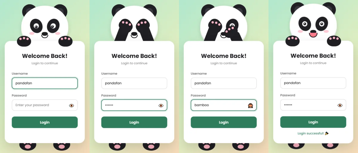
Login forms are usually the most boring page on a website. In this tutorial we'll make one people actually smile at: a panda that holds your form, watches you type your username, covers its eyes when you type your password, peeks when you click “show password”, and reacts when you log in.
You only need three files: HTML for the structure, CSS for the
panda and its animations, and JavaScript to react to what the user does. No
libraries, no frameworks, no images. The whole panda is drawn with plain <div>s.
If you know the basics of HTML and CSS, you can follow along.
What the panda can do
- Watches the username. When you click the username box, the panda looks down, and its eyes slide from left to right as you type.
- Covers its eyes for the password. Both arms swing up and the paws cover the eyes, so it “can't see” your password.
- Peeks when you show the password. Click the eye button and one paw slides down so the panda can sneak a look.
- Blinks on its own every few seconds, so it feels alive.
- Reacts to the result. Fill both fields and it smiles, bounces and taps its feet. Leave a field empty and it frowns and shakes its head.
- Works for everyone. It works with the keyboard, screen readers hear the messages, password managers can fill it, and it calms down for people who turn off animations.
The big idea: JavaScript switches classes, CSS animates
Before writing any code, here is the one trick that makes this project easy. JavaScript never moves the panda itself. It only adds or removes a class on the wrapper element:
look: the username box is focusedcover: the password box is focusedpeek: the password is visiblehappy/sad: after the form is submitted
CSS does all the moving with transition and @keyframes. This keeps the
JavaScript short, and the animations smooth, because the browser handles them.
Project setup
Create a folder with three empty files:
panda-login/
├── index.html   ← structure
├── style.css    ← looks and animations
└── script.js    ← behaviour
Open the folder in your code editor (VS Code works great) and open index.html in your
browser. Refresh after each step to see your progress.
Step 1: The HTML (index.html)
Here is the complete HTML file. Copy it in, then read the explanation below.
<!DOCTYPE html>
<html lang="en">
<head>
  <meta charset="UTF-8">
  <meta name="viewport" content="width=device-width, initial-scale=1.0">
  <title>Panda Login</title>
  <link rel="preconnect" href="https://fonts.googleapis.com">
  <link rel="preconnect" href="https://fonts.gstatic.com" crossorigin>
  <link href="https://fonts.googleapis.com/css2?family=Poppins:wght@400;500;600;700&display=swap" rel="stylesheet">
  <link rel="stylesheet" href="style.css">
</head>
<body>

  <div class="scene" id="scene">
    <!-- The panda is decoration, so screen readers skip it -->
    <div class="head" aria-hidden="true">
      <div class="ear l"></div>
      <div class="ear r"></div>
      <div class="face">
        <div class="patch l"><div class="eye"><div class="pupil"></div></div></div>
        <div class="patch r"><div class="eye"><div class="pupil"></div></div></div>
        <div class="blush l"></div>
        <div class="blush r"></div>
        <div class="nose"></div>
        <div class="mouth"></div>
      </div>
    </div>

    <!-- Arms -->
    <div class="arm l" aria-hidden="true"></div>
    <div class="arm r" aria-hidden="true"></div>

    <!-- Paws holding the form -->
    <div class="paw l" aria-hidden="true"><i></i><i></i><i></i></div>
    <div class="paw r" aria-hidden="true"><i></i><i></i><i></i></div>

    <!-- Form -->
    <form class="card" id="loginForm" novalidate>
      <h2>Welcome Back!</h2>
      <p class="sub">Login to continue</p>

      <div class="field">
        <label for="username">Username</label>
        <input type="text" id="username" name="username" autocomplete="username" placeholder="Enter your username">
      </div>

      <div class="field">
        <label for="password">Password</label>
        <input type="password" id="password" name="password" autocomplete="current-password" placeholder="Enter your password">
        <button type="button" class="toggle" id="toggle" aria-label="Show password" aria-pressed="false">👁️</button>
      </div>

      <button type="submit" class="btn">Login</button>
      <div class="msg" id="msg" role="status" aria-live="polite"></div>
    </form>

    <!-- Feet -->
    <div class="foot l" aria-hidden="true"><i></i><i></i><i></i><b></b></div>
    <div class="foot r" aria-hidden="true"><i></i><i></i><i></i><b></b></div>
  </div>

  <script src="script.js"></script>
</body>
</html>
How the HTML is organised
Everything sits inside one wrapper, <div class="scene" id="scene">. This is the
element JavaScript adds classes to. Inside it, from top to bottom:
- The head: two ears, then a face with two black eye patches. Each patch holds an eye, and each eye holds a pupil. Then come two pink blush cheeks, a nose and a mouth.
- Two arms (
.arm.land.arm.r). They're hidden behind the form until the panda covers its eyes. - Two paws resting on top of the form. The three
<i>tags inside each paw are the little pink toe beans. - The form card with a username field, a password field, a show/hide button, a Login button and an empty message area.
- Two feet peeking out under the card.
The class names l and r mean left and right. Both sides share the same
styles, and .l / .r only change the position.
Small details that matter
aria-hidden="true"on the panda parts tells screen readers to skip them. They are decoration, and nobody wants to hear “group, group, group” before the form.autocomplete="username"andautocomplete="current-password"let password managers fill the form. Turning autocomplete off on a login form only annoys users.- The eye button has
type="button"so clicking it doesn't submit the form. Itsaria-labeltells screen reader users what it does, since the emoji alone isn't clear. role="status"andaria-live="polite"on the message area mean screen readers announce “Login successful” or the error as soon as it appears.novalidateturns off the browser's own pop-up bubbles, because our panda handles the errors instead.
If you open the page now, you'll only see an unstyled form. That's expected. The CSS brings the panda to life.
Step 2: The CSS (style.css)
We'll build the stylesheet in sections. Paste each one into style.css in order. The
complete file is also in the live
demo.
2.1 Variables and the page
:root {
  --black: #1f1f24;
  --pink: #ffb3c1;
  --accent: #2e7d5b;
  --px: 0px;   /* pupil x, set by JavaScript */
  --py: 0px;   /* pupil y */
}
* { box-sizing: border-box; margin: 0; padding: 0; }
body {
  min-height: 100vh;
  display: grid;
  place-items: center;
  padding: 24px 16px 56px;
  background: linear-gradient(135deg, #a8e6cf 0%, #dcedc1 50%, #ffd3b6 100%);
  font-family: 'Poppins', sans-serif;
  overflow-x: hidden;
}
CSS variables (custom properties) are values you name once and reuse. We store the panda's black, the pink and the green accent here, so changing a colour later is a one-line edit.
The two special ones are --px and --py: how far the pupils move
sideways and downwards. They start at 0px. Later, JavaScript changes
--px while you type, and the eyes follow. This is how JavaScript and CSS talk to each
other without JavaScript touching any styles directly.
On body, display: grid with place-items: center is the
shortest way to centre something both ways on the screen.
2.2 The scene
.scene {
  position: relative;
  width: 340px;
  padding-top: 150px;
  margin-bottom: 40px;
}
/* Very narrow phones: zoom shrinks the whole scene (layout included),
   so every pixel offset in the paw animation still lines up */
@media (max-width: 370px) {
  body { padding-left: 12px; padding-right: 12px; }
  .scene { zoom: .86; }
}
The scene is position: relative. That makes it the “anchor” for every
panda part: all the parts use position: absolute, so their top and
left values are measured from the scene's corner. The padding-top
leaves room above the form for the head.
On very small phones we shrink everything with zoom. We use zoom
instead of transform: scale() because zoom also shrinks the space the element takes
up, so the panda stays centred instead of spilling off the right edge.
2.3 The head, ears and face
.head {
  position: absolute;
  top: 0; left: 50%;
  width: 200px; height: 180px;
  margin-left: -100px;
  z-index: 1;
  transition: transform .4s ease;
}
.ear {
  position: absolute;
  top: -6px;
  width: 64px; height: 64px;
  background: var(--black);
  border-radius: 50%;
}
.ear::after {
  content: ''; position: absolute; inset: 16px;
  background: #3a3a42; border-radius: 50%;
}
.ear.l { left: 4px; }
.ear.r { right: 4px; }
.face {
  position: absolute; inset: 0;
  background: #fff;
  border-radius: 50% 50% 46% 46%;
  box-shadow: 0 6px 18px rgba(0,0,0,.12), inset 0 -8px 0 #f1f1f1;
}
Every round shape here is just a box with border-radius: 50%. The ears use a
::after pseudo-element to draw the lighter inner circle without any extra HTML.
The face uses four different radius values (50% 50% 46% 46%) so it's slightly wider
at the cheeks, like a real panda.
2.4 The eyes, pupils and blinking
.patch {
  position: absolute;
  top: 55px;
  width: 52px; height: 62px;
  background: var(--black);
  border-radius: 50%;
  display: grid; place-items: center;
}
.patch.l { left: 38px; transform: rotate(-22deg); }
.patch.r { right: 38px; transform: rotate(22deg); }
.eye {
  width: 22px; height: 22px;
  background: #fff;
  border-radius: 50%;
  position: relative;
  animation: blink 4.5s infinite;
}
.pupil {
  position: absolute;
  top: 50%; left: 50%;
  width: 12px; height: 12px;
  margin: -6px 0 0 -6px;
  background: var(--black);
  border-radius: 50%;
  transform: translate(var(--px), var(--py));
  transition: transform .15s ease;
}
.pupil::after {
  content: ''; position: absolute; top: 2px; left: 3px;
  width: 4px; height: 4px; background: #fff; border-radius: 50%;
}
@keyframes blink {
  0%, 92%, 100% { transform: scaleY(1); }
  95% { transform: scaleY(.1); }
}
Three tricks make the eyes work:
- Tilted patches. Each black patch is rotated 22 degrees, the left one one way and the right one the other, which gives the classic sleepy panda look.
- Movable pupils. The pupil uses
transform: translate(var(--px), var(--py)). When the variables change, the pupil slides, andtransition: transform .15smakes it glide instead of jump. The small white::afterdot is a highlight that makes the eye look shiny. - Blinking. The
blinkkeyframes squash the eye to 10% of its height for a split second at the 95% mark of a 4.5 second loop. Because 92% to 100% of the time it stays open, it looks like a natural, occasional blink.
2.5 Nose, mouth and cheeks
.nose {
  position: absolute;
  top: 112px; left: 50%;
  width: 26px; height: 16px;
  margin-left: -13px;
  background: var(--black);
  border-radius: 50% 50% 60% 60%;
}
.mouth {
  position: absolute;
  top: 124px; left: 50%;
  width: 30px; height: 14px;
  margin-left: -15px;
  border: 3px solid var(--black);
  border-top: none;
  border-radius: 0 0 20px 20px;
  transition: all .3s ease;
}
.blush {
  position: absolute;
  top: 112px;
  width: 22px; height: 12px;
  background: var(--pink);
  border-radius: 50%;
  opacity: .7;
}
.blush.l { left: 34px; }
.blush.r { right: 34px; }
The smile is a clever one: it's a box with a border on three sides and no top border, plus rounded bottom corners. That leaves a curved “U” shape. Later, the sad state flips it into an upside-down U.
2.6 The arms and paws
.arm {
  position: absolute;
  top: 75px;
  width: 44px; height: 145px;
  background: var(--black);
  border-radius: 22px;
  transform-origin: 50% 100%;
  transform: scaleY(.5);
  z-index: 2;
  transition: transform .45s cubic-bezier(.68,-0.35,.27,1.35);
}
.arm.l { left: 60px; }
.arm.r { right: 60px; }

.paw {
  position: absolute;
  top: 128px;
  width: 60px; height: 46px;
  background: var(--black);
  border-radius: 50% 50% 45% 45%;
  z-index: 4;
  transition: transform .45s cubic-bezier(.68,-0.35,.27,1.35);
}
.paw.l { left: 52px; }
.paw.r { right: 52px; }
.paw i {
  position: absolute;
  width: 10px; height: 10px;
  background: var(--pink);
  border-radius: 50%;
  top: 8px;
}
.paw i:nth-child(1) { left: 10px; }
.paw i:nth-child(2) { left: 25px; top: 5px; }
.paw i:nth-child(3) { left: 40px; }
This is the most important part of the animation:
transform-origin: 50% 100%puts the arm's hinge at the bottom, like a shoulder. Rotating it then swings it up from below instead of spinning it around its middle.scaleY(.5)squashes the arm to half height, so it hides behind the form until it's needed.- The
cubic-bezier(.68,-0.35,.27,1.35)timing function goes slightly past the target and back. That tiny overshoot is what makes the movement feel bouncy and alive rather than robotic.
Understanding the layers (z-index)
The panda only looks right because the parts are stacked in the right order. Higher
z-index numbers sit on top:
- z-index 1: the head and the feet (at the back)
- z-index 2: the arms, in front of the face
- z-index 3: the form card, which hides the lower part of the arms
- z-index 4: the paws, on top of everything, so they can hold the card and cover the eyes
2.7 The form card
.card {
  position: relative;
  z-index: 3;
  background: #fff;
  border-radius: 24px;
  padding: 46px 30px 32px;
  box-shadow: 0 20px 50px rgba(0,0,0,.15);
}
.card h2 {
  text-align: center;
  color: var(--black);
  font-weight: 700;
  margin-bottom: 4px;
}
.card p.sub {
  text-align: center;
  color: #767676;
  font-size: 13px;
  margin-bottom: 24px;
}
.field { position: relative; margin-bottom: 18px; }
.field label {
  display: block;
  font-size: 13px;
  font-weight: 500;
  color: #555;
  margin-bottom: 6px;
}
.field input {
  width: 100%;
  padding: 12px 44px 12px 14px;
  border: 2px solid #e6e6e6;
  border-radius: 12px;
  font: inherit;
  font-size: 14px;
  outline: none;
  transition: border-color .2s, box-shadow .2s;
}
.field input:focus {
  border-color: var(--accent);
  box-shadow: 0 0 0 4px rgba(46,125,91,.15);
}
.toggle {
  position: absolute;
  right: 10px; bottom: 9px;
  border: none; background: none;
  cursor: pointer;
  font-size: 18px;
  line-height: 1;
  padding: 4px;
  border-radius: 6px;
}
.toggle:focus-visible { outline: 2px solid var(--accent); }
.btn {
  width: 100%;
  padding: 13px;
  border: none;
  border-radius: 12px;
  background: var(--accent);
  color: #fff;
  font: inherit;
  font-weight: 600;
  font-size: 15px;
  cursor: pointer;
  transition: transform .15s, background .2s;
  margin-top: 6px;
}
.btn:hover { background: #256a4c; }
.btn:active { transform: scale(.97); }
.btn:focus-visible { outline: 3px solid #1f1f24; outline-offset: 2px; }
.msg {
  text-align: center;
  font-size: 13px;
  margin-top: 14px;
  min-height: 18px;
  font-weight: 500;
}
This is regular form styling. A few things worth copying into your own projects:
font: inheriton inputs and buttons. By default they ignore the page font.- A soft
box-shadowring on:focusinstead of the default outline. It looks nicer and is still clearly visible. :focus-visibleoutlines on the buttons, so keyboard users can always see where they are.transform: scale(.97)on:activemakes the button feel pressed.- The password input has extra right padding (
44px) so the text never runs under the eye button.
2.8 The feet
.foot {
  position: absolute;
  bottom: -32px;
  width: 72px; height: 52px;
  background: var(--black);
  border-radius: 50%;
  z-index: 1;
}
.foot.l { left: 62px; }
.foot.r { right: 62px; }
.foot b {
  position: absolute;
  left: 50%; bottom: 8px;
  width: 26px; height: 18px;
  margin-left: -13px;
  background: var(--pink);
  border-radius: 50%;
}
.foot i {
  position: absolute;
  bottom: 28px;
  width: 9px; height: 9px;
  background: var(--pink);
  border-radius: 50%;
}
.foot i:nth-of-type(1) { left: 18px; }
.foot i:nth-of-type(2) { left: 31px; bottom: 31px; }
.foot i:nth-of-type(3) { left: 44px; }
The same toe-bean idea as the paws: a big pink pad (<b>) and three small toes
(<i>). bottom: -32px lets them hang below the card.
2.9 The states: where the magic happens
/* Username focus: look down at the form */
.scene.look { --py: 4px; }

/* Password focus: cover eyes */
.scene.cover .arm.l { transform: rotate(21deg) scaleY(1); }
.scene.cover .arm.r { transform: rotate(-21deg) scaleY(1); }
.scene.cover .paw.l { transform: translate(52px, -66px) rotate(18deg); }
.scene.cover .paw.r { transform: translate(-52px, -66px) rotate(-18deg); }

/* Show password: right paw peeks */
.scene.cover.peek .arm.r { transform: rotate(-24deg) scaleY(.82); }
.scene.cover.peek .paw.r { transform: translate(-58px, -40px) rotate(-30deg); }

/* Happy on success */
.scene.happy .mouth { height: 20px; width: 36px; margin-left: -18px; background: #ff7a8a; }
.scene.happy .foot { animation: tap .35s ease 3; }
.scene.happy .head { animation: bounce .5s ease 2; }
@keyframes tap { 50% { transform: translateY(-8px); } }
@keyframes bounce { 50% { transform: translateY(-10px); } }

/* Sad shake on error */
.scene.sad .mouth { border-radius: 20px 20px 0 0; border-top: 3px solid var(--black); border-bottom: none; top: 130px; }
.scene.sad .head { animation: shake .45s ease; }
@keyframes shake {
  20%, 60% { transform: translateX(-8px) rotate(-3deg); }
  40%, 80% { transform: translateX(8px) rotate(3deg); }
}
Each block only applies when the scene has a certain class. Let's go through them:
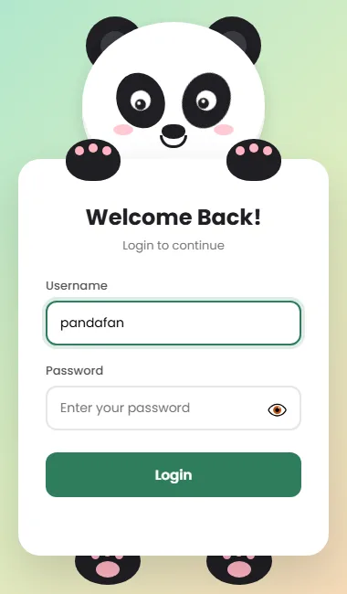
.scene.looksets--py: 4px, so the pupils move down. That one variable is enough to make the panda look at the form.
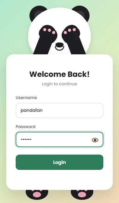
.scene.coverrotates both arms inwards to full height and moves the paws up (translate(52px, -66px)) until they land on the eyes. Because the arm and paw transitions share the same timing, they move together like one limb.
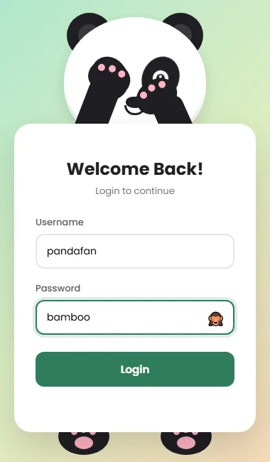
.scene.cover.peekonly applies when both classes are present. It moves just the right arm and paw a little lower, so one eye peeks out.
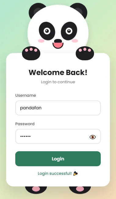
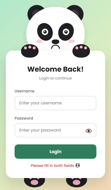
.scene.happymakes the mouth bigger and pink, bounces the head twice and taps the feet three times..scene.sadturns the smile upside down (the border moves from the bottom to the top) and shakes the head left and right.
2.10 Respect reduced motion
/* Respect visitors who turn animations off in their system settings */
@media (prefers-reduced-motion: reduce) {
  *, *::before, *::after {
    animation-duration: .01ms !important;
    animation-iteration-count: 1 !important;
    transition-duration: .01ms !important;
  }
}
Some people get dizzy or distracted by animation and switch it off in their system settings. This media query makes every animation finish almost instantly for them. The panda still changes state, it just doesn't bounce around. It's five lines and worth adding to every animated project.
Step 3: The JavaScript (script.js)
Now we connect the form to the panda. The <script> tag sits at the end of the
HTML body, so all the elements already exist when this code runs.
3.1 Grab the elements
const scene  = document.getElementById('scene');
const user   = document.getElementById('username');
const pass   = document.getElementById('password');
const toggle = document.getElementById('toggle');
const form   = document.getElementById('loginForm');
const msg    = document.getElementById('msg');
let resetTimer;
We look up every element we need once and keep it in a const. Searching the page on
every keystroke would be wasteful. resetTimer will hold a timer we use at the
end.
3.2 Eyes follow the username
// The longer the username, the further right the pupils move (-5px to +5px).
function followText() {
  const len = Math.min(user.value.length, 25);
  const x = -5 + (len / 25) * 10;
  scene.style.setProperty('--px', x + 'px');
}

user.addEventListener('focus', () => {
  scene.classList.remove('cover', 'peek');
  scene.classList.add('look');
  followText();
});
user.addEventListener('input', () => {
  if (document.activeElement === user) followText(); // ignore autofill while unfocused
});
user.addEventListener('blur', () => {
  scene.classList.remove('look');
  scene.style.setProperty('--px', '0px');
});
followText() turns the length of the username into a pupil position. With 0
characters the pupils sit at -5px (looking left, where the text starts). With 25 or
more they reach +5px (looking right). Math.min stops the eyes from
rolling out of their sockets on very long names.
Then three event listeners:
- focus: add
lookand place the pupils. - input: runs on every keystroke and moves the pupils. We check that the field is really focused, so a password manager filling it in the background doesn't make the eyes twitch.
- blur (leaving the field): remove
lookand centre the pupils again.
scene.style.setProperty('--px', …) is how we change a CSS variable from
JavaScript. The CSS transition does the smooth movement.
3.3 Cover the eyes on the password
function uncover() {
  scene.classList.remove('cover', 'peek');
}
pass.addEventListener('focus', () => scene.classList.add('cover'));
pass.addEventListener('blur', (e) => {
  if (e.relatedTarget === toggle) return; // moving to the eye button: keep covered
  uncover();
});
// Leaving the eye button for anything except the password box uncovers too
toggle.addEventListener('blur', (e) => {
  if (e.relatedTarget !== pass) uncover();
});
Focusing the password adds cover. Leaving it removes it, with one exception: if the
user is moving to the eye button. e.relatedTarget tells us which element is
receiving focus next. Without this check, the paws would drop for a moment every time you click
the eye.
The second listener handles keyboard users who press Tab past the eye button without clicking it. Without it, the panda would keep its eyes covered forever.
3.4 Show and hide the password
toggle.addEventListener('mousedown', (e) => e.preventDefault()); // keep focus in the input
toggle.addEventListener('click', () => {
  const show = pass.type === 'password';
  pass.type = show ? 'text' : 'password';
  toggle.textContent = show ? '🙈' : '👁️';
  toggle.setAttribute('aria-label', show ? 'Hide password' : 'Show password');
  toggle.setAttribute('aria-pressed', String(show));
  scene.classList.toggle('peek', show);
  pass.focus();
});
Showing a password is just switching the input's type between
"password" and "text". At the same time we:
- swap the emoji between 👁️ and 🙈,
- update
aria-labelandaria-pressed, so screen readers know whether the password is showing, - toggle the
peekclass. The second argument ofclassList.toggleforces it on or off, which keeps it in sync with the password type.
The mousedown listener with preventDefault() is a neat trick: it stops
the button from stealing focus from the password box when clicked, so the panda keeps its paws
up.
3.5 Submit: happy or sad
form.addEventListener('submit', (e) => {
  e.preventDefault();
  clearTimeout(resetTimer);
  scene.classList.remove('happy', 'sad', 'cover', 'peek', 'look');
  document.activeElement.blur();
  void scene.offsetWidth; // force a reflow so the animation can replay

  if (user.value.trim() && pass.value.trim()) {
    scene.classList.add('happy');
    msg.style.color = '#2e7d5b';
    msg.textContent = 'Login successful! 🎉';
    // In a real app, send the form to your server here.
  } else {
    scene.classList.add('sad');
    msg.style.color = '#d64545';
    msg.textContent = 'Please fill in both fields 🐼';
  }
  resetTimer = setTimeout(() => scene.classList.remove('happy', 'sad'), 2000);
});
Step by step:
e.preventDefault()stops the page from reloading.clearTimeout(resetTimer)cancels the previous reset. Without it, clicking Login twice quickly would let the first timer cut the second animation short.- Remove every state class and
blur()the focused field, so the panda drops its paws and looks at you. void scene.offsetWidthlooks odd, but it's a well-known trick. ReadingoffsetWidthforces the browser to apply the removed classes right now. Without it, addingsadagain straight after removing it wouldn't replay the shake.- If both fields have text (after
trim()removes spaces), show the happy panda. Otherwise show the sad one with a message. - After 2 seconds, go back to normal.
Test it yourself
Open index.html in your browser and try each of these:
- Click the username box and type. The panda looks down and its eyes follow the text.
- Click the password box. The paws cover its eyes.
- Click the 👁️ button. The password appears and the panda peeks with one eye.
- Press Tab from the password through to the Login button. The paws come down.
- Click Login with an empty field. The panda frowns and shakes its head.
- Fill both fields and click Login. It smiles, bounces and taps its feet.
- Make your browser window very narrow, or use DevTools device mode (Ctrl+Shift+M), to check it on a phone size.
Something not working? Press F12 and look at the Console tab for red
errors. The usual culprits are a typo in an id, or script.js not sitting
in the same folder as index.html.
Using it on a real website
This demo only checks that the fields aren't empty. Before you use it for real logins:
- Check the password on the server, never in JavaScript. Anyone can read and
change JavaScript in their browser. Add
method="post"and anactionto the form, or send it withfetch()where the comment says so inscript.js. - Always use HTTPS so the password is encrypted on the way.
- Show the sad panda for wrong passwords too. When your server says the login
failed, add the
sadclass with a message like “Wrong username or password”. - Host the font yourself if you prefer not to load Google Fonts on your login page.
Make it your own
- Change the colours in
:root. Try a blue accent, or a brown--blackfor a bear. - Swap the animal. Change the ears and patches, and the same arm-and-paw system works for a cat, a bear or a koala.
- Add a “Remember me” checkbox or a “Forgot password?” link under the button.
- Make the eyes follow the mouse by setting
--pxand--pyfrom amousemovelistener.
Share what you built
Finished your own version? Take a screenshot and turn it into a link with sshot.online to show your friends or teacher. If you're stuck, share your code with the free code sharing tool and send the link to someone who can help. No signup needed for either.
Conclusion
With three small files, you've built a login page that reacts to every action: it watches,
hides, peeks, celebrates and sulks. More importantly, you've learned techniques you'll use
everywhere: drawing shapes with CSS, layering with z-index, hinges with
transform-origin, bouncy timing curves, CSS variables controlled by JavaScript, and
the “JavaScript toggles a class, CSS animates” pattern. Try changing one thing at a
time and watch what happens. That's the best way to really understand it.
Frequently asked questions
Do I need any library or framework to build the panda login page?
No. It uses plain HTML, CSS and JavaScript. The panda is drawn entirely with CSS shapes, so there are no images or libraries to download.
How does the panda cover its eyes when I type a password?
When the password field gets focus, JavaScript adds a cover class to the scene.
CSS then rotates the arms up and moves the paws over the eyes using transitions.
Can I use this login form on a real website?
Yes, as the front end. Connect the form to your server, check the username and password there, and use HTTPS. Never check passwords in JavaScript, because anyone can read it.
Does it work on mobile phones?
Yes. The layout fits small screens, and on very narrow phones the whole panda is scaled down
with CSS zoom so the animation still lines up.
Why does the code use void scene.offsetWidth?
Reading offsetWidth forces the browser to apply style changes immediately. That
lets the same animation replay when the class is removed and added again straight
away.
Related articles
How to Share Code Snippets Online (Free, No Signup)
Paste a code snippet and get a shareable link in seconds — line numbers, a raw view, and no account. The fastest way to share code online.
Read More →
Five Free Browser Tools Every Developer Should Bookmark
DevTools shortcuts, screenshot and code sharing, in-browser data utilities, and documentation bookmarks: a lean toolkit that saves developers time.
Read More →
How to Share an Error Log or Stack Trace With a Link
Stop pasting giant stack traces into chat. Share an error log as a clean, line-numbered link that opens for anyone — free, no account.
Read More →