How to Build a Lamp Login Page with a Pull Cord in HTML, CSS and JavaScript
Published November 4, 2026 · 13 min read
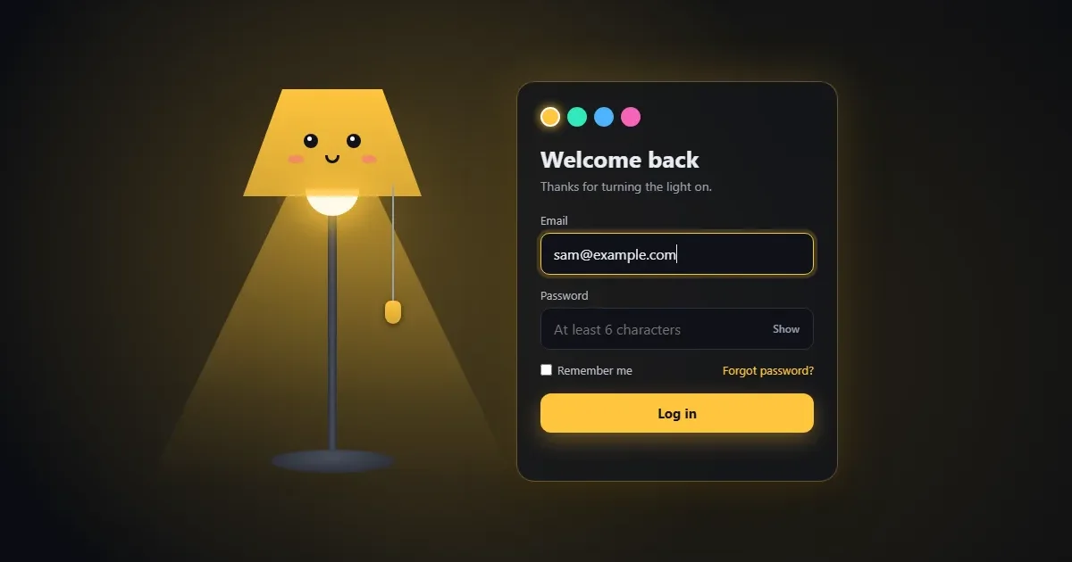
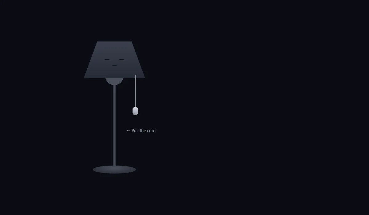
The room is dark. There's a lamp, asleep, with a little cord hanging from its shade. Grab the cord and pull it down: it stretches, springs back, and the light flickers on. The lamp opens its eyes, the room glows, and a login form fades in beside it.
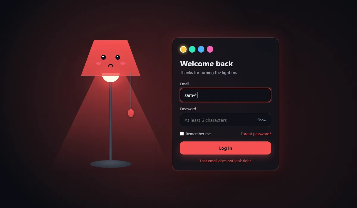
Type a bad email and the lamp turns red and frowns. Log in and it turns green with a big grin while sparkles fly out of the bulb. You can even pick the lamp's colour.
Try the live demo Drag the cord down and let go.
Everything is plain HTML, CSS and JavaScript. No
images, no libraries. The lamp is a handful of <div>s shaped with CSS. You'll
learn:
- how to theme a whole page from one CSS variable
- how to draw shapes with
clip-path - how to build a face whose expression changes with a single attribute
- how to make a draggable cord with simple spring physics
- how to hide a form properly, so keyboard users can't tab into it
The big idea: state lives in two attributes
The whole page is controlled by two attributes on the <main class="scene">
element:
data-on="true"or"false": is the lamp on?data-mood="error","ok"or empty: how does the lamp feel?
JavaScript only ever changes those two attributes. CSS reads them and does all the visual work: the glow, the face, the colours, showing the form. This keeps the script short and makes every state easy to style.
Project setup
lamp-login/
├── index.html   ← the lamp and the form
├── style.css    ← lamp shapes, face, glow and the form card
└── script.js    ← cord physics, on/off, colours, validation
The code blocks below follow each file from top to bottom. Copy them in order and you'll have the complete files.
Step 1: The HTML
1.1 The page and the glow
<!DOCTYPE html>
<html lang="en">
<head>
  <meta charset="UTF-8">
  <meta name="viewport" content="width=device-width, initial-scale=1">
  <title>Lamp Login Page – Pull the Cord</title>
  <link rel="stylesheet" href="style.css">
</head>
<body>
  <main class="scene" data-on="false" data-mood="">
    <div class="glow" aria-hidden="true"></div>
data-on and data-mood start on <main>. The empty
.glow div will become the soft light that fills the room. It has
aria-hidden="true" because it's pure decoration.
1.2 The lamp
    <!-- ---------- LAMP ---------- -->
    <div class="lamp">
      <div class="light" aria-hidden="true"></div>
      <div class="shade" aria-hidden="true">
        <span class="eye left"></span>
        <span class="eye right"></span>
        <span class="cheek left"></span>
        <span class="cheek right"></span>
        <span class="mouth"></span>
      </div>
      <div class="bulb" aria-hidden="true"></div>
      <button class="cord" type="button" aria-pressed="false" aria-label="Turn the lamp on">
        <span class="cord-line"></span>
        <span class="cord-knob"></span>
      </button>
      <div class="stand" aria-hidden="true"></div>
      <div class="base" aria-hidden="true"></div>
      <p class="hint" aria-hidden="true">Pull the cord</p>
    </div>
    <!-- ---------- END LAMP ---------- -->
The lamp is built from simple parts: a .light cone, a .shade with the
face inside it (two eyes, two cheeks, a mouth), a .bulb, a .stand and a
.base. All of them are hidden from screen readers.
The cord is the one part people interact with, so it's a real <button>. That
gives us keyboard support for free: Tab reaches it, and Enter or Space press it.
aria-pressed tells screen readers whether the lamp is on, and the
aria-label says what pressing it will do.
1.3 The form
    <!-- ---------- FORM ---------- -->
    <form class="card" novalidate inert>
      <div class="swatches" role="group" aria-label="Lamp colour">
        <button type="button" class="swatch" style="--sw: 42 100% 62%" aria-label="Warm" aria-pressed="true"></button>
        <button type="button" class="swatch" style="--sw: 165 80% 55%" aria-label="Mint" aria-pressed="false"></button>
        <button type="button" class="swatch" style="--sw: 205 95% 64%" aria-label="Sky" aria-pressed="false"></button>
        <button type="button" class="swatch" style="--sw: 325 90% 68%" aria-label="Pink" aria-pressed="false"></button>
      </div>

      <h1>Welcome back</h1>
      <p class="sub">Thanks for turning the light on.</p>

      <label class="field">
        <span>Email</span>
        <input type="email" name="email" autocomplete="email" placeholder="you@example.com" required>
      </label>

      <label class="field">
        <span>Password</span>
        <span class="pw-wrap">
          <input type="password" name="password" autocomplete="current-password" placeholder="At least 6 characters" required minlength="6">
          <button type="button" class="eye-btn" aria-label="Show password" aria-pressed="false">Show</button>
        </span>
      </label>

      <div class="row">
        <label class="remember"><input type="checkbox" name="remember"> Remember me</label>
        <a href="#" class="link">Forgot password?</a>
      </div>

      <button type="submit" class="submit"><span class="label">Log in</span></button>
      <p class="msg" role="status" aria-live="polite"></p>
    </form>
    <!-- ---------- END FORM ---------- -->
  </main>

  <script src="script.js"></script>
</body>
</html>
The form starts with the inert attribute. An inert element can't be clicked,
focused or read by screen readers. Without it, a keyboard user could tab into an invisible form
while the lamp is off.
Each colour swatch stores its colour in a CSS variable, style="--sw: 42 100% 62%".
Those three numbers are hue, saturation and lightness, the format the whole page uses. The
fields have proper autocomplete values so password managers work, and the message
paragraph has role="status" so screen readers announce errors and success.
Step 2: The CSS
2.1 One variable themes everything
/* ---------- BASE ---------- */
* { box-sizing: border-box; margin: 0; }

body {
  min-height: 100vh;
  min-height: 100dvh;
  background: #0b0d12;
  color: #e9ecf3;
  font-family: system-ui, -apple-system, "Segoe UI", Roboto, sans-serif;
  overflow-x: hidden;
}

/* --lamp is the chosen colour as "hue saturation lightness".
   --c is the colour actually shown: the lamp colour, unless a mood overrides it. */
.scene {
  --lamp: 42 100% 62%;
  --c: var(--lamp);
  position: relative;
  min-height: 100vh;
  min-height: 100dvh;
  display: flex;
  align-items: center;
  justify-content: center;
  gap: clamp(24px, 8vw, 120px);
  padding: 32px 16px;
}
.scene[data-mood="error"] { --c: 0 90% 64%; }
.scene[data-mood="ok"]    { --c: 145 70% 55%; }
/* ---------- END BASE ---------- */
This is the most useful trick in the project. --lamp holds the chosen colour as
three numbers, 42 100% 62%, without the hsl() around them. That lets us
write hsl(var(--c)) for the solid colour and
hsl(var(--c) / .3) for a see-through version of the same colour, anywhere we
like.
There are actually two variables. --lamp is the colour the visitor picked.
--c is the colour shown, and it normally just copies --lamp. The mood
rules override --c with red or green. When the mood is cleared, --c
goes back to the picked colour on its own. No JavaScript has to remember it.
2.2 The room glow
/* ---------- ROOM GLOW ---------- */
.glow {
  position: fixed;
  inset: 0;
  pointer-events: none;
  background:
    radial-gradient(circle at 35% 45%, hsl(var(--c) / .28), transparent 55%),
    radial-gradient(circle at 70% 60%, hsl(var(--c) / .12), transparent 60%);
  opacity: 0;
  transition: opacity .8s ease, background .5s ease;
}
.scene[data-on="true"] .glow { opacity: 1; }
/* ---------- END ROOM GLOW ---------- */
Two large radial-gradients, in the lamp's colour at low opacity, fade to transparent.
That's what makes the whole room feel lit. It sits at opacity: 0 and fades in when
data-on="true".
2.3 Drawing the lamp with clip-path
/* ---------- LAMP ---------- */
.lamp {
  position: relative;
  flex: none;
  width: 220px;
  height: 430px;
}

.shade {
  position: absolute;
  top: 0;
  left: 10px;
  width: 200px;
  height: 120px;
  clip-path: polygon(22% 0, 78% 0, 100% 100%, 0 100%);
  background: linear-gradient(#3b404e, #262a35);
  transition: background .4s ease;
  z-index: 2;
}
.scene[data-on="true"] .shade {
  background: linear-gradient(hsl(var(--c)), hsl(var(--c) / .78));
}

.bulb {
  position: absolute;
  top: 112px;
  left: 80px;
  width: 60px;
  height: 30px;
  border-radius: 0 0 30px 30px;
  background: #4a4f5c;
  transition: background .3s, box-shadow .5s;
  z-index: 1;
}
.scene[data-on="true"] .bulb {
  background: #fffbea;
  box-shadow: 0 0 30px 10px hsl(var(--c) / .8), 0 0 90px 30px hsl(var(--c) / .35);
}

/* The cone of light under the shade */
.light {
  position: absolute;
  top: 118px;
  left: -100px;
  width: 420px;
  height: 330px;
  clip-path: polygon(38% 0, 62% 0, 100% 100%, 0 100%);
  background: linear-gradient(hsl(var(--c) / .5), hsl(var(--c) / .08) 70%, transparent);
  opacity: 0;
  pointer-events: none;
  transition: opacity .4s ease, background .5s ease;
}
.scene[data-on="true"] .light {
  opacity: 1;
  animation: flicker .9s linear;
}

.stand {
  position: absolute;
  top: 120px;
  left: 105px;
  width: 10px;
  height: 290px;
  border-radius: 4px;
  background: linear-gradient(90deg, #2b2f3a, #4a4f5c, #2b2f3a);
}
.base {
  position: absolute;
  bottom: 0;
  left: 40px;
  width: 140px;
  height: 26px;
  border-radius: 50%;
  background: radial-gradient(ellipse at 50% 30%, #4a4f5c, #22252e);
}
/* ---------- END LAMP ---------- */
The shade is a plain rectangle cut into a trapezoid with
clip-path: polygon(22% 0, 78% 0, 100% 100%, 0 100%). Each pair is an x and y point:
the top edge runs from 22% to 78% of the width, and the bottom edge runs the full width. The cone
of light uses the same trick turned the other way, narrow at the top and wide at the bottom, with
a gradient that fades away from the bulb.
When the lamp turns on, the cone plays the flicker animation once. Its keyframes drop
the opacity to 0.2 twice, very briefly, like an old bulb warming up. Two big
box-shadows on the bulb give it a bright halo.
2.4 A face with moods
/* ---------- FACE ---------- */
.eye {
  position: absolute;
  top: 58px;
  width: 16px;
  height: 3px;              /* closed: a sleepy line */
  border-radius: 3px;
  background: #11131a;
  transition: height .25s ease, top .25s ease;
}
.eye.left  { left: 68px; }
.eye.right { left: 116px; }
.scene[data-on="true"] .eye {
  top: 50px;
  height: 16px;             /* open */
  border-radius: 50%;
  animation: blink 4s infinite 1.2s;
}
/* a little shine in each open eye */
.scene[data-on="true"] .eye::after {
  content: "";
  position: absolute;
  top: 3px;
  left: 4px;
  width: 5px;
  height: 5px;
  border-radius: 50%;
  background: #fff;
}

.cheek {
  position: absolute;
  top: 74px;
  width: 18px;
  height: 9px;
  border-radius: 50%;
  background: #ff6b8b;
  opacity: 0;
  transition: opacity .3s;
}
.cheek.left  { left: 50px; }
.cheek.right { left: 132px; }
.scene[data-on="true"] .cheek { opacity: .55; }

.mouth {
  position: absolute;
  top: 78px;
  left: 92px;
  width: 16px;
  height: 3px;
  border-radius: 3px;
  background: #11131a;
  transition: all .3s ease;
}
/* awake: a gentle smile */
.scene[data-on="true"] .mouth {
  top: 74px;
  height: 9px;
  background: transparent;
  border: 3px solid #11131a;
  border-top: 0;
  border-radius: 0 0 12px 12px;
}
/* error: a frown */
.scene[data-mood="error"] .mouth {
  top: 80px;
  border: 3px solid #11131a;
  border-bottom: 0;
  border-radius: 12px 12px 0 0;
}
/* success: a big open grin */
.scene[data-mood="ok"] .mouth {
  left: 88px;
  width: 24px;
  height: 13px;
  background: #11131a;
  border-radius: 0 0 14px 14px;
}
/* ---------- END FACE ---------- */
The face shows how far a few small boxes can go:
- Sleeping eyes are 3px-tall lines. When the lamp turns on, their height
animates to 16px and they become circles, so the lamp visibly opens its eyes. A
::afteradds a white shine dot, and theblinkanimation squashes them for a moment every four seconds. - The smile is a box with only a bottom border and rounded bottom corners, so just a curve is visible.
- The frown is the same box flipped: top border only, rounded top corners.
- The grin is a filled dark box with rounded bottom corners, like an open mouth.
Each expression is just one rule keyed on data-on or data-mood, and
transition: all .3s morphs smoothly between them.
2.5 The stretchy cord
/* ---------- CORD ---------- */
.cord {
  --pull: 0px;              /* set by script.js while you drag */
  position: absolute;
  top: 108px;
  left: 160px;
  width: 36px;
  height: calc(150px + var(--pull));
  padding: 0;
  border: 0;
  background: none;
  cursor: grab;
  touch-action: none;       /* lets us drag on phones without scrolling */
  z-index: 3;
}
.cord:active { cursor: grabbing; }
.cord-line {
  position: absolute;
  top: 0;
  left: 17px;
  width: 2px;
  height: calc(110px + var(--pull));
  background: #9aa1b1;
}
.cord-knob {
  position: absolute;
  top: calc(106px + var(--pull));
  left: 9px;
  width: 18px;
  height: 26px;
  border-radius: 9px 9px 12px 12px;
  background: linear-gradient(#d7dbe4, #8d93a3);
  box-shadow: 0 2px 6px rgba(0, 0, 0, .5);
  transition: background .3s;
}
.scene[data-on="true"] .cord-knob { background: linear-gradient(hsl(var(--c)), hsl(var(--c) / .7)); }
.cord:focus-visible { outline: none; }
.cord:focus-visible .cord-knob { outline: 3px solid #fff; outline-offset: 3px; }

.hint {
  position: absolute;
  top: 280px;
  left: 150px;
  width: 140px;
  font-size: 14px;
  color: #9aa1b1;
  animation: nudge 1.6s ease-in-out infinite;
  transition: opacity .3s;
}
.hint::before { content: "\2190  "; }
.scene[data-on="true"] .hint { opacity: 0; }
/* ---------- END CORD ---------- */
The cord reads one variable, --pull, which JavaScript sets while you drag. The line's
height grows by --pull and the knob moves down by the same amount, so the cord looks
like it stretches. The button itself grows too, so the knob always stays clickable.
touch-action: none matters on phones. Without it, dragging the cord down would scroll
the page instead. The focus outline is drawn on the knob, not the tall invisible button, so
keyboard users see a neat ring where they expect it.
2.6 The form card appears
/* ---------- FORM CARD ---------- */
.card {
  position: relative;
  width: 100%;
  max-width: 360px;
  padding: 28px 26px 22px;
  border-radius: 20px;
  background: rgba(18, 20, 28, .78);
  border: 1px solid hsl(var(--c) / .35);
  box-shadow: 0 0 50px hsl(var(--c) / .22), 0 20px 50px rgba(0, 0, 0, .5);
  backdrop-filter: blur(10px);
  /* hidden while the lamp is off */
  opacity: 0;
  visibility: hidden;
  transform: translateY(24px) scale(.96);
  filter: blur(6px);
  transition: opacity .5s ease, transform .6s cubic-bezier(.2, .9, .3, 1.2), filter .5s ease,
              visibility 0s linear .6s, border-color .5s, box-shadow .5s;
}
.scene[data-on="true"] .card {
  opacity: 1;
  visibility: visible;
  transform: none;
  filter: none;
  transition-delay: .25s, .25s, .25s, 0s, 0s, 0s;
}
.card.shake { animation: shake .45s ease; }

.card h1 { font-size: 26px; margin-bottom: 4px; }
.sub { color: #9aa1b1; font-size: 14px; margin-bottom: 20px; }

.swatches { display: flex; gap: 8px; margin-bottom: 18px; }
.swatch {
  width: 22px;
  height: 22px;
  border-radius: 50%;
  border: 2px solid transparent;
  background: hsl(var(--sw));
  cursor: pointer;
  transition: transform .2s;
}
.swatch:hover { transform: scale(1.15); }
.swatch[aria-pressed="true"] { border-color: #fff; box-shadow: 0 0 12px hsl(var(--sw)); }
.swatch:focus-visible { outline: 2px solid #fff; outline-offset: 2px; }

.field { display: block; margin-bottom: 14px; }
.field > span:first-child { display: block; font-size: 13px; color: #b9bfcc; margin-bottom: 6px; }
.field input {
  width: 100%;
  padding: 12px 14px;
  border-radius: 10px;
  border: 1px solid #2c3040;
  background: #0f1118;
  color: inherit;
  font: inherit;
  transition: border-color .25s, box-shadow .25s;
}
.field input:focus {
  outline: none;
  border-color: hsl(var(--c));
  box-shadow: 0 0 0 4px hsl(var(--c) / .18);
}
.field input[aria-invalid="true"] { border-color: hsl(0 90% 64%); box-shadow: 0 0 0 4px hsl(0 90% 64% / .18); }

.pw-wrap { position: relative; display: block; }
.pw-wrap input { padding-right: 64px; }
.eye-btn {
  position: absolute;
  top: 50%;
  right: 8px;
  transform: translateY(-50%);
  padding: 6px 8px;
  border: 0;
  border-radius: 6px;
  background: none;
  color: #9aa1b1;
  font: 600 12px/1 system-ui, sans-serif;
  cursor: pointer;
}
.eye-btn:hover, .eye-btn:focus-visible { color: hsl(var(--c)); }

.row { display: flex; justify-content: space-between; align-items: center; gap: 10px; flex-wrap: wrap; margin: 4px 0 18px; font-size: 13px; }
.remember { display: flex; align-items: center; gap: 6px; color: #b9bfcc; cursor: pointer; }
.remember input { accent-color: hsl(var(--c)); }
.link { color: hsl(var(--c)); text-decoration: none; }
.link:hover { text-decoration: underline; }

.submit {
  position: relative;
  width: 100%;
  padding: 13px;
  border: 0;
  border-radius: 12px;
  background: hsl(var(--c));
  color: #11131a;
  font: 700 15px/1.2 system-ui, sans-serif;
  cursor: pointer;
  box-shadow: 0 8px 24px hsl(var(--c) / .35);
  transition: transform .15s, background .4s, box-shadow .4s;
}
.submit:hover { transform: translateY(-1px); }
.submit:active { transform: translateY(1px); }
.submit:focus-visible { outline: 3px solid #fff; outline-offset: 3px; }
.submit.loading .label { visibility: hidden; }
.submit.loading::after {
  content: "";
  position: absolute;
  inset: 0;
  margin: auto;
  width: 18px;
  height: 18px;
  border: 3px solid #11131a;
  border-right-color: transparent;
  border-radius: 50%;
  animation: spin .7s linear infinite;
}

.msg { min-height: 20px; margin-top: 12px; font-size: 13px; text-align: center; color: hsl(var(--c)); }
/* ---------- END FORM CARD ---------- */
While the lamp is off, the card is transparent, blurred, a little lower and a little smaller.
When it turns on, all of that transitions back to normal, after a 0.25s delay so the light comes
on first. The bouncy curve cubic-bezier(.2, .9, .3, 1.2) overshoots slightly before
settling, which gives the card a little pop.
Look at how visibility is handled. When hiding, it waits 0.6s
(visibility 0s linear .6s) so the fade-out can finish before the card becomes truly
hidden. When showing, its delay is 0s, so it becomes visible right away and the fade-in
is seen. This is the standard way to fade something out and still remove it from clicks.
Every accent here uses hsl(var(--c)): the border, the glow, the focus ring, the
checkbox (accent-color) and the button. Change the lamp colour and the whole form
follows.
2.7 Sparkles, keyframes, phones and reduced motion
/* ---------- SPARKLES ---------- */
.spark {
  position: fixed;
  width: 8px;
  height: 8px;
  border-radius: 50%;
  background: hsl(var(--c));
  box-shadow: 0 0 10px hsl(var(--c));
  pointer-events: none;
  animation: fly 1s ease-out forwards;
}
/* ---------- END SPARKLES ---------- *//* ---------- KEYFRAMES ---------- */
@keyframes flicker {
0%, 18%, 22%, 50%, 54% { opacity: 1; }
20%, 52% { opacity: .2; }
}
@keyframes blink {
0%, 95%, 100% { transform: scaleY(1); }
97% { transform: scaleY(.1); }
}
@keyframes nudge {
0%, 100% { transform: translateX(0); }
50% { transform: translateX(8px); }
}
@keyframes shake {
20%, 60% { transform: translateX(-10px); }
40%, 80% { transform: translateX(10px); }
}
@keyframes spin { to { transform: rotate(360deg); } }
@keyframes fly {
to { transform: translate(var(--dx), var(--dy)) scale(0); opacity: 0; }
}
/* ---------- END KEYFRAMES ---------- */The fly animation moves each sparkle by var(--dx) and
var(--dy). JavaScript gives every sparkle its own values, so one keyframe rule sends
18 sparkles in 18 different directions.
/* ---------- SMALL SCREENS ---------- */
@media (max-width: 760px) {
  .scene { flex-direction: column; gap: 0; justify-content: flex-start; padding-top: 8px; }
  /* shrink the lamp without changing any of its numbers */
  .lamp { transform: scale(.6); transform-origin: top center; margin-bottom: -160px; }
  .hint { font-size: 22px; }
}
/* ---------- END SMALL SCREENS ---------- */

/* ---------- REDUCED MOTION ---------- */
@media (prefers-reduced-motion: reduce) {
  *, *::before, *::after {
    animation-duration: .01ms !important;
    animation-iteration-count: 1 !important;
    transition-duration: .01ms !important;
    transition-delay: 0s !important;
  }
}
/* ---------- END REDUCED MOTION ---------- */
On phones the lamp goes above the form and is shrunk with transform: scale(.6). A
transform doesn't change how much space an element takes in the layout, so a negative
margin-bottom removes the empty space the full-size lamp would leave. The
reduced-motion block makes every animation and transition finish instantly for people who turn
motion off in their system settings.
Step 3: The JavaScript
3.1 Settings and elements
// ---------- SETTINGS ----------
const PULL_TO_TOGGLE = 34;   // how far (px) you drag the cord before it clicks
const MAX_PULL = 70;         // the cord will not stretch further than this
const FAKE_DELAY = 1100;     // pretend the server takes this long (ms)
// ---------- END SETTINGS ----------

// ---------- ELEMENTS ----------
const scene = document.querySelector('.scene');
const cord = document.querySelector('.cord');
const form = document.querySelector('.card');
const email = form.querySelector('[name="email"]');
const password = form.querySelector('[name="password"]');
const eyeBtn = form.querySelector('.eye-btn');
const submit = form.querySelector('.submit');
const msg = form.querySelector('.msg');
const reduceMotion = matchMedia('(prefers-reduced-motion: reduce)').matches;
// ---------- END ELEMENTS ----------
The three settings at the top are the numbers you're most likely to tweak: how far to pull, how far the cord can stretch, and how long the fake server takes.
3.2 Turning the lamp on and off
// ---------- LAMP ON / OFF ----------
function setLamp(on) {
  scene.dataset.on = on;
  cord.setAttribute('aria-pressed', on);
  cord.setAttribute('aria-label', on ? 'Turn the lamp off' : 'Turn the lamp on');
  form.inert = !on;                       // no tabbing into an invisible form
  if (!on) {
    scene.dataset.mood = '';
    msg.textContent = '';
    submit.querySelector('.label').textContent = 'Log in';
  }
  if (on) setTimeout(() => email.focus({ preventScroll: true }), reduceMotion ? 0 : 500);
}
// ---------- END LAMP ON / OFF ----------
setLamp() is the only place that switches the lamp. It updates
data-on, the button's aria-pressed and label, and the form's
inert. Turning off also resets the mood, the message and the button text. Turning on
moves focus to the email field after the card has faded in. preventScroll stops the
page jumping while it does.
3.3 Spring physics for the cord
// ---------- CORD PHYSICS ----------
// The cord is a spring: x is how far it is stretched, v is its speed.
let x = 0, v = 0, dragging = false, startY = 0, moved = 0, springing = false;

function draw() {
  cord.style.setProperty('--pull', x + 'px');
}

function spring() {
  if (dragging) { springing = false; return; }
  v += -x * 0.18;   // pull back toward 0 (stiffness)
  v *= 0.82;        // lose some energy every frame (damping)
  x += v;
  draw();
  if (Math.abs(x) > 0.3 || Math.abs(v) > 0.3) requestAnimationFrame(spring);
  else { x = 0; v = 0; draw(); springing = false; }
}

function release() {
  if (reduceMotion) { x = 0; draw(); return; }
  if (!springing) { springing = true; requestAnimationFrame(spring); }
}

cord.addEventListener('pointerdown', (e) => {
  dragging = true;
  moved = 0;
  startY = e.clientY;
  try { cord.setPointerCapture(e.pointerId); } catch (err) { /* old browsers */ }
});

cord.addEventListener('pointermove', (e) => {
  if (!dragging) return;
  moved = Math.max(0, Math.min(MAX_PULL, e.clientY - startY));
  x = moved;
  draw();
});

cord.addEventListener('pointerup', () => {
  if (!dragging) return;
  dragging = false;
  release();
});
cord.addEventListener('pointercancel', () => { dragging = false; moved = 0; release(); });

// A click covers mouse clicks, taps, Enter and Space.
// A short drag that did not reach PULL_TO_TOGGLE does nothing.
cord.addEventListener('click', () => {
  if (moved > 5 && moved < PULL_TO_TOGGLE) { moved = 0; return; }
  if (moved === 0 && !reduceMotion) { v = 14; release(); }   // a little tug for clicks and keys
  moved = 0;
  setLamp(scene.dataset.on !== 'true');
});
// ---------- END CORD PHYSICS ----------
The cord is a tiny physics simulation with two numbers: x, how far it's stretched, and
v, how fast it's moving. Every frame, spring() does three things:
v += -x * 0.18: the further it's stretched, the harder it pulls back. This is the spring's stiffness.v *= 0.82: it loses some speed every frame. This is damping, and it's why the bouncing dies down instead of going on forever.x += v: move by the current speed.
When both numbers are tiny, the loop stops. Try changing 0.18 and 0.82: a higher stiffness snaps back faster, and a damping closer to 1 bounces longer.
Dragging uses pointer events, which cover mouse, touch and pen with one set of
listeners. setPointerCapture keeps the events coming even if your finger slides off
the narrow cord.
The actual toggle happens in the click listener, because a button gets a click from a
mouse, a tap, Enter and Space alike. Three cases are handled:
- A plain click or a key press (
moved === 0): give the cord a little kick (v = 14) so it bounces, then toggle. - A long drag (34px or more): toggle. The spring is already bouncing back from the release.
- A half-hearted drag (between 5 and 34px): do nothing, like a real cord that wasn't pulled far enough.
3.4 Colours, password and validation
// ---------- COLOUR SWATCHES ----------
form.querySelectorAll('.swatch').forEach((sw) => {
  sw.addEventListener('click', () => {
    form.querySelectorAll('.swatch').forEach((s) => s.setAttribute('aria-pressed', s === sw));
    scene.style.setProperty('--lamp', sw.style.getPropertyValue('--sw'));
  });
});
// ---------- END COLOUR SWATCHES ----------

// ---------- SHOW PASSWORD ----------
eyeBtn.addEventListener('click', () => {
  const show = password.type === 'password';
  password.type = show ? 'text' : 'password';
  eyeBtn.textContent = show ? 'Hide' : 'Show';
  eyeBtn.setAttribute('aria-pressed', show);
  eyeBtn.setAttribute('aria-label', show ? 'Hide password' : 'Show password');
});
// ---------- END SHOW PASSWORD ----------

// ---------- VALIDATION ----------
function findProblem() {
  if (!/^[^\s@]+@[^\s@]+\.[^\s@]{2,}$/.test(email.value.trim())) {
    return { input: email, text: 'That email does not look right.' };
  }
  if (password.value.length < 6) {
    return { input: password, text: 'Your password needs at least 6 characters.' };
  }
  return null;
}

function showError(problem) {
  scene.dataset.mood = 'error';
  problem.input.setAttribute('aria-invalid', 'true');
  problem.input.focus();
  msg.textContent = problem.text;
  form.classList.remove('shake');
  void form.offsetWidth;                  // restart the shake animation
  form.classList.add('shake');
}

// Typing again calms the lamp down.
[email, password].forEach((input) => input.addEventListener('input', () => {
  input.removeAttribute('aria-invalid');
  if (scene.dataset.mood === 'error') { scene.dataset.mood = ''; msg.textContent = ''; }
}));
// ---------- END VALIDATION ----------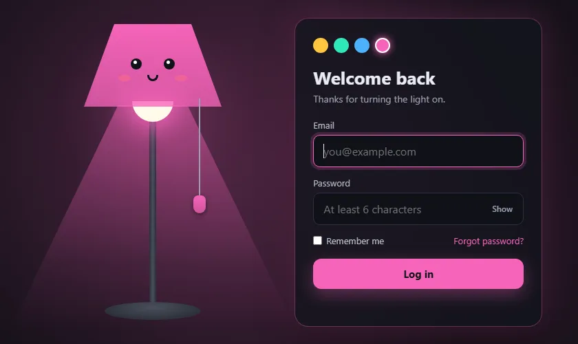
A swatch click copies the swatch's --sw value into --lamp on the scene.
That one line recolours everything, thanks to the variables from step 2.1.
findProblem() returns the first problem it finds, with the field and a message, or
null if everything is fine. showError() sets the mood to
error, marks the field with aria-invalid, focuses it and restarts the
shake. Reading form.offsetWidth between removing and re-adding the class forces the
browser to notice the change, so the shake plays again on every failed attempt. As soon as you
type, the lamp calms down.
3.5 Sparkles and submit
// ---------- SPARKLES ----------
function sparkle() {
  if (reduceMotion) return;
  const box = document.querySelector('.bulb').getBoundingClientRect();
  for (let i = 0; i < 18; i++) {
    const s = document.createElement('span');
    s.className = 'spark';
    const angle = Math.random() * Math.PI * 2;
    const dist = 80 + Math.random() * 120;
    s.style.left = box.left + box.width / 2 + 'px';
    s.style.top = box.top + box.height / 2 + 'px';
    s.style.setProperty('--dx', Math.cos(angle) * dist + 'px');
    s.style.setProperty('--dy', Math.sin(angle) * dist + 'px');
    s.style.animationDelay = Math.random() * 0.2 + 's';
    document.body.appendChild(s);
    s.addEventListener('animationend', () => s.remove());
  }
}
// ---------- END SPARKLES ----------

// ---------- SUBMIT ----------
form.addEventListener('submit', (e) => {
  e.preventDefault();
  if (submit.classList.contains('loading')) return;

  const problem = findProblem();
  if (problem) { showError(problem); return; }

  submit.classList.add('loading');
  msg.textContent = 'Checking…';

  // Replace this timeout with a real fetch() to your server.
  setTimeout(() => {
    submit.classList.remove('loading');
    scene.dataset.mood = 'ok';
    submit.querySelector('.label').textContent = 'Welcome back ✓';
    msg.textContent = 'You are logged in. The lamp is very proud.';
    sparkle();
  }, FAKE_DELAY);
});
// ---------- END SUBMIT ----------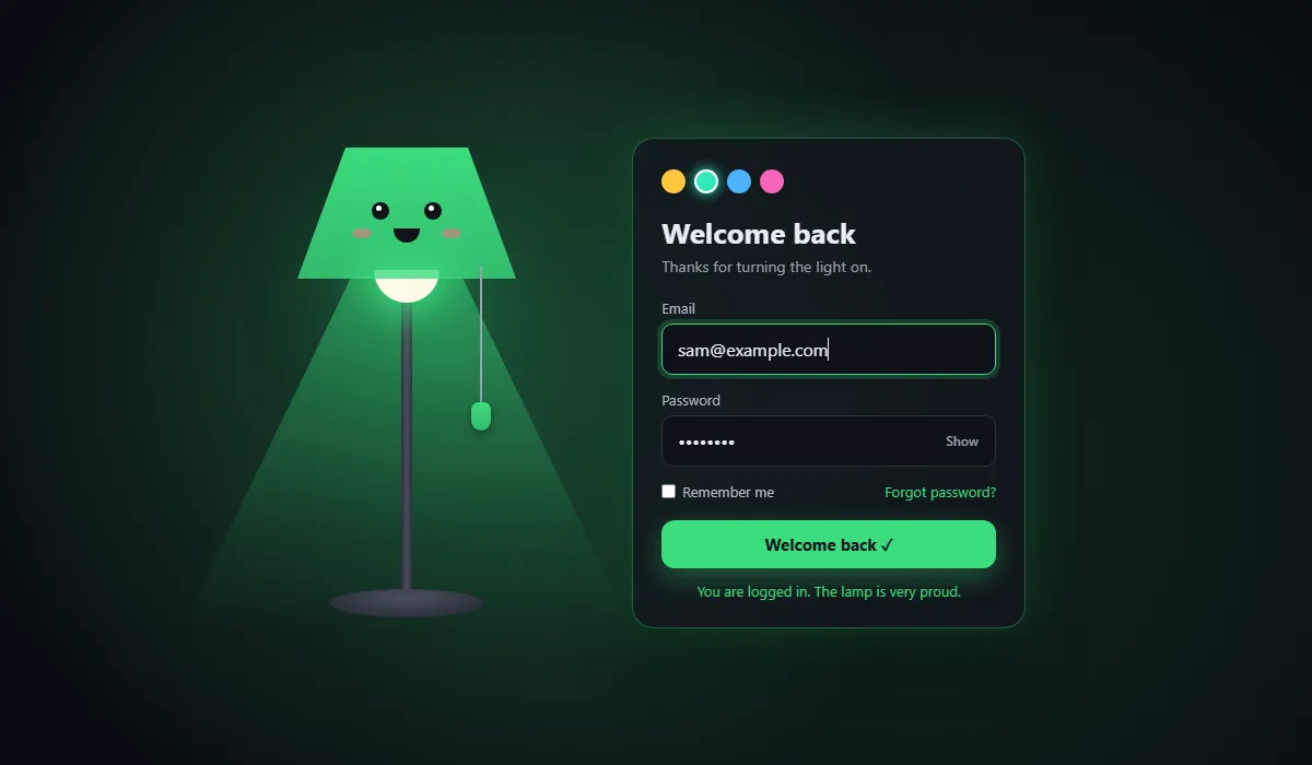
sparkle() finds the bulb on screen with getBoundingClientRect() and
creates 18 small dots there. Each one gets a random angle, and Math.cos and
Math.sin turn that angle and a distance into the --dx and
--dy the CSS animation needs. Each dot removes itself when its animation ends.
Submitting shows a spinner, waits, then sets the mood to ok. The
loading check at the top ignores extra clicks while it's busy.
Test it yourself
- Drag the cord down a little and let go. It bounces but nothing happens.
- Drag it further. The light flickers on and the form appears.
- Press Tab until the cord is focused, then press Enter. The lamp switches off.
- Turn it back on and submit with an invalid email. The lamp turns red and frowns.
- Pick a different colour, then log in with a valid email and a six-character password.
Using it on a real site
Replace the setTimeout in the submit handler with a fetch() to your
login endpoint over HTTPS, and only set the ok mood when the server agrees. For a
wrong password, call showError({ input: password, text: 'Wrong email or password.' })
and the lamp will frown for you. Browser checks are for convenience; the server must check
everything again.
One more thought: a hidden login form is a fun demo, but on a real product, consider starting
with the lamp on (call setLamp(true) at the end of the script) so nobody gets
stuck in the dark.
Share your lamp
Made a lamp with a different face? Share a screenshot as a link with sshot.online, or share your code with the free code sharing tool. No account needed.
Conclusion
This small project uses a handful of techniques you'll reuse everywhere:
- state kept in
data-attributes, with CSS doing the visuals - HSL numbers in a variable, so one value themes a whole page
clip-pathshapes- a spring made from three lines of maths
inertand a delayedvisibilityto hide things properly
Frequently asked questions
How does the pull cord work?
Pointer events track how far you drag the cord and set a CSS variable that stretches it. When you let go, a small spring simulation pulls it back with a bounce. If you dragged far enough, the lamp toggles.
Can keyboard users turn on the lamp?
Yes. The cord is a real button, so Tab reaches it and Enter or Space toggles the lamp.
aria-pressed tells screen readers whether the light is on.
How does one variable change the lamp colour everywhere?
The colour is stored as three HSL numbers in a CSS variable. Every colour on the page is
written as hsl(var(--c)) or hsl(var(--c) / opacity), so changing the
variable recolours the lamp, glow and form at once.
Why is the form inert while the lamp is off?
The form is invisible while the lamp is off. The inert attribute stops keyboard
and screen reader users from reaching fields they cannot see.
Does it use any images or libraries?
No. The lamp, face, light cone and sparkles are all HTML elements styled with CSS, and the behaviour is plain JavaScript.
Related articles
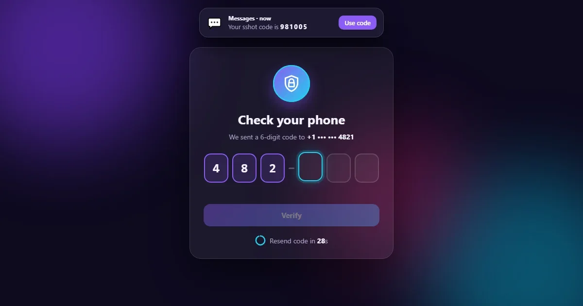
How to Build an Animated OTP Verification Page with HTML, CSS and JavaScript
Six digit boxes that pop, paste and autofill, a fake text message with the code, a resend countdown ring, a wrong-code shake and a confetti finish.
Read More →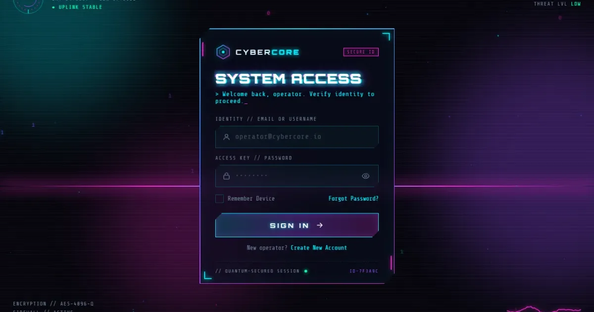
How to Build a Cyberpunk Login Page with HTML, CSS and JavaScript
A full tutorial for a neon login page with sign in, sign up and recovery views: glitch text, a spinning neon border, particles, validation and a loading screen.
Read More →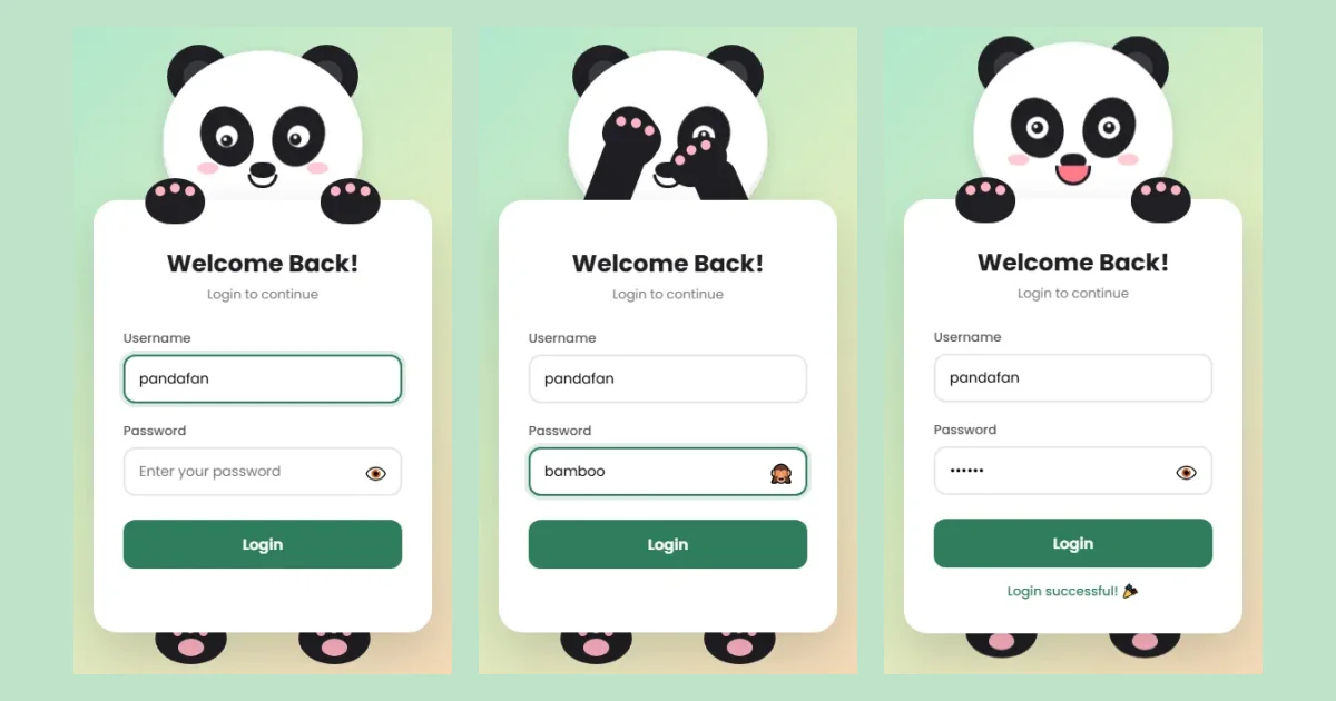
How to Build an Animated Panda Login Page with HTML, CSS and JavaScript
A step-by-step tutorial: build a login form where a CSS panda follows your typing, covers its eyes for the password, peeks, and reacts. Full code and live demo.
Read More →