How to Build an Animated OTP Verification Page with HTML, CSS and JavaScript
Published November 4, 2026 · 14 min read
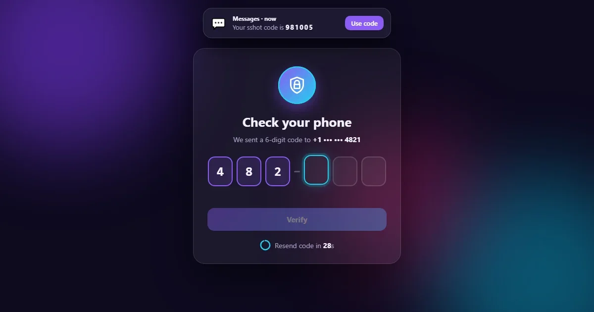
Almost every app asks for a one-time code at some point: after sign-up, at login, before a payment. It's a tiny screen, but it's easy to get wrong. Pasting the code fails, phone autofill puts all six digits into the first box, Backspace gets stuck, and nobody knows when they can ask for a new code.
This tutorial builds an OTP screen that gets all of that right, and looks great doing it:
- Each digit pops into its box.
- A fake text message slides in with the code; tap Use code and it types itself in.
- A wrong code shakes the boxes red. The right one flips them green in a wave.
- A tick draws itself and confetti bursts.
Try the live demo Try a wrong code first, then tap “Use code”.
It's built with plain HTML, CSS and JavaScript, with no libraries.
Six inputs or one?
There are two common ways to build code boxes: one hidden input with six fake boxes drawn on top, or six real inputs. We use six real inputs, because each box then gets a real focus ring, a real caret and a label of its own. The price is a little JavaScript to move between boxes, which is what most of this tutorial is about.
Project setup
otp-verify/
├── index.html   ← the card, the six boxes, the toast, the success view
├── style.css    ← glass card, box animations, timer ring, confetti
└── script.js    ← typing, pasting, autofill, timer, verify
The code blocks below follow each file from top to bottom. Copy them in order and you'll have the complete files.
Step 1: The HTML
1.1 Head, background and the text message
<!DOCTYPE html>
<html lang="en">
<head>
  <meta charset="UTF-8">
  <meta name="viewport" content="width=device-width, initial-scale=1">
  <title>Animated OTP Verification Screen</title>
  <link rel="stylesheet" href="style.css">
</head>
<body>
  <div class="blobs" aria-hidden="true"><i></i><i></i><i></i></div>

  <!-- ---------- SMS TOAST ---------- -->
  <div class="toast" role="status" aria-live="polite" hidden>
    <span class="toast-icon" aria-hidden="true">💬</span>
    <span class="toast-text">
      <strong>Messages · now</strong>
      <span>Your sshot code is <b class="toast-code"></b></span>
    </span>
    <button type="button" class="toast-use">Use code</button>
  </div>
  <!-- ---------- END SMS TOAST ---------- -->

  <main class="card">
The three empty <i> elements become the blurry colour blobs drifting in the
background. The toast is our pretend text message. It starts hidden and has
role="status", so a screen reader announces the code when it arrives.
1.2 The code boxes
    <!-- ---------- VERIFY VIEW ---------- -->
    <section class="view verify-view">
      <div class="badge" aria-hidden="true">
        <span class="ring"></span><span class="ring"></span>
        <svg viewBox="0 0 24 24"><path d="M12 2 4 5v6c0 5 3.4 9.4 8 11 4.6-1.6 8-6 8-11V5l-8-3Z"/><path class="lock" d="M9 11V9a3 3 0 0 1 6 0v2M8.5 11h7v5h-7z"/></svg>
      </div>

      <h1>Check your phone</h1>
      <p class="sub">We sent a 6-digit code to <b>+1 ••• ••• 4821</b></p>

      <form class="otp-form" novalidate>
        <div class="boxes" role="group" aria-label="6-digit verification code">
          <input inputmode="numeric" autocomplete="one-time-code" maxlength="6" aria-label="Digit 1 of 6">
          <input inputmode="numeric" maxlength="1" aria-label="Digit 2 of 6">
          <input inputmode="numeric" maxlength="1" aria-label="Digit 3 of 6">
          <span class="dash" aria-hidden="true"></span>
          <input inputmode="numeric" maxlength="1" aria-label="Digit 4 of 6">
          <input inputmode="numeric" maxlength="1" aria-label="Digit 5 of 6">
          <input inputmode="numeric" maxlength="1" aria-label="Digit 6 of 6">
        </div>

        <p class="msg" role="alert"></p>

        <button type="submit" class="verify" disabled><span class="label">Verify</span></button>
      </form>

      <div class="resend">
        <svg class="timer" viewBox="0 0 36 36" aria-hidden="true">
          <circle class="timer-track" cx="18" cy="18" r="15"/>
          <circle class="timer-fill" cx="18" cy="18" r="15"/>
        </svg>
        <span class="resend-text">Resend code in <b class="seconds">30</b>s</span>
        <button type="button" class="resend-btn" hidden>Send a new code</button>
      </div>
    </section>
    <!-- ---------- END VERIFY VIEW ---------- -->
A few small attributes do a lot here:
inputmode="numeric"opens the number pad on phones. We don't usetype="number", which adds spinner arrows and drops leading zeros.autocomplete="one-time-code"on the first box lets iPhones and Android phones offer the code from a text message above the keyboard. That box hasmaxlength="6"so autofill can drop all six digits in at once; JavaScript spreads them out.- Each box has an
aria-labellike “Digit 2 of 6”, and the group has its own label, so screen reader users know where they are. - The error message uses
role="alert", which is read out immediately.
The timer is a small SVG with two circles: a faint track and a coloured ring we'll empty second by second.
1.3 The success view
    <!-- ---------- SUCCESS VIEW ---------- -->
    <section class="view success-view" hidden>
      <svg class="check" viewBox="0 0 52 52" aria-hidden="true">
        <circle cx="26" cy="26" r="24"/>
        <path d="M15 27l7 7 15-15"/>
      </svg>
      <h2 tabindex="-1">You're verified!</h2>
      <p class="sub">Your phone number is confirmed. Welcome aboard.</p>
      <button type="button" class="again">Try the demo again</button>
    </section>
    <!-- ---------- END SUCCESS VIEW ---------- -->
  </main>

  <script src="script.js"></script>
</body>
</html>
The tick is a circle and a path inside an SVG. CSS will “draw” both. The heading has
tabindex="-1" so JavaScript can move focus to it, which makes screen readers announce
the success.
Step 2: The CSS
2.1 Colours and drifting blobs
/* ---------- BASE ---------- */
* { box-sizing: border-box; margin: 0; }

:root {
  --accent: #8b5cf6;
  --accent-2: #22d3ee;
  --ok: #22c55e;
  --bad: #f43f5e;
  --text: #f4f3ff;
  --muted: #a9a3c9;
}

body {
  min-height: 100vh;
  min-height: 100dvh;
  display: grid;
  grid-template-columns: minmax(0, 1fr);   /* the column may never grow wider than the screen */
  place-items: center;
  padding: 24px 16px;
  background: #0e0a1f;
  color: var(--text);
  font-family: system-ui, -apple-system, "Segoe UI", Roboto, sans-serif;
  overflow-x: hidden;
}
/* ---------- END BASE ---------- */

/* ---------- BACKGROUND BLOBS ---------- */
.blobs { position: fixed; inset: 0; overflow: hidden; pointer-events: none; }
.blobs i {
  position: absolute;
  width: 420px;
  height: 420px;
  border-radius: 50%;
  filter: blur(80px);
  opacity: .55;
  animation: drift 18s ease-in-out infinite alternate;
}
.blobs i:nth-child(1) { background: #7c3aed; top: -120px; left: -80px; }
.blobs i:nth-child(2) { background: #0891b2; bottom: -140px; right: -100px; animation-delay: -6s; }
.blobs i:nth-child(3) { background: #db2777; top: 40%; left: 55%; width: 300px; height: 300px; opacity: .35; animation-delay: -12s; }
/* ---------- END BACKGROUND BLOBS ---------- */
All the colours live in variables at the top, so you can rebrand the page in one place.
grid-template-columns: minmax(0, 1fr) on the body might look odd, but it's important:
without it, the grid column grows to fit the card's content and the card overflows on 320px
phones.
The blobs are big circles with filter: blur(80px), so they turn into soft glows. Each
drifts for 18 seconds with alternate (forward, then back), and negative delays start
them at different points so they never move together.
2.2 The glass card and pulsing badge
/* ---------- CARD ---------- */
.card {
  position: relative;
  width: 100%;
  max-width: 420px;
  padding: 36px 28px 26px;
  border-radius: 24px;
  background: rgba(255, 255, 255, .06);
  border: 1px solid rgba(255, 255, 255, .12);
  box-shadow: 0 30px 80px rgba(0, 0, 0, .45);
  backdrop-filter: blur(18px);
  text-align: center;
  animation: rise .7s cubic-bezier(.2, .9, .3, 1.15) both;
}
.view[hidden] { display: none; }
.view { animation: fade .45s ease both; }

h1, h2 { font-size: 26px; margin-bottom: 8px; }
.sub { color: var(--muted); font-size: 14px; line-height: 1.5; margin-bottom: 24px; }
.sub b { color: var(--text); white-space: nowrap; }
/* ---------- END CARD ---------- */

/* ---------- SHIELD BADGE ---------- */
.badge {
  position: relative;
  width: 76px;
  height: 76px;
  margin: 0 auto 18px;
  display: grid;
  place-items: center;
  border-radius: 50%;
  background: linear-gradient(135deg, var(--accent), var(--accent-2));
  box-shadow: 0 10px 30px rgba(139, 92, 246, .45);
}
.badge svg { width: 38px; height: 38px; fill: none; stroke: #fff; stroke-width: 1.8; stroke-linejoin: round; stroke-linecap: round; }
.badge .ring {
  position: absolute;
  inset: 0;
  border-radius: 50%;
  border: 2px solid var(--accent-2);
  animation: ping 2.4s ease-out infinite;
}
.badge .ring + .ring { animation-delay: 1.2s; }
/* ---------- END SHIELD BADGE ---------- */
The card is white at 6% opacity with backdrop-filter: blur(18px), which blurs the
blobs behind it into frosted glass. It rises into place on load with a slightly bouncy curve.
The badge's “radar” effect is two rings running the same ping animation,
which grows a ring while fading it out. The second ring starts 1.2s later, so there's always one
ring on its way out.
2.3 Animated digit boxes
/* ---------- DIGIT BOXES ---------- */
.boxes {
  display: flex;
  justify-content: center;
  align-items: center;
  gap: 8px;
  margin-bottom: 10px;
}
.boxes input {
  width: 50px;
  height: 60px;
  min-width: 0;
  flex: 0 1 50px;
  border-radius: 14px;
  border: 2px solid rgba(255, 255, 255, .14);
  background: rgba(255, 255, 255, .05);
  color: var(--text);
  font: 700 26px/1 ui-monospace, "SF Mono", Consolas, monospace;
  text-align: center;
  caret-color: var(--accent-2);
  transition: border-color .2s, box-shadow .2s, background .3s, transform .2s;
}
.boxes input:focus {
  outline: none;
  border-color: var(--accent-2);
  box-shadow: 0 0 0 4px rgba(34, 211, 238, .18), 0 0 24px rgba(34, 211, 238, .25);
  transform: translateY(-3px);
}
.boxes input::selection { background: rgba(34, 211, 238, .3); }
.boxes input.filled { border-color: var(--accent); background: rgba(139, 92, 246, .16); }
.boxes input.pop { animation: pop .28s ease; }
.dash { width: 12px; height: 3px; flex: none; border-radius: 2px; background: rgba(255, 255, 255, .25); }

/* wrong code */
.boxes.bad { animation: shake .45s ease; }
.boxes.bad input { border-color: var(--bad); background: rgba(244, 63, 94, .14); color: #fecdd3; }

/* right code: each box turns green a moment after the one before (--i set in script.js) */
.boxes.good input {
  border-color: var(--ok);
  background: rgba(34, 197, 94, .18);
  animation: flip .5s ease both;
  animation-delay: calc(var(--i) * 70ms);
}

.msg { min-height: 20px; margin-bottom: 14px; font-size: 13px; color: var(--bad); }
/* ---------- END DIGIT BOXES ---------- */
Each state is one class:
- Focus lifts the box 3px and adds a cyan glow, so you always see where you're typing.
.filledtints the box purple..popscales it up for a moment when a digit lands..badon the group shakes all six boxes and turns them red..goodflips every box green. The clever part isanimation-delay: calc(var(--i) * 70ms). JavaScript gives each box its number in--i(0 to 5), so each box flips 70ms after the one before it, making a wave.
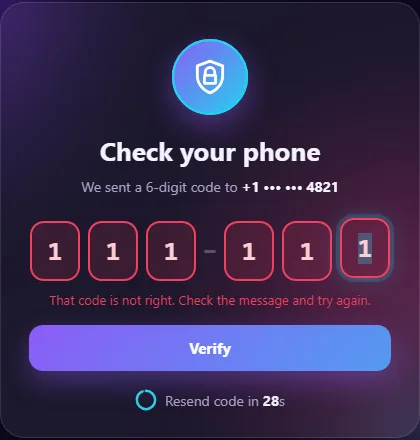
Boxes use flex: 0 1 50px with min-width: 0. They are 50px wide when there
is room, and shrink evenly on small phones instead of overflowing.
2.4 Button, timer ring and toast
/* ---------- VERIFY BUTTON ---------- */
.verify, .again {
  position: relative;
  width: 100%;
  padding: 14px;
  border: 0;
  border-radius: 14px;
  background: linear-gradient(135deg, var(--accent), var(--accent-2));
  background-size: 200% 100%;
  color: #fff;
  font: 700 15px/1.2 system-ui, sans-serif;
  cursor: pointer;
  box-shadow: 0 10px 28px rgba(139, 92, 246, .4);
  transition: opacity .3s, transform .15s, background-position .5s;
}
.verify:hover:not(:disabled), .again:hover { background-position: 100% 0; transform: translateY(-1px); }
.verify:disabled { opacity: .4; cursor: not-allowed; box-shadow: none; }
.verify:focus-visible, .again:focus-visible, .resend-btn:focus-visible, .toast-use:focus-visible { outline: 3px solid #fff; outline-offset: 3px; }
.verify.loading .label { visibility: hidden; }
.verify.loading::after {
  content: "";
  position: absolute;
  inset: 0;
  margin: auto;
  width: 18px;
  height: 18px;
  border: 3px solid #fff;
  border-right-color: transparent;
  border-radius: 50%;
  animation: spin .7s linear infinite;
}
/* ---------- END VERIFY BUTTON ---------- */

/* ---------- RESEND TIMER ---------- */
.resend { display: flex; align-items: center; justify-content: center; gap: 8px; margin-top: 18px; font-size: 14px; color: var(--muted); }
.timer { width: 22px; height: 22px; transform: rotate(-90deg); }
.timer circle { fill: none; stroke-width: 4; }
.timer-track { stroke: rgba(255, 255, 255, .12); }
.timer-fill {
  stroke: var(--accent-2);
  stroke-linecap: round;
  stroke-dasharray: 94.25;          /* 2 × π × 15, the full circle */
  stroke-dashoffset: 0;
  transition: stroke-dashoffset 1s linear;
}
.resend b { color: var(--text); font-variant-numeric: tabular-nums; }
.resend-btn {
  border: 0;
  background: none;
  color: var(--accent-2);
  font: 600 14px/1 system-ui, sans-serif;
  cursor: pointer;
  padding: 4px;
}
.resend-btn:hover { text-decoration: underline; }
/* ---------- END RESEND TIMER ---------- */

/* ---------- SMS TOAST ---------- */
.toast {
  position: fixed;
  top: 16px;
  left: 50%;
  z-index: 10;
  width: calc(100% - 32px);
  max-width: 380px;
  display: flex;
  align-items: center;
  gap: 12px;
  padding: 12px 14px;
  border-radius: 18px;
  background: rgba(30, 27, 52, .92);
  border: 1px solid rgba(255, 255, 255, .14);
  box-shadow: 0 16px 40px rgba(0, 0, 0, .5);
  backdrop-filter: blur(12px);
  text-align: left;
  transform: translate(-50%, -140%);
  transition: transform .55s cubic-bezier(.2, .9, .3, 1.2);
}
.toast[hidden] { display: none; }
.toast.show { transform: translate(-50%, 0); }
.toast-icon { font-size: 24px; }
.toast-text { flex: 1; font-size: 13px; line-height: 1.4; color: var(--muted); }
.toast-text strong { display: block; color: var(--text); font-size: 12px; }
.toast-code { color: var(--text); letter-spacing: 2px; }
.toast-use {
  flex: none;
  padding: 8px 12px;
  border: 0;
  border-radius: 10px;
  background: var(--accent);
  color: #fff;
  font: 600 13px/1 system-ui, sans-serif;
  cursor: pointer;
}
/* ---------- END SMS TOAST ---------- */
The button's gradient is twice as wide as the button (background-size: 200% 100%).
On hover, background-position slides it, so the colours shift smoothly.
The timer ring uses the classic SVG dash trick. The circle's outline is 94.25px
long (2 × π × the 15px radius). stroke-dasharray: 94.25 makes one dash
exactly that long, so the ring looks complete. Increasing stroke-dashoffset slides the
dash away, so the ring empties. The SVG is rotated -90 degrees so it empties from the top, like a
clock.
The toast waits above the screen at translate(-50%, -140%) and slides down when the
.show class is added.
2.5 A tick that draws itself
/* ---------- SUCCESS VIEW ---------- */
.check { width: 96px; height: 96px; margin: 4px auto 18px; display: block; }
.check circle, .check path { fill: none; stroke: var(--ok); stroke-width: 3; stroke-linecap: round; stroke-linejoin: round; }
.check circle { stroke-dasharray: 151; stroke-dashoffset: 151; animation: draw .6s ease forwards; }
.check path { stroke-dasharray: 36; stroke-dashoffset: 36; animation: draw .35s ease forwards .55s; }
.success-view h2:focus { outline: none; }
.confetti {
  position: fixed;
  top: 0;
  left: 0;
  width: 9px;
  height: 14px;
  border-radius: 2px;
  pointer-events: none;
  z-index: 20;
}
/* ---------- END SUCCESS VIEW ---------- */

/* ---------- KEYFRAMES ---------- */
@keyframes drift { to { transform: translate(60px, 80px) scale(1.15); } }
@keyframes rise { from { opacity: 0; transform: translateY(30px) scale(.96); } }
@keyframes fade { from { opacity: 0; transform: translateY(8px); } }
@keyframes ping { from { transform: scale(1); opacity: .8; } to { transform: scale(1.7); opacity: 0; } }
@keyframes pop { 50% { transform: translateY(-3px) scale(1.12); } }
@keyframes shake { 20%, 60% { transform: translateX(-10px); } 40%, 80% { transform: translateX(10px); } }
@keyframes flip { 0% { transform: rotateX(0); } 50% { transform: rotateX(90deg); } 100% { transform: rotateX(0); } }
@keyframes spin { to { transform: rotate(360deg); } }
@keyframes draw { to { stroke-dashoffset: 0; } }
/* ---------- END KEYFRAMES ---------- */

/* ---------- SMALL SCREENS ---------- */
@media (max-width: 400px) {
  .card { padding: 28px 16px 22px; }
  .boxes { gap: 5px; }
  .boxes input { height: 52px; font-size: 22px; border-radius: 12px; }
  .dash { width: 8px; }
}
/* ---------- END SMALL SCREENS ---------- */

/* ---------- REDUCED MOTION ---------- */
@media (prefers-reduced-motion: reduce) {
  *, *::before, *::after {
    animation-duration: .01ms !important;
    animation-iteration-count: 1 !important;
    animation-delay: 0s !important;
    transition-duration: .01ms !important;
  }
}
/* ---------- END REDUCED MOTION ---------- */
The same dash trick draws the tick. The circle's dash and offset both equal its length (about
151px), so it starts invisible. The draw animation moves the offset to 0 and the line
appears as if drawn by a pen. The check mark does the same, starting 0.55s later, once the circle
is finished.

Step 3: The JavaScript
3.1 Settings, elements and the fake server
// ---------- SETTINGS ----------
const RESEND_SECONDS = 30;   // wait this long before "Send a new code" appears
const TOAST_DELAY = 1200;    // the fake text message arrives after this many ms
const FAKE_DELAY = 900;      // pretend the server takes this long to check (ms)
// ---------- END SETTINGS ----------

// ---------- ELEMENTS ----------
const inputs = [...document.querySelectorAll('.boxes input')];
const boxes = document.querySelector('.boxes');
const form = document.querySelector('.otp-form');
const verifyBtn = document.querySelector('.verify');
const msg = document.querySelector('.msg');
const toast = document.querySelector('.toast');
const toastCode = document.querySelector('.toast-code');
const useBtn = document.querySelector('.toast-use');
const seconds = document.querySelector('.seconds');
const resendText = document.querySelector('.resend-text');
const resendBtn = document.querySelector('.resend-btn');
const timerFill = document.querySelector('.timer-fill');
const verifyView = document.querySelector('.verify-view');
const successView = document.querySelector('.success-view');
const reduceMotion = matchMedia('(prefers-reduced-motion: reduce)').matches;

inputs.forEach((input, i) => input.style.setProperty('--i', i));
// ---------- END ELEMENTS ----------

// ---------- FAKE SERVER ----------
// In a real app the server makes the code, texts it, and checks it.
// Here we keep it in a variable so the demo works with no back end.
let secret = '';

function makeCode() {
  secret = String(Math.floor(100000 + Math.random() * 900000));
  return secret;
}
// ---------- END FAKE SERVER ----------
inputs.forEach((input, i) => input.style.setProperty('--i', i)) hands each box the
number the CSS wave delay uses.
In a real app, the server makes the code, sends the text message and checks
what you type. The browser never knows the right answer. For the demo, makeCode()
makes a random six-digit number and keeps it in secret, so the page works with no back
end.
3.2 Reading and writing the boxes
// ---------- READ AND WRITE THE BOXES ----------
const code = () => inputs.map((i) => i.value).join('');

// Put digits into the boxes, starting at box `start`.
function fill(digits, start) {
  let i = start;
  for (const d of digits) {
    if (i >= inputs.length) break;
    setBox(i, d);
    i++;
  }
  inputs[Math.min(i, inputs.length - 1)].focus();
}

function setBox(i, digit) {
  const input = inputs[i];
  input.value = digit;
  input.classList.toggle('filled', digit !== '');
  if (digit && !reduceMotion) {
    input.classList.remove('pop');
    void input.offsetWidth;              // restart the pop animation
    input.classList.add('pop');
  }
}

function onChange() {
  const full = code().length === inputs.length;
  verifyBtn.disabled = !full;
  boxes.classList.remove('bad');
  msg.textContent = '';
  if (full) form.requestSubmit();       // no need to press Verify
}
// ---------- END READ AND WRITE THE BOXES ----------
Three small helpers keep the rest of the code simple:
code()joins the six values into one string.setBox()sets one box, toggles.filled, and replays the pop animation. Removing the class, readingoffsetWidthand adding it again restarts an animation that already ran.fill()spreads several digits across the boxes from a starting box, then focuses the box after the last digit.
onChange() runs after every change. Once all six boxes are full, it calls
form.requestSubmit(), so people don't have to press Verify. Unlike
form.submit(), requestSubmit() fires the submit event, so our
handler still runs.
3.3 Typing, deleting and pasting
// ---------- TYPING, DELETING, PASTING ----------
inputs.forEach((input, i) => {
  input.addEventListener('input', () => {
    const digits = input.value.replace(/\D/g, '');
    setBox(i, '');
    // One digit is normal typing. Several digits means autofill or a fast keyboard.
    if (digits) fill(digits, i);
    onChange();
  });

  input.addEventListener('keydown', (e) => {
    if (e.key === 'Backspace' && !input.value && i > 0) {
      e.preventDefault();
      setBox(i - 1, '');
      inputs[i - 1].focus();
      onChange();
    }
    if (e.key === 'ArrowLeft' && i > 0) { e.preventDefault(); inputs[i - 1].focus(); }
    if (e.key === 'ArrowRight' && i < inputs.length - 1) { e.preventDefault(); inputs[i + 1].focus(); }
  });

  input.addEventListener('paste', (e) => {
    e.preventDefault();
    const digits = (e.clipboardData.getData('text') || '').replace(/\D/g, '');
    if (!digits) return;
    fill(digits, i);
    onChange();
  });

  // Select the digit on focus so typing replaces it.
  // Only if it still has focus: select() also focuses, and two boxes doing that
  // to each other would bounce focus back and forth forever.
  input.addEventListener('focus', () => setTimeout(() => {
    if (document.activeElement === input) input.select();
  }, 0));
});
// ---------- END TYPING, DELETING, PASTING ----------
This is the part most OTP inputs get wrong. Each box listens for four things:
input: strip anything that isn't a digit with/\D/g. One digit is normal typing. Several digits mean phone autofill, sofill()spreads them over the boxes.- Backspace in an empty box clears the box before it and moves there. Without this, people get stuck and have to click back.
- Left and right arrows move between boxes.
paste: read the clipboard text, keep only digits, and fill from the current box. Pasting482 913or48-29-13works too.
On focus, the box's digit is selected, so typing replaces it. Notice the check
document.activeElement === input. select() also focuses the input, so
if focus moves through several boxes quickly, each delayed select() would pull focus
back to its own box, and the boxes would fight over focus forever. The check makes each box
select only if it still has focus.
3.4 The fake text message
// ---------- SMS TOAST ----------
let toastTimer;

function sendText() {
  toastCode.textContent = makeCode();
  toast.hidden = false;
  clearTimeout(toastTimer);
  requestAnimationFrame(() => requestAnimationFrame(() => toast.classList.add('show')));
  toastTimer = setTimeout(hideToast, 9000);
}

function hideToast() {
  toast.classList.remove('show');
  setTimeout(() => { if (!toast.classList.contains('show')) toast.hidden = true; }, 600);
}

// "Use code" types the digits in one by one, like a phone's autofill.
useBtn.addEventListener('click', () => {
  hideToast();
  inputs.forEach((_, i) => setBox(i, ''));
  [...secret].forEach((d, i) => {
    setTimeout(() => {
      setBox(i, d);
      inputs[i].focus();
      if (i === inputs.length - 1) onChange();
    }, reduceMotion ? 0 : i * 90);
  });
});
// ---------- END SMS TOAST ----------
sendText() makes a new code, puts it in the toast and shows it. The double
requestAnimationFrame waits until the browser has drawn the toast once without
hidden; otherwise the slide-in transition would be skipped. The toast hides itself
after nine seconds.
“Use code” types the digits in one by one, 90ms apart, the way a phone's autofill feels.
3.5 The resend countdown
// ---------- RESEND TIMER ----------
let left = 0, tick;

function startTimer() {
  left = RESEND_SECONDS;
  resendText.hidden = false;
  resendBtn.hidden = true;
  drawTimer();
  clearInterval(tick);
  tick = setInterval(() => {
    left--;
    drawTimer();
    if (left <= 0) {
      clearInterval(tick);
      resendText.hidden = true;
      resendBtn.hidden = false;
    }
  }, 1000);
}

function drawTimer() {
  seconds.textContent = left;
  // 94.25 is the circle's length; empty it a little more every second
  timerFill.style.strokeDashoffset = 94.25 * (1 - left / RESEND_SECONDS);
}

resendBtn.addEventListener('click', () => {
  inputs.forEach((_, i) => setBox(i, ''));
  onChange();
  inputs[0].focus();
  startTimer();
  sendText();
});
// ---------- END RESEND TIMER ----------
Every second, left goes down by one, the number updates, and the ring's
strokeDashoffset becomes 94.25 × (1 - left / 30). That's 0 at the
start, a full ring, and 94.25 at the end, an empty ring. The CSS transition of one second makes
the ring drain smoothly instead of jumping. At zero, the text swaps for the “Send a new
code” button.
The countdown matters: it stops people requesting ten codes in a row, and tells them exactly when they can try again.
3.6 Verify, wrong code and success
// ---------- VERIFY ----------
let checking = false;

form.addEventListener('submit', (e) => {
  e.preventDefault();
  if (checking || code().length !== inputs.length) return;
  checking = true;
  verifyBtn.classList.add('loading');

  // Replace this timeout with a fetch() that sends code() to your server.
  setTimeout(() => {
    verifyBtn.classList.remove('loading');
    checking = false;
    if (code() === secret) success();
    else wrong();
  }, FAKE_DELAY);
});

function wrong() {
  boxes.classList.remove('bad');
  void boxes.offsetWidth;
  boxes.classList.add('bad');
  msg.textContent = 'That code is not right. Check the message and try again.';
  setTimeout(() => {
    boxes.classList.remove('bad');
    inputs.forEach((_, i) => setBox(i, ''));
    verifyBtn.disabled = true;
    inputs[0].focus();
  }, 700);
}

function success() {
  clearInterval(tick);
  hideToast();
  boxes.classList.add('good');
  const wave = reduceMotion ? 0 : inputs.length * 70 + 500;
  setTimeout(() => {
    verifyView.hidden = true;
    successView.hidden = false;
    successView.querySelector('h2').focus();
    confetti();
  }, wave);
}
// ---------- END VERIFY ----------
The checking flag ignores extra submits while a check is running. After the fake
delay:
- Wrong: shake the boxes and show the message. 0.7s later, clear the boxes and focus the first one, ready for another try.
- Right: stop the timer, hide the toast and add
.goodfor the green wave. After the wave (6 boxes × 70ms + 500ms), switch to the success view, focus its heading and launch confetti.
3.7 Confetti with the Web Animations API
// ---------- CONFETTI ----------
function confetti() {
  if (reduceMotion) return;
  const colors = ['#8b5cf6', '#22d3ee', '#22c55e', '#f472b6', '#facc15'];
  for (let i = 0; i < 80; i++) {
    const piece = document.createElement('i');
    piece.className = 'confetti';
    piece.style.background = colors[i % colors.length];
    document.body.appendChild(piece);
    const x = innerWidth / 2, y = innerHeight / 2;
    const dx = (Math.random() - 0.5) * innerWidth;
    const up = -200 - Math.random() * 250;
    const spin = Math.random() * 720 - 360;
    // three keyframes: start in the middle, burst up and out, then fall
    piece.animate([
      { transform: `translate(${x}px, ${y}px) rotate(0)`, opacity: 1 },
      { transform: `translate(${x + dx * 0.6}px, ${y + up}px) rotate(${spin / 2}deg)`, opacity: 1, offset: 0.35 },
      { transform: `translate(${x + dx}px, ${innerHeight + 40}px) rotate(${spin}deg)`, opacity: 0.8 }
    ], { duration: 1800 + Math.random() * 900, easing: 'cubic-bezier(.2,.6,.4,1)' }).onfinish = () => piece.remove();
  }
}
// ---------- END CONFETTI ----------

// ---------- START / RESTART ----------
function start() {
  boxes.classList.remove('good', 'bad');
  inputs.forEach((_, i) => setBox(i, ''));
  verifyBtn.disabled = true;
  msg.textContent = '';
  successView.hidden = true;
  verifyView.hidden = false;
  inputs[0].focus();
  startTimer();
  setTimeout(sendText, TOAST_DELAY);
}

document.querySelector('.again').addEventListener('click', start);
start();
// ---------- END START / RESTART ----------
Each of the 80 confetti pieces is animated with element.animate(), the Web Animations
API. It's like CSS keyframes, but written in JavaScript, so every piece can have its own random
path. Each piece gets three keyframes:
- Start in the middle of the screen.
- At 35% of the time, burst up and out to a random point.
- Fall past the bottom of the screen while spinning.
onfinish removes the piece, so nothing is left behind. start() resets
everything, and runs when the page loads and when you click “Try the demo again”.
Test it yourself
- Type three digits, then press Backspace four times. Focus walks back through the boxes.
- Copy
12-34-56and paste it into the first box. All six boxes fill. - Wrong code: the boxes shake red, then clear.
- Tap “Use code” in the message. The digits type in, the boxes turn green and confetti falls.
- Wait 30 seconds without verifying. “Send a new code” appears.
Using it on a real site
- Never put the code in the page. The server makes it, sends it and checks it.
Replace the
setTimeoutin the submit handler with afetch()that sendscode()to your server. - Limit attempts on the server, for example five tries per code, and make codes expire after a few minutes.
- Limit resends on the server too. The countdown is only a hint in the browser.
- For automatic autofill from a text message on Android and iOS, end the message with a line like
@yourdomain.com #123456. This is the WebOTP format, and it lets the phone match the message to your site.
Share your screen
Built your own verification step? Share a screenshot as a link with sshot.online, or share your code with the free code sharing tool. No account needed.
Conclusion
A good OTP screen is mostly about small details: numeric keypads, autofill, paste, Backspace, a clear countdown and honest error messages. The animations then make it feel great:
- staggered delays from one CSS variable
- SVG lines that draw themselves
- confetti from the Web Animations API
Frequently asked questions
How do I let users paste a 6-digit code into separate boxes?
Listen for the paste event on each box, read the text from
clipboardData, remove everything that is not a digit, then write one digit into
each box starting from the current one.
How does SMS autofill work with OTP boxes?
Add autocomplete="one-time-code" to the first box and give it
maxlength="6". The phone inserts the whole code there, and the input handler
spreads the digits across all six boxes.
Should I use type="number" for OTP inputs?
No. Use inputmode="numeric" instead. It shows the number pad on phones without
spinner arrows, and it keeps leading zeros.
How is the countdown ring drawn?
It is an SVG circle whose stroke-dasharray equals its length. Increasing
stroke-dashoffset each second slides the dash away, so the ring empties like a
clock.
Is it safe to check the code in JavaScript?
Only in a demo. On a real site the server creates, sends and checks the code, limits attempts and expires old codes. The browser must never know the right answer.
Related articles
How to Build an Animated Wind Login Page with a Bird Mascot, Lockout and 2FA Code
A full tutorial for a breezy login flow: letters that fly in as leaves, a windsock strength meter, a storm lockout after three tries and a six-digit code step.
Read More →
How to Build a Lamp Login Page with a Pull Cord in HTML, CSS and JavaScript
A dark room, a cute lamp and a cord you can actually pull. The light flickers on, the login form appears, and the lamp frowns or grins at what you type.
Read More →
How to Build an Add to Cart Animation and Shopping Cart with HTML, CSS and JavaScript
Products that fly into the cart in an arc, a slide-out cart drawer, a free shipping progress bar, counting totals and a delivery truck checkout button.
Read More →