How to Center a Div in CSS: 7 Easy Ways (with Examples)
Published November 5, 2026 · 10 min read
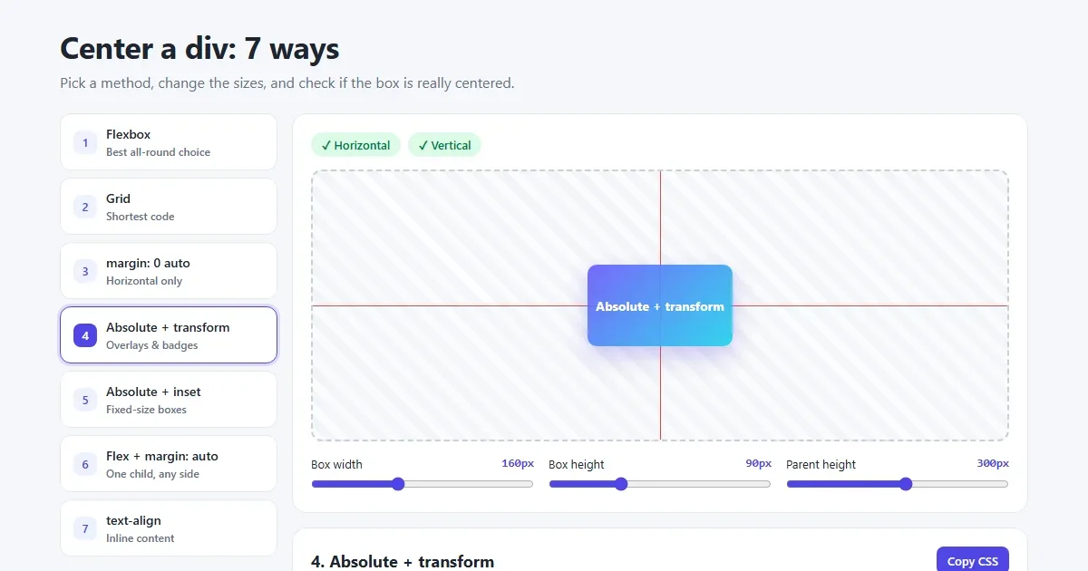
“How do I center a div?” is one of the most asked CSS questions of all time, and it's even become a joke among developers. The good news: in modern CSS it takes two or three lines. The confusing part is that there are many ways to do it, and each one works in slightly different situations.
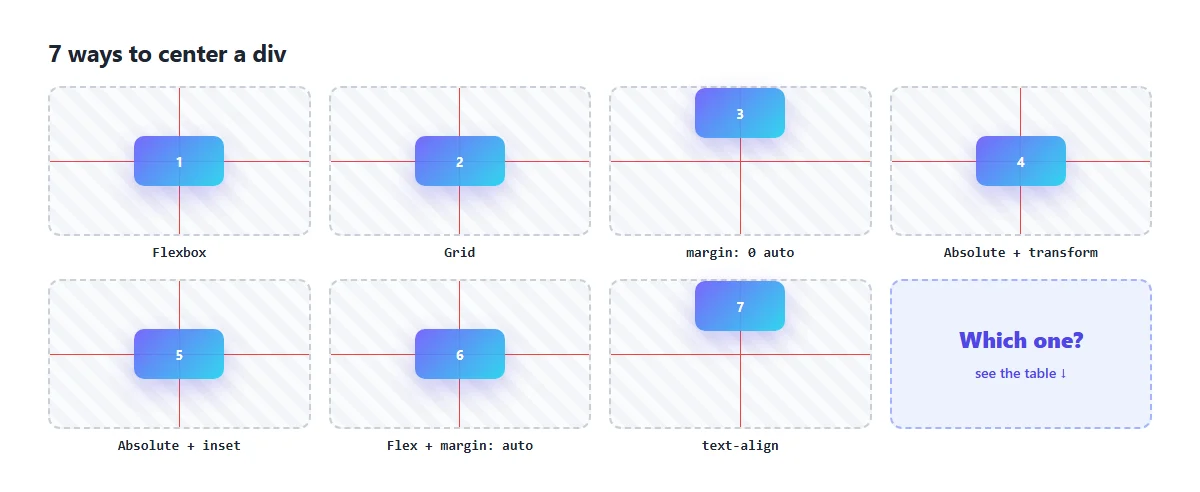
This guide shows seven methods, each with a picture of the result, code you can copy, and when to use it.
The quick answer
To center a div horizontally and vertically, put this on its parent:
.parent {
  display: grid;
  place-items: center;
}
Or, with Flexbox:
.parent {
  display: flex;
  justify-content: center;   /* horizontally */
  align-items: center;       /* vertically */
}
Both work in every modern browser, for any size of child. If centering “doesn't work”, the parent probably has no height; jump to the fix.
Try all 7 methods live The playground shows a ✓ or ✗ for each direction.
All the examples use the same HTML: a .parent box with a .child
inside it.
<div class="parent">
  <div class="child">I am centered</div>
</div>
1. Flexbox: the all-round choice
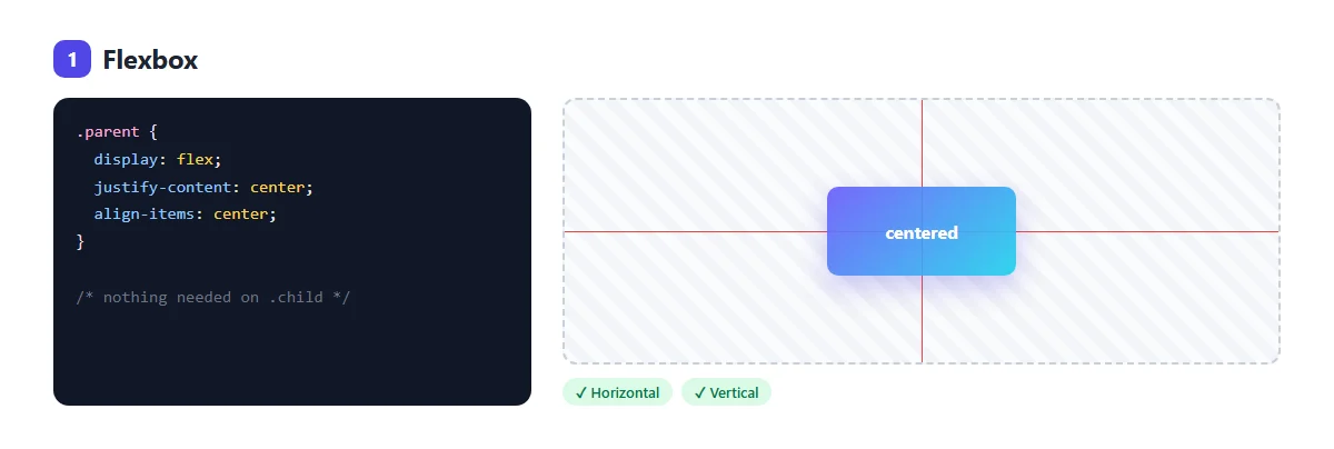
display: flex lines the children up in a row. Then:
justify-content: centercenters them along the row (left to right).align-items: centercenters them across the row (top to bottom).
Use it when: you have one or more items to center, like a button group, a row of icons or a card. It's the most common method in real projects.
Watch out: with flex-direction: column, the two properties swap
jobs. justify-content then centers vertically and align-items
horizontally.
2. Grid: the shortest code
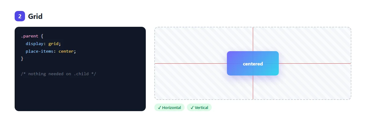
place-items: center is shorthand for align-items: center plus
justify-items: center. It centers every child inside its grid cell, and with no
columns defined, the whole parent is one cell.
Use it when: you want to center a single thing with the least code: a loading spinner, an empty state, a login form on the page.
Watch out: with several children, Grid stacks them in rows. If you want them side by side, use Flexbox instead.
3. margin: 0 auto: horizontal only
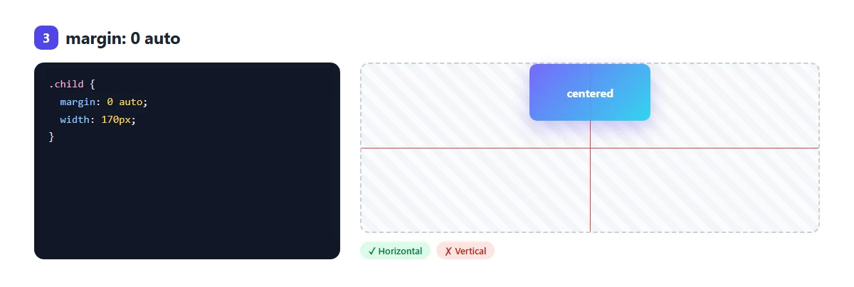
The classic method from before Flexbox existed. A block element with a width, and
auto left and right margins, sits in the middle. The browser splits the leftover
space equally between the two margins.
.container {
  max-width: 960px;
  margin: 0 auto;
}
Use it when: you want to center a page layout or a block of content left to right. It's how most websites center their main column.
Watch out:
- It needs a
widthormax-width. A block with no width fills its parent, so there's no space left to share. - It doesn't center vertically. In normal page flow,
autotop and bottom margins count as zero.
4. Absolute position + transform
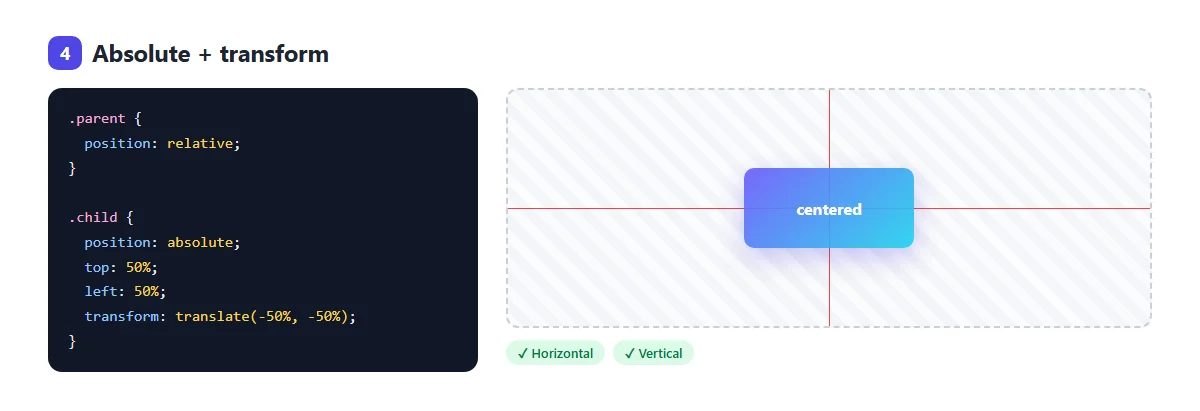
This method takes the child out of the normal flow and places it by coordinates:
position: relativeon the parent makes it the reference box.top: 50%; left: 50%moves the child's top-left corner to the parent's middle, so the child hangs down and to the right.transform: translate(-50%, -50%)pulls it back by half its own width and height. The percentages intranslaterefer to the element itself, which is what makes the trick work at any size.
Use it when: the child must sit on top of other content: a play button over a video, a badge over an image, a label in the middle of a chart.
Watch out: the parent no longer makes room for the child, so give the parent a
height. If the element already uses transform for an animation, the two will clash;
use method 5 instead.
5. Absolute position + inset: 0 + margin: auto
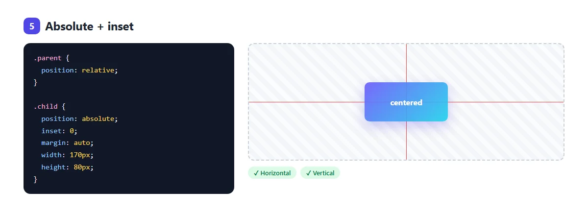
inset: 0 is short for top: 0; right: 0; bottom: 0; left: 0. On its own,
it would stretch the box to fill the parent. With a fixed width and height, it can't stretch, so
margin: auto shares the spare space evenly on all four sides.
Use it when: you center something with a known size, like an icon or a dialog
box, and you want to keep transform free for animations.
Watch out: without a width and a height, the child just fills the parent.
6. Flex + margin: auto
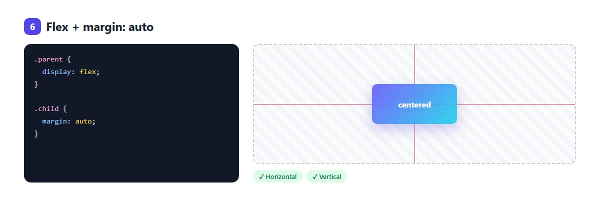
.parent { display: flex; }
.child  { margin: auto; }
Inside a flex (or grid) container, auto margins behave differently from normal flow:
they work vertically too, and soak up all the free space around the child.
Use it when: you need one item centered, or pushed to one side. For example,
margin-left: auto on the last item of a navigation bar pushes it to the right
edge.
7. text-align: center for inline content
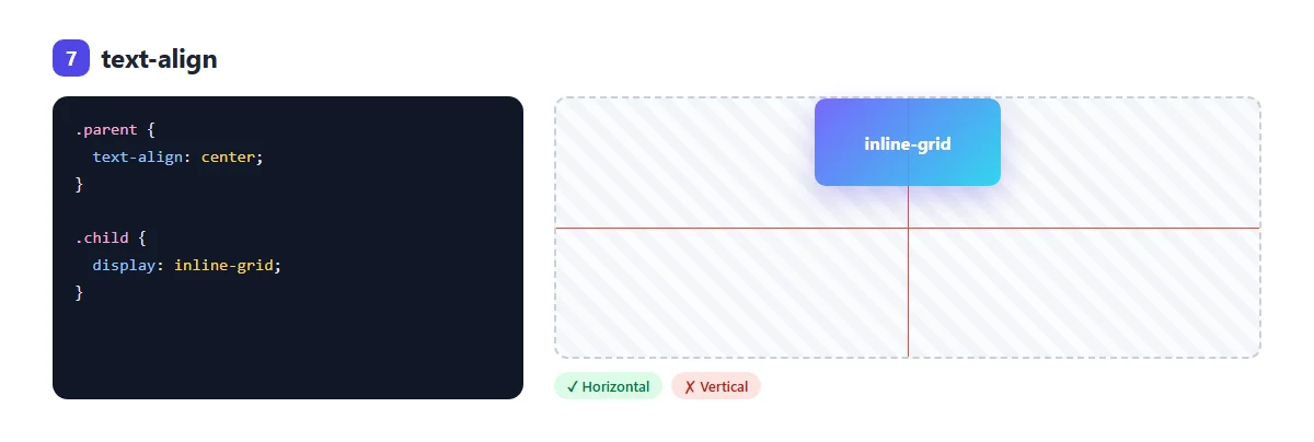
text-align: center centers inline content inside a block: text,
links, images, and elements with display: inline-block. It does nothing to a normal
block div, which is why it often seems not to work.
Use it when: you're centering text, or a few inline items like icons and buttons in a line.
Why isn't my div centering vertically?
Nine times out of ten, the parent has no height. A block element is only as tall as its content. If the parent is exactly as tall as the child, there's no space above or below to center in, so the child looks stuck at the top.
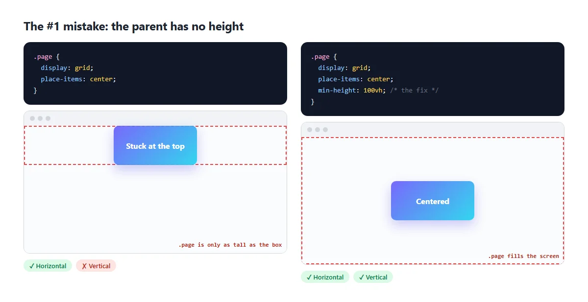
To center something in the middle of the whole screen, give the container the height of the viewport:
body {
  margin: 0;              /* remove the default 8px gap */
}
.page {
  min-height: 100vh;      /* at least as tall as the window */
  min-height: 100dvh;     /* better on phones, where toolbars come and go */
  display: grid;
  place-items: center;
}
dvh means “dynamic viewport height”. On phones, the browser's address bar
grows and shrinks, and 100vh can end up a little taller than the visible area.
Browsers that don't know dvh ignore that line and use the vh line above
it.
Bonus: center a popup on the screen
A modal or popup should stay centered even when the page scrolls. Use position:
fixed, which positions it against the browser window instead of a parent:
.modal {
position: fixed;
inset: 0;
margin: auto;
width: min(90vw, 480px); /* 480px, but never wider than the screen */
height: fit-content; /* as tall as its content */
}The built-in <dialog> element opened with showModal() is centered
like this by default.
Which method should I use?
| Method | Horizontal | Vertical | Best for |
|---|---|---|---|
| 1. Flexbox | ✓ | ✓ | Most things, especially several items |
2. Grid place-items | ✓ | ✓ | One item, shortest code |
3. margin: 0 auto | ✓ | ✗ | Page columns and content blocks |
| 4. Absolute + transform | ✓ | ✓ | Overlays, badges, unknown sizes |
| 5. Absolute + inset | ✓ | ✓ | Fixed-size boxes, modals |
6. Flex + margin: auto | ✓ | ✓ | One item, or pushing items aside |
7. text-align | ✓ | ✗ | Text and inline elements |
If you're not sure, use Grid for one thing and Flexbox for a group of things.
Common mistakes
- Putting the CSS on the wrong element. Flexbox and Grid centering go on the parent, not on the thing you want centered.
- The parent has no height. See above: add a height or
min-height. margin: 0 autowith no width. The block fills the whole width, so there's nothing to share.text-align: centeron a block child. It centers the text inside the div, not the div itself.- Forgetting
position: relativeon the parent with methods 4 and 5. The child then centers on the whole page instead. - Swapped properties in a column. With
flex-direction: column,justify-contentworks vertically.
Try it in the playground
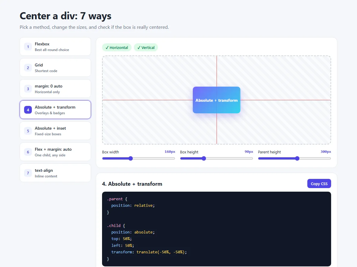
In the centering playground you can:
- switch between all seven methods and see the CSS each one needs
- change the box and parent sizes, and watch which methods keep up
- see green ✓ and red ✗ badges that measure whether the box is really centered
- copy the CSS straight into your project
Want to understand the margins and padding that affect all of this? Read CSS margin vs padding vs border next.
Share your work
Finally got it centered? Share a screenshot as a link with sshot.online, or share your code with the free code sharing tool. No account needed.
Frequently asked questions
What is the easiest way to center a div?
Put display: grid and place-items: center on the parent element.
The child is then centered horizontally and vertically, whatever its size.
How do I center a div horizontally?
Give the div a width or max-width and set margin: 0
auto. Or use display: flex with justify-content: center on
its parent.
How do I center a div vertically?
Use display: flex and align-items: center on the parent, or
display: grid with place-items: center. The parent must be taller
than the child, so give it a height or min-height.
Why is align-items: center not working?
Usually the parent has no extra height, so there is no space to center in. Add a height or
min-height to the parent. Also check that display: flex or
grid is on the parent, not the child.
How do I center a div in the middle of the screen?
Give a wrapper min-height: 100vh (or 100dvh on phones) with
display: grid and place-items: center, and remove the default body
margin.
Why does margin: auto not center vertically?
In normal block layout, auto top and bottom margins are treated as zero. They
only center vertically inside a flex or grid container, or on an absolutely positioned
element with inset: 0 and a fixed height.
Related articles
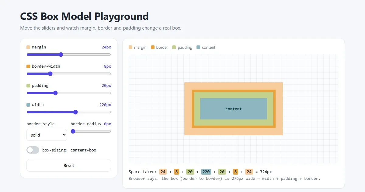
CSS Margin vs Padding vs Border: The Box Model Explained with Examples
A picture-by-picture lesson on margin, padding and border: shorthand order, border styles, box-sizing, margin collapse and centering, plus a live playground.
Read More →
How to Build a Lamp Login Page with a Pull Cord in HTML, CSS and JavaScript
A dark room, a cute lamp and a cord you can actually pull. The light flickers on, the login form appears, and the lamp frowns or grins at what you type.
Read More →
How to Build an Animated OTP Verification Page with HTML, CSS and JavaScript
Six digit boxes that pop, paste and autofill, a fake text message with the code, a resend countdown ring, a wrong-code shake and a confetti finish.
Read More →