How to Build a Freight Logistics Landing Page with HTML, CSS and JavaScript
Published November 5, 2026 · 16 min read
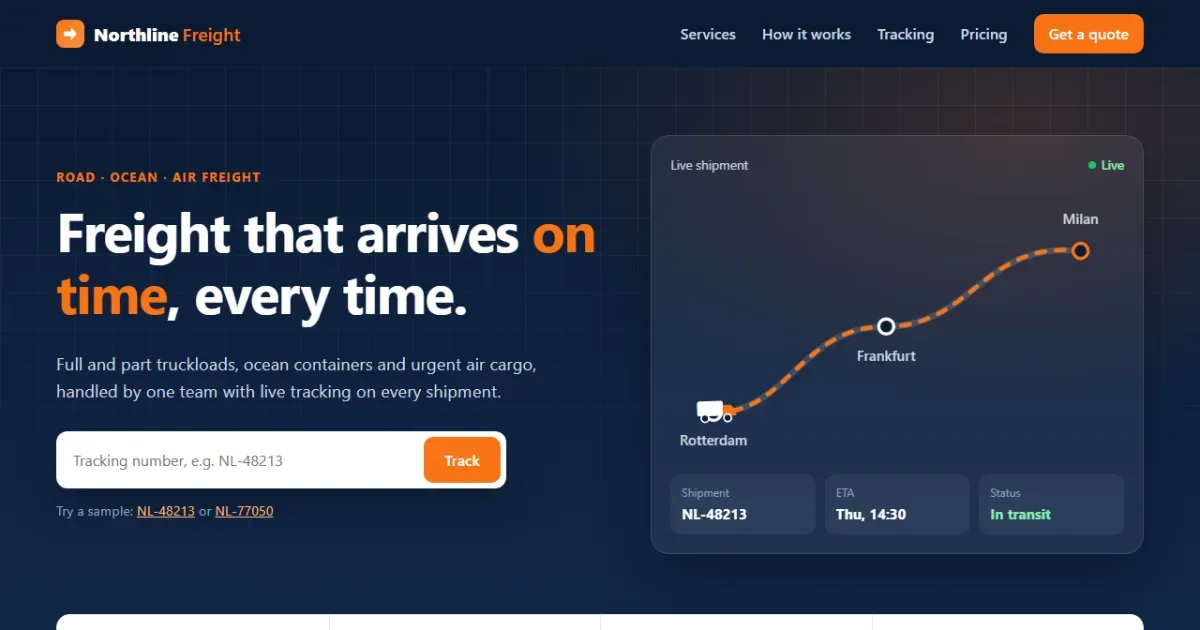
In this tutorial you'll build a complete landing page for a made-up freight company, Northline Freight. It looks and works like a real logistics website: a dark hero with a truck driving along a live route, animated numbers, service cards, a working shipment tracker and an instant quote calculator that prices a shipment as you move the sliders.
Open the live demo
Try tracking NL-48213 or NL-77050.
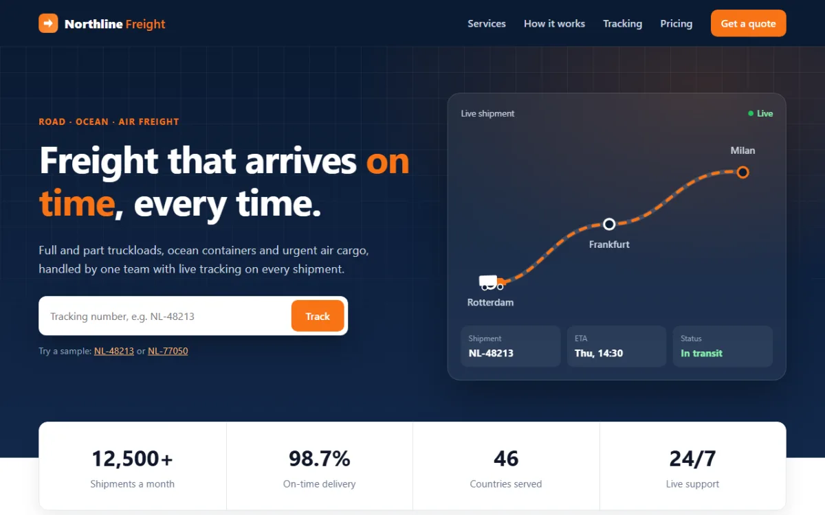
Everything is plain HTML, CSS and JavaScript, with no frameworks, no images and no libraries. The tutorial is split into three parts, one per language, so you can stop after any part and still have something that works:
- Part 1, HTML: the structure and content of every section.
- Part 2, CSS: the layout, colours, the animated route and the responsive design.
- Part 3, JavaScript: the mobile menu, counters, tracking and the price calculator.
What you'll learn
- how to plan a landing page as a list of sections
- how to theme a whole site from a few CSS variables
- how to move a shape along an SVG path with
<animateMotion> - how to build layouts with CSS Grid that collapse neatly on phones
- how to animate numbers and reveal cards as you scroll with
IntersectionObserver - how to read a whole form at once with
FormDataand format money withIntl.NumberFormat
Project setup
Create a folder with three empty files:
freight-landing/
├── index.html   ← all the sections and their content
├── style.css    ← layout, colours, animation, mobile styles
└── script.js    ← menu, counters, tracking, quote calculator
Each file is split into sections marked with comments like
/* ---------- HERO ---------- */. The code blocks below follow those markers from top to
bottom, so if you copy every block in order you'll rebuild each file exactly.
Plan the page first
Before writing code, list the sections a visitor scrolls through. A good logistics landing page answers four questions fast: what do you move, how does it work, where is my shipment and how much will it cost. That gives us this order:
- Header with navigation
- Hero with a headline, a tracking box and a live route card
- Stats bar with the company's key numbers
- Services grid
- How it works, in four steps
- Shipment tracking
- Instant quote calculator
- Customer reviews
- Call to action and footer
Part 1: The HTML
In this part we write the content and structure only. Without any CSS the page will look plain, but every section, heading, link and form will already be there and readable.
1.1 The head and the header
<!DOCTYPE html>
<html lang="en">
<head>
  <meta charset="UTF-8">
  <meta name="viewport" content="width=device-width, initial-scale=1">
  <title>Northline Freight - Logistics Landing Page</title>
  <meta name="description" content="Road, ocean and air freight with live tracking and instant quotes.">
  <link rel="stylesheet" href="style.css">
</head>
<body> <!-- ---------- HEADER ---------- -->
<header class="site-header">
<div class="wrap nav">
<a class="logo" href="#top"><span class="logo-mark" aria-hidden="true"></span>Northline<b>Freight</b></a>
<button class="menu-btn" type="button" aria-expanded="false" aria-controls="menu" aria-label="Open menu"><span></span></button>
<nav id="menu" class="menu" aria-label="Main">
<a href="#services">Services</a>
<a href="#process">How it works</a>
<a href="#track">Tracking</a>
<a href="#quote">Pricing</a>
<a href="#contact" class="btn btn-small">Get a quote</a>
</nav>
</div>
</header>
<main id="top">The viewport meta tag makes the page use the phone's real width, which the mobile
styles depend on. The <header> holds the logo and a <nav>.
Every link points at a section id such as #services, so clicking scrolls down the page.
The menu button is a real <button> with three ARIA attributes.
aria-controls says which element it opens, aria-expanded says whether it's
open now, and aria-label gives it a name, because the button only shows a hamburger
icon. The <main id="top"> tag opens here and wraps every section that follows.
1.2 The hero and the route card
<!-- ---------- HERO ---------- -->
<section class="hero">
<div class="wrap hero-grid">
<div class="hero-copy">
<p class="eyebrow">Road · Ocean · Air freight</p>
<h1>Freight that arrives <em>on time</em>, every time.</h1>
<p class="lead">Full and part truckloads, ocean containers and urgent air cargo, handled by one
team with live tracking on every shipment.</p>
<form class="track-mini" id="heroForm">
<label for="heroId" class="sr-only">Tracking number</label>
<input id="heroId" name="id" placeholder="Tracking number, e.g. NL-48213" autocomplete="off">
<button class="btn" type="submit">Track</button>
</form>
<p class="hint">Try a sample:
<button type="button" class="link-btn" data-sample="NL-48213">NL-48213</button> or
<button type="button" class="link-btn" data-sample="NL-77050">NL-77050</button>
</p>
</div>
<div class="route-card" aria-hidden="true">
<div class="route-head"><span>Live shipment</span><span class="live">Live</span></div>
<svg class="route-map" viewBox="0 0 420 270">
<path class="route-bg" d="M40 220 C 110 220, 120 140, 200 140 S 290 60, 380 70"/>
<path class="route-line" id="routePath" d="M40 220 C 110 220, 120 140, 200 140 S 290 60, 380 70"/>
<circle class="stop" cx="40" cy="220" r="7"/>
<circle class="stop" cx="200" cy="140" r="7"/>
<circle class="stop end" cx="380" cy="70" r="7"/>
<text class="city" x="40" y="250" text-anchor="middle">Rotterdam</text>
<text class="city" x="200" y="172" text-anchor="middle">Frankfurt</text>
<text class="city" x="380" y="45" text-anchor="middle">Milan</text>
<g class="truck">
<rect class="truck-body" x="-18" y="-11" width="24" height="14" rx="2"/>
<path class="truck-cab" d="M6 -7 h7 l5 5 v5 h-12 z"/>
<circle class="truck-wheel" cx="-11" cy="5" r="3.5"/>
<circle class="truck-wheel" cx="10" cy="5" r="3.5"/>
<animateMotion dur="9s" repeatCount="indefinite" rotate="auto">
<mpath href="#routePath"/>
</animateMotion>
</g>
</svg>
<div class="route-meta">
<div><span>Shipment</span><strong>NL-48213</strong></div>
<div><span>ETA</span><strong>Thu, 14:30</strong></div>
<div><span>Status</span><strong class="ok">In transit</strong></div>
</div>
</div>
</div>
</section>The left column is the pitch: a small label, the headline, a short paragraph and a tracking form.
The form has a <label> with the sr-only class. It's hidden on
screen but still read aloud by screen readers, which a placeholder alone would not be. The two
sample buttons let visitors try the tracker without knowing a real number.
The right column is an inline SVG map. It has two copies of the same curved
path: a wide faint one for the road and a dashed orange one on top. Three circles mark the stops.
The truck is a small group of shapes with an <animateMotion> inside it, and
<mpath href="#routePath"> tells it to follow the route.
rotate="auto" turns the truck to face the direction of the road as it drives. The
whole card has aria-hidden="true" because it's decoration; the same information is
in the tracker.
1.3 Stats, services and the four steps
    <!-- ---------- STATS ---------- -->
    <section class="stats" aria-label="Northline in numbers">
      <div class="wrap stats-grid">
        <div class="stat"><strong data-count="12500" data-suffix="+">12,500+</strong><span>Shipments a month</span></div>
        <div class="stat"><strong data-count="98.7" data-decimals="1" data-suffix="%">98.7%</strong><span>On-time delivery</span></div>
        <div class="stat"><strong data-count="46">46</strong><span>Countries served</span></div>
        <div class="stat"><strong>24/7</strong><span>Live support</span></div>
      </div>
    </section>
Each number has a data-count attribute with its final value, plus optional
data-decimals and data-suffix. JavaScript will count up to it in Part 3.
The final number is also written inside the tag, so the page still shows correct numbers if
JavaScript doesn't run.
    <!-- ---------- SERVICES ---------- -->
    <section class="section" id="services">
      <div class="wrap">
        <div class="section-head">
          <p class="eyebrow">What we move</p>
          <h2>One partner for every kind of shipment</h2>
          <p>From a single pallet to a full container ship slot, pick the service that fits your cargo
             and deadline.</p>
        </div>
        <div class="services-grid">
          <article class="service reveal">
            <div class="icon"><svg viewBox="0 0 24 24"><path d="M3 7h11v9H3zM14 10h4l3 3v3h-7"/><circle cx="7" cy="17.5" r="1.8"/><circle cx="17" cy="17.5" r="1.8"/></svg></div>
            <h3>Full truckload</h3>
            <p>A dedicated truck for your goods, door to door, with no stops for other loads.</p>
            <ul><li>53 ft and 40 ft trailers</li><li>Same-day dispatch</li></ul>
          </article>
          <article class="service reveal">
            <div class="icon"><svg viewBox="0 0 24 24"><path d="M4 11h7v8H4zM13 11h7v8h-7zM8.5 3h7v8h-7z"/></svg></div>
            <h3>Part truckload</h3>
            <p>Share space and cost when you have a few pallets, not a whole trailer.</p>
            <ul><li>Pay per pallet</li><li>Weekly fixed routes</li></ul>
          </article>
          <article class="service reveal">
            <div class="icon"><svg viewBox="0 0 24 24"><path d="M3 14l2 4h14l2-4zM6 14V9h12v5M10 9V5h4v4"/><path d="M2 21c2 0 2-1 4-1s2 1 4 1 2-1 4-1 2 1 4 1 2-1 4-1"/></svg></div>
            <h3>Ocean freight</h3>
            <p>Full and shared containers on the major trade lanes, with port pickup handled.</p>
            <ul><li>FCL and LCL</li><li>Reefer containers</li></ul>
          </article>
          <article class="service reveal">
            <div class="icon"><svg viewBox="0 0 24 24"><path d="M2 12l20-8-6 17-4-7z"/><path d="M12 14l10-10"/></svg></div>
            <h3>Air cargo</h3>
            <p>When it has to be there tomorrow. Priority space on scheduled cargo flights.</p>
            <ul><li>Next-flight-out</li><li>Dangerous goods certified</li></ul>
          </article>
          <article class="service reveal">
            <div class="icon"><svg viewBox="0 0 24 24"><path d="M3 21V9l9-5 9 5v12M7 21v-8h10v8M7 17h10"/></svg></div>
            <h3>Warehousing</h3>
            <p>Store, pick and pack in bonded warehouses close to the main ports.</p>
            <ul><li>Real-time stock levels</li><li>Cross-docking</li></ul>
          </article>
          <article class="service reveal">
            <div class="icon"><svg viewBox="0 0 24 24"><path d="M6 3h9l4 4v14H6zM14 3v5h5M9 14l2 2 4-4"/></svg></div>
            <h3>Customs clearance</h3>
            <p>Licensed brokers prepare your paperwork so goods don't wait at the border.</p>
            <ul><li>Import and export</li><li>Duty estimates up front</li></ul>
          </article>
        </div>
      </div>
    </section>
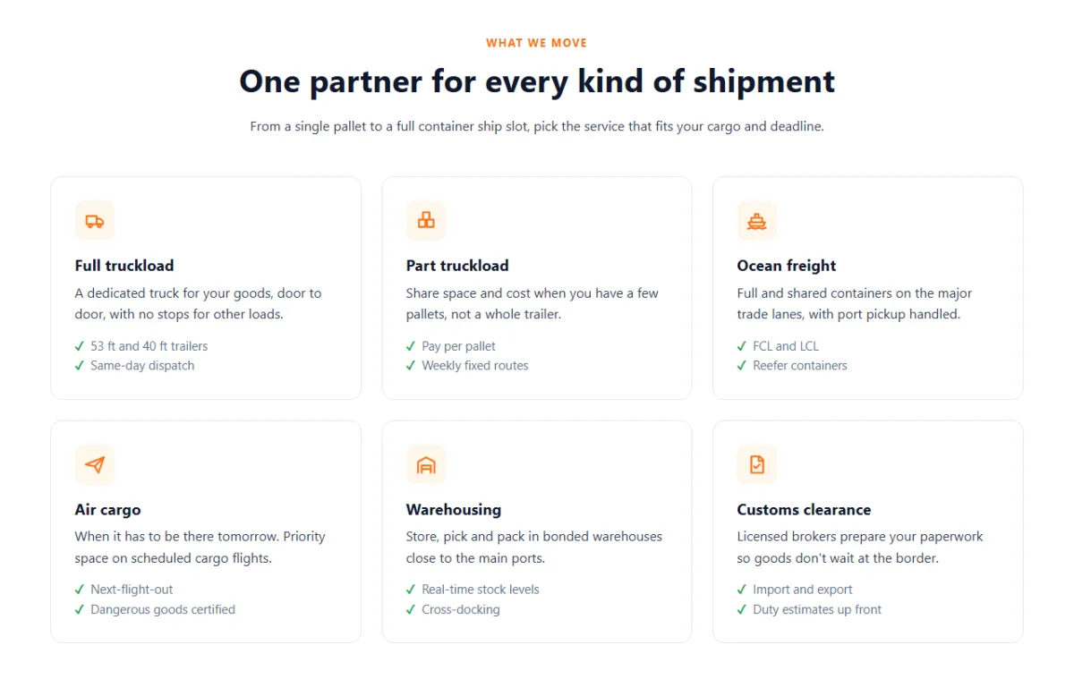
Six <article> cards, each with an icon, a title, one sentence and two
benefits. The icons are tiny inline SVGs drawn with lines only. Their colour comes from CSS, so
they always match the theme. The reveal class marks cards that will fade in as you
scroll.
    <!-- ---------- PROCESS ---------- -->
    <section class="section process" id="process">
      <div class="wrap">
        <div class="section-head">
          <p class="eyebrow">How it works</p>
          <h2>From quote to doorstep in four steps</h2>
        </div>
        <ol class="steps">
          <li class="reveal"><h3>Get a quote</h3><p>Price your shipment online in seconds.</p></li>
          <li class="reveal"><h3>We pick it up</h3><p>A driver collects on the date you choose.</p></li>
          <li class="reveal"><h3>Track it live</h3><p>Follow every border, hub and handover.</p></li>
          <li class="reveal"><h3>Delivered</h3><p>Signed proof of delivery in your inbox.</p></li>
        </ol>
      </div>
    </section>
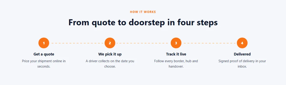
The steps are an ordered list (<ol>) because the order matters. The numbers in
the orange circles won't be typed in the HTML: CSS will add them with a counter.
1.4 The tracking section
    <!-- ---------- TRACKING ---------- -->
    <section class="section" id="track">
      <div class="wrap track-grid">
        <div>
          <p class="eyebrow">Shipment tracking</p>
          <h2>Know where your cargo is, right now</h2>
          <p>Enter a tracking number to see every checkpoint, the current status and the expected
             delivery time.</p>
          <form class="track-form" id="trackForm" novalidate>
            <label for="trackId" class="sr-only">Tracking number</label>
            <input id="trackId" name="id" placeholder="e.g. NL-48213" autocomplete="off" aria-describedby="trackError">
            <button class="btn" type="submit">Track shipment</button>
          </form>
          <p class="track-error" id="trackError" role="alert"></p>
        </div>
        <div class="track-panel" id="trackPanel" aria-live="polite">
          <p class="track-empty">Your shipment details will appear here.</p>
        </div>
      </div>
    </section>
The form has novalidate because we'll show our own friendlier messages. The error
paragraph has role="alert", so a screen reader announces errors as soon as they
appear, and the input points to it with aria-describedby.
The result panel starts with a placeholder message. aria-live="polite" asks screen
readers to read the new content when the shipment appears, without interrupting the user.
1.5 The quote calculator
    <!-- ---------- QUOTE ---------- -->
    <section class="section quote" id="quote">
      <div class="wrap">
        <div class="section-head">
          <p class="eyebrow">Instant quote</p>
          <h2>See your price before you book</h2>
          <p>Move the sliders and the estimate updates as you go. No sign-up, no sales call.</p>
        </div>
        <div class="quote-card">
          <form class="quote-form" id="quoteForm">
            <div class="field">
              <label for="distance">Distance <output id="distanceOut" for="distance">800 km</output></label>
              <input type="range" id="distance" name="distance" min="50" max="5000" step="50" value="800">
            </div>
            <div class="field">
              <label for="weight">Weight (kg)</label>
              <input type="number" id="weight" name="weight" min="1" max="40000" value="1200" inputmode="numeric">
            </div>
            <fieldset class="field">
              <legend>Transport mode</legend>
              <div class="modes">
                <label class="mode"><input type="radio" name="mode" value="road" checked><span>Road<small>2-4 days</small></span></label>
                <label class="mode"><input type="radio" name="mode" value="ocean"><span>Ocean<small>18-30 days</small></span></label>
                <label class="mode"><input type="radio" name="mode" value="air"><span>Air<small>1-2 days</small></span></label>
              </div>
            </fieldset>
            <label class="check"><input type="checkbox" name="express"> Express handling (+25%)</label>
          </form>
          <div class="quote-result">
            <h3>Estimated price</h3>
            <p class="price" id="price">$0</p>
            <p class="price-note">Transit time: <strong id="transit">2-4 days</strong></p>
            <ul class="breakdown">
              <li>Transport <b id="costTransport">$0</b></li>
              <li>Fuel surcharge (12%) <b id="costFuel">$0</b></li>
              <li>Express handling <b id="costExpress">$0</b></li>
            </ul>
            <button class="btn" type="submit" form="quoteForm" id="bookBtn">Book this shipment</button>
          </div>
        </div>
      </div>
    </section>
The left side is a normal form: a range slider for distance, a number input for weight, three
radio buttons for the transport mode and a checkbox for express handling. The radio buttons share
name="mode", which is what makes only one of them selectable.
The <output> element is the right tag for a value calculated from other fields.
The price panel on the right sits outside the form, yet its button still submits it thanks to
form="quoteForm".
1.6 Reviews, call to action and footer
<!-- ---------- TESTIMONIALS ---------- -->
<section class="section">
<div class="wrap">
<div class="section-head">
<p class="eyebrow">Customers</p>
<h2>Trusted by shippers across Europe</h2>
</div>
<div class="reviews">
<figure class="review reveal">
<div class="stars" aria-label="5 out of 5 stars">★★★★★</div>
<blockquote>"We cut our late deliveries in half in the first quarter. The tracking page means
our support team stopped chasing drivers."</blockquote>
<figcaption><span class="avatar">SK</span><span><strong>Sara Kovacs</strong><small>Supply chain lead, Brightwear</small></span></figcaption>
</figure>
<figure class="review reveal">
<div class="stars" aria-label="5 out of 5 stars">★★★★★</div>
<blockquote>"Quotes in seconds instead of two days of emails. We book most of our road
freight straight from the calculator now."</blockquote>
<figcaption><span class="avatar">DM</span><span><strong>Daniel Meyer</strong><small>Operations, Kettle & Co</small></span></figcaption>
</figure>
<figure class="review reveal">
<div class="stars" aria-label="5 out of 5 stars">★★★★★</div>
<blockquote>"Customs used to hold our containers for days. Northline's brokers sort the
paperwork before the ship even docks."</blockquote>
<figcaption><span class="avatar">AR</span><span><strong>Amira Rahman</strong><small>Import manager, Verde Foods</small></span></figcaption>
</figure>
</div>
</div>
</section> <!-- ---------- CTA ---------- -->
<section class="cta" id="contact">
<div class="wrap cta-box">
<div>
<h2>Ready to ship smarter?</h2>
<p>Talk to a freight specialist and get a tailored rate within one business hour.</p>
</div>
<div class="cta-actions">
<a class="btn" href="#quote">Get an instant quote</a>
<a class="btn btn-ghost" href="mailto:sales@example.com">Contact sales</a>
</div>
</div>
</section>
</main> <!-- ---------- FOOTER ---------- -->
<footer class="site-footer">
<div class="wrap footer-grid">
<div>
<a class="logo" href="#top"><span class="logo-mark" aria-hidden="true"></span>Northline<b>Freight</b></a>
<p>Road, ocean and air freight with one team and one tracking page.</p>
</div>
<div><h4>Services</h4><ul><li><a href="#services">Truckload</a></li><li><a href="#services">Ocean</a></li><li><a href="#services">Air cargo</a></li></ul></div>
<div><h4>Company</h4><ul><li><a href="#process">How it works</a></li><li><a href="#track">Tracking</a></li><li><a href="#contact">Contact</a></li></ul></div>
<div><h4>Support</h4><ul><li><a href="#quote">Pricing</a></li><li><a href="#contact">Help centre</a></li><li><a href="#contact">Claims</a></li></ul></div>
</div>
<div class="wrap footer-bottom">
<span>© 2026 Northline Freight. A demo page.</span>
<span>Built with HTML, CSS and JavaScript</span>
</div>
</footer>
<script src="script.js"></script>
</body>
</html>Each review is a <figure> with a <blockquote> and a
<figcaption>, the standard way to mark up a quote and who said it. The stars
get an aria-label so screen readers say "5 out of 5 stars" instead of reading five
symbols. The script tag is at the very end of <body>, so the HTML above it
exists by the time the script runs.
Open index.html in a browser now. It's unstyled, but the whole page is there. That's
the end of Part 1.
Part 2: The CSS
Now we turn the plain document into a professional page. We'll go section by section, in the same order as the HTML.
2.1 Variables and shared styles
/* ---------- BASE ---------- */
:root {
  --navy: #0b1b33;
  --navy-2: #12284a;
  --ink: #0f172a;
  --text: #334155;
  --muted: #64748b;
  --line: #e2e8f0;
  --bg: #f5f7fb;
  --accent: #f97316;
  --accent-dark: #ea580c;
  --accent-soft: #fff7ed;
  --ok: #16a34a;
  --radius: 14px;
  --shadow: 0 12px 32px rgba(15, 23, 42, .08);
}

*, *::before, *::after { box-sizing: border-box; }
html { scroll-behavior: smooth; scroll-padding-top: 80px; }
body {
  margin: 0;
  font-family: "Segoe UI", system-ui, -apple-system, Roboto, Arial, sans-serif;
  color: var(--text);
  background: #fff;
  line-height: 1.6;
}
svg { display: block; max-width: 100%; }
h1, h2, h3, h4 { color: var(--ink); line-height: 1.15; margin: 0 0 .5em; }
a { color: inherit; }
:focus-visible { outline: 3px solid #fdba74; outline-offset: 2px; }

.wrap { width: min(1160px, 100% - 40px); margin-inline: auto; }
.sr-only {
  position: absolute; width: 1px; height: 1px; overflow: hidden;
  clip: rect(0 0 0 0); white-space: nowrap;
}

.btn {
  display: inline-flex; align-items: center; justify-content: center; gap: 8px;
  padding: 12px 22px;
  border: 0; border-radius: 10px;
  background: var(--accent); color: #fff;
  font: inherit; font-weight: 600; text-decoration: none; white-space: nowrap;
  cursor: pointer;
  transition: background .2s, transform .2s;
}
.btn:hover { background: var(--accent-dark); }
.btn:active { transform: translateY(1px); }
.btn-small { padding: 8px 16px; }
.btn-ghost { background: transparent; box-shadow: inset 0 0 0 1.5px rgba(255, 255, 255, .4); }
.btn-ghost:hover { background: rgba(255, 255, 255, .08); }

.section { padding: 88px 0; }
.section-head { max-width: 760px; margin: 0 auto 48px; text-align: center; }
.section-head h2, .track-grid h2 { font-size: clamp(1.8rem, 3vw, 2.4rem); }
.eyebrow {
  margin: 0 0 12px;
  font-size: .8rem; font-weight: 700; letter-spacing: .12em; text-transform: uppercase;
  color: var(--accent);
}
/* ---------- END BASE ---------- */
All the colours live in :root as CSS variables: navy for the dark areas, orange as
the accent, and greys for text and lines. To rebrand the whole site, change
--accent and --navy and everything follows.
A few lines here do a lot of work:
box-sizing: border-boxmakes padding count inside an element's width, so boxes are the size you set.scroll-behavior: smoothanimates the jump when you click a menu link, andscroll-padding-top: 80pxstops the sticky header from covering the section heading you land on..wrapuseswidth: min(1160px, 100% - 40px): at most 1160px wide, and always 20px from each edge on small screens. It's a one-line container..sr-onlyhides text visually but keeps it for screen readers.
2.2 The sticky header
/* ---------- HEADER ---------- */
.site-header {
  position: sticky; top: 0; z-index: 50;
  background: var(--navy);
  transition: box-shadow .3s;
}
.site-header.scrolled { box-shadow: 0 6px 24px rgba(0, 0, 0, .25); }
.nav { display: flex; align-items: center; justify-content: space-between; height: 72px; }

.logo {
  display: inline-flex; align-items: center; gap: 10px;
  color: #fff; font-weight: 800; font-size: 1.2rem; text-decoration: none;
}
.logo b { color: var(--accent); font-weight: 600; margin-left: -6px; }
.logo-mark {
  position: relative; width: 30px; height: 30px; border-radius: 8px;
  background: linear-gradient(135deg, var(--accent), #fb923c);
}
.logo-mark::after {          /* a white arrow cut out with clip-path */
  content: ""; position: absolute; inset: 8px;
  background: #fff;
  clip-path: polygon(0 32%, 55% 32%, 55% 0, 100% 50%, 55% 100%, 55% 68%, 0 68%);
}

.menu { display: flex; align-items: center; gap: 28px; }
.menu a { color: #cbd5e1; text-decoration: none; font-weight: 500; }
.menu a:hover { color: #fff; }
.menu .btn { color: #fff; }
.menu-btn { display: none; }
/* ---------- END HEADER ---------- */
position: sticky; top: 0 keeps the header at the top while you scroll. The
.scrolled class, added by JavaScript later, gives it a shadow once the page moves, so
it looks lifted above the content.
The logo icon is pure CSS. An orange rounded square with an ::after pseudo-element
inside, cut into an arrow shape with clip-path: polygon(...). Each pair of numbers is
one corner of the shape.
2.3 The hero and the moving truck
/* ---------- HERO ---------- */
.hero {
  position: relative; overflow: hidden;
  padding: 72px 0 120px;
  color: #cbd5e1;
  background:
    radial-gradient(900px 500px at 85% 10%, rgba(249, 115, 22, .18), transparent 60%),
    linear-gradient(180deg, var(--navy), var(--navy-2));
}
.hero::before {              /* faint map grid that fades out downwards */
  content: ""; position: absolute; inset: 0; pointer-events: none;
  background-image:
    linear-gradient(rgba(255, 255, 255, .05) 1px, transparent 1px),
    linear-gradient(90deg, rgba(255, 255, 255, .05) 1px, transparent 1px);
  background-size: 40px 40px;
  -webkit-mask-image: linear-gradient(180deg, #000, transparent);
  mask-image: linear-gradient(180deg, #000, transparent);
}
.hero-grid {
  position: relative;
  display: grid; grid-template-columns: 1.1fr 1fr; gap: 56px; align-items: center;
}
.hero h1 { color: #fff; font-size: clamp(2.2rem, 4.6vw, 3.6rem); letter-spacing: -.02em; }
.hero h1 em { font-style: normal; color: var(--accent); }
.lead { font-size: 1.15rem; max-width: 34em; margin: 0 0 28px; }

.track-mini {
  display: flex; gap: 8px; max-width: 480px; padding: 6px;
  background: #fff; border-radius: 12px;
  box-shadow: 0 20px 40px rgba(0, 0, 0, .25);
}
.track-mini:focus-within { box-shadow: 0 0 0 3px #fdba74, 0 20px 40px rgba(0, 0, 0, .25); }
.track-mini input {
  flex: 1; min-width: 0; padding: 10px 12px;
  border: 0; outline: 0; background: transparent;
  font: inherit; color: var(--ink);
}
.hint { margin: 12px 0 0; font-size: .9rem; color: #94a3b8; }
.link-btn {
  padding: 0; border: 0; background: none; cursor: pointer;
  font: inherit; color: #fdba74; text-decoration: underline;
}

.route-card {
  padding: 20px;
  background: rgba(255, 255, 255, .06);
  border: 1px solid rgba(255, 255, 255, .12); border-radius: 20px;
  box-shadow: 0 30px 60px rgba(0, 0, 0, .3);
  backdrop-filter: blur(8px);
}
.route-head { display: flex; justify-content: space-between; font-size: .85rem; }
.live { display: inline-flex; align-items: center; gap: 6px; color: #86efac; font-weight: 600; }
.live::before {
  content: ""; width: 8px; height: 8px; border-radius: 50%;
  background: #22c55e; animation: pulse 1.6s infinite;
}
.route-map { width: 100%; height: auto; }
.route-bg { fill: none; stroke: rgba(255, 255, 255, .15); stroke-width: 6; stroke-linecap: round; }
.route-line {
  fill: none; stroke: var(--accent); stroke-width: 4; stroke-linecap: round;
  stroke-dasharray: 8 10;
  animation: dash 1.2s linear infinite;
}
.stop { fill: var(--navy); stroke: #fff; stroke-width: 3; }
.stop.end { stroke: var(--accent); }
.city { fill: #cbd5e1; font-size: 13px; font-weight: 600; }
.truck-body { fill: #fff; }
.truck-cab { fill: var(--accent); }
.truck-wheel { fill: var(--navy); stroke: #fff; stroke-width: 1.5; }

.route-meta { display: grid; grid-template-columns: repeat(3, 1fr); gap: 10px; margin-top: 8px; }
.route-meta div { padding: 10px 12px; background: rgba(255, 255, 255, .06); border-radius: 10px; }
.route-meta span { display: block; font-size: .75rem; color: #94a3b8; }
.route-meta strong { color: #fff; font-size: .95rem; }
.route-meta .ok { color: #86efac; }
/* ---------- END HERO ---------- */
The hero background stacks two gradients: an orange radial-gradient glow in the top
right corner over a navy linear-gradient. The ::before layer draws a
faint map grid with two 1px line gradients repeated every 40px. A mask-image fades
the grid out towards the bottom.
.hero-grid is a two-column grid, 1.1fr 1fr, so the text side is a little
wider. The clamp() on the headline size means "never smaller than 2.2rem, never
bigger than 3.6rem, and 4.6% of the screen width in between". It grows smoothly with the screen,
with no media query needed.
In the SVG, the dashed route uses stroke-dasharray: 8 10 (8px dash, 10px gap). The
dash animation shifts stroke-dashoffset by exactly two dash-and-gap
lengths (36px), so the loop is seamless and the dashes look like they're flowing towards Milan.
The truck moves by itself thanks to <animateMotion> from Part 1. The CSS only
colours it.
2.4 The stats bar
/* ---------- STATS ---------- */
.stats { position: relative; z-index: 2; margin-top: -56px; }
.stats-grid {
  display: grid; grid-template-columns: repeat(4, 1fr);
  background: #fff; border: 1px solid var(--line); border-radius: var(--radius);
  box-shadow: var(--shadow);
}
.stat { padding: 28px; text-align: center; }
.stat + .stat { border-left: 1px solid var(--line); }
.stat strong { display: block; font-size: 2.1rem; color: var(--ink); font-variant-numeric: tabular-nums; }
.stat span { color: var(--muted); font-size: .95rem; }
/* ---------- END STATS ---------- */
A negative margin-top: -56px pulls the white stats card up so it overlaps the bottom
of the dark hero. That overlap is a common trick that makes a page feel layered and designed.
.stat + .stat selects every stat that comes after another one, which draws a divider
between them without one on the first. font-variant-numeric: tabular-nums gives all
digits the same width, so the numbers don't jiggle while they count up.
2.5 Services and the four steps
/* ---------- SERVICES ---------- */
.services-grid { display: grid; grid-template-columns: repeat(3, 1fr); gap: 24px; }
.service {
  padding: 28px;
  background: #fff; border: 1px solid var(--line); border-radius: var(--radius);
  transition: transform .25s, box-shadow .25s, border-color .25s;
}
.service:hover { transform: translateY(-4px); box-shadow: var(--shadow); border-color: #fed7aa; }
.icon {
  display: grid; place-items: center; width: 48px; height: 48px; margin-bottom: 18px;
  border-radius: 12px; background: var(--accent-soft); color: var(--accent);
}
.icon svg {
  width: 26px; height: 26px;
  fill: none; stroke: currentColor; stroke-width: 2; stroke-linecap: round; stroke-linejoin: round;
}
.service h3 { font-size: 1.15rem; }
.service p { margin: 0 0 14px; }
.service ul { margin: 0; padding: 0; list-style: none; font-size: .92rem; color: var(--muted); }
.service li::before { content: "\2713"; margin-right: 8px; color: var(--ok); font-weight: 700; }
/* ---------- END SERVICES ---------- */
Three equal columns with repeat(3, 1fr) and a 24px gap. On hover a card
lifts 4px and gets a shadow. The tick before each benefit is added by li::before with
content: "\2713", the Unicode code for ✓.
/* ---------- PROCESS ---------- */
.process { background: var(--bg); }
.steps {
  position: relative;
  display: grid; grid-template-columns: repeat(4, 1fr); gap: 24px;
  margin: 0; padding: 0; list-style: none;
  counter-reset: step;
}
.steps::before {             /* dashed road behind the numbers */
  content: ""; position: absolute; top: 24px; left: 12%; right: 12%; height: 2px;
  background: repeating-linear-gradient(90deg, #fdba74 0 8px, transparent 8px 16px);
}
.steps li { position: relative; padding: 0 8px; text-align: center; }
.steps li::before {
  counter-increment: step; content: counter(step);
  position: relative;
  display: grid; place-items: center; width: 48px; height: 48px; margin: 0 auto 16px;
  border-radius: 50%; background: var(--accent); color: #fff; font-weight: 800;
  box-shadow: 0 0 0 6px var(--bg);
}
.steps h3 { font-size: 1.05rem; }
.steps p { margin: 0; font-size: .95rem; }
/* ---------- END PROCESS ---------- */
CSS counters number the steps for us. counter-reset: step starts a counter on the
list, and each item's ::before does counter-increment: step and shows it
with content: counter(step). The dashed road between the circles is a
repeating-linear-gradient on the list's own ::before. Each circle has a
box-shadow in the background colour, which cuts a clean gap in the road around
it.
2.6 The tracking panel and timeline
/* ---------- TRACKING ---------- */
.track-grid { display: grid; grid-template-columns: 1fr 1.25fr; gap: 48px; align-items: start; }
.track-form { display: flex; gap: 8px; margin: 24px 0 8px; }
.track-form input {
  flex: 1; min-width: 0; padding: 12px 14px;
  border: 1.5px solid var(--line); border-radius: 10px;
  font: inherit; color: var(--ink); text-transform: uppercase;
}
.track-form input::placeholder { text-transform: none; }
.track-form input:focus { outline: 0; border-color: var(--accent); box-shadow: 0 0 0 4px rgba(249, 115, 22, .15); }
.track-form input[aria-invalid="true"] { border-color: #dc2626; }
.track-error { min-height: 1.6em; margin: 0; color: #dc2626; font-size: .92rem; }

.track-panel {
  min-height: 200px; padding: 28px;
  background: #fff; border: 1px solid var(--line); border-radius: var(--radius);
  box-shadow: var(--shadow);
}
.track-empty { margin: 0; padding: 60px 0; text-align: center; color: var(--muted); }
.track-top { display: flex; justify-content: space-between; align-items: flex-start; gap: 16px; flex-wrap: wrap; }
.track-top h3 { margin: 0; font-size: 1.3rem; }
.track-top p { margin: 2px 0 0; font-size: .92rem; color: var(--muted); }
.badge {
  padding: 4px 12px; border-radius: 999px;
  font-size: .8rem; font-weight: 700;
  background: var(--accent-soft); color: var(--accent-dark);
}
.badge.done { background: #dcfce7; color: #15803d; }

.progress { height: 8px; margin: 20px 0 6px; background: var(--line); border-radius: 99px; overflow: hidden; }
.progress-bar {
  width: 0; height: 100%; border-radius: inherit;
  background: linear-gradient(90deg, var(--accent), #fb923c);
  transition: width .9s cubic-bezier(.2, .8, .2, 1);
}
.progress-labels { display: flex; justify-content: space-between; font-size: .8rem; color: var(--muted); }

.timeline { margin: 24px 0 0; padding: 0; list-style: none; }
.timeline li { position: relative; padding: 0 0 18px 32px; }
.timeline li::before {       /* the dot */
  content: ""; position: absolute; left: 0; top: 4px;
  width: 14px; height: 14px; border-radius: 50%;
  background: #fff; border: 3px solid var(--line);
}
.timeline li::after {        /* the line down to the next dot */
  content: ""; position: absolute; left: 6px; top: 22px; bottom: 0;
  width: 2px; background: var(--line);
}
.timeline li:last-child::after { display: none; }
.timeline li.done::before { background: var(--accent); border-color: var(--accent); }
.timeline li.done::after { background: #fdba74; }
.timeline li.current::before { border-color: var(--accent); box-shadow: 0 0 0 5px rgba(249, 115, 22, .2); }
.timeline strong { display: block; color: var(--ink); }
.timeline li:not(.done):not(.current) strong { color: var(--muted); font-weight: 500; }
.timeline span { font-size: .88rem; color: var(--muted); }
.fade-in { animation: fadeUp .4s ease both; }
/* ---------- END TRACKING ---------- */
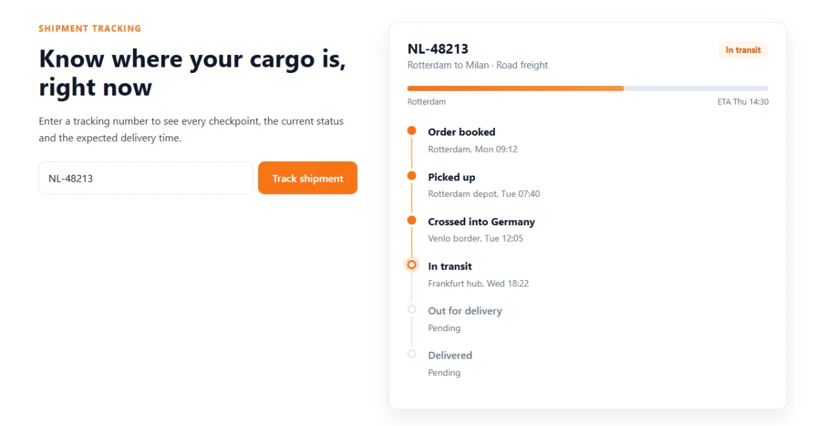
The timeline is a list where each item draws its own dot with ::before and the line
down to the next dot with ::after. The last item hides its line. Three states change
the look:
.done: a filled orange dot and an orange line..current: an outlined dot with a soft orange ring around it.- no class: a grey dot and muted text, for steps that haven't happened yet.
The progress bar starts at width: 0 with a transition on width, so when
JavaScript sets a percentage the bar slides to it.
2.7 The quote calculator
/* ---------- QUOTE ---------- */
.quote { background: var(--bg); }
.quote-card {
  display: grid; grid-template-columns: 1.4fr 1fr;
  background: #fff; border: 1px solid var(--line); border-radius: 20px;
  box-shadow: var(--shadow); overflow: hidden;
}
.quote-form { display: grid; gap: 24px; padding: 36px; }
.field { margin: 0; padding: 0; border: 0; }
.field > label, .field legend {
  display: flex; justify-content: space-between;
  margin-bottom: 8px; padding: 0;
  font-weight: 600; color: var(--ink);
}
.field output { color: var(--accent-dark); font-variant-numeric: tabular-nums; }
.field input[type="range"] { width: 100%; accent-color: var(--accent); }
.field input[type="number"] {
  width: 100%; padding: 11px 14px;
  border: 1.5px solid var(--line); border-radius: 10px;
  font: inherit; color: var(--ink);
}
.field input[type="number"]:focus { outline: 0; border-color: var(--accent); box-shadow: 0 0 0 4px rgba(249, 115, 22, .15); }

.modes { display: grid; grid-template-columns: repeat(3, 1fr); gap: 10px; }
.mode { position: relative; }
.mode input { position: absolute; opacity: 0; }
.mode span {
  display: block; padding: 12px; text-align: center; cursor: pointer;
  border: 1.5px solid var(--line); border-radius: 10px;
  font-weight: 600; color: var(--ink);
  transition: border-color .2s, background .2s, color .2s;
}
.mode small { display: block; font-weight: 400; font-size: .8rem; color: var(--muted); }
.mode input:checked + span { border-color: var(--accent); background: var(--accent-soft); color: var(--accent-dark); }
.mode input:focus-visible + span { outline: 3px solid #fdba74; outline-offset: 2px; }
.check { display: flex; align-items: center; gap: 10px; font-weight: 500; color: var(--ink); cursor: pointer; }
.check input { width: 18px; height: 18px; accent-color: var(--accent); }

.quote-result { display: flex; flex-direction: column; padding: 36px; background: var(--navy); color: #cbd5e1; }
.quote-result h3 { margin: 0; font-size: 1rem; font-weight: 600; color: #cbd5e1; }
.price {
  margin: 6px 0 4px;
  font-size: 3rem; font-weight: 800; line-height: 1.1; color: #fff;
  font-variant-numeric: tabular-nums;
}
.price-note { margin: 0 0 20px; font-size: .92rem; }
.price-note strong { color: #fff; }
.breakdown {
  display: grid; gap: 8px; margin: 0 0 28px; padding: 16px 0 0; list-style: none;
  border-top: 1px solid rgba(255, 255, 255, .12); font-size: .92rem;
}
.breakdown li { display: flex; justify-content: space-between; }
.breakdown b { color: #fff; font-weight: 600; font-variant-numeric: tabular-nums; }
.quote-result .btn { margin-top: auto; }
.quote-result .btn.sent { background: var(--ok); }
.bump { animation: bump .3s ease; }
/* ---------- END QUOTE ---------- */
The card is a two-column grid with overflow: hidden, so the navy price panel follows
the card's rounded corners.
The transport mode buttons are a classic accessible pattern. The real radio inputs are made
invisible with opacity: 0, but they're still there and still work with the keyboard.
The <span> next to each one is styled as a button, and
input:checked + span highlights the one that's selected.
input:focus-visible + span shows a focus ring when you tab to it.
accent-color colours the slider and checkbox orange with one line.
2.8 Reviews, call to action and footer
/* ---------- TESTIMONIALS ---------- */
.reviews { display: grid; grid-template-columns: repeat(3, 1fr); gap: 24px; }
.review {
  display: flex; flex-direction: column; margin: 0; padding: 28px;
  background: #fff; border: 1px solid var(--line); border-radius: var(--radius);
}
.stars { margin-bottom: 12px; color: #f59e0b; letter-spacing: 2px; }
.review blockquote { flex: 1; margin: 0 0 20px; color: var(--ink); }
.review figcaption { display: flex; align-items: center; gap: 12px; font-size: .9rem; }
.avatar {
  display: grid; place-items: center; flex: none; width: 42px; height: 42px;
  border-radius: 50%; background: var(--navy); color: #fff; font-weight: 700;
}
.review strong { display: block; color: var(--ink); }
.review small { color: var(--muted); }
/* ---------- END TESTIMONIALS ---------- *//* ---------- CTA AND FOOTER ---------- */
.cta { padding: 0 0 88px; }
.cta-box {
display: flex; align-items: center; justify-content: space-between; gap: 32px; flex-wrap: wrap;
padding: 48px; border-radius: 20px; color: #cbd5e1;
background: linear-gradient(120deg, var(--navy), var(--navy-2) 60%, #1e3a5f);
}
.cta-box h2 { margin-bottom: 6px; color: #fff; }
.cta-box p { margin: 0; }
.cta-actions { display: flex; gap: 12px; flex-wrap: wrap; }
.site-footer { padding: 56px 0 24px; background: #07142a; color: #94a3b8; font-size: .92rem; }
.footer-grid { display: grid; grid-template-columns: 2fr 1fr 1fr 1fr; gap: 32px; }
.footer-grid h4 { margin: 0 0 12px; font-size: .95rem; color: #fff; }
.footer-grid ul { display: grid; gap: 8px; margin: 0; padding: 0; list-style: none; }
.footer-grid a { text-decoration: none; }
.footer-grid a:hover { color: #fff; }
.footer-bottom {
display: flex; justify-content: space-between; flex-wrap: wrap; gap: 8px;
margin-top: 40px; padding-top: 20px; border-top: 1px solid rgba(255, 255, 255, .08);
}
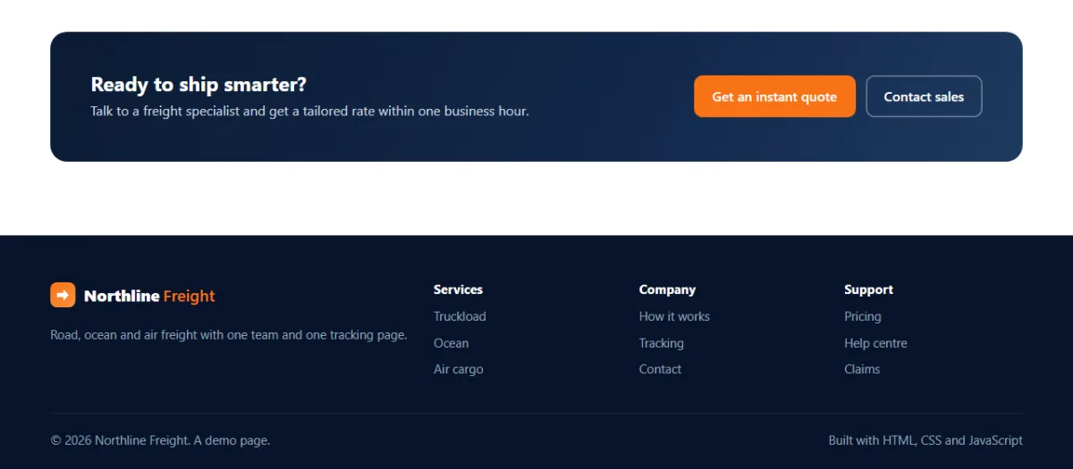
/* ---------- END CTA AND FOOTER ---------- */Each review card is a flex column, and the quote has flex: 1. The quote stretches,
so the names line up along the bottom even when the quotes are different lengths. The call to
action uses flex-wrap: wrap, so the buttons drop below the text when space runs
out.
2.9 Animations, phones and reduced motion
/* ---------- ANIMATIONS ---------- */
@keyframes dash { to { stroke-dashoffset: -36; } }
@keyframes pulse { 50% { opacity: .3; } }
@keyframes fadeUp { from { opacity: 0; transform: translateY(8px); } }
@keyframes bump { 50% { transform: scale(1.06); } }

@keyframes rise { from { opacity: 0; transform: translateY(24px); } }

/* Only hide .reveal items when JavaScript is running, so the page still works without it */
.js .reveal:not(.visible) { opacity: 0; }
.js .reveal.visible { animation: rise .6s ease backwards; }
.js .reveal.visible:nth-child(3n + 2) { animation-delay: .1s; }
.js .reveal.visible:nth-child(3n + 3) { animation-delay: .2s; }
/* ---------- END ANIMATIONS ---------- */
Look closely at the .js .reveal rules. The cards are only hidden when the
<html> element has the class js, which our script adds. If the
script fails to load, nothing is ever hidden. Always build scroll effects this way.
The reveal uses a keyframe animation instead of a transition, with
animation-fill-mode: backwards. That applies the starting style during the delay, then
lets go completely once the animation ends, so the hover lift on the service cards still works
afterwards.
/* ---------- SMALL SCREENS ---------- */
@media (max-width: 960px) {
  .hero-grid, .track-grid, .quote-card { grid-template-columns: 1fr; }
  .services-grid, .reviews, .steps { grid-template-columns: 1fr 1fr; }
  .steps { row-gap: 40px; }
  .steps::before { display: none; }
  .stats-grid { grid-template-columns: 1fr 1fr; }
  .stat:nth-child(3) { border-left: 0; }
  .stat:nth-child(n + 3) { border-top: 1px solid var(--line); }
  .footer-grid { grid-template-columns: 1fr 1fr; }
}

@media (max-width: 860px) {
  .menu-btn {
    display: grid; place-items: center; width: 44px; height: 44px;
    border: 0; border-radius: 10px; background: rgba(255, 255, 255, .08); cursor: pointer;
  }
  .menu-btn span, .menu-btn span::before, .menu-btn span::after {
    display: block; width: 20px; height: 2px; border-radius: 2px; background: #fff;
    transition: transform .3s, background .3s;
  }
  .menu-btn span { position: relative; }
  .menu-btn span::before, .menu-btn span::after { content: ""; position: absolute; left: 0; }
  .menu-btn span::before { top: -6px; }
  .menu-btn span::after { top: 6px; }
  .menu-btn[aria-expanded="true"] span { background: transparent; }
  .menu-btn[aria-expanded="true"] span::before { transform: translateY(6px) rotate(45deg); }
  .menu-btn[aria-expanded="true"] span::after { transform: translateY(-6px) rotate(-45deg); }

  .menu {
    position: absolute; top: 72px; left: 0; right: 0;
    display: none; flex-direction: column; align-items: stretch; gap: 0;
    padding: 8px 20px 20px;
    background: var(--navy); border-top: 1px solid rgba(255, 255, 255, .08);
  }
  .menu.open { display: flex; }
  .menu a { padding: 12px 0; }
  .menu .btn { margin-top: 8px; padding: 12px; }
}

@media (max-width: 600px) {
  .section { padding: 64px 0; }
  .hero { padding: 48px 0 104px; }
  .services-grid, .reviews, .steps { grid-template-columns: 1fr; }
  .steps li { padding-left: 64px; text-align: left; }
  .steps li::before { position: absolute; left: 0; top: 0; margin: 0; }
  .stat { padding: 20px 12px; }
  .stat strong { font-size: 1.7rem; }
  .track-form { flex-direction: column; }
  .quote-form, .quote-result, .cta-box { padding: 24px; }
  .route-meta strong { font-size: .85rem; }
}
/* ---------- END SMALL SCREENS ---------- */
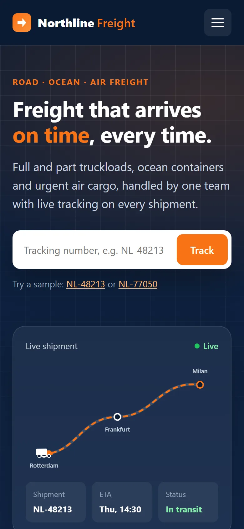
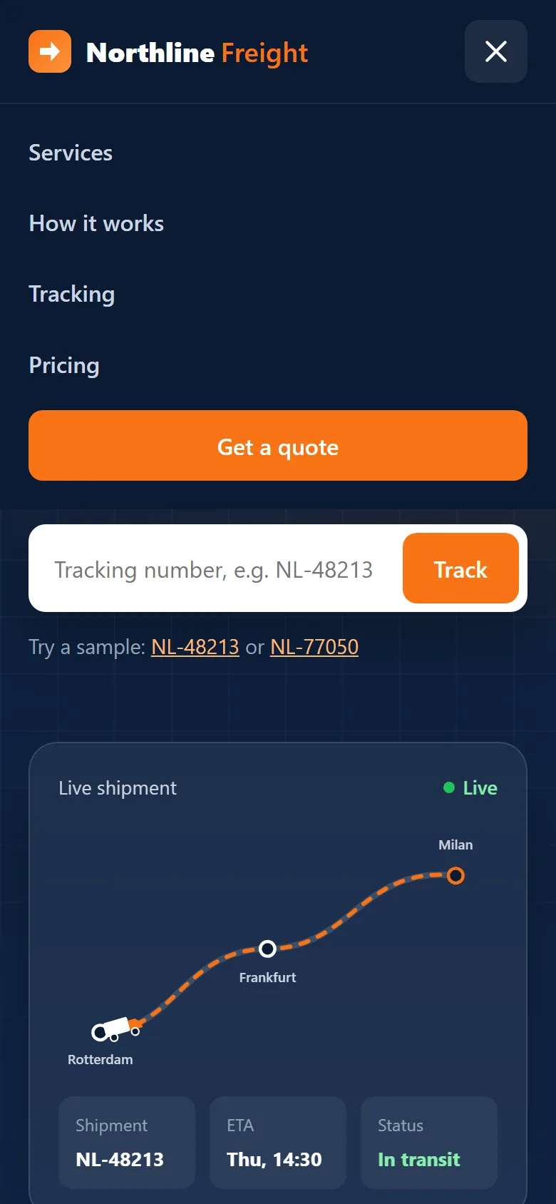
Three breakpoints handle smaller screens:
- 960px: the two-column sections stack, and the three-column grids become two columns.
- 860px: the menu links hide behind the hamburger button. The three lines are
one
<span>plus its::beforeand::after. Whenaria-expanded="true", the middle line turns transparent and the other two rotate into an X. The CSS reads the same attribute screen readers use, so the icon and the accessibility state can never disagree. - 600px: everything is one column, and the steps switch to a left-aligned list.
/* ---------- REDUCED MOTION ---------- */
@media (prefers-reduced-motion: reduce) {
  html { scroll-behavior: auto; }
  *, *::before, *::after {
    animation-duration: .01ms !important;
    animation-iteration-count: 1 !important;
    transition-duration: .01ms !important;
    transition-delay: 0s !important;
  }
}
/* ---------- END REDUCED MOTION ---------- */
Some people get dizzy from motion and turn it off in their system settings. This block makes every CSS animation and transition finish instantly for them. That's the end of Part 2: the page now looks finished, and only the interactive parts are missing.
Part 3: The JavaScript
The script makes five things work: the mobile menu, the header shadow, the scroll animations, the tracker and the quote calculator. Each is a small, separate block.
3.1 Settings and sample data
// ---------- SETTINGS ----------
// Price per mode: a fixed base fee, plus a price per km and per kg (in US dollars).
const RATES = {
  road:  { base: 90,  perKm: 1.15, perKg: 0.08, days: [2, 4] },
  ocean: { base: 240, perKm: 0.35, perKg: 0.03, days: [18, 30] },
  air:   { base: 160, perKm: 2.4,  perKg: 0.55, days: [1, 2] }
};
const FUEL = 0.12;     // fuel surcharge: 12% of transport
const EXPRESS = 0.25;  // express handling: +25%
const money = new Intl.NumberFormat('en-US', { style: 'currency', currency: 'USD', maximumFractionDigits: 0 });
const reduceMotion = window.matchMedia('(prefers-reduced-motion: reduce)').matches;
// ---------- END SETTINGS ----------
All the prices sit in one RATES object at the top, so anyone can adjust pricing
without reading the rest of the code. Intl.NumberFormat is the browser's built-in
money formatter. It adds the dollar sign and the thousands commas for us, so
1238.7 becomes $1,239. Change 'USD' to
'EUR' and 'en-US' to 'de-DE' and you get
1.239 €. reduceMotion checks the same system setting as the CSS.
// ---------- SAMPLE SHIPMENTS ----------
// In a real app this would come from your API. "step" is the index of the latest event.
const SHIPMENTS = {
  'NL-48213': {
    from: 'Rotterdam', to: 'Milan', mode: 'Road freight', eta: 'Thu 14:30', step: 3,
    events: [
      ['Order booked', 'Rotterdam, Mon 09:12'],
      ['Picked up', 'Rotterdam depot, Tue 07:40'],
      ['Crossed into Germany', 'Venlo border, Tue 12:05'],
      ['In transit', 'Frankfurt hub, Wed 18:22'],
      ['Out for delivery', 'Milan'],
      ['Delivered', 'Milan']
    ]
  },
  'NL-77050': {
    from: 'Shanghai', to: 'Hamburg', mode: 'Ocean freight', eta: 'Delivered', step: 4,
    events: [
      ['Container loaded', 'Shanghai port, 2 Oct'],
      ['Departed port', 'Shanghai, 4 Oct'],
      ['Arrived at port', 'Hamburg, 31 Oct'],
      ['Customs cleared', 'Hamburg, 1 Nov'],
      ['Delivered', 'Hamburg warehouse, 2 Nov 10:15']
    ]
  }
};
// ---------- END SAMPLE SHIPMENTS ----------
Each shipment has a list of events and a step number, which is the index of the
latest event. Everything before it is done, it is the current status, and everything after it
is still to come. On a real site this object would come from your server.
3.2 Mobile menu and sticky header
// ---------- MOBILE MENU ----------
const menuBtn = document.querySelector('.menu-btn');
const menu = document.getElementById('menu');

function setMenu(open) {
  menuBtn.setAttribute('aria-expanded', open);
  menuBtn.setAttribute('aria-label', open ? 'Close menu' : 'Open menu');
  menu.classList.toggle('open', open);
}
menuBtn.addEventListener('click', () => setMenu(menuBtn.getAttribute('aria-expanded') !== 'true'));
menu.addEventListener('click', e => { if (e.target.closest('a')) setMenu(false); });
document.addEventListener('keydown', e => { if (e.key === 'Escape') setMenu(false); });
// ---------- END MOBILE MENU ----------
setMenu() is the single place that opens or closes the menu. It updates
aria-expanded, the button's label and the open class together, so they
always agree. The menu closes when you pick a link (otherwise it would cover the section you just
jumped to) or press Esc. e.target.closest('a') checks whether the click
was on a link or inside one.
// ---------- STICKY HEADER ----------
const header = document.querySelector('.site-header');
function onScroll() { header.classList.toggle('scrolled', window.scrollY > 10); }
window.addEventListener('scroll', onScroll, { passive: true });
onScroll();
// ---------- END STICKY HEADER ----------
classList.toggle(name, condition) adds the class when the condition is true and
removes it when it's false: one line instead of an if/else.
{ passive: true } tells the browser this listener never cancels scrolling, which
keeps scrolling smooth.
3.3 Counters and scroll reveal
// ---------- SCROLL REVEAL AND COUNTERS ----------
document.documentElement.classList.add('js');

function countUp(el) {
  const target = Number(el.dataset.count);
  const decimals = Number(el.dataset.decimals || 0);
  const suffix = el.dataset.suffix || '';
  const duration = reduceMotion ? 0 : 1400;
  const start = performance.now();

  function frame(now) {
    const t = duration ? Math.min((now - start) / duration, 1) : 1;
    const eased = 1 - Math.pow(1 - t, 3);            // fast start, slow finish
    el.textContent = (target * eased).toLocaleString('en-US', {
      minimumFractionDigits: decimals, maximumFractionDigits: decimals
    }) + suffix;
    if (t < 1) requestAnimationFrame(frame);
  }
  requestAnimationFrame(frame);
}

const observer = new IntersectionObserver(entries => {
  entries.forEach(entry => {
    if (!entry.isIntersecting) return;
    entry.target.classList.add('visible');
    if (entry.target.dataset.count) countUp(entry.target);
    observer.unobserve(entry.target);                  // animate once only
  });
}, { threshold: 0.2 });

document.querySelectorAll('.reveal, [data-count]').forEach(el => observer.observe(el));

// SVG animations (the truck) ignore the CSS reduced-motion rule, so pause them here
if (reduceMotion) document.querySelector('.route-map').pauseAnimations();
// ---------- END SCROLL REVEAL AND COUNTERS ----------
The first line adds the js class that the CSS from 2.9 waits for.
countUp() animates a number with requestAnimationFrame, which runs a
function just before each screen repaint, about 60 times a second. Each frame works out how far
through the animation we are (t, from 0 to 1) and shows that fraction of the target.
1 - Math.pow(1 - t, 3) is an "ease out" curve: the number races up at first and slows
down as it lands, which feels natural.
IntersectionObserver tells us when an element scrolls into view. That's much cheaper
than checking positions on every scroll event. With threshold: 0.2, it fires when
20% of the element is visible. We add the visible class, start the counter if it's a
number, and then unobserve the element so each animation plays only once.
The last line is for the truck. SVG <animateMotion> ignores the CSS
reduced-motion rule, so for those visitors we call pauseAnimations() on the
SVG.
3.4 Shipment tracking
// ---------- TRACKING ----------
const trackForm = document.getElementById('trackForm');
const trackInput = document.getElementById('trackId');
const trackError = document.getElementById('trackError');
const trackPanel = document.getElementById('trackPanel');
const heroForm = document.getElementById('heroForm');
const heroInput = document.getElementById('heroId');
function renderShipment(id, s) {
const last = s.events.length - 1;
const delivered = s.step === last;
const percent = Math.round(s.step / last * 100);
const items = s.events.map((ev, i) => {
const state = i < s.step || delivered ? 'done' : i === s.step ? 'current' : '';
const detail = i <= s.step ? ev[1] : 'Pending';
return `<li class="${state}"><strong>${ev[0]}</strong><span>${detail}</span></li>`;
}).join('');
trackPanel.innerHTML = `
<div class="fade-in">
<div class="track-top">
<div><h3>${id}</h3><p>${s.from} to ${s.to} · ${s.mode}</p></div>
<span class="badge${delivered ? ' done' : ''}">${s.events[s.step][0]}</span>
</div>
<div class="progress"><div class="progress-bar"></div></div>
<div class="progress-labels"><span>${s.from}</span><span>${delivered ? 'Delivered' : 'ETA ' + s.eta}</span></div>
<ol class="timeline">${items}</ol>
</div>`;
const bar = trackPanel.querySelector('.progress-bar');
bar.offsetWidth; // make the browser draw 0% first, so the width animates
bar.style.width = percent + '%';
}
function showTrackError(message) {
trackInput.setAttribute('aria-invalid', 'true');
trackError.textContent = message;
trackInput.focus();
}
function track(raw) {
const id = raw.trim().toUpperCase();
trackInput.value = id;
if (!id) return showTrackError('Enter a tracking number.');
const shipment = SHIPMENTS[id];
if (!shipment) return showTrackError(`We couldn't find ${id}. Check the number and try again.`);
trackInput.removeAttribute('aria-invalid');
trackError.textContent = '';
renderShipment(id, shipment);
}
trackForm.addEventListener('submit', e => {
e.preventDefault();
track(trackInput.value);
});
// The hero box tracks too, then scrolls down to the result
heroForm.addEventListener('submit', e => {
e.preventDefault();
track(heroInput.value);
document.getElementById('track').scrollIntoView({ behavior: reduceMotion ? 'auto' : 'smooth' });
});
document.querySelectorAll('[data-sample]').forEach(btn => {
btn.addEventListener('click', () => {
heroInput.value = btn.dataset.sample;
heroForm.requestSubmit();
});
});
// Deep link: index.html?track=NL-48213 opens straight on that shipment
const linked = new URLSearchParams(location.search).get('track');
if (linked) track(linked);
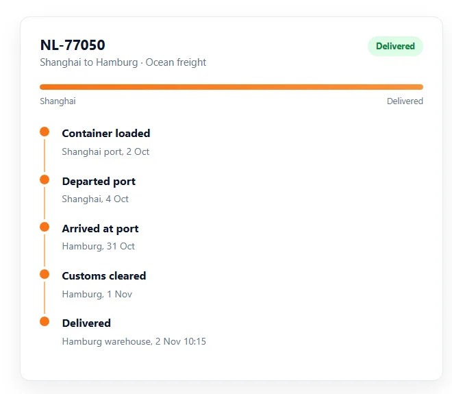
// ---------- END TRACKING ----------This block is the heart of the page, so let's take it one function at a time.
track(raw)cleans the input withtrim()andtoUpperCase(), so" nl-48213"still works. Then it looks the number up inSHIPMENTS. An empty or unknown number shows an error. A match is passed torenderShipment().renderShipment()usesmap()to turn each event into a list item, choosing the classdone,currentor none by comparing its index withstep. Then it builds the panel with a template literal.- The progress bar needs one trick. If we insert it and set its width straight
away, the browser only ever sees the final width and there's nothing to animate. Reading
bar.offsetWidthforces the browser to draw the bar at 0% first. Then the new width transitions smoothly. showTrackError()marks the field witharia-invalid, which turns the border red in the CSS, writes the message into therole="alert"paragraph and moves focus back to the field.
We only use innerHTML with data from our own SHIPMENTS object, never
with what the visitor typed. The error message uses textContent, which shows text
exactly as typed and can never run code. Keep that rule when you connect a real API: escape any
text from the server, or build elements with textContent.
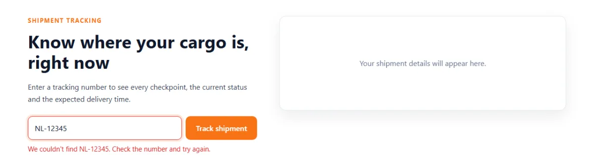
Three extras make the tracker feel complete:
- The hero form runs the same
track()function and then scrolls to the result. - The sample buttons fill in a number and call
heroForm.requestSubmit(), which submits the form exactly as if the visitor had pressed Enter. - A deep link:
URLSearchParamsreads the address bar, soindex.html?track=NL-48213opens straight on that shipment. Customers can bookmark the link, and you can put it in shipping emails.
3.5 The quote calculator
// ---------- QUOTE CALCULATOR ----------
const quoteForm = document.getElementById('quoteForm');
const priceEl = document.getElementById('price');
const bookBtn = document.getElementById('bookBtn');
const show = (id, text) => { document.getElementById(id).textContent = text; };

function calculate() {
  const data = new FormData(quoteForm);
  const km = Number(data.get('distance'));
  const kg = Math.max(0, Number(data.get('weight')) || 0);
  const rate = RATES[data.get('mode')];
  const express = data.get('express') === 'on';

  const transport = rate.base + km * rate.perKm + kg * rate.perKg;
  const fuel = transport * FUEL;
  const extra = express ? (transport + fuel) * EXPRESS : 0;
  const total = transport + fuel + extra;

  // Express shaves about 40% off the transit time
  const [min, max] = rate.days.map(d => express ? Math.max(1, Math.round(d * 0.6)) : d);

  show('distanceOut', km.toLocaleString('en-US') + ' km');
  show('price', money.format(total));
  show('transit', min === max ? `${min} day${min > 1 ? 's' : ''}` : `${min}-${max} days`);
  show('costTransport', money.format(transport));
  show('costFuel', money.format(fuel));
  show('costExpress', express ? money.format(extra) : '-');

  priceEl.classList.remove('bump');
  priceEl.offsetWidth;             // restart the bump animation
  priceEl.classList.add('bump');

  bookBtn.textContent = 'Book this shipment';
  bookBtn.classList.remove('sent');
}

quoteForm.addEventListener('input', calculate);
quoteForm.addEventListener('submit', e => {
  e.preventDefault();
  bookBtn.textContent = 'Request sent ✓';
  bookBtn.classList.add('sent');
});
calculate();
// ---------- END QUOTE CALCULATOR ----------
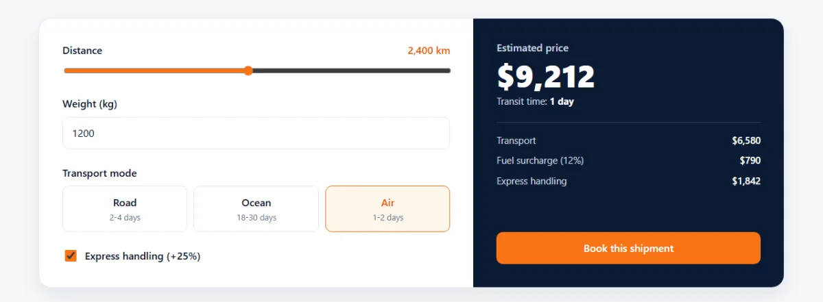
new FormData(quoteForm) reads every field in the form in one go.
data.get('mode') returns the value of whichever radio button is checked, and a
checked checkbox returns 'on'. The maths follows the price list:
- Transport = base fee + distance × price per km + weight × price per kg.
- Fuel = 12% of transport.
- Express = 25% of transport plus fuel, only if the box is ticked.
One listener for the input event on the whole form recalculates on every change,
whether you drag the slider, type a weight or click a mode. Events from every field bubble up to
the form, so we don't need a listener on each field. That's called event
delegation.
The price gets a small "bump" animation on each change, restarted with the same
offsetWidth trick as the progress bar. calculate() also runs once at the
end so the price is filled in when the page loads.
Test it yourself
- Click NL-48213 under the hero box. The page scrolls down and the progress bar slides to about 60%.
- Type
nl-77050in lowercase and press Enter. It still works, and the badge turns green. - Try
NL-1. You get a red border and an error message. - Drag the distance slider and switch to Air. Watch the price and the transit time change.
- Make the window narrow, open the menu, then press Esc.
- Turn on "reduce motion" in your system settings and reload. The truck stops and the numbers appear without counting.
Using it on a real site
- Real tracking: replace the
SHIPMENTSlookup intrack()withfetch('/api/track?id=' + encodeURIComponent(id))and pass the JSON response torenderShipment(). Show a loading state while you wait. - Real prices: the calculator is an estimate. Show it as one, and calculate the final price on the server when the booking arrives.
- Your brand: change
--navyand--accentin:root. For different cities, edit the SVG path and the three circles and labels.
Share your version
Built your own logistics page? Share a screenshot as a link with sshot.online, or share your code with the free code sharing tool. No account needed. If you'd like a second project in the same style, the HR software landing page tutorial uses the same three-part structure with tabs, a pricing toggle and an FAQ accordion.
Conclusion
You've built a complete, responsive landing page in three parts. Along the way you used:
- CSS variables for a theme you can change in two lines
- CSS Grid,
clamp()and three breakpoints for a responsive layout - SVG
<animateMotion>for the moving truck, and CSS counters for the steps IntersectionObserverandrequestAnimationFramefor scroll effectsFormData,Intl.NumberFormatandURLSearchParamsfor the interactive tools- ARIA attributes, live regions and reduced motion support, so the page works for everyone
Frequently asked questions
Do I need a framework to build this landing page?
No. The whole page is one HTML file, one CSS file and one JavaScript file, with no frameworks, libraries or images.
How does the truck move along the route?
The truck is an SVG group with an <animateMotion> element inside it. An
<mpath> points at the route path, and rotate="auto" turns the
truck to follow the curve.
How do I connect the tracker to real shipment data?
Replace the lookup in the SHIPMENTS object with a fetch() call to
your tracking API, then pass the response to renderShipment(). Escape any text
that comes from the server before inserting it as HTML.
How is the quote price calculated?
Each transport mode has a base fee plus a price per kilometre and per kilogram. A 12% fuel
surcharge is added, and express handling adds 25%. All the rates are in one
RATES object at the top of the script.
Is the page responsive and accessible?
Yes. CSS Grid layouts collapse to one column on phones, the menu becomes a hamburger, form fields have labels, errors are announced to screen readers, and all motion stops when the visitor has reduced motion turned on.
Related articles
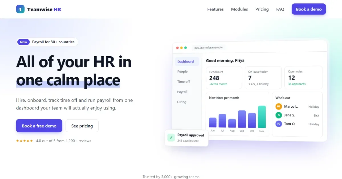
How to Build an HR Software Landing Page with HTML, CSS and JavaScript
A SaaS-style HR landing page in 3 parts: a CSS dashboard mockup, accessible feature tabs, a pricing toggle with a team-size slider, an FAQ and a demo form.
Read More →
CSS Flexbox Explained: A Visual Guide with Examples
Every Flexbox property in pictures: direction, justify-content, align-items, wrap, gap, flex-grow, plus a navbar, equal-height cards and a sticky footer.
Read More →
JavaScript map(), filter() and reduce() Explained with Examples
The three array methods you will use every day, explained step by step with pictures and real examples, plus find(), some(), every() and chaining.
Read More →