How to Build an HR Software Landing Page with HTML, CSS and JavaScript
Published November 5, 2026 · 17 min read
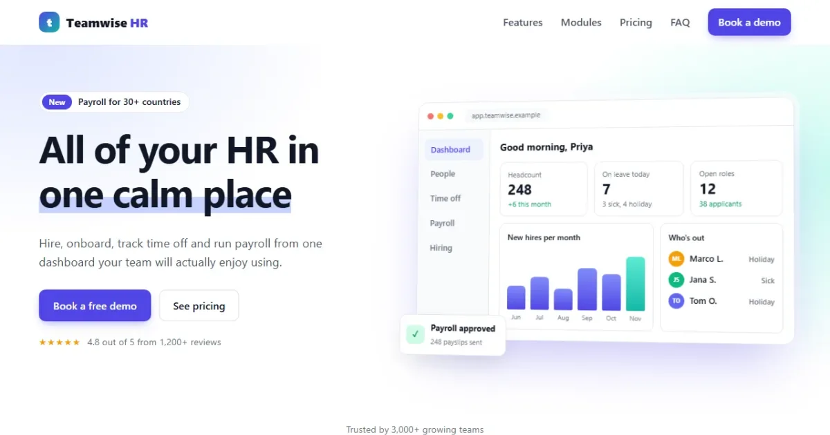
Software companies sell with landing pages, and HR software is a great one to learn from. The page has to show a product people can't touch yet, explain several modules without overwhelming anyone, and make pricing feel simple. In this tutorial you'll build exactly that for a made-up product, Teamwise HR.
The page has a product dashboard drawn entirely in HTML and CSS, feature tabs you can use with the keyboard, a pricing section with a monthly/yearly switch and a team-size slider, an animated FAQ and a demo booking form with friendly validation.
Open the live demo Switch the tabs and drag the team-size slider.
Like our freight logistics landing page, this tutorial is split into three parts:
- Part 1, HTML: the content and structure, with the right ARIA roles.
- Part 2, CSS: the light SaaS look, the dashboard mockup and the responsive layout.
- Part 3, JavaScript: tabs, pricing, the accordion and form validation.
What you'll learn
- how to draw a convincing app screenshot with HTML and CSS
- how to build accessible tabs with arrow-key support
- how to make a toggle switch with
role="switch" - how to animate an accordion to its natural height with
grid-template-rows - how to draw progress rings with
conic-gradientand animate them with@property - how to validate a form with a small table of rules
Project setup
hr-landing/
├── index.html   ← all sections, the dashboard mockup and the form
├── style.css    ← theme, layout, mockups, mobile styles
└── script.js    ← menu, tabs, pricing, FAQ, form validation
Every file is divided by marker comments such as <!-- ---------- PRICING ---------- -->.
The code blocks follow the markers from top to bottom, so copying them in order rebuilds each
file.
Plan the page first
A software landing page has a well-known order, and each section answers the visitor's next question:
- Hero: what is it, and what does it look like?
- Logos: do other companies trust it?
- Feature tabs: what can it do for me?
- Modules: what else is included?
- Pricing: what will it cost my team?
- FAQ: what about my doubts?
- Demo form: how do I start?
Part 1: The HTML
1.1 The head and the header
<!DOCTYPE html>
<html lang="en">
<head>
  <meta charset="UTF-8">
  <meta name="viewport" content="width=device-width, initial-scale=1">
  <title>Teamwise HR - HR Software Landing Page</title>
  <meta name="description" content="Hiring, onboarding, time off and payroll in one simple HR platform.">
  <link rel="stylesheet" href="style.css">
</head>
<body> <!-- ---------- HEADER ---------- -->
<header class="site-header">
<div class="wrap nav">
<a class="logo" href="#top"><span class="logo-mark" aria-hidden="true">t</span>Teamwise<b>HR</b></a>
<button class="menu-btn" type="button" aria-expanded="false" aria-controls="menu" aria-label="Open menu"><span></span></button>
<nav id="menu" class="menu" aria-label="Main">
<a href="#features">Features</a>
<a href="#modules">Modules</a>
<a href="#pricing">Pricing</a>
<a href="#faq">FAQ</a>
<a href="#demo" class="btn btn-small">Book a demo</a>
</nav>
</div>
</header>
<main id="top">The header is the same pattern as in the freight tutorial: a logo, a <nav> of
section links, and a menu button for phones with aria-expanded and
aria-controls. The last link is styled as a button because "Book a demo" is the one
action we want every visitor to take.
1.2 The hero and the dashboard mockup
<!-- ---------- HERO ---------- -->
<section class="hero">
<div class="wrap hero-grid">
<div class="hero-copy">
<p class="pill"><span>New</span> Payroll for 30+ countries</p>
<h1>All of your HR in <span class="marker">one calm place</span></h1>
<p class="lead">Hire, onboard, track time off and run payroll from one dashboard your team
will actually enjoy using.</p>
<div class="hero-actions">
<a class="btn" href="#demo">Book a free demo</a>
<a class="btn btn-light" href="#pricing">See pricing</a>
</div>
<p class="rating"><span class="stars" aria-hidden="true">★★★★★</span>
4.8 out of 5 from 1,200+ reviews</p>
</div>
<div class="app" aria-hidden="true">
<div class="app-bar"><i></i><i></i><i></i><span>app.teamwise.example</span></div>
<div class="app-body">
<aside class="app-side">
<b class="on">Dashboard</b><b>People</b><b>Time off</b><b>Payroll</b><b>Hiring</b>
</aside>
<div class="app-main">
<p class="hello">Good morning, Priya</p>
<div class="kpis">
<div class="kpi"><span>Headcount</span><strong>248</strong><em class="up">+6 this month</em></div>
<div class="kpi"><span>On leave today</span><strong>7</strong><em>3 sick, 4 holiday</em></div>
<div class="kpi"><span>Open roles</span><strong>12</strong><em class="up">38 applicants</em></div>
</div>
<div class="app-row">
<div class="panel">
<p class="panel-title">New hires per month</p>
<div class="bars">
<span style="--h: 40%" data-m="Jun"></span><span style="--h: 55%" data-m="Jul"></span><span style="--h: 35%" data-m="Aug"></span>
<span style="--h: 70%" data-m="Sep"></span><span style="--h: 60%" data-m="Oct"></span><span style="--h: 90%" data-m="Nov"></span>
</div>
</div>
<div class="panel">
<p class="panel-title">Who's out</p>
<ul class="out">
<li><i style="--c: #f59e0b">ML</i>Marco L.<small>Holiday</small></li>
<li><i style="--c: #10b981">JS</i>Jana S.<small>Sick</small></li>
<li><i style="--c: #6366f1">TO</i>Tom O.<small>Holiday</small></li>
</ul>
</div>
</div>
</div>
</div>
<div class="toast"><span>✓</span><div><strong>Payroll approved</strong><small>248 payslips sent</small></div></div>
</div>
</div>
</section>The left column has a small "New" pill, the headline, a lead paragraph, two buttons and a rating.
The words "one calm place" are wrapped in <span class="marker">, which will get
an animated highlighter stroke.
The right column, .app, is a fake app window: a browser bar with three dots, a
sidebar, three KPI cards, a bar chart and a "Who's out" list. Why not just use a screenshot?
- It stays sharp on every screen, at any zoom.
- It's tiny compared with a large image.
- You can animate it: the bars will grow and the toast will float.
- Changing a number is a text edit, not a redesign.
Each bar sets its own height with a CSS variable, style="--h: 70%", and its month in
data-m. Each avatar sets its colour the same way with --c. Because the
whole mockup is a picture of the product rather than real content, it has
aria-hidden="true".
1.3 The logo strip
<!-- ---------- LOGOS ---------- -->
<section class="logos" aria-label="Customers">
<div class="wrap">
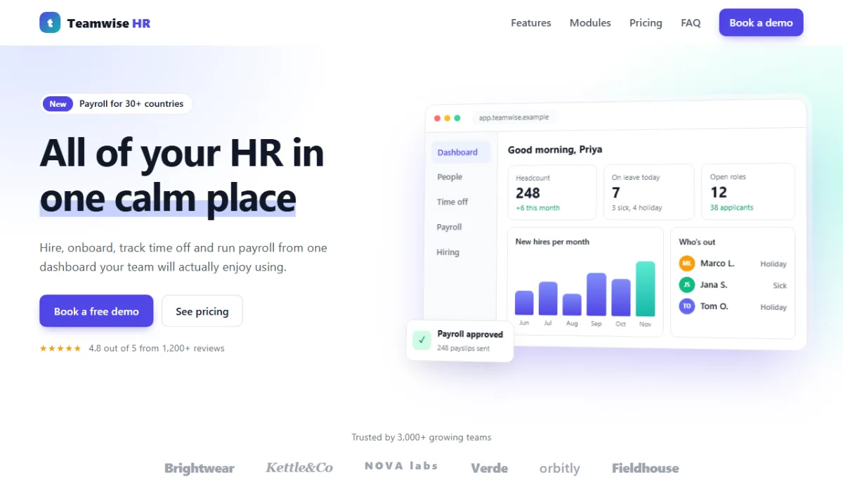
<p>Trusted by 3,000+ growing teams</p>
<div class="logo-row">
<span>Brightwear</span><span>Kettle&Co</span><span>NOVA labs</span><span>Verde</span><span>orbitly</span><span>Fieldhouse</span>
</div>
</div>
</section>Real sites use customer logo images here. We fake them with text in different styles, which is enough to show the layout.
1.4 Feature tabs with ARIA roles
    <!-- ---------- FEATURES TABS ---------- -->
    <section class="section" id="features">
      <div class="wrap">
        <div class="section-head">
          <p class="eyebrow">Features</p>
          <h2>Everything from first interview to first payslip</h2>
        </div>

        <div class="tabs" role="tablist" aria-label="HR features">
          <button role="tab" id="tab-hiring" aria-controls="panel-hiring" aria-selected="true">Hiring</button>
          <button role="tab" id="tab-onboarding" aria-controls="panel-onboarding" aria-selected="false" tabindex="-1">Onboarding</button>
          <button role="tab" id="tab-timeoff" aria-controls="panel-timeoff" aria-selected="false" tabindex="-1">Time off</button>
          <button role="tab" id="tab-payroll" aria-controls="panel-payroll" aria-selected="false" tabindex="-1">Payroll</button>
        </div>

        <div class="tab-panel" role="tabpanel" id="panel-hiring" aria-labelledby="tab-hiring" tabindex="0">
          <div class="feature-text">
            <h3>Hire the right people, faster</h3>
            <p>Post a job to 20 job boards in one click and move candidates through a simple board.</p>
            <ul class="checks"><li>Drag-and-drop hiring pipeline</li><li>Interview scorecards</li><li>Offer letters with e-signature</li></ul>
          </div>
          <div class="mock board">
            <div><p>Applied <b>14</b></p><span>Alex Kim</span><span>Rosa M.</span><span>Liam P.</span></div>
            <div><p>Interview <b>5</b></p><span>Noor A.</span><span class="hot">Ben W.</span></div>
            <div><p>Offer <b>2</b></p><span class="hot">Chloe D.</span></div>
          </div>
        </div>

        <div class="tab-panel" role="tabpanel" id="panel-onboarding" aria-labelledby="tab-onboarding" tabindex="0" hidden>
          <div class="feature-text">
            <h3>A great first day, every time</h3>
            <p>New starters get a welcome page with tasks, documents and their buddy before day one.</p>
            <ul class="checks"><li>Reusable onboarding checklists</li><li>Contracts signed online</li><li>Laptop and account requests</li></ul>
          </div>
          <div class="mock checklist">
            <p class="mock-title">Welcome, Ben! <span>3 of 5 done</span></p>
            <div class="meter"><span style="--w: 60%"></span></div>
            <ul><li class="done">Sign your contract</li><li class="done">Add bank details</li><li class="done">Meet your buddy</li><li>Set up your laptop</li><li>Read the handbook</li></ul>
          </div>
        </div>

        <div class="tab-panel" role="tabpanel" id="panel-timeoff" aria-labelledby="tab-timeoff" tabindex="0" hidden>
          <div class="feature-text">
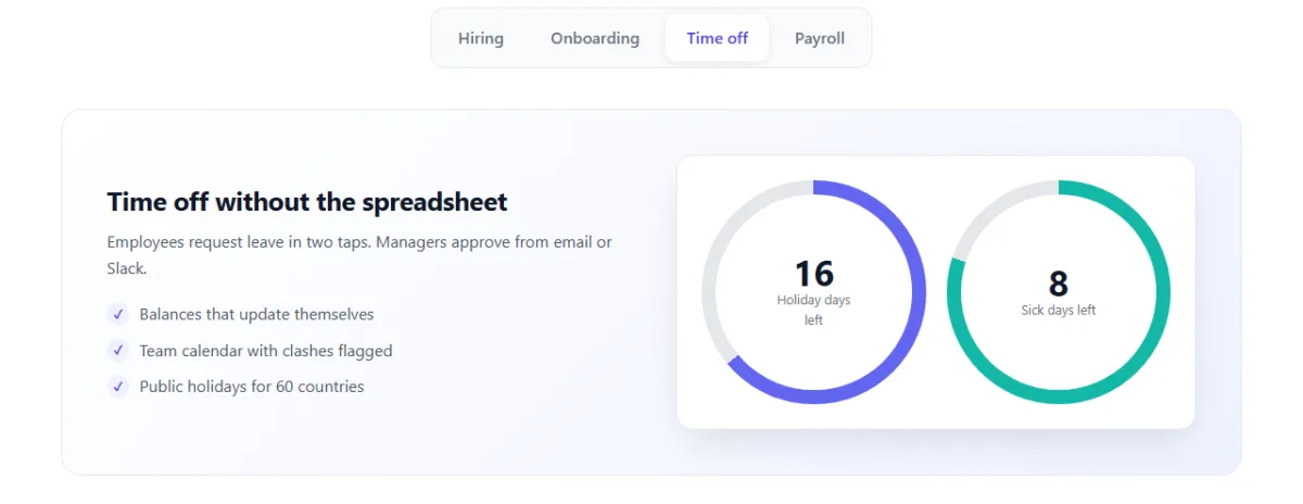
            <h3>Time off without the spreadsheet</h3>
            <p>Employees request leave in two taps. Managers approve from email or Slack.</p>
            <ul class="checks"><li>Balances that update themselves</li><li>Team calendar with clashes flagged</li><li>Public holidays for 60 countries</li></ul>
          </div>
          <div class="mock rings">
            <div class="ring" style="--p: 64; --c: #6366f1"><strong>16</strong><span>Holiday days left</span></div>
            <div class="ring" style="--p: 80; --c: #14b8a6"><strong>8</strong><span>Sick days left</span></div>
          </div>
        </div>

        <div class="tab-panel" role="tabpanel" id="panel-payroll" aria-labelledby="tab-payroll" tabindex="0" hidden>
          <div class="feature-text">
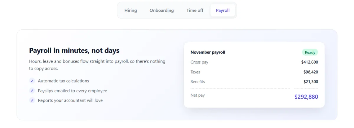
            <h3>Payroll in minutes, not days</h3>
            <p>Hours, leave and bonuses flow straight into payroll, so there's nothing to copy across.</p>
            <ul class="checks"><li>Automatic tax calculations</li><li>Payslips emailed to every employee</li><li>Reports your accountant will love</li></ul>
          </div>
          <div class="mock payslip">
            <p class="mock-title">November payroll <span class="ok">Ready</span></p>
            <dl><dt>Gross pay</dt><dd>$412,600</dd><dt>Taxes</dt><dd>$98,420</dd><dt>Benefits</dt><dd>$21,300</dd><dt>Net pay</dt><dd class="total">$292,880</dd></dl>
          </div>
        </div>
      </div>
    </section>
Tabs need the right roles so screen readers announce them as tabs, "tab 2 of 4", and not as a row of random buttons. The pattern has three parts:
- The wrapper has
role="tablist"and anaria-label. - Each button has
role="tab",aria-selectedandaria-controlspointing at its panel. Only the selected tab is in the keyboard Tab order; the others havetabindex="-1". Arrow keys will move between them. - Each panel has
role="tabpanel"andaria-labelledbypointing back at its tab. Panels that aren't shown have thehiddenattribute.
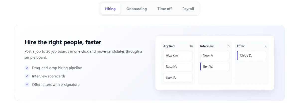
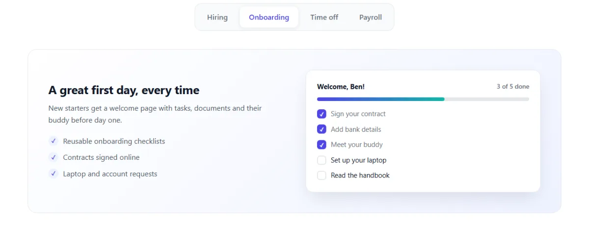
Each panel holds a short description, a checklist and a small mock of that feature: a hiring board, an onboarding checklist, leave balance rings and a payroll summary.
1.5 Modules
    <!-- ---------- MODULES ---------- -->
    <section class="section soft" id="modules">
      <div class="wrap">
        <div class="section-head">
          <p class="eyebrow">Modules</p>
          <h2>Start with what you need, add the rest later</h2>
        </div>
        <div class="modules">
          <article class="module">
            <span class="m-icon" style="--c: #6366f1"><svg viewBox="0 0 24 24"><circle cx="9" cy="8" r="3.5"/><path d="M2.5 20c0-3.6 2.9-6 6.5-6s6.5 2.4 6.5 6M16 4.5a3.5 3.5 0 0 1 0 7M18 14c2.2.6 3.5 2.6 3.5 6"/></svg></span>
            <h3>Core HR</h3><p>One profile per person with contracts, documents and history.</p>
          </article>
          <article class="module">
            <span class="m-icon" style="--c: #14b8a6"><svg viewBox="0 0 24 24"><circle cx="12" cy="12" r="9"/><path d="M12 7v5l3 2"/></svg></span>
            <h3>Attendance</h3><p>Clock in from web or phone, with shifts and overtime rules.</p>
          </article>
          <article class="module">
            <span class="m-icon" style="--c: #f59e0b"><svg viewBox="0 0 24 24"><circle cx="12" cy="12" r="9"/><circle cx="12" cy="12" r="5"/><circle cx="12" cy="12" r="1"/></svg></span>
            <h3>Performance</h3><p>Goals, one-to-ones and review cycles that take minutes.</p>
          </article>
          <article class="module">
            <span class="m-icon" style="--c: #ec4899"><svg viewBox="0 0 24 24"><path d="M6 3h12v18l-3-2-3 2-3-2-3 2zM9 8h6M9 12h6"/></svg></span>
            <h3>Expenses</h3><p>Snap a receipt, submit, and get paid with the next payroll.</p>
          </article>
          <article class="module">
            <span class="m-icon" style="--c: #0ea5e9"><svg viewBox="0 0 24 24"><path d="M5 20V11M11 20V4M17 20v-7M2 20h20"/></svg></span>
            <h3>Analytics</h3><p>Headcount, turnover and cost reports, ready to share.</p>
          </article>
          <article class="module">
            <span class="m-icon" style="--c: #22c55e"><svg viewBox="0 0 24 24"><rect x="7" y="2.5" width="10" height="19" rx="2"/><path d="M11 18h2"/></svg></span>
            <h3>Self-service app</h3><p>Payslips, leave and profile updates from any phone.</p>
          </article>
        </div>
      </div>
    </section>
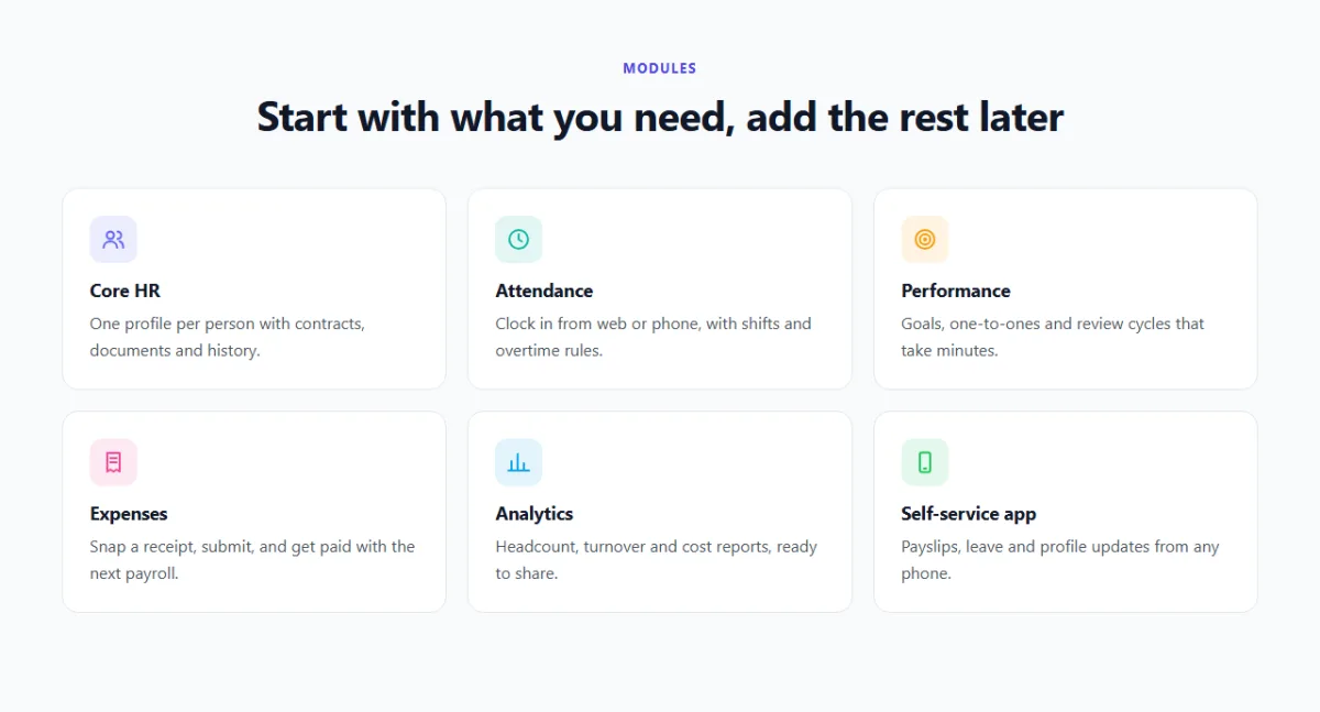
Six cards, each with a line icon. Each card sets one colour with --c, and the CSS
uses it for both the icon and its pale background square.
1.6 Pricing
    <!-- ---------- PRICING ---------- -->
    <section class="section" id="pricing">
      <div class="wrap">
        <div class="section-head">
          <p class="eyebrow">Pricing</p>
          <h2>Simple pricing per employee</h2>
          <p>Every plan includes unlimited admins and free setup help.</p>
        </div>

        <div class="price-controls">
          <div class="billing">
            <span id="lblMonthly" class="active">Monthly</span>
            <button type="button" class="switch" role="switch" aria-checked="false" aria-labelledby="lblYearly"></button>
            <span id="lblYearly">Yearly <em>Save 20%</em></span>
          </div>
          <label class="seats" for="seats">
            <span>Team size: <output id="seatsOut" for="seats">50</output> employees</span>
            <input type="range" id="seats" min="5" max="500" step="5" value="50">
          </label>
        </div>

        <div class="plans">
          <article class="plan">
            <h3>Starter</h3>
            <p class="plan-desc">Core HR and time off for small teams.</p>
            <p class="plan-price"><strong data-price="4">$4</strong><span>/ employee / month</span></p>
            <p class="plan-total" data-total="4"></p>
            <ul class="checks"><li>Employee profiles</li><li>Time off and calendar</li><li>Self-service app</li></ul>
            <a class="btn btn-light" href="#demo">Start free trial</a>
          </article>
          <article class="plan featured">
            <span class="ribbon">Most popular</span>
            <h3>Growth</h3>
            <p class="plan-desc">Everything to hire, onboard and pay.</p>
            <p class="plan-price"><strong data-price="8">$8</strong><span>/ employee / month</span></p>
            <p class="plan-total" data-total="8"></p>
            <ul class="checks"><li>Everything in Starter</li><li>Hiring and onboarding</li><li>Payroll and expenses</li><li>Performance reviews</li></ul>
            <a class="btn" href="#demo">Start free trial</a>
          </article>
          <article class="plan">
            <h3>Enterprise</h3>
            <p class="plan-desc">For 500+ people and complex rules.</p>
            <p class="plan-price"><strong>Custom</strong></p>
            <p class="plan-total">Volume pricing and a dedicated manager</p>
            <ul class="checks"><li>Everything in Growth</li><li>Single sign-on (SSO)</li><li>Custom approval flows</li></ul>
            <a class="btn btn-light" href="#demo">Talk to sales</a>
          </article>
        </div>
      </div>
    </section>
The billing switch is a <button> with role="switch" and
aria-checked, so it's announced as an on/off switch. aria-labelledby
names it after the "Yearly" label, so a screen reader says "Yearly, switch, off".
Each plan's monthly price per employee is stored in data-price. JavaScript reads it,
applies the discount and the team size, and writes the results. The Enterprise plan has no
data-price, so the script simply skips it.
1.7 FAQ, demo form and footer
    <!-- ---------- FAQ ---------- -->
    <section class="section soft" id="faq">
      <div class="wrap faq-wrap">
        <div class="section-head">
          <p class="eyebrow">FAQ</p>
          <h2>Questions, answered</h2>
        </div>
        <div class="faq">
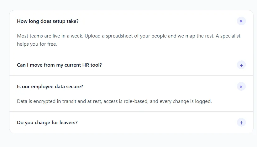
          <h3><button type="button" aria-expanded="true" aria-controls="faq1">How long does setup take?</button></h3>
          <div class="faq-a open" id="faq1"><div><p>Most teams are live in a week. Upload a spreadsheet of your people and we map the rest. A specialist helps you for free.</p></div></div>
          <h3><button type="button" aria-expanded="false" aria-controls="faq2">Can I move from my current HR tool?</button></h3>
          <div class="faq-a" id="faq2"><div><p>Yes. We import people, balances and documents from the common HR tools and from CSV files.</p></div></div>
          <h3><button type="button" aria-expanded="false" aria-controls="faq3">Is our employee data secure?</button></h3>
          <div class="faq-a" id="faq3"><div><p>Data is encrypted in transit and at rest, access is role-based, and every change is logged.</p></div></div>
          <h3><button type="button" aria-expanded="false" aria-controls="faq4">Do you charge for leavers?</button></h3>
          <div class="faq-a" id="faq4"><div><p>No. You only pay for active employees. Leavers' records stay archived at no cost.</p></div></div>
        </div>
      </div>
    </section>
Each question is a <button> inside a heading, so screen reader users can jump
between questions by heading and open them like buttons. aria-expanded says whether
the answer is open. Each answer has an extra inner <div>, which the height
animation in Part 2 needs.
    <!-- ---------- DEMO FORM ---------- -->
    <section class="section" id="demo">
      <div class="wrap demo">
        <div class="demo-copy">
          <h2>See Teamwise in 20 minutes</h2>
          <p>A product specialist will walk you through the modules that matter to your team and answer
             every question.</p>
          <ul class="checks light"><li>No credit card needed</li><li>Free data import</li><li>Cancel any time</li></ul>
        </div>
        <form class="demo-form" id="demoForm" novalidate>
          <div class="field">
            <label for="name">Full name</label>
            <input id="name" name="name" autocomplete="name" required aria-describedby="nameError">
            <small class="error" id="nameError"></small>
          </div>
          <div class="field">
            <label for="email">Work email</label>
            <input id="email" name="email" type="email" autocomplete="email" required aria-describedby="emailError">
            <small class="error" id="emailError"></small>
          </div>
          <div class="field">
            <label for="size">Company size</label>
            <select id="size" name="size" required aria-describedby="sizeError">
              <option value="">Choose one</option>
              <option>1-20</option><option>21-100</option><option>101-500</option><option>500+</option>
            </select>
            <small class="error" id="sizeError"></small>
          </div>
          <button class="btn btn-block" type="submit">Book my demo</button>
          <p class="form-done" id="formDone" role="status"></p>
        </form>
      </div>
    </section>
  </main>
Every field has a real <label>, an autocomplete value so browsers
can fill it in, and aria-describedby pointing at its error line. That way a screen
reader reads the error out when the field is focused. The form uses novalidate so we
can show our own messages instead of the browser's pop-ups.
<!-- ---------- FOOTER ---------- -->
<footer class="site-footer">
<div class="wrap footer-row">
<a class="logo" href="#top"><span class="logo-mark" aria-hidden="true">t</span>Teamwise<b>HR</b></a>
<nav aria-label="Footer"><a href="#features">Features</a><a href="#pricing">Pricing</a><a href="#faq">FAQ</a><a href="#demo">Contact</a></nav>
<span>© 2026 Teamwise HR. A demo page.</span>
</div>
</footer>
<script src="script.js"></script>
</body>
</html>Part 2: The CSS
2.1 Theme and shared styles
/* ---------- BASE ---------- */
:root {
  --brand: #4f46e5;
  --brand-dark: #4338ca;
  --brand-soft: #eef2ff;
  --teal: #14b8a6;
  --ink: #111827;
  --text: #4b5563;
  --muted: #6b7280;
  --line: #e5e7eb;
  --soft: #f8fafc;
  --shadow: 0 16px 40px -12px rgba(17, 24, 39, .15);
}

*, *::before, *::after { box-sizing: border-box; }
html { scroll-behavior: smooth; scroll-padding-top: 76px; }
body {
  margin: 0;
  font-family: "Segoe UI", system-ui, -apple-system, Roboto, Arial, sans-serif;
  color: var(--text);
  background: #fff;
  line-height: 1.6;
}
h1, h2, h3 { color: var(--ink); line-height: 1.15; margin: 0 0 .5em; }
a { color: inherit; }
svg { display: block; }
:focus-visible { outline: 3px solid #a5b4fc; outline-offset: 2px; }

.wrap { width: min(1160px, 100% - 40px); margin-inline: auto; }
.section { padding: 96px 0; }
.soft { background: var(--soft); }
.section-head { max-width: 820px; margin: 0 auto 48px; text-align: center; }
.section-head h2 { font-size: clamp(1.8rem, 3.2vw, 2.5rem); letter-spacing: -.02em; }
.eyebrow {
  margin: 0 0 12px;
  font-size: .8rem; font-weight: 700; letter-spacing: .12em; text-transform: uppercase;
  color: var(--brand);
}

.btn {
  display: inline-flex; align-items: center; justify-content: center;
  padding: 12px 22px;
  border: 0; border-radius: 10px;
  background: var(--brand); color: #fff;
  font: inherit; font-weight: 600; text-decoration: none; white-space: nowrap;
  cursor: pointer;
  box-shadow: 0 6px 16px -6px rgba(79, 70, 229, .6);
  transition: background .2s, transform .2s, box-shadow .2s;
}
.btn:hover { background: var(--brand-dark); transform: translateY(-1px); }
.btn:disabled { opacity: .8; cursor: default; transform: none; }
.btn-light { background: #fff; color: var(--ink); box-shadow: inset 0 0 0 1.5px var(--line); }
.btn-light:hover { background: var(--soft); }
.btn-small { padding: 8px 16px; }
.btn-block { width: 100%; }

.checks { display: grid; gap: 10px; margin: 0; padding: 0; list-style: none; }
.checks li { position: relative; padding-left: 32px; }
.checks li::before {
  content: "\2713"; position: absolute; left: 0; top: 2px;
  display: grid; place-items: center; width: 22px; height: 22px; border-radius: 50%;
  background: var(--brand-soft); color: var(--brand); font-size: 12px; font-weight: 800;
}
.checks.light li::before { background: rgba(255, 255, 255, .18); color: #fff; }
/* ---------- END BASE ---------- */
The theme is indigo (--brand) with teal (--teal) as a second colour, on
white and very light grey. Light SaaS designs rely on three things you can see here: lots of white
space (.section has 96px of padding), soft borders (--line) instead of
heavy shadows, and one strong colour for actions.
The .checks list is used all over the page. Its round tick is a
::before with content: "\2713" on a pale indigo circle.
2.2 A frosted sticky header
/* ---------- HEADER ---------- */
.site-header {
  position: sticky; top: 0; z-index: 50;
  background: rgba(255, 255, 255, .8);
  backdrop-filter: blur(12px);
  border-bottom: 1px solid transparent;
  transition: border-color .3s, box-shadow .3s;
}
.site-header.scrolled { border-color: var(--line); box-shadow: 0 4px 20px rgba(17, 24, 39, .06); }
.nav { display: flex; align-items: center; justify-content: space-between; height: 68px; }

.logo {
  display: inline-flex; align-items: center; gap: 10px;
  color: var(--ink); font-weight: 800; font-size: 1.2rem; text-decoration: none;
}
.logo b { margin-left: -6px; color: var(--brand); }
.logo-mark {
  display: grid; place-items: center; width: 32px; height: 32px; border-radius: 10px;
  background: linear-gradient(135deg, var(--brand), var(--teal));
  color: #fff; font-size: 1.1rem;
}

.menu { display: flex; align-items: center; gap: 28px; }
.menu a { color: var(--text); text-decoration: none; font-weight: 500; }
.menu a:hover { color: var(--brand); }
.menu .btn { color: #fff; }
.menu-btn { display: none; }
/* ---------- END HEADER ---------- */
The header is 80% white, and backdrop-filter: blur(12px) blurs whatever scrolls
behind it. That's the frosted glass effect you see on many modern apps. The bottom border starts
transparent and only appears with the .scrolled class.
2.3 The hero and the highlighter
/* ---------- HERO ---------- */
.hero {
  padding: 72px 0 104px;
  background:
    radial-gradient(640px 420px at 5% 0%, #e0e7ff, transparent 70%),
    radial-gradient(640px 420px at 100% 35%, #ccfbf1, transparent 70%),
    #fff;
  overflow: hidden;
}
.hero-grid { display: grid; grid-template-columns: 1fr 1.15fr; gap: 64px; align-items: center; }
.pill {
  display: inline-flex; align-items: center; gap: 10px;
  margin: 0 0 20px; padding: 4px 14px 4px 4px;
  background: #fff; border: 1px solid var(--line); border-radius: 999px;
  font-size: .88rem; font-weight: 500; color: var(--ink);
}
.pill span {
  padding: 2px 10px; border-radius: 999px;
  background: var(--brand); color: #fff; font-size: .75rem; font-weight: 700;
}
.hero h1 { font-size: clamp(2.3rem, 4.8vw, 3.7rem); letter-spacing: -.03em; }
.marker {                     /* a highlighter stroke that draws itself */
  background: linear-gradient(#c7d2fe, #c7d2fe) no-repeat 0 88% / 0% 32%;
  -webkit-box-decoration-break: clone;
  box-decoration-break: clone;
  animation: mark .8s .3s ease forwards;
}
.lead { max-width: 32em; margin: 0 0 28px; font-size: 1.15rem; }
.hero-actions { display: flex; flex-wrap: wrap; gap: 12px; margin-bottom: 20px; }
.rating { margin: 0; font-size: .9rem; color: var(--muted); }
.stars { margin-right: 6px; color: #f59e0b; letter-spacing: 1px; }
/* ---------- END HERO ---------- */
Two soft radial-gradient blobs, indigo top left and teal on the right, give the hero
colour without any images.
The highlighter is a single-colour linear-gradient used as a background image. It's
placed at 0 88% (the bottom part of the text) with a size of 0% 32%, so
it starts with no width. The mark animation grows the width to 100%, and the stroke
draws itself across the words. box-decoration-break: clone makes it work even when
the phrase wraps onto two lines.
2.4 The dashboard mockup
/* ---------- APP MOCKUP ---------- */
.app {
  position: relative;
  background: #fff; border: 1px solid var(--line); border-radius: 16px;
  box-shadow: 0 40px 80px -24px rgba(79, 70, 229, .35), 0 0 0 8px rgba(255, 255, 255, .6);
  font-size: 13px;
  transform: perspective(1400px) rotateY(-7deg) rotateX(2deg);
}
.app-bar { display: flex; align-items: center; gap: 6px; padding: 10px 14px; border-bottom: 1px solid var(--line); }
.app-bar i { width: 10px; height: 10px; border-radius: 50%; }
.app-bar i:nth-child(1) { background: #f87171; }
.app-bar i:nth-child(2) { background: #fbbf24; }
.app-bar i:nth-child(3) { background: #34d399; }
.app-bar span { margin-left: 12px; padding: 2px 12px; border-radius: 6px; background: var(--soft); color: var(--muted); font-size: 11px; }

.app-body { display: grid; grid-template-columns: 116px 1fr; }
.app-side {
  display: flex; flex-direction: column; gap: 4px; padding: 14px 10px;
  background: var(--soft); border-right: 1px solid var(--line); border-radius: 0 0 0 16px;
}
.app-side b { padding: 7px 10px; border-radius: 8px; font-weight: 500; color: var(--muted); }
.app-side b.on { background: var(--brand-soft); color: var(--brand); font-weight: 600; }
.app-main { min-width: 0; padding: 16px; }
.hello { margin: 0 0 12px; font-size: 15px; font-weight: 700; color: var(--ink); }

.kpis { display: grid; grid-template-columns: repeat(3, 1fr); gap: 10px; }
.kpi { padding: 10px 12px; border: 1px solid var(--line); border-radius: 10px; }
.kpi span, .kpi em { display: block; font-size: 11px; font-style: normal; color: var(--muted); }
.kpi strong { display: block; font-size: 22px; line-height: 1.3; color: var(--ink); }
.kpi em.up { color: #059669; }

.app-row { display: grid; grid-template-columns: 1.3fr 1fr; gap: 10px; margin-top: 10px; }
.panel { padding: 12px; border: 1px solid var(--line); border-radius: 10px; }
.panel-title { margin: 0 0 10px; font-size: 12px; font-weight: 600; color: var(--ink); }

.bars { display: flex; align-items: flex-end; gap: 8px; height: 110px; padding-bottom: 18px; }
.bars span {
  position: relative; flex: 1; height: var(--h);
  border-radius: 6px 6px 2px 2px;
  background: linear-gradient(180deg, #818cf8, var(--brand));
  transform-origin: bottom;
  animation: grow .9s cubic-bezier(.2, .8, .2, 1) both;
}
.bars span:last-child { background: linear-gradient(180deg, #5eead4, var(--teal)); }
.bars span:nth-child(2) { animation-delay: .08s; }
.bars span:nth-child(3) { animation-delay: .16s; }
.bars span:nth-child(4) { animation-delay: .24s; }
.bars span:nth-child(5) { animation-delay: .32s; }
.bars span:nth-child(6) { animation-delay: .4s; }
.bars span::after {           /* month label under each bar */
  content: attr(data-m);
  position: absolute; top: 100%; left: 0; right: 0; padding-top: 3px;
  text-align: center; font-size: 10px; color: var(--muted);
}

.out { display: grid; gap: 8px; margin: 0; padding: 0; list-style: none; }
.out li { display: flex; align-items: center; gap: 8px; font-weight: 500; color: var(--ink); }
.out i {
  display: grid; place-items: center; flex: none; width: 24px; height: 24px; border-radius: 50%;
  background: var(--c); color: #fff; font-size: 9px; font-style: normal; font-weight: 700;
}
.out small { margin-left: auto; font-size: 11px; color: var(--muted); }

.toast {
  position: absolute; left: -28px; bottom: -26px;
  display: flex; align-items: center; gap: 10px; padding: 10px 16px 10px 10px;
  background: #fff; border: 1px solid var(--line); border-radius: 12px; box-shadow: var(--shadow);
  animation: float 4s ease-in-out infinite;
}
.toast > span {
  display: grid; place-items: center; width: 30px; height: 30px; border-radius: 8px;
  background: #d1fae5; color: #059669; font-weight: 800;
}
.toast strong { display: block; font-size: 13px; color: var(--ink); }
.toast small { font-size: 11px; color: var(--muted); }
/* ---------- END APP MOCKUP ---------- */
The tilt comes from transform: perspective(1400px) rotateY(-7deg) rotateX(2deg).
perspective sets how far away the viewer is: a smaller number gives a stronger 3D
effect. Two shadows sell the depth: a large soft indigo one below, and an 8px white ring that
looks like a glass frame.
The bar chart is a flex row with align-items: flex-end, so every bar stands on the
bottom. Each bar reads its height from var(--h). The grow animation
starts each bar at scaleY(0), and transform-origin: bottom makes it grow
upwards. The animation-delays ripple the bars in from left to right. The month labels
come from content: attr(data-m), which shows an attribute's value as text.
The "Payroll approved" toast is positioned outside the window, with a negative left
and bottom, and bobs gently with the float animation. It breaks the
rectangle and makes the mockup feel alive.
2.5 Logos and tabs
/* ---------- LOGOS ---------- */
.logos { padding: 8px 0 24px; text-align: center; }
.logos p { margin: 0 0 18px; font-size: .9rem; color: var(--muted); }
.logo-row { display: flex; flex-wrap: wrap; justify-content: center; gap: 16px 48px; }
.logo-row span { font-size: 1.25rem; font-weight: 800; letter-spacing: -.02em; color: #9ca3af; }
.logo-row span:nth-child(2) { font-family: Georgia, serif; font-style: italic; font-weight: 700; }
.logo-row span:nth-child(3) { font-size: 1rem; letter-spacing: .2em; }
.logo-row span:nth-child(5) { font-weight: 600; letter-spacing: .02em; }
/* ---------- END LOGOS ---------- *//* ---------- TABS ---------- */
.tabs {
display: flex; gap: 6px; width: max-content; max-width: 100%;
margin: 0 auto 40px; padding: 6px;
background: var(--soft); border: 1px solid var(--line); border-radius: 14px;
overflow-x: auto;
}
.tabs button {
padding: 10px 20px; border: 0; border-radius: 10px;
background: transparent; color: var(--muted);
font: inherit; font-weight: 600; white-space: nowrap; cursor: pointer;
transition: background .2s, color .2s, box-shadow .2s;
}
.tabs button:hover { color: var(--ink); }
.tabs button[aria-selected="true"] { background: #fff; color: var(--brand); box-shadow: 0 2px 8px rgba(17, 24, 39, .08); }
.tab-panel {
display: grid; grid-template-columns: 1fr 1fr; gap: 48px; align-items: center;
padding: 44px;
background: linear-gradient(135deg, #fff, var(--brand-soft));
border: 1px solid var(--line); border-radius: 20px;
animation: fadeUp .4s ease;
}
.tab-panel[hidden] { display: none; } /* display: grid would otherwise beat the hidden attribute */
.feature-text h3 { font-size: 1.6rem; letter-spacing: -.01em; }
.feature-text p { margin: 0 0 20px; }
/* ---------- END TABS ---------- */The tab bar is a grey "segmented control". width: max-content shrinks it to fit
its buttons, margin: 0 auto centres it, and overflow-x: auto lets it
scroll sideways on very narrow phones. The selected tab is styled with
[aria-selected="true"]. The CSS reads the same attribute that screen readers use, so
there's no extra "active" class to keep in sync.
One line here is easy to miss: .tab-panel[hidden] { display: none; }. The
hidden attribute works by setting display: none, but our own
display: grid rule is more specific and would win, so every panel would show.
Whenever you give an element a display value, re-state [hidden] like
this.
2.6 The feature mockups
/* ---------- FEATURE MOCKS ---------- */
.mock {
  padding: 24px;
  background: #fff; border: 1px solid var(--line); border-radius: 16px; box-shadow: var(--shadow);
  font-size: .92rem;
}
.mock-title { display: flex; justify-content: space-between; align-items: center; margin: 0 0 12px; font-weight: 700; color: var(--ink); }
.mock-title span { font-size: .85rem; font-weight: 500; color: var(--muted); }
.mock-title .ok { padding: 2px 10px; border-radius: 999px; background: #d1fae5; color: #047857; font-weight: 600; }

.board { display: grid; grid-template-columns: repeat(3, 1fr); gap: 12px; }
.board div { display: flex; flex-direction: column; gap: 8px; padding: 10px; background: var(--soft); border-radius: 10px; }
.board p { display: flex; justify-content: space-between; margin: 0 0 2px; font-size: .85rem; font-weight: 600; color: var(--ink); }
.board b { font-weight: 500; color: var(--muted); }
.board span { padding: 8px 10px; background: #fff; border: 1px solid var(--line); border-radius: 8px; font-size: .85rem; color: var(--ink); }
.board span.hot { border-left: 3px solid var(--brand); }

.meter { height: 8px; margin-bottom: 16px; background: var(--line); border-radius: 99px; overflow: hidden; }
.meter span { display: block; width: var(--w); height: 100%; border-radius: inherit; background: linear-gradient(90deg, var(--brand), var(--teal)); }
.checklist ul { display: grid; gap: 10px; margin: 0; padding: 0; list-style: none; }
.checklist li { display: flex; align-items: center; gap: 10px; color: var(--ink); }
.checklist li::before {
  content: ""; display: grid; place-items: center; flex: none; width: 20px; height: 20px;
  border: 2px solid var(--line); border-radius: 6px; font-size: 11px; font-weight: 800; color: #fff;
}
.checklist li.done { color: var(--muted); }
.checklist li.done::before { content: "\2713"; background: var(--brand); border-color: var(--brand); }

@property --p { syntax: "<number>"; inherits: false; initial-value: 0; }
.rings { display: grid; grid-template-columns: 1fr 1fr; gap: 20px; }
.ring {
  position: relative;
  display: grid; place-items: center; align-content: center; aspect-ratio: 1;
  border-radius: 50%; text-align: center;
  background: conic-gradient(var(--c) calc(var(--p) * 1%), var(--line) 0);
  animation: fill 1.2s ease both;
}
.ring::before { content: ""; position: absolute; inset: 14px; border-radius: 50%; background: #fff; }
.ring strong, .ring span { position: relative; }
.ring strong { font-size: 2.2rem; line-height: 1; color: var(--ink); }
.ring span { max-width: 7em; font-size: .8rem; color: var(--muted); }

.payslip dl { display: grid; grid-template-columns: 1fr auto; gap: 12px 16px; margin: 0; }
.payslip dt { color: var(--muted); }
.payslip dd { margin: 0; text-align: right; font-weight: 600; color: var(--ink); font-variant-numeric: tabular-nums; }
.payslip dt:last-of-type, .payslip dd.total { padding-top: 12px; border-top: 1px dashed var(--line); }
.payslip dd.total { font-size: 1.3rem; color: var(--brand); }
/* ---------- END FEATURE MOCKS ---------- */
Each mock is a few lines of CSS:
- Hiring board: a three-column grid of grey columns holding white cards.
.hotadds an indigo left border to highlight a candidate. - Onboarding checklist: the progress bar width comes from
--w. Each item draws its own checkbox with::before, which becomes an indigo tick for.doneitems. - Payroll summary: a
<dl>laid out as a two-column grid, with labels on the left and right-aligned amounts.
The leave rings are the most interesting part. Each ring is a circle with a
conic-gradient: coloured up to --p percent of the way round, grey for
the rest. A white ::before circle on top turns the pie into a ring.
To animate the ring filling up, we need the browser to understand that --p is a
number. Normally custom properties are just text, and text can't be animated between two values.
@property --p { syntax: "<number>"; ... } registers it as a number. Now the
fill animation can smoothly count it up from 0.
2.7 Modules
/* ---------- MODULES ---------- */
.modules { display: grid; grid-template-columns: repeat(3, 1fr); gap: 20px; }
.module {
  padding: 26px;
  background: #fff; border: 1px solid var(--line); border-radius: 16px;
  transition: transform .25s, box-shadow .25s;
}
.module:hover { transform: translateY(-4px); box-shadow: var(--shadow); }
.m-icon {
  display: grid; place-items: center; width: 46px; height: 46px; margin-bottom: 16px;
  border-radius: 12px;
  color: var(--c);
  background: color-mix(in srgb, var(--c) 12%, white);
}
.m-icon svg {
  width: 24px; height: 24px;
  fill: none; stroke: currentColor; stroke-width: 2; stroke-linecap: round; stroke-linejoin: round;
}
.module h3 { font-size: 1.1rem; }
.module p { margin: 0; }
/* ---------- END MODULES ---------- */
The icon background is color-mix(in srgb, var(--c) 12%, white): 12% of the card's
colour mixed into white. One variable gives both the strong icon colour and its matching pale
background, so there's no second colour to pick for each card.
2.8 Pricing
/* ---------- PRICING ---------- */
.price-controls {
  display: flex; flex-wrap: wrap; justify-content: center; align-items: center; gap: 24px 56px;
  margin-bottom: 48px;
}
.billing { display: flex; align-items: center; gap: 12px; font-weight: 600; color: var(--muted); }
.billing > span { cursor: pointer; transition: color .2s; }
.billing .active { color: var(--ink); }
.billing em {
  margin-left: 4px; padding: 2px 8px; border-radius: 999px;
  background: #d1fae5; color: #047857; font-size: .75rem; font-style: normal;
}
.switch {
  position: relative; width: 52px; height: 30px; border: 0; border-radius: 999px;
  background: #cbd5e1; cursor: pointer; transition: background .25s;
}
.switch::after {
  content: ""; position: absolute; top: 4px; left: 4px; width: 22px; height: 22px; border-radius: 50%;
  background: #fff; box-shadow: 0 1px 3px rgba(0, 0, 0, .25);
  transition: transform .25s;
}
.switch[aria-checked="true"] { background: var(--brand); }
.switch[aria-checked="true"]::after { transform: translateX(22px); }

.seats { display: grid; gap: 6px; font-weight: 600; color: var(--ink); }
.seats output { color: var(--brand); font-variant-numeric: tabular-nums; }
.seats input { width: 260px; accent-color: var(--brand); }

.plans { display: grid; grid-template-columns: repeat(3, 1fr); gap: 24px; align-items: stretch; }
.plan {
  position: relative; display: flex; flex-direction: column; padding: 32px;
  background: #fff; border: 1px solid var(--line); border-radius: 20px;
}
.plan.featured {
  border: 2px solid var(--brand);
  box-shadow: 0 24px 48px -16px rgba(79, 70, 229, .35);
  transform: translateY(-8px);
}
.ribbon {
  position: absolute; top: -13px; left: 50%; transform: translateX(-50%);
  padding: 4px 14px; border-radius: 999px;
  background: var(--brand); color: #fff; font-size: .78rem; font-weight: 700; white-space: nowrap;
}
.plan h3 { margin-bottom: 4px; font-size: 1.2rem; }
.plan-desc { margin: 0 0 20px; font-size: .95rem; color: var(--muted); }
.plan-price { display: flex; align-items: baseline; gap: 6px; margin: 0; }
.plan-price strong { font-size: 2.6rem; line-height: 1; letter-spacing: -.02em; color: var(--ink); font-variant-numeric: tabular-nums; }
.plan-price span { font-size: .9rem; color: var(--muted); }
.plan-total { min-height: 3em; margin: 10px 0 20px; font-size: .9rem; font-weight: 600; color: var(--brand); }
.plan .checks { flex: 1; align-content: start; margin-bottom: 28px; }
.plan .btn { width: 100%; }
/* ---------- END PRICING ---------- */
The toggle switch is a grey pill with a white knob drawn by ::after. When
aria-checked="true", the pill turns indigo and the knob slides 22px to the right with
translateX.
The featured plan stands out in three ways: a 2px indigo border, a coloured shadow and
translateY(-8px) to raise it above the others. The "Most popular" ribbon is centred on
the top border with left: 50% and translateX(-50%), the standard
centring trick for absolutely positioned elements.
Each plan is a flex column and the feature list has flex: 1, so the buttons line up
at the bottom of all three cards.
2.9 The FAQ height animation
/* ---------- FAQ ---------- */
.faq-wrap { max-width: 780px; }
.faq { background: #fff; border: 1px solid var(--line); border-radius: 16px; overflow: hidden; }
.faq h3 { margin: 0; font-size: 1rem; }
.faq h3 + .faq-a + h3 { border-top: 1px solid var(--line); }
.faq button {
  display: flex; justify-content: space-between; align-items: center; gap: 16px;
  width: 100%; padding: 20px 24px; border: 0; background: none;
  font: inherit; font-weight: 600; color: var(--ink); text-align: left; cursor: pointer;
}
.faq button::after {
  content: "+"; flex: none;
  display: grid; place-items: center; width: 28px; height: 28px; border-radius: 50%;
  background: var(--brand-soft); color: var(--brand); font-size: 1.2rem; line-height: 1;
  transition: transform .3s;
}
.faq button[aria-expanded="true"]::after { transform: rotate(45deg); }
/* Animate height from 0 to "auto": a one-row grid that goes from 0fr to 1fr */
.faq-a { display: grid; grid-template-rows: 0fr; transition: grid-template-rows .3s ease; }
.faq-a.open { grid-template-rows: 1fr; }
.faq-a > div { overflow: hidden; }
.faq-a p { margin: 0; padding: 0 24px 20px; }
/* ---------- END FAQ ---------- */
CSS can't transition height from 0 to auto. This is the
modern workaround. Make the answer a one-row grid and transition
grid-template-rows from 0fr (no space) to 1fr (all the space
the content needs). The inner <div> has overflow: hidden, so the
text is clipped while the row is small. The result is a smooth open and close at the content's
natural height, with no JavaScript measuring.
The plus sign rotates 45° into an × when the question is open.
2.10 Demo form, footer, animations and phones
/* ---------- DEMO FORM ---------- */
.demo {
  display: grid; grid-template-columns: 1fr 1fr; gap: 56px; align-items: center;
  padding: 56px; border-radius: 24px; color: #e0e7ff;
  background: linear-gradient(135deg, var(--brand-dark), var(--brand) 50%, #0d9488);
}
.demo h2 { color: #fff; font-size: clamp(1.8rem, 3vw, 2.4rem); }
.demo-copy p { margin: 0 0 24px; font-size: 1.05rem; }
.demo-form {
  display: grid; gap: 6px; padding: 28px;
  background: #fff; border-radius: 16px; color: var(--text);
  box-shadow: 0 30px 60px -20px rgba(0, 0, 0, .4);
}
.field label { display: block; margin-bottom: 6px; font-size: .92rem; font-weight: 600; color: var(--ink); }
.field input, .field select {
  width: 100%; padding: 11px 14px;
  border: 1.5px solid var(--line); border-radius: 10px;
  background: #fff; font: inherit; color: var(--ink);
}
.field input:focus, .field select:focus { outline: 0; border-color: var(--brand); box-shadow: 0 0 0 4px rgba(79, 70, 229, .15); }
.field [aria-invalid="true"] { border-color: #dc2626; }
.error { display: block; min-height: 1.4em; margin-top: 2px; font-size: .82rem; color: #dc2626; }
.form-done { margin: 8px 0 0; text-align: center; font-weight: 600; color: #047857; }
.form-done:empty { display: none; }
/* ---------- END DEMO FORM ---------- */
Invalid fields are styled with [aria-invalid="true"], again reusing the attribute that
screen readers announce. .form-done:empty hides the success line until it has
text.
/* ---------- FOOTER ---------- */
.site-footer { padding: 32px 0; border-top: 1px solid var(--line); font-size: .9rem; color: var(--muted); }
.footer-row { display: flex; flex-wrap: wrap; justify-content: space-between; align-items: center; gap: 16px; }
.footer-row nav { display: flex; flex-wrap: wrap; gap: 24px; }
.footer-row nav a { text-decoration: none; }
.footer-row nav a:hover { color: var(--brand); }
/* ---------- END FOOTER ---------- *//* ---------- ANIMATIONS ---------- */
@keyframes mark { to { background-size: 100% 32%; } }
@keyframes grow { from { transform: scaleY(0); } }
@keyframes float { 50% { transform: translateY(-8px); } }
@keyframes fadeUp { from { opacity: 0; transform: translateY(10px); } }
@keyframes fill { from { --p: 0; } }
/* ---------- END ANIMATIONS ---------- */Notice how short the keyframes are. @keyframes grow { from { transform: scaleY(0); } }
only gives a starting point. With no to, the browser animates to the element's normal
style.
/* ---------- SMALL SCREENS ---------- */
@media (max-width: 980px) {
  .hero-grid, .tab-panel, .demo { grid-template-columns: 1fr; }
  .app { transform: none; }
  .tab-panel { padding: 28px; gap: 32px; }
  .modules { grid-template-columns: 1fr 1fr; }
  .plans { grid-template-columns: 1fr; max-width: 460px; margin-inline: auto; }
  .plan.featured { transform: none; }
  .demo { padding: 40px; gap: 32px; }
}

@media (max-width: 860px) {
  .menu-btn {
    display: grid; place-items: center; width: 44px; height: 44px;
    border: 0; border-radius: 10px; background: var(--soft); cursor: pointer;
  }
  .menu-btn span, .menu-btn span::before, .menu-btn span::after {
    display: block; width: 20px; height: 2px; border-radius: 2px; background: var(--ink);
    transition: transform .3s, background .3s;
  }
  .menu-btn span { position: relative; }
  .menu-btn span::before, .menu-btn span::after { content: ""; position: absolute; left: 0; }
  .menu-btn span::before { top: -6px; }
  .menu-btn span::after { top: 6px; }
  .menu-btn[aria-expanded="true"] span { background: transparent; }
  .menu-btn[aria-expanded="true"] span::before { transform: translateY(6px) rotate(45deg); }
  .menu-btn[aria-expanded="true"] span::after { transform: translateY(-6px) rotate(-45deg); }

  .menu {
    position: absolute; top: 68px; left: 0; right: 0;
    display: none; flex-direction: column; align-items: stretch; gap: 0;
    padding: 8px 20px 20px;
    background: #fff; border-bottom: 1px solid var(--line); box-shadow: var(--shadow);
  }
  .menu.open { display: flex; }
  .menu a { padding: 12px 0; }
  .menu .btn { margin-top: 8px; padding: 12px; }
}

@media (max-width: 600px) {
  .section { padding: 64px 0; }
  .hero { padding: 48px 0 72px; }
  .app-body, .app-row { grid-template-columns: 1fr; }
  .app-side { display: none; }
  .toast { left: 8px; bottom: -28px; }
  .modules { grid-template-columns: 1fr; }
  .board { grid-template-columns: 1fr; }
  .tab-panel { padding: 20px; }
  .tabs { justify-content: flex-start; }
  .seats input { width: 100%; }
  .price-controls { flex-direction: column; }
  .demo { padding: 24px; border-radius: 16px; }
  .demo-form { padding: 20px; }
}
/* ---------- END SMALL SCREENS ---------- */
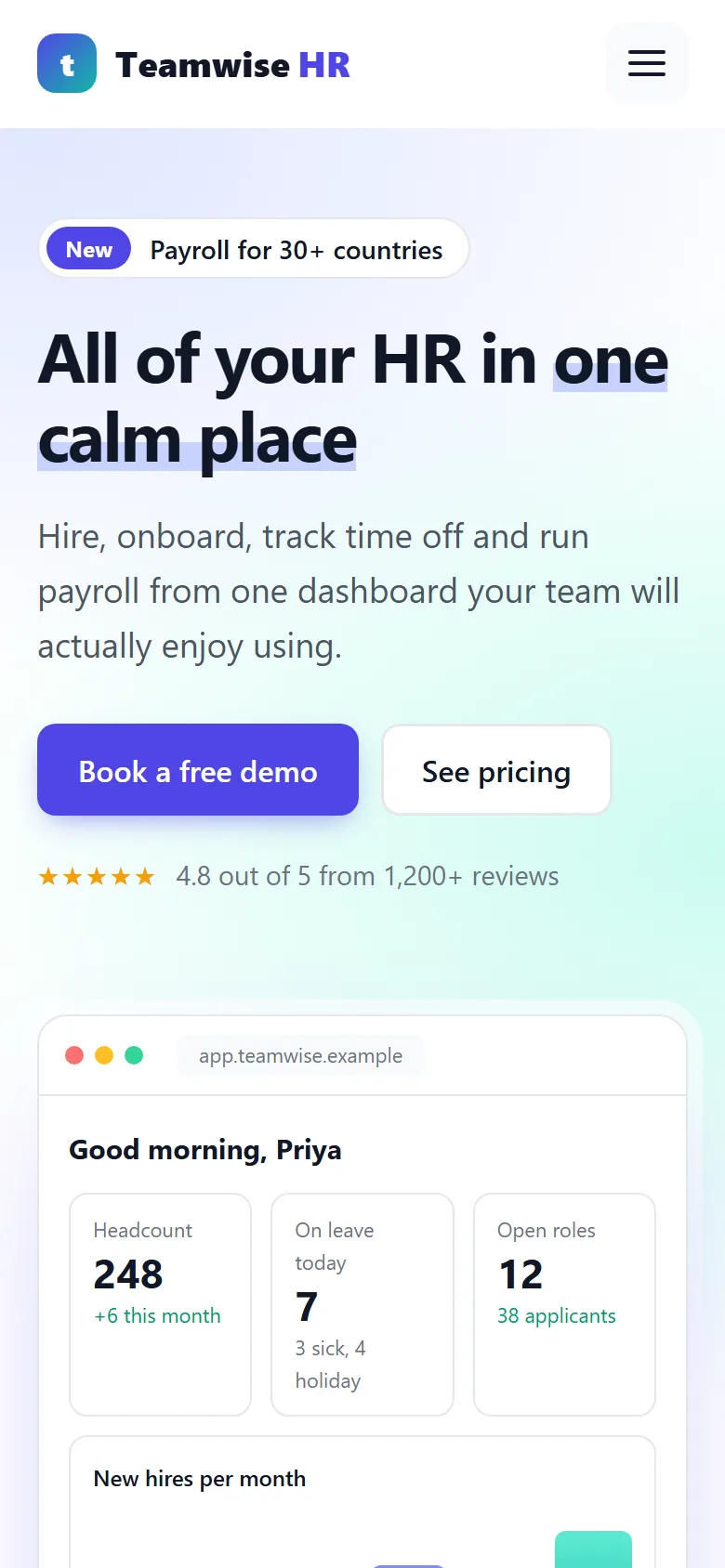
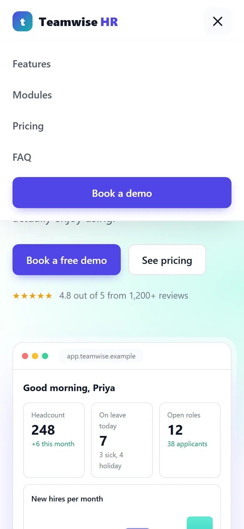
At 980px the two-column sections stack, the dashboard loses its tilt, and the plans become one column. At 860px the menu turns into a hamburger. At 600px the mockup hides its sidebar and everything goes single-column.
/* ---------- REDUCED MOTION ---------- */
@media (prefers-reduced-motion: reduce) {
  html { scroll-behavior: auto; }
  *, *::before, *::after {
    animation-duration: .01ms !important;
    animation-iteration-count: 1 !important;
    animation-delay: 0s !important;
    transition-duration: .01ms !important;
  }
}
/* ---------- END REDUCED MOTION ---------- */
Part 3: The JavaScript
3.1 Settings, menu and header
// ---------- SETTINGS ----------
const YEARLY_DISCOUNT = 0.2;   // 20% off when billed yearly
const money = new Intl.NumberFormat('en-US', { style: 'currency', currency: 'USD', maximumFractionDigits: 0 });
const seatPrice = n => '$' + (n % 1 ? n.toFixed(2) : n);   // $8 or $6.40
// ---------- END SETTINGS ----------
seatPrice() shows whole prices without decimals ($8) and others with two ($6.40).
n % 1 is the part after the decimal point, so it's zero for whole numbers.
// ---------- MENU AND HEADER ----------
const menuBtn = document.querySelector('.menu-btn');
const menu = document.getElementById('menu');
const header = document.querySelector('.site-header');

function setMenu(open) {
  menuBtn.setAttribute('aria-expanded', open);
  menuBtn.setAttribute('aria-label', open ? 'Close menu' : 'Open menu');
  menu.classList.toggle('open', open);
}
menuBtn.addEventListener('click', () => setMenu(menuBtn.getAttribute('aria-expanded') !== 'true'));
menu.addEventListener('click', e => { if (e.target.closest('a')) setMenu(false); });
document.addEventListener('keydown', e => { if (e.key === 'Escape') setMenu(false); });

function onScroll() { header.classList.toggle('scrolled', window.scrollY > 10); }
window.addEventListener('scroll', onScroll, { passive: true });
onScroll();
// ---------- END MENU AND HEADER ----------
This is the same menu and header code as the freight tutorial. One setMenu()
function keeps aria-expanded, the label and the CSS class in sync. The menu closes on
a link click or Esc.
3.2 Accessible tabs
// ---------- TABS ----------
const tabs = [...document.querySelectorAll('[role="tab"]')];

function selectTab(tab, moveFocus) {
  tabs.forEach(t => {
    const selected = t === tab;
    t.setAttribute('aria-selected', selected);
    t.tabIndex = selected ? 0 : -1;           // only the active tab is in the Tab order
    document.getElementById(t.getAttribute('aria-controls')).hidden = !selected;
  });
  if (moveFocus) tab.focus();
}

tabs.forEach((tab, i) => {
  tab.addEventListener('click', () => selectTab(tab));
  tab.addEventListener('keydown', e => {
    const keys = {
      ArrowRight: tabs[(i + 1) % tabs.length],
      ArrowLeft: tabs[(i - 1 + tabs.length) % tabs.length],
      Home: tabs[0],
      End: tabs[tabs.length - 1]
    };
    if (keys[e.key]) {
      e.preventDefault();
      selectTab(keys[e.key], true);
    }
  });
});
// ---------- END TABS ----------
selectTab() loops over every tab and, for each one, sets
aria-selected, its tabIndex and its panel's hidden. The CSS
does all the visual work from those attributes.
The keyboard handler follows the standard tabs pattern that screen reader users expect:
→ and ← move to the next and previous tab, wrapping around at the
ends, and Home and End jump to the first and last. Instead of a chain of
ifs, a small keys object maps each key name to the tab it should select.
The % tabs.length does the wrapping: one past the last tab is index 0 again.
Only the selected tab has tabIndex = 0. This is called a roving
tabindex: Tab enters the tab list once, the arrows move inside it, and the
next Tab goes straight into the panel.
3.3 The pricing calculator
// ---------- PRICING ----------
const billingSwitch = document.querySelector('.switch');
const seatsInput = document.getElementById('seats');
const seatsOut = document.getElementById('seatsOut');

function updatePrices() {
  const yearly = billingSwitch.getAttribute('aria-checked') === 'true';
  const seats = Number(seatsInput.value);
  seatsOut.textContent = seats;
  document.getElementById('lblMonthly').classList.toggle('active', !yearly);
  document.getElementById('lblYearly').classList.toggle('active', yearly);

  document.querySelectorAll('[data-price]').forEach(el => {
    const perSeat = Number(el.dataset.price) * (yearly ? 1 - YEARLY_DISCOUNT : 1);
    el.textContent = seatPrice(perSeat);
    el.closest('.plan').querySelector('[data-total]').textContent = yearly
      ? `${money.format(perSeat * seats * 12)} billed yearly for ${seats} people`
      : `${money.format(perSeat * seats)} a month for ${seats} people`;
  });
}

function setYearly(on) {
  billingSwitch.setAttribute('aria-checked', on);
  updatePrices();
}
billingSwitch.addEventListener('click', () => setYearly(billingSwitch.getAttribute('aria-checked') !== 'true'));
document.getElementById('lblMonthly').addEventListener('click', () => setYearly(false));
document.getElementById('lblYearly').addEventListener('click', () => setYearly(true));
seatsInput.addEventListener('input', updatePrices);
updatePrices();
// ---------- END PRICING ----------
updatePrices() reads two inputs, whether yearly billing is on and the team size,
then updates every plan that has a data-price:
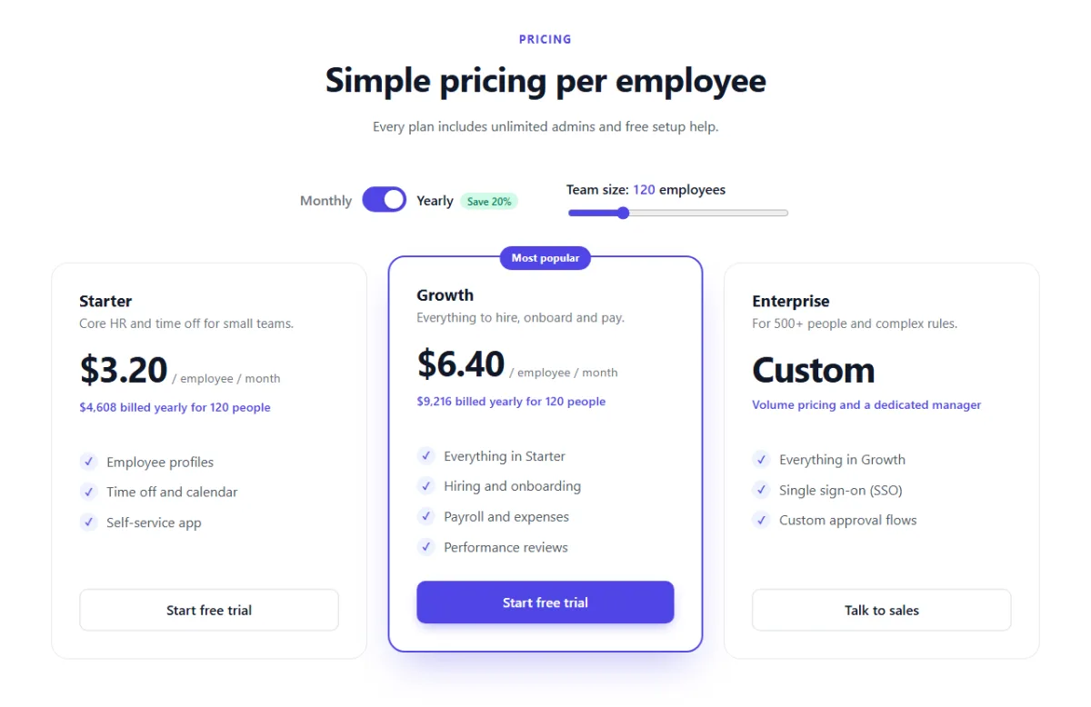
- The per-employee price is the monthly price, minus 20% when billed yearly. $8 becomes $6.40.
- The total line is that price × the number of people, and × 12 for yearly.
el.closest('.plan')walks up from the price to its card, thenquerySelector('[data-total]')finds that card's total line. This way one loop handles any number of plans.
The switch flips aria-checked. Clicking the words "Monthly" or "Yearly" sets it
directly, which is a small touch people appreciate. The slider recalculates on every
input event, so the totals change while you drag.
3.4 The FAQ accordion
// ---------- FAQ ACCORDION ----------
document.querySelectorAll('.faq button').forEach(btn => {
  const answer = document.getElementById(btn.getAttribute('aria-controls'));
  answer.inert = btn.getAttribute('aria-expanded') !== 'true';   // closed answers can't be reached

  btn.addEventListener('click', () => {
    const open = btn.getAttribute('aria-expanded') !== 'true';
    btn.setAttribute('aria-expanded', open);
    answer.classList.toggle('open', open);
    answer.inert = !open;
  });
});
// ---------- END FAQ ACCORDION ----------
Each click flips aria-expanded on the button and the open class on the
answer. The CSS from 2.9 handles the animation. Closed answers also get the inert
property, so they can't be focused or read while they're collapsed. Without it, a screen reader
could still read the hidden text, because a 0fr row hides content visually but not
from assistive technology.
3.5 Demo form validation
// ---------- DEMO FORM ----------
const demoForm = document.getElementById('demoForm');
const formDone = document.getElementById('formDone');

// Each rule returns true, or the error message to show
const rules = {
  name: v => v.trim().length >= 2 || 'Please enter your name.',
  email: v => /^[^\s@]+@[^\s@]+\.[^\s@]{2,}$/.test(v.trim()) || 'Please enter a valid work email.',
  size: v => v !== '' || 'Please choose your company size.'
};

function check(field) {
  const result = rules[field.name](field.value);
  const ok = result === true;
  field.setAttribute('aria-invalid', !ok);
  document.getElementById(field.name + 'Error').textContent = ok ? '' : result;
  return ok;
}

demoForm.addEventListener('submit', e => {
  e.preventDefault();
  const fields = [...demoForm.elements].filter(el => rules[el.name]);
  const invalid = fields.filter(field => !check(field));
  if (invalid.length) return invalid[0].focus();

  const button = demoForm.querySelector('button');
  button.disabled = true;
  button.textContent = 'Booking...';
  setTimeout(() => {                         // pretend to send it to a server
    const first = document.getElementById('name').value.trim().split(' ')[0];
    button.textContent = 'Demo booked ✓';
    formDone.textContent = `Thanks, ${first}! We'll email you within one business day.`;
  }, 900);
});

// Once a field has shown an error, re-check it as the visitor fixes it
demoForm.addEventListener('input', e => {
  if (rules[e.target.name] && e.target.getAttribute('aria-invalid') === 'true') check(e.target);
});
// ---------- END DEMO FORM ----------
The validation is driven by a small rules object. Each rule is a function that gets
the field's value and returns true or an error message. The trick is
||: condition || 'message' gives true when the condition
passes and the message when it fails. To validate a new field, add one line to
rules, a field with the same name, and an error element with the id
name + 'Error'.
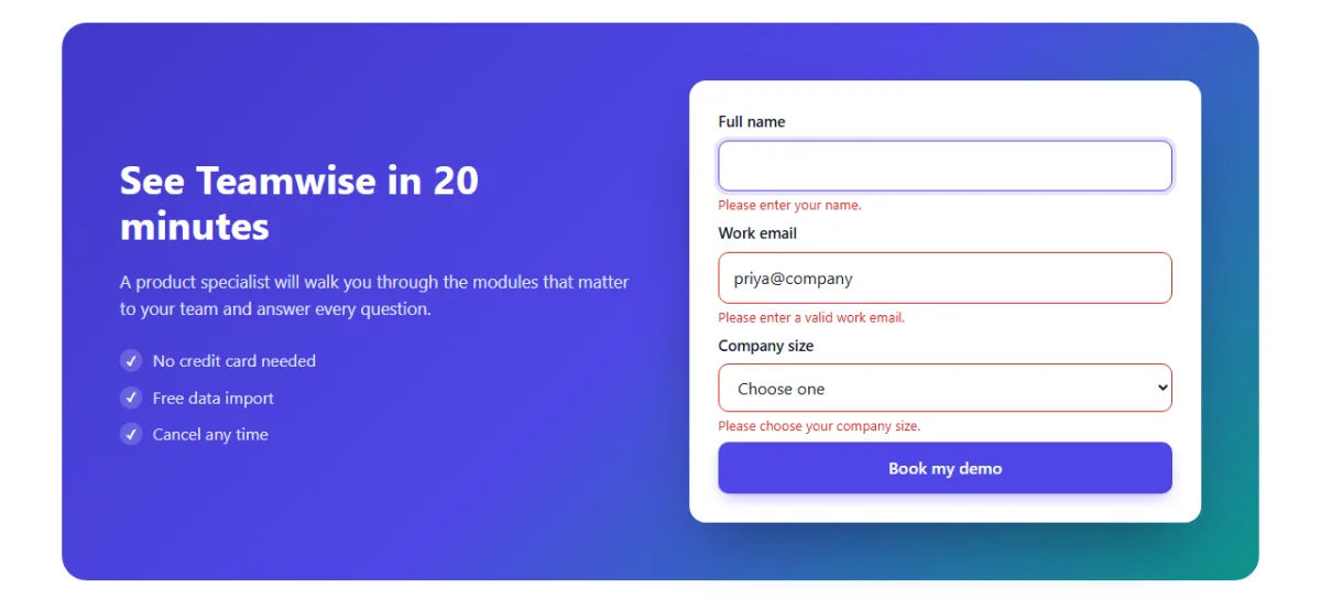
On submit, every field with a rule is checked, not just the first bad one, so the visitor sees all the problems at once. Focus moves to the first invalid field. After the first failed attempt, each field re-checks itself as you type, so the red disappears the moment the value is right.
When everything is valid, the button is disabled (so it can't be clicked twice) and shows
"Booking...". After a pretend server delay it says "Demo booked" and thanks the visitor by first
name. The message is written with textContent, so whatever someone types as their
name is shown as plain text and can never run as code.
Test it yourself
- Click the Hiring tab, then press → three times and Home. Watch the panels change.
- Open the Time off tab and watch the rings fill.
- Turn on yearly billing and drag the team size to 200. Check that Growth shows $6.40 and $15,360 billed yearly.
- Open and close a few FAQ questions.
- Submit the empty demo form, then fix one field at a time.
- Make the window narrow and check the menu, the mockup and the plans.
Using it on a real site
- The demo form: replace the
setTimeoutwith afetch()to your CRM or email service, and validate everything again on the server. - Prices: keep them in the
data-priceattributes so marketing can edit the HTML without touching the script. - The mockup: make it look like your real product's screens. Keep it simple; a mockup sells best when it highlights two or three numbers, not every feature.
- Brand colours: change
--brand,--brand-dark,--brand-softand--tealin:root.
Share your version
Made your own SaaS landing page? Share a screenshot as a link with sshot.online, or share the code with the free code sharing tool. No account needed.
Conclusion
In three parts you've built a landing page that would fit any modern software product, and learned the patterns behind it:
- a product mockup made from HTML and CSS instead of an image
- accessible tabs with a roving tabindex and arrow keys
- a
role="switch"toggle and a live pricing calculator - an accordion that animates to its natural height with
grid-template-rows - progress rings with
conic-gradientand@property - rule-based form validation that shows every error and clears as you type
Next, try the freight logistics landing page. It uses the same three-part structure with an animated SVG route, a shipment tracker and a quote calculator.
Frequently asked questions
Is the dashboard in the hero an image?
No. The dashboard mockup is built from HTML elements styled with CSS, so it stays sharp at any size, loads fast and can be animated.
Are the feature tabs accessible?
Yes. They use the tablist, tab and tabpanel roles with
aria-selected, a roving tabindex, and arrow, Home and End key support, which is
the standard pattern screen reader users expect.
How does the FAQ animate to its natural height?
Each answer is a one-row CSS grid whose grid-template-rows transitions from
0fr to 1fr, with an inner element set to
overflow: hidden. No JavaScript measuring is needed.
How does the yearly pricing work?
Each plan stores its monthly price per employee in a data-price attribute. When
yearly billing is on, the script takes 20% off and multiplies by the team size and by 12 to
show the yearly total.
Can I use this page for my own product?
Yes. Change the colour variables in :root, replace the text and mockup numbers
with your own, and connect the demo form to your backend with fetch().
Related articles
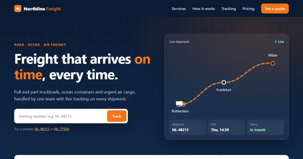
How to Build a Freight Logistics Landing Page with HTML, CSS and JavaScript
A professional logistics landing page in 3 parts: a truck driving along an SVG route, animated stats, live shipment tracking and an instant quote calculator.
Read More →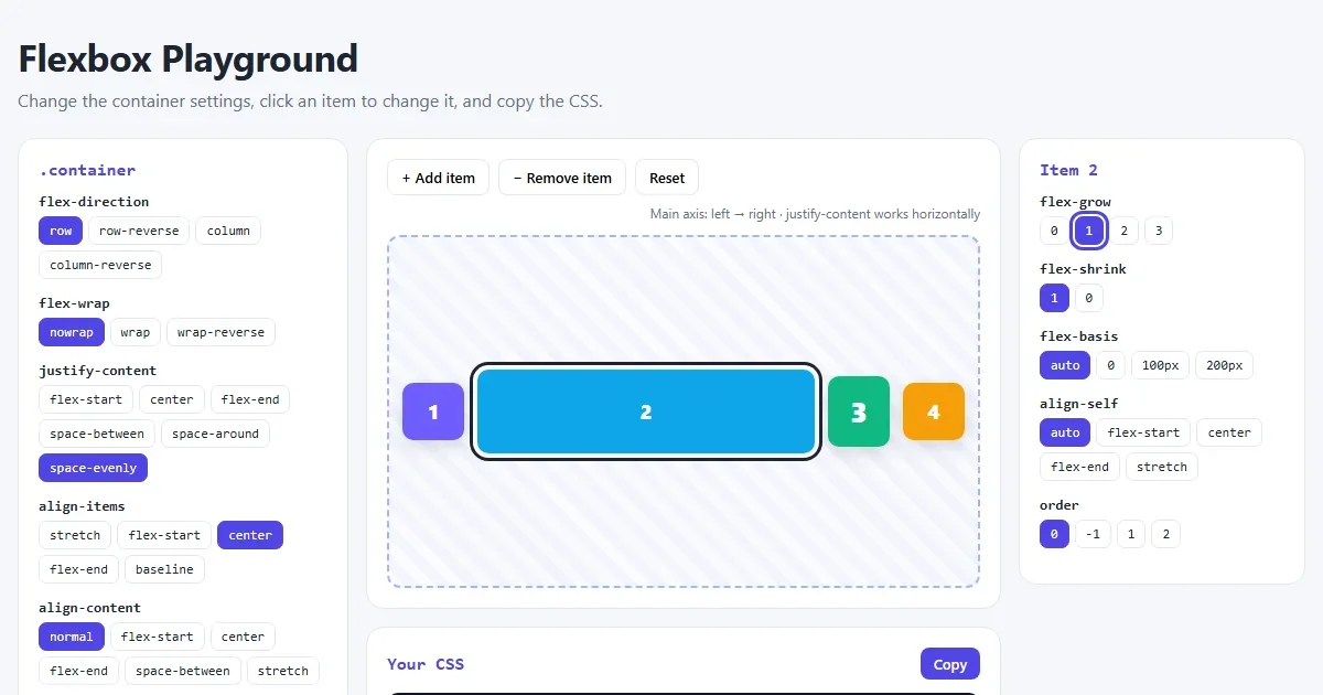
CSS Flexbox Explained: A Visual Guide with Examples
Every Flexbox property in pictures: direction, justify-content, align-items, wrap, gap, flex-grow, plus a navbar, equal-height cards and a sticky footer.
Read More →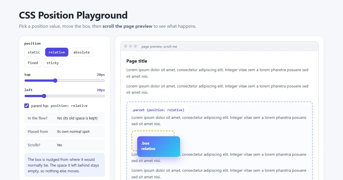
CSS Position Explained: static, relative, absolute, fixed and sticky
The five CSS position values with pictures: what each is placed from, whether it scrolls, z-index, and why sticky or absolute sometimes does not work.
Read More →