How to Build a Night Owl Login Page with HTML, CSS and JavaScript
Published November 4, 2026 · 11 min read
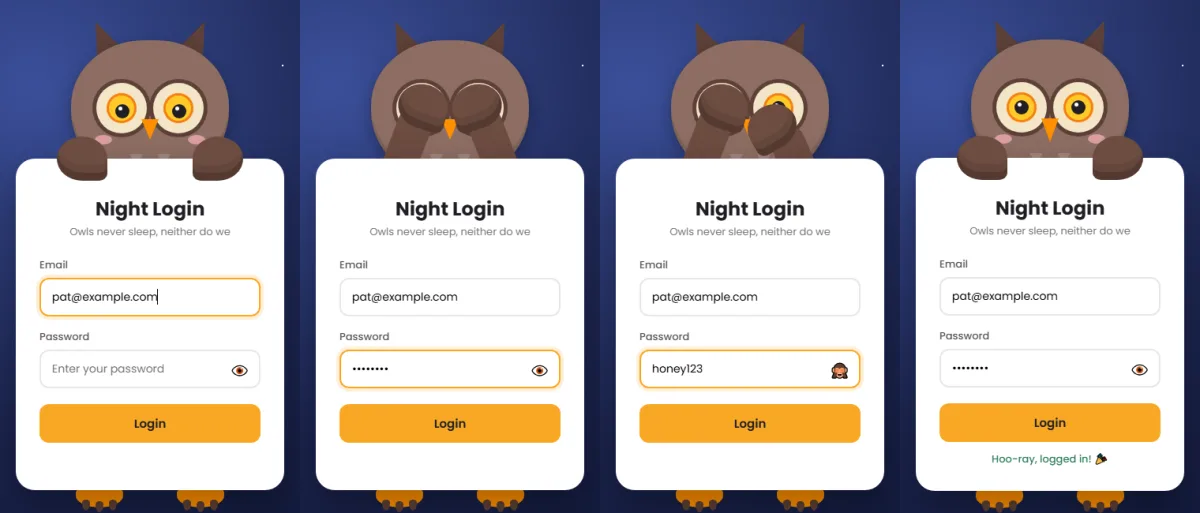
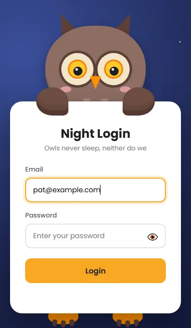
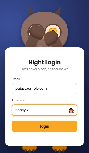
Dark themes are popular, and nothing says “night mode” like an owl. In this tutorial we'll build a login page set under a twinkling, starry sky, guarded by a wide-eyed owl. It watches your email with huge yellow eyes, folds its wings over its face when you type your password, lifts one wing to peek, and hops with joy when you log in.
It's made with three files of HTML, CSS and JavaScript, with no images. You'll learn how to:
- draw a whole star field with gradients
- make rings with
box-shadow - shape a beak with
clip-path - turn arms into wings with one sharp corner
- keep a yellow button readable
Project setup
owl-login/
├── index.html
├── style.css
└── script.js
Step 1: The HTML
<!DOCTYPE html>
<html lang="en">
<head>
  <meta charset="UTF-8">
  <meta name="viewport" content="width=device-width, initial-scale=1.0">
  <title>Owl Login</title>
  <link rel="preconnect" href="https://fonts.googleapis.com">
  <link rel="preconnect" href="https://fonts.gstatic.com" crossorigin>
  <link href="https://fonts.googleapis.com/css2?family=Poppins:wght@400;500;600;700&display=swap" rel="stylesheet">
  <link rel="stylesheet" href="style.css">
</head>
<body>

  <div class="scene" id="scene">
    <!-- The owl is decoration, so screen readers skip it -->
    <div class="head" aria-hidden="true">
      <div class="ear l"></div>
      <div class="ear r"></div>
      <div class="face">
        <div class="patch l"><div class="eye"><div class="pupil"></div></div></div>
        <div class="patch r"><div class="eye"><div class="pupil"></div></div></div>
        <div class="blush l"></div>
        <div class="blush r"></div>
        <div class="chest"></div>
        <div class="beak"></div>
      </div>
    </div>

    <!-- Wings: the same arm + paw pieces as the panda, with no toe beans -->
    <div class="arm l" aria-hidden="true"></div>
    <div class="arm r" aria-hidden="true"></div>
    <div class="paw l" aria-hidden="true"></div>
    <div class="paw r" aria-hidden="true"></div>

    <form class="card" id="form" novalidate>
      <h2>Night Login</h2>
      <p class="sub">Owls never sleep, neither do we</p>

      <div class="field">
        <label for="email">Email</label>
        <input type="email" id="email" name="email" autocomplete="username" data-t placeholder="you@example.com">
      </div>

      <div class="field">
        <label for="password">Password</label>
        <input type="password" id="password" name="password" autocomplete="current-password" data-pw placeholder="Enter your password">
        <button type="button" class="toggle" aria-label="Show password" aria-pressed="false">👁️</button>
      </div>

      <button type="submit" class="btn">Login</button>
      <div class="msg" id="msg" role="status" aria-live="polite"></div>
    </form>

    <!-- Feet: three claws each -->
    <div class="foot l" aria-hidden="true"><i></i><i></i><i></i></div>
    <div class="foot r" aria-hidden="true"><i></i><i></i><i></i></div>
  </div>

  <script src="script.js"></script>
</body>
</html>
The owl's face is simpler than you might expect:
- Two ear tufts, two eye patches (each with an eye and a pupil), two cheeks, a chest and a beak.
- No mouth. Owls don't smile with their lips, so the beak does the expressing.
- The wings are the same four pieces many CSS mascots use for arms and paws
(
.armand.paw), just styled differently and without toe beans. Reusing those names means the cover and peek animations work unchanged. - The feet have three
<i>claws each.
Leaving out elements you don't need, rather than hiding them with CSS, keeps the page lighter and
the code easier to read. As usual, the decoration has aria-hidden="true", the
message has role="status", and the fields carry autocomplete hints for
password managers.
Step 2: The CSS
2.1 A dark palette
:root {
  --bg: radial-gradient(circle at 25% 15%, #3b4f9a 0%, #1c2550 55%, #0e1430 100%);
  --feather: #8d6e63;  /* face */
  --dark: #5d4037;     /* ear tufts, eye rings, talons */
  --wing: #6d4c41;     /* wings (the "arms" and "paws") */
  --disc: #f3e5c8;     /* pale discs around the eyes */
  --beak: #ff8f00;     /* beak and feet */
  --accent: #f9a825;   /* button and focus ring */
  --px: 0px;           /* pupil x, set by JavaScript */
  --py: 0px;           /* pupil y */
}
* { box-sizing: border-box; margin: 0; padding: 0; }
body {
  min-height: 100vh;
  display: grid;
  place-items: center;
  padding: 24px 16px 56px;
  background: var(--bg);
  font-family: 'Poppins', sans-serif;
  overflow-x: hidden;
}
The background is a radial-gradient that starts as a soft blue
glow in the top left (like moonlight) and fades to deep navy. The owl uses warm browns, a cream
--disc around the eyes, and orange for the beak and feet. Warm colours on a cool
background make the mascot pop.
2.2 Stars without a single image
/* Eight tiny radial gradients = eight stars, all on one pseudo-element */
body::before {
  content: '';
  position: fixed;
  inset: 0;
  pointer-events: none;
  background-image:
    radial-gradient(2px 2px at 12% 20%, #fff 50%, transparent 51%),
    radial-gradient(2px 2px at 78% 12%, #fff 50%, transparent 51%),
    radial-gradient(1.5px 1.5px at 60% 30%, #fff 50%, transparent 51%),
    radial-gradient(2px 2px at 30% 70%, #fff 50%, transparent 51%),
    radial-gradient(1.5px 1.5px at 88% 60%, #fff 50%, transparent 51%),
    radial-gradient(2px 2px at 8% 88%, #fff 50%, transparent 51%),
    radial-gradient(1.5px 1.5px at 45% 90%, #fff 50%, transparent 51%),
    radial-gradient(2px 2px at 92% 85%, #fff 50%, transparent 51%);
  animation: twinkle 3s ease-in-out infinite alternate;
}
@keyframes twinkle { to { opacity: .4; } }
This is a neat trick. background-image accepts a list of images, and a
gradient counts as an image. Each radial-gradient(2px 2px at 12% 20%, #fff 50%, transparent
51%) draws one tiny white dot at a chosen spot. Eight gradients give eight stars, all on a
single pseudo-element.
position: fixedkeeps the stars still when the page scrolls.pointer-events: nonemakes sure they never block clicks.- The
twinkleanimation fades them to 40% and back, usingalternate, forever.
Want more stars? Add more gradients to the list.
2.3 The scene
.scene {
  position: relative;
  width: 340px;
  padding-top: 150px;
  margin-bottom: 40px;
}
@media (max-width: 370px) {
  body { padding-left: 12px; padding-right: 12px; }
  .scene { zoom: .86; }
}
Everything is positioned inside this 340px box. On very narrow phones, zoom scales
the whole owl down, including all the pixel offsets the wing animation relies on.
2.4 Head, ear tufts and chest feathers
.head {
  position: absolute;
  top: 0; left: 50%;
  width: 200px; height: 180px;
  margin-left: -100px;
  z-index: 1;
}
/* Ear tufts: narrow triangles tilted outwards */
.ear {
  position: absolute;
  top: -26px;
  width: 46px; height: 60px;
  background: var(--dark);
  clip-path: polygon(50% 0, 100% 100%, 0 100%);
}
.ear.l { left: 20px;  transform: rotate(-24deg); }
.ear.r { right: 20px; transform: rotate(24deg); }
/* The head is a little wider at the bottom than a panda's (46% / 50%) */
.face {
  position: absolute;
  inset: 0;
  background: var(--feather);
  border-radius: 46% 46% 50% 50%;
  box-shadow: 0 6px 18px rgba(0,0,0,.3), inset 0 -8px 0 rgba(0,0,0,.1);
}
/* Chest feathers: three circles drawn with radial gradients */
.chest {
  position: absolute;
  left: 50%; bottom: 14px;
  width: 70px; height: 22px;
  margin-left: -35px;
  background:
    radial-gradient(circle at 25% 0,   #a1887f 7px, transparent 8px),
    radial-gradient(circle at 75% 0,   #a1887f 7px, transparent 8px),
    radial-gradient(circle at 50% 100%, #a1887f 7px, transparent 8px);
}- Ear tufts are narrow triangles made with
clip-path: polygon(50% 0, 100% 100%, 0 100%), tilted 24 degrees outwards. - The head has
border-radius: 46% 46% 50% 50%, slightly flatter on top than at the bottom, which gives an owl's broad, round silhouette. - The chest feathers are three circles, each drawn by its own
radial-gradienton one small box. The7px, transparent 8pxpair makes a crisp circle edge. It's the same layering idea as the stars.
2.5 Big round eyes with box-shadow rings
/* Pale disc + a dark ring drawn with box-shadow (no extra element) */
.patch {
  position: absolute;
  top: 54px;
  width: 64px; height: 64px;
  background: var(--disc);
  border-radius: 50%;
  box-shadow: 0 0 0 5px var(--dark);
  display: grid;
  place-items: center;
}
.patch.l { left: 32px; }
.patch.r { right: 32px; }
.eye {
  position: relative;
  width: 38px; height: 38px;
  background: #ffca28;
  border-radius: 50%;
  box-shadow: inset 0 0 0 3px #f57f17;
  overflow: hidden;
  animation: blink 4.5s infinite;
}
.pupil {
  position: absolute;
  top: 50%; left: 50%;
  width: 18px; height: 18px;
  margin: -9px 0 0 -9px;
  background: #1f1f24;
  border-radius: 50%;
  transform: translate(var(--px), var(--py));
  transition: transform .15s ease;
}
.pupil::after {
  content: '';
  position: absolute;
  top: 3px; left: 4px;
  width: 5px; height: 5px;
  background: #fff;
  border-radius: 50%;
}
@keyframes blink {
  0%, 92%, 100% { transform: scaleY(1); }
  95% { transform: scaleY(.1); }
}
An owl's face is all eyes, so these are built in three rings:
- The cream disc (
.patch) with a dark outline. The outline isbox-shadow: 0 0 0 5px: no offset, no blur, just a 5px spread. Unlike a border, a shadow doesn't change the element's size, so the positioning stays simple. - The yellow iris, with an orange ring drawn by an
insetshadow. - The pupil, larger than other mascots' at 18px, which gives the wide-eyed
night owl look. It moves with the
--pxand--pyvariables, like the other CSS animals.
2.6 The beak
/* A downward triangle: three clip-path points */
.beak {
  position: absolute;
  top: 100px; left: 50%;
  width: 22px; height: 26px;
  margin-left: -11px;
  background: var(--beak);
  clip-path: polygon(0 0, 100% 0, 50% 100%);
  transition: transform .3s ease;
  transform-origin: 50% 0;
}
.blush {
  position: absolute;
  top: 120px;
  width: 22px; height: 12px;
  background: #ffb3c1;
  border-radius: 50%;
  opacity: .7;
}
.blush.l { left: 30px; }
.blush.r { right: 30px; }
The beak is an upside-down triangle: clip-path: polygon(0 0, 100% 0, 50% 100%) keeps
the two top corners and the bottom middle. transform-origin: 50% 0 pins the top
edge, so when the owl is happy, scaleY(1.15) stretches the beak downwards, like
it's opening to hoot.
2.7 Wings
/* Same arm + paw system as the panda, styled as wings:
   one sharp corner in border-radius gives each wing tip a point */
.arm {
  position: absolute;
  top: 75px;
  width: 44px; height: 145px;
  background: var(--wing);
  border-radius: 22px;
  transform-origin: 50% 100%;
  transform: scaleY(.5);
  z-index: 2;
  transition: transform .45s cubic-bezier(.68, -0.35, .27, 1.35);
}
.arm.l { left: 60px; }
.arm.r { right: 60px; }
.paw {
  position: absolute;
  top: 122px;
  width: 64px; height: 56px;
  background: var(--wing);
  border-radius: 60% 60% 20% 60%;
  box-shadow: inset 0 -10px 0 rgba(0,0,0,.18), inset 0 -20px 0 rgba(0,0,0,.08);
  z-index: 4;
  transition: transform .45s cubic-bezier(.68, -0.35, .27, 1.35);
}
.paw.l { left: 52px; }
.paw.r { right: 52px; border-radius: 60% 60% 60% 20%; }
The “arms” are tall rounded bars that pivot from the bottom
(transform-origin: 50% 100%) and start squashed to half height behind the form. The
“paws” become wing tips with one small change: three corners at 60% and
one corner at 20%. That nearly sharp corner points inwards, which makes the
shape read as a feathered wing instead of a paw. The right wing mirrors the left by moving the
sharp corner to the other side.
Two stacked inset shadows darken the bottom of each wing, suggesting layers of
feathers.
2.8 The form card and a readable yellow button
.card {
  position: relative;
  z-index: 3;
  background: #fff;
  border-radius: 24px;
  padding: 46px 30px 30px;
  box-shadow: 0 20px 50px rgba(0,0,0,.35);
}
.card h2 { text-align: center; color: #1f1f24; font-weight: 700; margin-bottom: 2px; }
.card p.sub { text-align: center; color: #767676; font-size: 13px; margin-bottom: 22px; }
.field { position: relative; margin-bottom: 16px; }
.field label { display: block; font-size: 13px; font-weight: 500; color: #555; margin-bottom: 6px; }
.field input {
  width: 100%;
  padding: 12px 44px 12px 14px;
  border: 2px solid #e6e6e6;
  border-radius: 12px;
  font: inherit;
  font-size: 14px;
  outline: none;
  transition: border-color .2s, box-shadow .2s;
}
.field input:focus {
  border-color: var(--accent);
  box-shadow: 0 0 0 4px color-mix(in srgb, var(--accent) 18%, transparent);
}
.field input[aria-invalid="true"] { border-color: #d64545; }
.toggle {
  position: absolute;
  right: 10px; bottom: 9px;
  padding: 4px;
  border: none;
  border-radius: 6px;
  background: none;
  font-size: 18px;
  line-height: 1;
  cursor: pointer;
}
.toggle:focus-visible { outline: 2px solid var(--accent); }
/* Yellow button with dark text: white on yellow would be hard to read */
.btn {
  width: 100%;
  margin-top: 4px;
  padding: 13px;
  border: none;
  border-radius: 12px;
  background: var(--accent);
  color: #1f1f24;
  font: inherit;
  font-weight: 600;
  font-size: 15px;
  cursor: pointer;
  transition: transform .15s, filter .2s;
}
.btn:hover { filter: brightness(.92); }
.btn:active { transform: scale(.97); }
.btn:focus-visible { outline: 3px solid #1f1f24; outline-offset: 2px; }
.msg { text-align: center; font-size: 13px; margin-top: 12px; min-height: 18px; font-weight: 500; }
The accent is a warm yellow to match the owl's eyes. White text on yellow is very hard to
read, so the button uses near-black text instead. Always check contrast when you pick a
light accent colour. The focus ring is mixed from the same yellow with color-mix(),
and fields marked aria-invalid="true" turn red.
On a dark page the card needs a deeper shadow (.35 opacity) to lift it off the
background.
2.9 Talons
.foot {
  position: absolute;
  bottom: -22px;
  width: 60px; height: 30px;
  background: var(--beak);
  border-radius: 40% 40% 50% 50%;
  z-index: 1;
}
.foot.l { left: 76px; }
.foot.r { right: 76px; }
/* Three claws peeking out under each foot */
.foot i {
  position: absolute;
  bottom: -4px;
  width: 10px; height: 14px;
  background: var(--dark);
  border-radius: 50% 50% 50% 50% / 30% 30% 70% 70%;
}
.foot i:nth-of-type(1) { left: 8px; }
.foot i:nth-of-type(2) { left: 25px; bottom: -6px; }
.foot i:nth-of-type(3) { left: 42px; }
Short orange feet with three dark claws peeking out underneath. The claws use the slash syntax
in border-radius: the vertical values (30% 30% 70% 70%) make them
narrow at the top and rounder at the tip.
2.10 The states
/* Typing in a text field: look down at the form */
.scene.look { --py: 4px; }

/* Typing a password: both wings over the eyes */
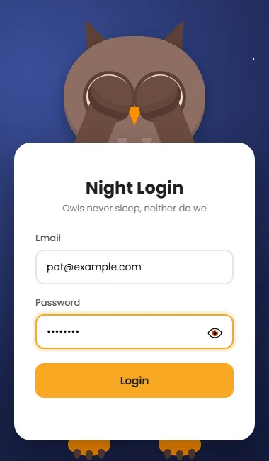
.scene.cover .arm.l { transform: rotate(21deg) scaleY(1); }
.scene.cover .arm.r { transform: rotate(-21deg) scaleY(1); }
.scene.cover .paw.l { transform: translate(52px, -66px) rotate(18deg); }
.scene.cover .paw.r { transform: translate(-52px, -66px) rotate(-18deg); }

/* Password shown: the right wing lifts to peek */
.scene.cover.peek .arm.r { transform: rotate(-24deg) scaleY(.82); }
.scene.cover.peek .paw.r { transform: translate(-58px, -40px) rotate(-30deg); }

/* Success: the beak opens a little, bounce, happy feet */
.scene.happy .beak { transform: scaleY(1.15); }
.scene.happy .foot { animation: tap .35s ease 3; }
.scene.happy .head { animation: bounce .5s ease 2; }
@keyframes tap { 50% { transform: translateY(-8px); } }
@keyframes bounce { 50% { transform: translateY(-10px); } }

/* Problem: a head shake (owls have no mouth to frown with) */
.scene.sad .head { animation: shake .45s ease; }
@keyframes shake {
  20%, 60% { transform: translateX(-8px) rotate(-3deg); }
  40%, 80% { transform: translateX(8px) rotate(3deg); }
}
JavaScript only adds a class to .scene, and the CSS does the moving:
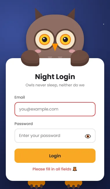
look: pupils drop to the form.cover: wings swing up over the eyes.cover.peek: the right wing lowers a little.happy: the beak opens, the head bobs and the feet tap.sad: a head shake. With no mouth to frown, that's all an owl needs.
2.11 Reduced motion
@media (prefers-reduced-motion: reduce) {
  *, *::before, *::after {
    animation-duration: .01ms !important;
    animation-iteration-count: 1 !important;
    transition-duration: .01ms !important;
  }
}
This also stops the stars twinkling for people who prefer less movement.
Step 3: The JavaScript
3.1 Settings and elements
const SUCCESS = 'Hoo-ray, logged in! 🎉';
const EMOJI = '🦉';const scene = document.getElementById('scene');
const form = document.getElementById('form');
const msg = document.getElementById('msg');
const texts = [...form.querySelectorAll('input[data-t]')]; // fields the owl watches
const pws = [...form.querySelectorAll('input[data-pw]')]; // fields the owl hides from
let resetTimer;The owl's success message and emoji are the only owl-specific lines. Fields are collected by data
attribute: data-t for ones the owl watches, data-pw for ones it hides
from.
3.2 Watching the email
// The longer the text, the further right the pupils move (-5px to +5px).
function follow(input) {
  const len = Math.min(input.value.length, 25);
  scene.style.setProperty('--px', (-5 + (len / 25) * 10) + 'px');
}

texts.forEach((input) => {
  input.addEventListener('focus', () => {
    scene.classList.remove('cover', 'peek');
    scene.classList.add('look');
    follow(input);
  });
  input.addEventListener('input', () => {
    if (document.activeElement === input) follow(input); // ignore autofill
  });
  input.addEventListener('blur', () => {
    scene.classList.remove('look');
    scene.style.setProperty('--px', '0px');
  });
});
As you type, the length of the text becomes a pupil offset, written to the --px CSS
variable. With such big pupils, even the 10px range from -5px to +5px
is easy to see.
3.3 Hiding behind the wings
pws.forEach((input) => {
  const toggle = input.parentElement.querySelector('.toggle');
  const uncover = () => scene.classList.remove('cover', 'peek');

  input.addEventListener('focus', () => {
    scene.classList.add('cover');
    scene.classList.toggle('peek', input.type === 'text');
  });
  // Moving between the password and its eye button keeps the wings up
  input.addEventListener('blur', (e) => {
    if (e.relatedTarget !== toggle) uncover();
  });
  toggle.addEventListener('blur', (e) => {
    if (e.relatedTarget !== input) uncover();
  });

  toggle.addEventListener('mousedown', (e) => e.preventDefault()); // keep focus in the input
  toggle.addEventListener('click', () => {
    const show = input.type === 'password';
    input.type = show ? 'text' : 'password';
    toggle.textContent = show ? '🙈' : '👁️';
    toggle.setAttribute('aria-label', show ? 'Hide password' : 'Show password');
    toggle.setAttribute('aria-pressed', String(show));
    input.focus();
    scene.classList.add('cover');
    scene.classList.toggle('peek', show); // one wing lifts to peek
  });
});
Focus on the password adds cover, and the eye button toggles peek. The
e.relatedTarget checks keep the wings up while focus moves between the password and
its eye button, and bring them down when you tab anywhere else.
preventDefault() on mousedown stops the button from stealing focus when
clicked.
3.4 Checking the form
const EMAIL = /^[^\s@]+@[^\s@]+\.[^\s@]{2,}$/;

// Returns the first problem as { input, text }, or null if all is well
function findProblem() {
  const inputs = [...form.querySelectorAll('input')];
  const empty = inputs.find((i) => !i.value.trim());
  if (empty) return { input: empty, text: 'Please fill in all fields' };

  const badEmail = inputs.find((i) => i.type === 'email' && !EMAIL.test(i.value.trim()));
  if (badEmail) return { input: badEmail, text: 'Please enter a valid email' };

  if (pws.length > 1 && pws[0].value !== pws[1].value) {
    return { input: pws[1], text: "Passwords don't match" };
  }
  return null;
}
findProblem() returns the first issue (an empty field or a badly formatted email) and
which input it belongs to.
3.5 Submitting
form.addEventListener('submit', (e) => {
  e.preventDefault();
  clearTimeout(resetTimer);
  scene.classList.remove('happy', 'sad', 'cover', 'peek', 'look');
  form.querySelectorAll('[aria-invalid]').forEach((i) => i.removeAttribute('aria-invalid'));
  if (document.activeElement) document.activeElement.blur();
  void scene.offsetWidth; // force a reflow so the animation can replay

  const problem = findProblem();
  if (!problem) {
    scene.classList.add('happy');
    msg.style.color = '#2e7d5b';
    msg.textContent = SUCCESS;
    // In a real app, send the form to your server here.
  } else {
    scene.classList.add('sad');
    msg.style.color = '#d64545';
    msg.textContent = problem.text + ' ' + EMOJI;
    problem.input.setAttribute('aria-invalid', 'true');
  }
  resetTimer = setTimeout(() => scene.classList.remove('happy', 'sad'), 2000);
});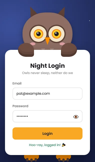
The handler clears old states, forces a reflow with void scene.offsetWidth so the
animation can replay, then shows either the happy owl or the sad one with the problem field
marked aria-invalid. clearTimeout keeps rapid clicks from cutting the
animation short.
Test it yourself
- Watch the stars twinkle, and the owl blink.
- Type an email. The big pupils follow along.
- Click the password. The wings fold over the eyes.
- Click 👁️. One wing lowers.
- Submit empty, then with an invalid email, then with valid details.
Ideas to extend it
- A moon: add one more
radial-gradienttobody::before, larger and pale yellow, in a top corner. - Shooting star: a thin white line on
body::afterthat moves diagonally across the screen every few seconds with@keyframes. - A snowy owl: white and pale grey variables with yellow eyes.
- Pick a theme by time of day: use the owl at night and a bright mascot during
the day, by checking
new Date().getHours().
Before you use it for real
- Check the email and password on your server, over HTTPS. The browser checks only give quick feedback.
- When the server says the login failed, add the
sadclass and show the message.
Share your night owl
Built a snowy owl or added a moon? Share a screenshot as a link with sshot.online, or share your code with the free code sharing tool. No account needed.
Conclusion
You've built a dark, atmospheric login page with a mascot that reacts to every step. The techniques here go well beyond owls:
- layered gradients for star fields and patterns
box-shadowspread for rings that don't affect layoutclip-pathfor beaks and tufts- one sharp
border-radiuscorner to change a shape's character - checking text contrast on light accent colours
Frequently asked questions
How are the stars made without images?
Each star is a tiny radial-gradient. background-image accepts a
comma-separated list, so eight small gradients on one fixed pseudo-element draw eight stars.
An animation fades them in and out.
How do you draw a ring around the owl eyes?
Use box-shadow: 0 0 0 5px with a dark colour. With no offset and no blur, the
spread value draws a solid ring that doesn't change the element's size.
Why does the yellow button use dark text?
White text on a light yellow background has very low contrast and is hard to read. Near-black text on yellow is much easier to read for everyone.
How do the wings cover the owl eyes?
When the password field is focused, JavaScript adds a cover class. CSS then
rotates the wing pieces up from a hinge at their base and moves the wing tips over the eyes
with a transition.
Does the owl login page need a library?
No. It's plain HTML, CSS and JavaScript in three files, with an optional Google Font.
Related articles
How to Build a Cute Cat Login Page with HTML, CSS and JavaScript
Draw a tabby cat in CSS with clip-path ears, slit pupils and whiskers, then make it watch your email and cover its eyes for the password.
Read More →
How to Build an Animated Teddy Bear Sign Up Form with HTML, CSS and JavaScript
A sign up form with a teddy bear that reads your name and email, hides from your password and cheers when the account is created. One script handles any number of fields.
Read More →
How to Build a Cyberpunk Login Page with HTML, CSS and JavaScript
A full tutorial for a neon login page with sign in, sign up and recovery views: glitch text, a spinning neon border, particles, validation and a loading screen.
Read More →