How to Build a Cute Cat Login Page with HTML, CSS and JavaScript
Published November 4, 2026 · 11 min read
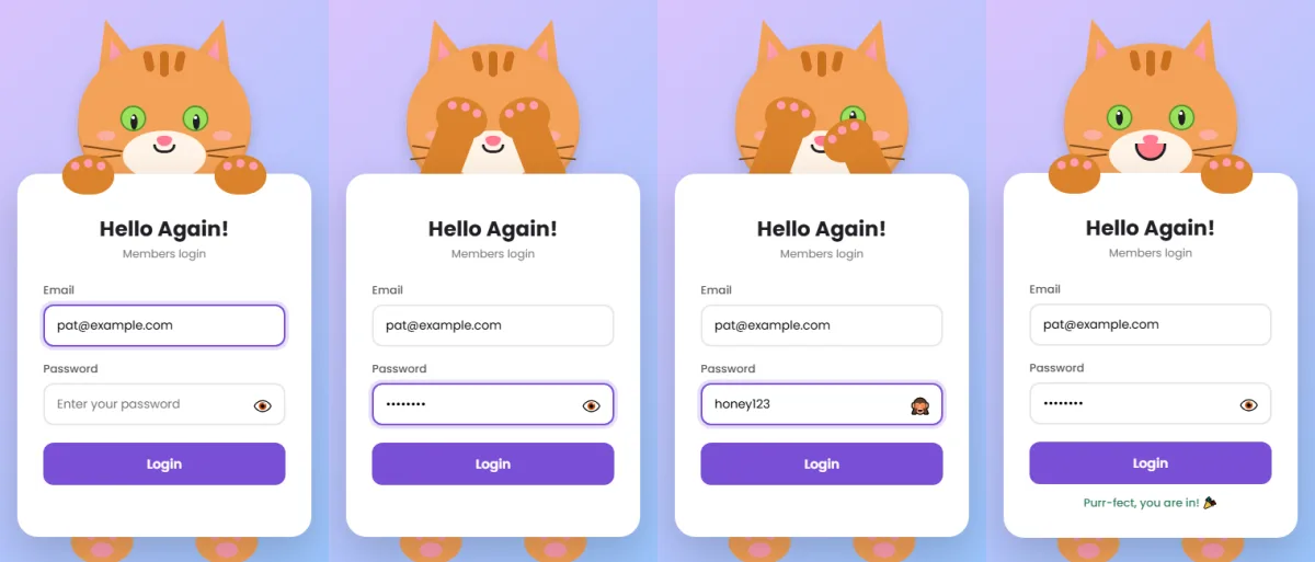
Cats are famously curious, which makes them the perfect login page mascot. In this tutorial we'll build an orange tabby that peers at your email as you type, covers its eyes with its paws when you reach the password, sneaks a peek if you reveal it, and purrs (well, smiles) when you log in.
The whole cat is drawn with CSS. Along the way you'll learn some drawing tricks that are useful
well beyond this project: triangles with clip-path, slit
pupils from a stretched circle, whiskers from rotated lines, and the
little-known slash syntax in border-radius.
What you'll build
- A tabby cat with pointy ears, forehead stripes, a pale muzzle, green eyes with slit pupils, a pink nose and four whiskers.
- Eyes that follow your typing and blink every few seconds.
- Paws that cover the eyes for the password, and one paw that lowers to peek.
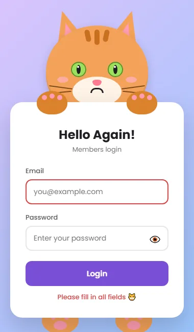
- A happy face on success, and a frown and head shake on mistakes.
- Email format checking, accessible messages, and support for password managers.
Project setup
cat-login/
├── index.html
├── style.css
└── script.js
Step 1: The HTML
<!DOCTYPE html>
<html lang="en">
<head>
  <meta charset="UTF-8">
  <meta name="viewport" content="width=device-width, initial-scale=1.0">
  <title>Cat Login</title>
  <link rel="preconnect" href="https://fonts.googleapis.com">
  <link rel="preconnect" href="https://fonts.gstatic.com" crossorigin>
  <link href="https://fonts.googleapis.com/css2?family=Poppins:wght@400;500;600;700&display=swap" rel="stylesheet">
  <link rel="stylesheet" href="style.css">
</head>
<body>

  <div class="scene" id="scene">
    <!-- The cat is decoration, so screen readers skip it -->
    <div class="head" aria-hidden="true">
      <div class="ear l"></div>
      <div class="ear r"></div>
      <div class="face">
        <div class="stripe a"></div>
        <div class="stripe"></div>
        <div class="stripe c"></div>
        <div class="muzzle"></div>
        <div class="patch l"><div class="eye"><div class="pupil"></div></div></div>
        <div class="patch r"><div class="eye"><div class="pupil"></div></div></div>
        <div class="blush l"></div>
        <div class="blush r"></div>
        <div class="wh l1"></div>
        <div class="wh l2"></div>
        <div class="wh r1"></div>
        <div class="wh r2"></div>
        <div class="nose"></div>
        <div class="mouth"></div>
      </div>
    </div>

    <div class="arm l" aria-hidden="true"></div>
    <div class="arm r" aria-hidden="true"></div>
    <div class="paw l" aria-hidden="true"><i></i><i></i><i></i></div>
    <div class="paw r" aria-hidden="true"><i></i><i></i><i></i></div>

    <form class="card" id="form" novalidate>
      <h2>Hello Again!</h2>
      <p class="sub">Members login</p>

      <div class="field">
        <label for="email">Email</label>
        <input type="email" id="email" name="email" autocomplete="username" data-t placeholder="you@example.com">
      </div>

      <div class="field">
        <label for="password">Password</label>
        <input type="password" id="password" name="password" autocomplete="current-password" data-pw placeholder="Enter your password">
        <button type="button" class="toggle" aria-label="Show password" aria-pressed="false">👁️</button>
      </div>

      <button type="submit" class="btn">Login</button>
      <div class="msg" id="msg" role="status" aria-live="polite"></div>
    </form>

    <div class="foot l" aria-hidden="true"><i></i><i></i><i></i><b></b></div>
    <div class="foot r" aria-hidden="true"><i></i><i></i><i></i><b></b></div>
  </div>

  <script src="script.js"></script>
</body>
</html>
The cat's face has more parts than most CSS animals. The order inside .face is
deliberate, because later elements paint on top of earlier ones:
- Stripes first, at the top of the forehead.
- The muzzle, a pale oval for the lower face.
- Eyes, each a pupil inside an eye inside a
.patchthat positions it. - Cheeks and whiskers (
.wh), on top of the muzzle. - The nose and mouth last, so nothing covers them.
Below the head are the arms, the paws with three toe beans each, the form, and the feet. Every
decorative part has aria-hidden="true", so screen readers only meet the form.
The email field uses autocomplete="username". On a login form, that's the value
password managers look for, even when the username is an email. data-t and
data-pw tell the script which fields the cat watches and which it hides from.
Step 2: The CSS
2.1 The colour palette
:root {
  --bg: linear-gradient(135deg, #e0c3fc 0%, #8ec5fc 100%);
  --fur: #f4a259;      /* head, ears and feet */
  --body: #d9822b;     /* arms and paws (a shade darker) */
  --stripe: #c96f1e;   /* tabby stripes */
  --muzzle: #fff3e6;
  --pad: #ff9eb1;      /* inner ears and toe beans */
  --ink: #1f1f24;      /* mouth */
  --accent: #7b4fd6;   /* button and focus ring */
  --px: 0px;           /* pupil x, set by JavaScript */
  --py: 0px;           /* pupil y */
}
* { box-sizing: border-box; margin: 0; padding: 0; }
body {
  min-height: 100vh;
  display: grid;
  place-items: center;
  padding: 24px 16px 56px;
  background: var(--bg);
  font-family: 'Poppins', sans-serif;
  overflow-x: hidden;
}
An orange tabby needs a few shades of orange: --fur for the head and feet, a darker
--body for the arms and paws so they stand out against the face, and an even darker
--stripe. The purple --accent on the lilac-to-blue background
complements the orange nicely.
2.2 The scene
.scene {
  position: relative;
  width: 340px;
  padding-top: 150px;
  margin-bottom: 40px;
}
@media (max-width: 370px) {
  body { padding-left: 12px; padding-right: 12px; }
  .scene { zoom: .86; }
}
Every cat part is absolutely positioned inside this 340px-wide box. The 150px of top padding is
where the head sits. On very small phones, zoom scales the whole cat down evenly, so
all the pixel positions still line up.
2.3 Pointy ears and tabby stripes
.head {
  position: absolute;
  top: 0; left: 50%;
  width: 200px; height: 180px;
  margin-left: -100px;
  z-index: 1;
}
/* Pointy ears: clip-path cuts a box into a triangle */
.ear {
  position: absolute;
  top: -30px;
  width: 70px; height: 82px;
  background: var(--fur);
  clip-path: polygon(50% 0, 100% 100%, 0 100%);
}
.ear::after {
  content: '';
  position: absolute;
  left: 17px; top: 24px;
  width: 36px; height: 50px;
  background: var(--pad);
  clip-path: polygon(50% 0, 100% 100%, 0 100%);
}
.ear.l { left: 8px;  transform: rotate(-16deg); }
.ear.r { right: 8px; transform: rotate(16deg); }
.face {
  position: absolute;
  inset: 0;
  background: var(--fur);
  border-radius: 50% 50% 46% 46%;
  box-shadow: 0 6px 18px rgba(0,0,0,.15), inset 0 -8px 0 rgba(0,0,0,.07);
}
/* Three tabby stripes on the forehead, fanned out with rotate() */
.stripe {
  position: absolute;
  top: 8px; left: 50%;
  width: 10px; height: 30px;
  margin-left: -5px;
  background: var(--stripe);
  border-radius: 6px;
}
.stripe.a { height: 24px; transform: translateX(-18px) rotate(-12deg); }
.stripe.c { height: 24px; transform: translateX(18px) rotate(12deg); }
.muzzle {
  position: absolute;
  top: 100px; left: 50%;
  width: 96px; height: 58px;
  margin-left: -48px;
  background: var(--muzzle);
  border-radius: 50%;
}
Triangles with clip-path: the ear starts as a normal 70×82px box.
clip-path: polygon(50% 0, 100% 100%, 0 100%) keeps only the area inside three
points (top centre, bottom right, bottom left) and cuts the rest away. The result is a
triangle.
The pink inner ear is the same trick on a smaller ::after box. Then each ear is
rotated 16 degrees outwards and moved up with top: -30px, so the bottom of the
triangle tucks behind the head.
The stripes are three rounded bars at the top of the forehead. The middle one
stays straight, and the outer two get translateX to move sideways plus a small
rotate to fan out. Order matters in transform. Written as
translateX(…) rotate(…), the stripe slides straight sideways and tilts around its
own centre. Written the other way round, the tilt would also change the direction of the
slide.
2.4 Green eyes with slit pupils
.patch {
  position: absolute;
  top: 55px;
  width: 52px; height: 62px;
  display: grid;
  place-items: center;
}
.patch.l { left: 38px; }
.patch.r { right: 38px; }
/* Big green eyes with a darker rim */
.eye {
  position: relative;
  width: 30px; height: 30px;
  background: #9be15d;
  border-radius: 50%;
  box-shadow: inset 0 0 0 2px #5a8f2e;
  overflow: hidden;
  animation: blink 4.5s infinite;
}
/* Slit pupil: a tall, narrow ellipse */
.pupil {
  position: absolute;
  top: 50%; left: 50%;
  width: 8px; height: 18px;
  margin: -9px 0 0 -4px;
  background: #1f1f24;
  border-radius: 50%;
  transform: translate(var(--px), var(--py));
  transition: transform .15s ease;
}
.pupil::after {
  content: '';
  position: absolute;
  top: 2px; left: 1px;
  width: 4px; height: 4px;
  background: #fff;
  border-radius: 50%;
}
@keyframes blink {
  0%, 92%, 100% { transform: scaleY(1); }
  95% { transform: scaleY(.1); }
}
Cat eyes are bigger and greener than a panda's. The darker ring is an inset
box-shadow, which draws a border inside the circle without changing its size.
The slit pupil is just an 8×18px box with border-radius: 50%.
Applying 50% to a box that isn't square makes an ellipse, so a tall, narrow box becomes the
classic cat pupil. The margin values are half its width and height, which centres it.
The pupil still moves with translate(var(--px), var(--py)), and
overflow: hidden on the eye keeps it from sliding out of the iris.
2.5 Nose, mouth and whiskers
/* A small pink nose: the slash in border-radius sets different
   horizontal / vertical curves, giving a soft upside-down triangle */
.nose {
  position: absolute;
  top: 106px; left: 50%;
  width: 18px; height: 12px;
  margin-left: -9px;
  background: #ff7a93;
  border-radius: 50% 50% 60% 60% / 40% 40% 80% 80%;
}
.mouth {
  position: absolute;
  top: 116px; left: 50%;
  width: 26px; height: 10px;
  margin-left: -13px;
  border: 3px solid var(--ink);
  border-top: none;
  border-radius: 0 0 20px 20px;
  transition: all .3s ease;
}
/* Whiskers: four thin bars, tilted a little up or down */
.wh {
  position: absolute;
  top: 120px;
  width: 46px; height: 2px;
  background: #7a4a1c;
  border-radius: 2px;
}
.wh.l1 { left: 6px;  transform: rotate(8deg); }
.wh.l2 { left: 4px;  top: 130px; transform: rotate(-6deg); }
.wh.r1 { right: 6px; transform: rotate(-8deg); }
.wh.r2 { right: 4px; top: 130px; transform: rotate(6deg); }
.blush {
  position: absolute;
  top: 100px;
  width: 22px; height: 12px;
  background: #ffb3c1;
  border-radius: 50%;
  opacity: .7;
}
.blush.l { left: 22px; }
.blush.r { right: 22px; }
The slash in border-radius: normally each corner gets one value. With
a slash, values before it set the horizontal curve and values after it set the
vertical curve. 50% 50% 60% 60% / 40% 40% 80% 80% makes the bottom corners
curve deeply downwards, so a small box becomes a soft, rounded triangle, a perfect little cat
nose.
Whiskers are four 46×2px bars. The top pair angles slightly upwards towards the
outside and the bottom pair angles downwards, so they fan out naturally. They're placed with left and
right, which keeps both sides symmetrical.
2.6 Arms and paws
.arm {
  position: absolute;
  top: 75px;
  width: 44px; height: 145px;
  background: var(--body);
  border-radius: 22px;
  transform-origin: 50% 100%;
  transform: scaleY(.5);
  z-index: 2;
  transition: transform .45s cubic-bezier(.68, -0.35, .27, 1.35);
}
.arm.l { left: 60px; }
.arm.r { right: 60px; }
.paw {
  position: absolute;
  top: 128px;
  width: 60px; height: 46px;
  background: var(--body);
  border-radius: 50% 50% 45% 45%;
  z-index: 4;
  transition: transform .45s cubic-bezier(.68, -0.35, .27, 1.35);
}
.paw.l { left: 52px; }
.paw.r { right: 52px; }
.paw i {
  position: absolute;
  top: 8px;
  width: 10px; height: 10px;
  background: var(--pad);
  border-radius: 50%;
}
.paw i:nth-child(1) { left: 10px; }
.paw i:nth-child(2) { left: 25px; top: 5px; }
.paw i:nth-child(3) { left: 40px; }
The arms pivot from the bottom (transform-origin: 50% 100%) and start at half height,
hidden behind the form. The paws sit on top of everything (z-index: 4), so they can
rest on the card and later cover the eyes. The springy cubic-bezier makes them
overshoot slightly, the way a cat swats.
2.7 The form card
.card {
  position: relative;
  z-index: 3;
  background: #fff;
  border-radius: 24px;
  padding: 46px 30px 30px;
  box-shadow: 0 20px 50px rgba(0,0,0,.18);
}
.card h2 { text-align: center; color: #1f1f24; font-weight: 700; margin-bottom: 2px; }
.card p.sub { text-align: center; color: #767676; font-size: 13px; margin-bottom: 22px; }
.field { position: relative; margin-bottom: 16px; }
.field label { display: block; font-size: 13px; font-weight: 500; color: #555; margin-bottom: 6px; }
.field input {
  width: 100%;
  padding: 12px 44px 12px 14px;
  border: 2px solid #e6e6e6;
  border-radius: 12px;
  font: inherit;
  font-size: 14px;
  outline: none;
  transition: border-color .2s, box-shadow .2s;
}
.field input:focus {
  border-color: var(--accent);
  box-shadow: 0 0 0 4px color-mix(in srgb, var(--accent) 18%, transparent);
}
.field input[aria-invalid="true"] { border-color: #d64545; }
.toggle {
  position: absolute;
  right: 10px; bottom: 9px;
  padding: 4px;
  border: none;
  border-radius: 6px;
  background: none;
  font-size: 18px;
  line-height: 1;
  cursor: pointer;
}
.toggle:focus-visible { outline: 2px solid var(--accent); }
.btn {
  width: 100%;
  margin-top: 4px;
  padding: 13px;
  border: none;
  border-radius: 12px;
  background: var(--accent);
  color: #fff;
  font: inherit;
  font-weight: 600;
  font-size: 15px;
  cursor: pointer;
  transition: transform .15s, filter .2s;
}
.btn:hover { filter: brightness(.92); }
.btn:active { transform: scale(.97); }
.btn:focus-visible { outline: 3px solid #1f1f24; outline-offset: 2px; }
.msg { text-align: center; font-size: 13px; margin-top: 12px; min-height: 18px; font-weight: 500; }
Notice color-mix() for the focus ring. It mixes 18% of the purple accent with
transparency, so if you change --accent, the ring follows automatically. Fields with
aria-invalid="true" get a red border.
2.8 Feet
.foot {
  position: absolute;
  bottom: -32px;
  width: 72px; height: 52px;
  background: var(--fur);
  border-radius: 50%;
  z-index: 1;
}
.foot.l { left: 62px; }
.foot.r { right: 62px; }
.foot b {
  position: absolute;
  left: 50%; bottom: 8px;
  width: 26px; height: 18px;
  margin-left: -13px;
  background: var(--pad);
  border-radius: 50%;
}
.foot i {
  position: absolute;
  bottom: 28px;
  width: 9px; height: 9px;
  background: var(--pad);
  border-radius: 50%;
}
.foot i:nth-of-type(1) { left: 18px; }
.foot i:nth-of-type(2) { left: 31px; bottom: 31px; }
.foot i:nth-of-type(3) { left: 44px; }
2.9 The states
/* Typing in a text field: look down at the form */
.scene.look { --py: 4px; }

/* Typing a password: both paws over the eyes */
.scene.cover .arm.l { transform: rotate(21deg) scaleY(1); }
.scene.cover .arm.r { transform: rotate(-21deg) scaleY(1); }
.scene.cover .paw.l { transform: translate(52px, -66px) rotate(18deg); }
.scene.cover .paw.r { transform: translate(-52px, -66px) rotate(-18deg); }

/* Password shown: the right paw lifts to peek */
.scene.cover.peek .arm.r { transform: rotate(-24deg) scaleY(.82); }
.scene.cover.peek .paw.r { transform: translate(-58px, -40px) rotate(-30deg); }

/* Success: big smile, bounce, happy feet */
.scene.happy .mouth { width: 36px; height: 20px; margin-left: -18px; background: #ff7a8a; }
.scene.happy .foot { animation: tap .35s ease 3; }
.scene.happy .head { animation: bounce .5s ease 2; }
@keyframes tap { 50% { transform: translateY(-8px); } }
@keyframes bounce { 50% { transform: translateY(-10px); } }

/* Problem: frown and head shake */
.scene.sad .mouth {
  top: 122px;
  border-top: 3px solid var(--ink);
  border-bottom: none;
  border-radius: 20px 20px 0 0;
}
.scene.sad .head { animation: shake .45s ease; }
@keyframes shake {
  20%, 60% { transform: translateX(-8px) rotate(-3deg); }
  40%, 80% { transform: translateX(8px) rotate(3deg); }
}
JavaScript only adds or removes one class on .scene, and these rules turn that into
movement:
looknudges the pupils down to the form.coverrotates the arms inwards at full height and moves the paws up onto the eyes.cover.peeklowers just the right paw.happyopens the mouth into a pink smile and bounces.sadturns the smile into a frown and shakes the head.

2.10 Reduced motion
@media (prefers-reduced-motion: reduce) {
  *, *::before, *::after {
    animation-duration: .01ms !important;
    animation-iteration-count: 1 !important;
    transition-duration: .01ms !important;
  }
}
Step 3: The JavaScript
3.1 Settings and elements
const SUCCESS = 'Purr-fect, you are in! 🎉';
const EMOJI = '🐱';const scene = document.getElementById('scene');
const form = document.getElementById('form');
const msg = document.getElementById('msg');
const texts = [...form.querySelectorAll('input[data-t]')]; // fields the cat watches
const pws = [...form.querySelectorAll('input[data-pw]')]; // fields the cat hides from
let resetTimer;The cat-specific wording lives in two constants at the top. The script then collects fields by
their data attributes, which keeps the HTML in charge: whatever has data-t gets
watched.
3.2 Eyes follow the email
// The longer the text, the further right the pupils move (-5px to +5px).
function follow(input) {
  const len = Math.min(input.value.length, 25);
  scene.style.setProperty('--px', (-5 + (len / 25) * 10) + 'px');
}

texts.forEach((input) => {
  input.addEventListener('focus', () => {
    scene.classList.remove('cover', 'peek');
    scene.classList.add('look');
    follow(input);
  });
  input.addEventListener('input', () => {
    if (document.activeElement === input) follow(input); // ignore autofill
  });
  input.addEventListener('blur', () => {
    scene.classList.remove('look');
    scene.style.setProperty('--px', '0px');
  });
});
The number of characters (capped at 25) becomes a pupil offset from -5px to
+5px. JavaScript writes it to the --px CSS variable with
setProperty, and the CSS transition does the smooth movement. The check against
document.activeElement means a password manager filling the field in the background
won't make the cat's eyes jump.
3.3 Covering and peeking
pws.forEach((input) => {
  const toggle = input.parentElement.querySelector('.toggle');
  const uncover = () => scene.classList.remove('cover', 'peek');

  input.addEventListener('focus', () => {
    scene.classList.add('cover');
    scene.classList.toggle('peek', input.type === 'text');
  });
  // Moving between the password and its eye button keeps the paws up
  input.addEventListener('blur', (e) => {
    if (e.relatedTarget !== toggle) uncover();
  });
  toggle.addEventListener('blur', (e) => {
    if (e.relatedTarget !== input) uncover();
  });

  toggle.addEventListener('mousedown', (e) => e.preventDefault()); // keep focus in the input
  toggle.addEventListener('click', () => {
    const show = input.type === 'password';
    input.type = show ? 'text' : 'password';
    toggle.textContent = show ? '🙈' : '👁️';
    toggle.setAttribute('aria-label', show ? 'Hide password' : 'Show password');
    toggle.setAttribute('aria-pressed', String(show));
    input.focus();
    scene.classList.add('cover');
    scene.classList.toggle('peek', show); // one paw lifts to peek
  });
});
Focusing the password adds cover. Clicking the eye switches the input's
type and toggles peek, so one paw slides down. Three details make it
solid:
mousedown+preventDefault(): clicking the eye doesn't steal focus from the input, so the paws don't flicker.e.relatedTarget: moving focus between the password and its eye keeps the paws up. Tabbing anywhere else brings them down.aria-pressedandaria-labelkeep screen reader users informed about whether the password is visible.

3.4 Checking the form
const EMAIL = /^[^\s@]+@[^\s@]+\.[^\s@]{2,}$/;

// Returns the first problem as { input, text }, or null if all is well
function findProblem() {
  const inputs = [...form.querySelectorAll('input')];
  const empty = inputs.find((i) => !i.value.trim());
  if (empty) return { input: empty, text: 'Please fill in all fields' };

  const badEmail = inputs.find((i) => i.type === 'email' && !EMAIL.test(i.value.trim()));
  if (badEmail) return { input: badEmail, text: 'Please enter a valid email' };

  if (pws.length > 1 && pws[0].value !== pws[1].value) {
    return { input: pws[1], text: "Passwords don't match" };
  }
  return null;
}
findProblem() looks for an empty field first, then an email that doesn't match the
pattern. The regular expression ^[^\s@]+@[^\s@]+\.[^\s@]{2,}$ reads as: some
characters without spaces or @, then @, then more of the same, a dot, and at least two
characters. It's simple on purpose. The server should do the strict check.
3.5 Submitting
form.addEventListener('submit', (e) => {
  e.preventDefault();
  clearTimeout(resetTimer);
  scene.classList.remove('happy', 'sad', 'cover', 'peek', 'look');
  form.querySelectorAll('[aria-invalid]').forEach((i) => i.removeAttribute('aria-invalid'));
  if (document.activeElement) document.activeElement.blur();
  void scene.offsetWidth; // force a reflow so the animation can replay

  const problem = findProblem();
  if (!problem) {
    scene.classList.add('happy');
    msg.style.color = '#2e7d5b';
    msg.textContent = SUCCESS;
    // In a real app, send the form to your server here.
  } else {
    scene.classList.add('sad');
    msg.style.color = '#d64545';
    msg.textContent = problem.text + ' ' + EMOJI;
    problem.input.setAttribute('aria-invalid', 'true');
  }
  resetTimer = setTimeout(() => scene.classList.remove('happy', 'sad'), 2000);
});
The submit handler resets everything, then forces a reflow with
void scene.offsetWidth, so the browser applies the reset before adding the new
class. Without that line, submitting twice in a row wouldn't replay the animation. The problem
field gets aria-invalid="true", which both turns its border red and tells screen
readers which field needs fixing. clearTimeout makes sure an old two-second timer
never ends the new animation early.
Test it yourself
- Type in the email field. The cat's slit pupils slide along.
- Click the password field. Paws up!
- Click 👁️. One paw lowers.
- Press Tab past the eye. The paws come down.
- Submit empty, then with
cat@home(no dot), then with a proper email.
Make it your own
- A black cat: set
--furto#2b2b30,--bodyto#1d1d21,--stripeto transparent and the muzzle to#3a3a40. Yellow eyes look great: change the eye background to#ffd54f. - A grey tabby: greys for fur, body and stripes, and keep the green eyes.
- Round the ears with
border-radiusinstead ofclip-pathfor a lion cub.
Using it on a real site
- Check the email and password on your server, over HTTPS. The browser checks are only there to give quick feedback.
- When the server rejects a login, reuse the sad state: add the
sadclass and show “Wrong email or password”.
Share your cat
Built a black cat or a lion cub? Share a screenshot as a link with sshot.online, or share your code with the free code sharing tool. No account needed.
Conclusion
With three files, you've drawn a cat entirely in CSS and made it react to every step of a login. The drawing techniques are the real takeaway:
clip-pathpolygons for any pointed shape- stretched circles for slit pupils
- rotated bars for whiskers
- the slash in
border-radiusfor organic curves
Combine them and you can draw almost any animal. Try a fox next.
Frequently asked questions
How do you make triangle cat ears in CSS?
Use clip-path: polygon(50% 0, 100% 100%, 0 100%) on a normal box. It keeps only
the triangle between the top centre and the two bottom corners. Rotate each ear outwards with
transform.
How are the slit pupils made?
A tall, narrow box (8×18px) with border-radius: 50% becomes an ellipse, which
looks like a cat pupil. It moves with a CSS transform driven by variables that JavaScript
updates.
What does the slash in border-radius do?
Values before the slash set the horizontal radius of each corner and values after it set the vertical radius. This lets you make uneven, organic curves, like the cat nose.
Does the cat login page need any libraries?
No. It uses only HTML, CSS and JavaScript, plus an optional Google Font.
Can I change the cat colour?
Yes. All colours are CSS variables in :root. Change --fur,
--body and --stripe for a different coat, and the eye background
for different eye colours.
Related articles
How to Build an Animated Panda Login Page with HTML, CSS and JavaScript
A step-by-step tutorial: build a login form where a CSS panda follows your typing, covers its eyes for the password, peeks, and reacts. Full code and live demo.
Read More →
How to Build an Animated Teddy Bear Sign Up Form with HTML, CSS and JavaScript
A sign up form with a teddy bear that reads your name and email, hides from your password and cheers when the account is created. One script handles any number of fields.
Read More →
How to Build a Night Owl Login Page with HTML, CSS and JavaScript
A dark-themed login page with a CSS owl that hides behind its wings for the password, under a starry sky made entirely of gradients.
Read More →