CSS Grid Explained: A Visual Guide with Examples
Published November 7, 2026 · 14 min read
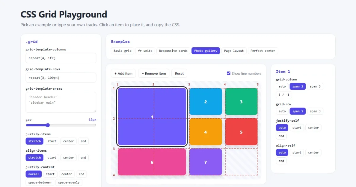
CSS Grid is the layout system built for two directions at once. You describe the rows and columns on the parent, then place the children into them. Page layouts, card galleries and dashboards that once took pages of CSS now take a few lines.
This guide explains Grid from the first line of code to full page layouts. Every example opens in a live playground, so you can change the values and see what happens.
Open the CSS Grid playground See the grid lines, change the tracks and copy the CSS.
The short version
| Property | Goes on | What it does |
|---|---|---|
display: grid | Parent | Turns on Grid for the direct children |
grid-template-columns | Parent | Sets the number and size of the columns |
grid-template-rows | Parent | Sets the number and size of the rows |
gap | Parent | Sets the space between tracks |
grid-template-areas | Parent | Draws the layout using names |
grid-column | Child | Sets where a child starts and ends across |
grid-row | Child | Sets where a child starts and ends down |
grid-area | Child | Puts a child into a named area |
Your first grid
Three lines of CSS give you a complete grid:
.grid {
  display: grid;
  grid-template-columns: repeat(3, 1fr);
  gap: 12px;
}<div class="grid">
<div>1</div>
<div>2</div>
<div>3</div>
<div>4</div>
<div>5</div>
<div>6</div>
</div>That makes three equal columns with a 12px gap. The six children fill the cells in order, left to right, and start a new row when the columns run out. You did not need to create the rows, because Grid adds them as needed. Rows made this way are called implicit.
display: grid only affects the direct children of the element. A
child's own children are not part of the grid.
Tracks, cells and lines
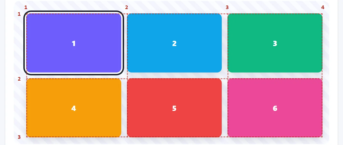
Four words make everything else in Grid easier to follow:
- Track: one whole column or one whole row.
- Cell: one box where a column and a row cross.
- Line: a border between tracks. Lines are numbered from 1.
- Area: any rectangle made from one or more cells.
The numbers are on the lines, not the columns. This is the part that catches most people out. A three-column grid has four column lines, so the last line is 4, not 3. The playground draws these numbers on every grid for you.
The fr unit: share the free space
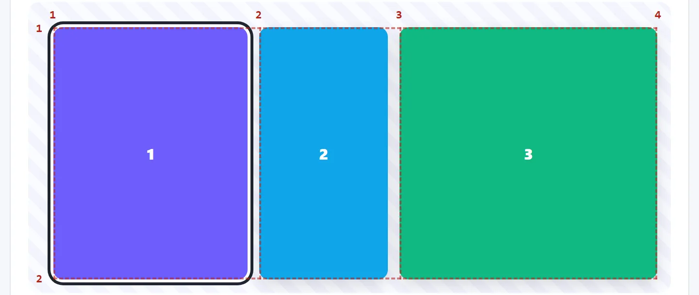
.grid {
  display: grid;
  grid-template-columns: 200px 1fr 2fr;
}
fr means a fraction of the free space. The browser works it out in three steps:
- It takes the fixed sizes and gaps away from the total width.
- It adds up the
frvalues. Here 1 + 2 makes 3 shares. - It divides what is left into those shares.
In a 1,000px grid, 800px is left after the 200px column. That makes each share about 267px, so the columns come to 200px, 267px and 533px.
This is why fr is better than percentages. 33.33% columns plus a gap are
wider than the grid and overflow it, while 1fr takes the gap out first. Try it in
the fr units example.
repeat() and minmax()
repeat() saves you from typing the same size many times:
grid-template-columns: repeat(4, 1fr);          /* same as 1fr 1fr 1fr 1fr */
grid-template-columns: 80px repeat(3, 1fr);     /* mixed with other sizes */
grid-template-columns: repeat(2, 100px 1fr);    /* 100px 1fr 100px 1fr */
minmax() sets a smallest and a largest size for a track. The track grows and shrinks
between the two:
grid-template-columns: minmax(200px, 300px) 1fr;  /* sidebar between 200 and 300px */
grid-template-rows: minmax(100px, auto);          /* at least 100px, taller if needed */
Responsive cards with no media queries
Put those two together and you get the most useful single line in CSS Grid:
.cards {
  display: grid;
  grid-template-columns: repeat(auto-fit, minmax(250px, 1fr));
  gap: 16px;
}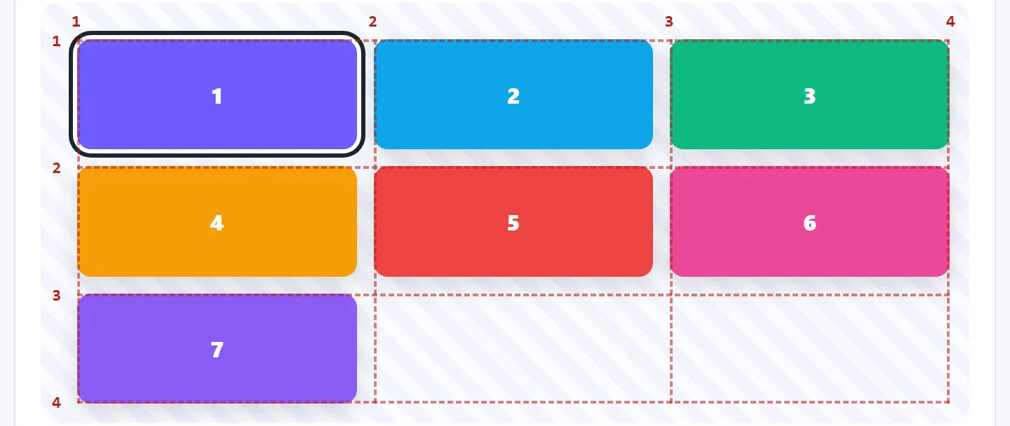
Read it as: make as many columns as fit, each at least 250px wide, and share out any spare space. On a phone that gives one column, and on a wide screen it might give four. No media query is needed. Change the browser width with the responsive cards example open and watch the line numbers change.
auto-fit vs auto-fill
The two keywords only behave differently when you have fewer items than columns:
auto-fitcollapses the empty columns, so the items stretch to fill the row. This is usually what you want.auto-fillkeeps the empty columns, so the items stay small and leave a gap at the end. Use it when one lonely card should not stretch across the page.
Make an item span several cells
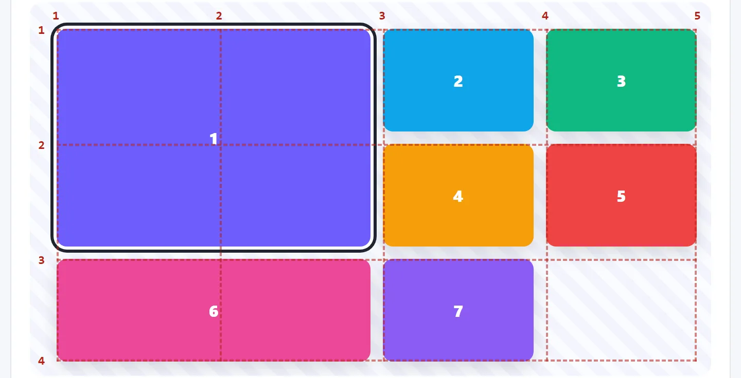
.big {
  grid-column: span 2;   /* two columns wide */
  grid-row: span 2;      /* two rows tall */
}

.banner {
  grid-column: 1 / -1;   /* from the first line to the last line */
}

.placed {
  grid-column: 2 / 4;    /* from line 2 to line 4 */
  grid-row: 1 / 3;       /* from line 1 to line 3 */
}
The value before the slash is the start line and the value after it is the end line.
span 2 means “take up two tracks from wherever you land”, which is
handy when you don't care about the exact position. Negative numbers count from the end, so
-1 is the last line.
This is how you build a magazine or photo layout. Open the photo gallery example, click any item and give it a span.
When a large item leaves a hole, grid-auto-flow: row dense tells Grid to go back and
fill it with a later, smaller item. The visual order then differs from the HTML order, so don't
use it where the reading order matters.
grid-template-areas: draw your layout
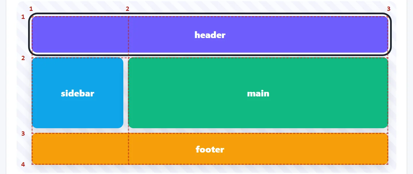
.page {
  display: grid;
  grid-template-columns: 160px 1fr;
  grid-template-rows: 64px 1fr 56px;
  grid-template-areas:
    "header  header"
    "sidebar main"
    "footer  footer";
  gap: 8px;
  min-height: 100vh;
}

.page header { grid-area: header; }
.page aside  { grid-area: sidebar; }
.page main   { grid-area: main; }
.page footer { grid-area: footer; }
Each quoted string is a row, and each word is a cell. Repeat a word to stretch that area across
cells. It works like a small drawing of the page, and many developers find it the easiest way to
read a layout. Use a dot (.) for an empty cell.
Areas also make responsive layouts simple. On a small screen, redraw the map as one column and leave the HTML alone:
@media (max-width: 700px) {
  .page {
    grid-template-columns: 1fr;
    grid-template-rows: auto;
    grid-template-areas:
      "header"
      "main"
      "sidebar"
      "footer";
  }
}
Each area must be a single rectangle. An L shape is invalid, and the browser then ignores the
whole grid-template-areas value. You can test this in the
page layout example: the box turns red until the value is valid again.
Alignment: justify and align
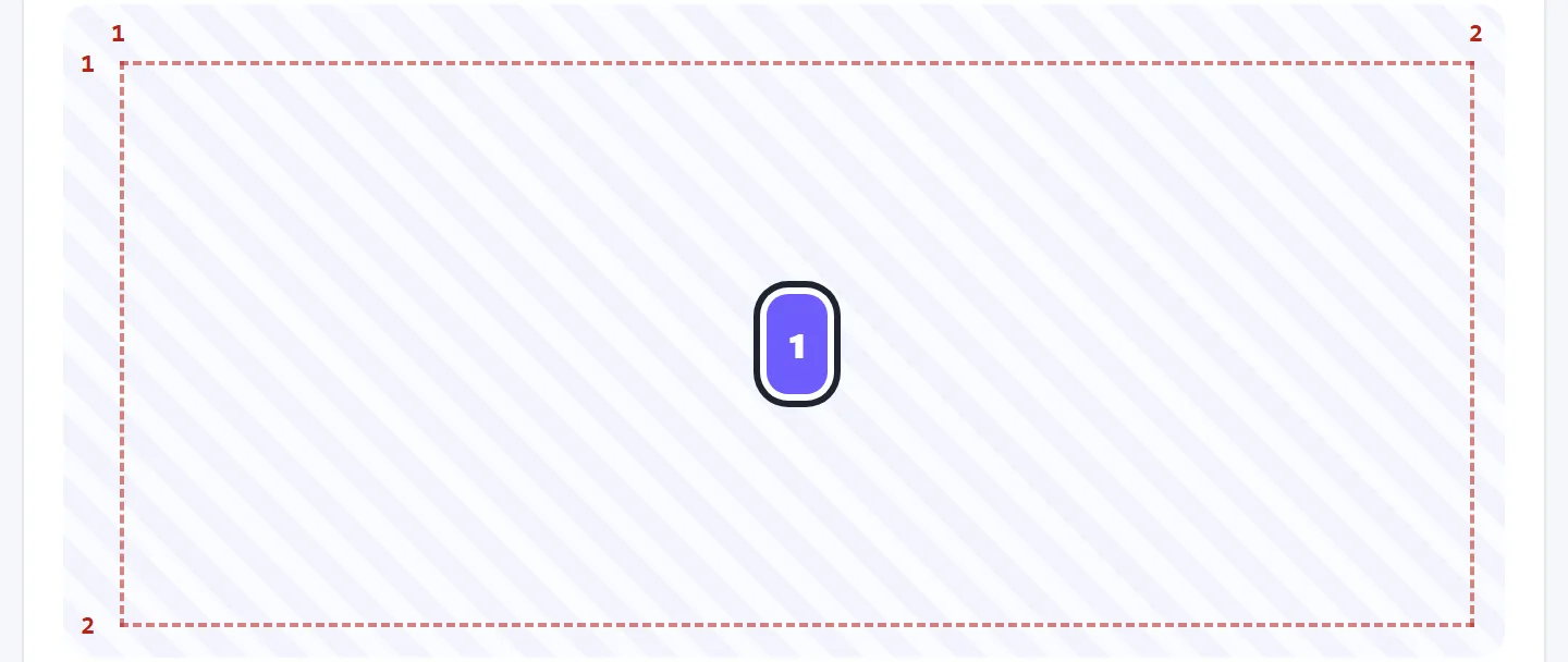
Grid has one simple naming rule: justify works across (the row
direction) and align works down (the column direction).
| Property | Moves | Goes on |
|---|---|---|
justify-items | All items across, inside their cells | Parent |
align-items | All items down, inside their cells | Parent |
justify-content | The whole grid across, inside the parent | Parent |
align-content | The whole grid down, inside the parent | Parent |
justify-self | One item across | Child |
align-self | One item down | Child |
place-items sets align-items and justify-items together,
which gives you the shortest way to center anything in CSS:
.parent {
  display: grid;
  place-items: center;
  min-height: 100vh;
}
Without a height on the parent, there is no spare space to center in. See the perfect center example, or read 7 ways to center a div for the other methods.
Items stretch to fill their cells by default. This is why all the cards in a row come out the same height, with no extra code.
Rows you didn't define
When items overflow the rows you wrote, Grid creates new ones and sizes them to their content. Use
grid-auto-rows to control them, which is useful when you don't know how many items
there will be:
.gallery {
  display: grid;
  grid-template-columns: repeat(3, 1fr);
  grid-auto-rows: minmax(150px, auto);   /* every new row is at least 150px */
}
Grid vs Flexbox: which should you use?
| Flexbox | Grid | |
|---|---|---|
| Directions | One at a time | Two at once |
| Driven by | The content's size | The layout you define |
| Best for | Navbars, button rows, centering a few items | Page layouts, card grids, dashboards |
| Items line up across rows | No, each row is separate | Yes, always |
A good rule: if you want things to line up in both directions, use Grid. If you just need a line of things, use Flexbox. Most real pages use both, such as Grid for the page and Flexbox for the header inside it. Our Flexbox guide covers the other half.
Common mistakes
- Counting columns instead of lines. To cover all three columns, use
grid-column: 1 / 4, not1 / 3. - Expecting
1 / -1to work with no template. Negative numbers only count the columns you defined. With implicit tracks,-1is not the end you expect. - Forgetting
min-heighton the parent. With no extra height,1frrows and centering have no free space to work with. - A
1frcolumn that won't shrink. Long words or wide<pre>blocks can push a track wider than its share and cause side-scrolling. Useminmax(0, 1fr)instead. - Using percentages with a gap. Percentages ignore the gap, so the grid
overflows. Use
fr. - Styling a grandchild. Only direct children are grid items. A wrapper
divaround your cards turns them all into a single item. - Reordering important content. Grid can move things visually, but keyboard and screen reader users still get the HTML order. Keep the HTML in a sensible order.
Try it in the playground
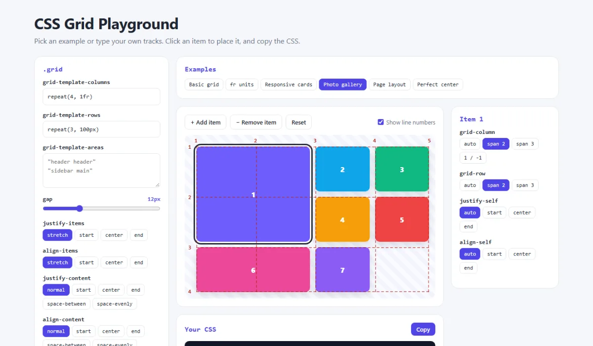
In the CSS Grid playground you can type any value into the columns and rows, and invalid values are flagged straight away. Try these:
- Set the columns to
repeat(4, 100px), then try eachjustify-contentvalue. - Click item 1 and choose
1 / -1, then set the columns tonone. - Choose “Page layout” and change an area to make the sidebar run the full height of the page.
Share your layout
Built something you want feedback on? Paste it into the free code sharing tool, or share a screenshot as a link with sshot.online. No account needed.
Frequently asked questions
What is the difference between CSS Grid and Flexbox?
Flexbox works in one direction at a time, either a row or a column. Grid works in two directions at once, so you control rows and columns together. Use Flexbox for a line of things, like a navbar, and Grid for a whole layout or a set of cards that must line up in both directions.
What does 1fr mean in CSS Grid?
fr stands for fraction. 1fr means one share of the free space left in the grid after fixed sizes and gaps are taken out. In 200px 1fr 2fr, the first column gets 200px and the last column gets twice the width of the middle one.
What is the difference between auto-fit and auto-fill?
Both create as many columns as fit. auto-fill keeps the empty columns, so a few items stay at their small size. auto-fit collapses the empty columns, so the items stretch to fill the row. You only see a difference when there are fewer items than columns.
How do I make a CSS Grid responsive without media queries?
Use grid-template-columns: repeat(auto-fit, minmax(250px, 1fr)). The browser fits as many 250px columns as it can, shares out the spare space, and wraps the rest onto new rows.
Why does grid-column: 1 / -1 not span the full width?
Negative line numbers only count lines in the explicit grid, which is the part you defined with grid-template-columns. If your columns are created automatically or your grid has no template, -1 does not point to the end you expect. Define the columns first.
Is CSS Grid supported in all browsers?
Yes. All current browsers have supported CSS Grid since 2017, so you can use it without a fallback. Only very old browsers such as Internet Explorer lack the modern version.
Related articles
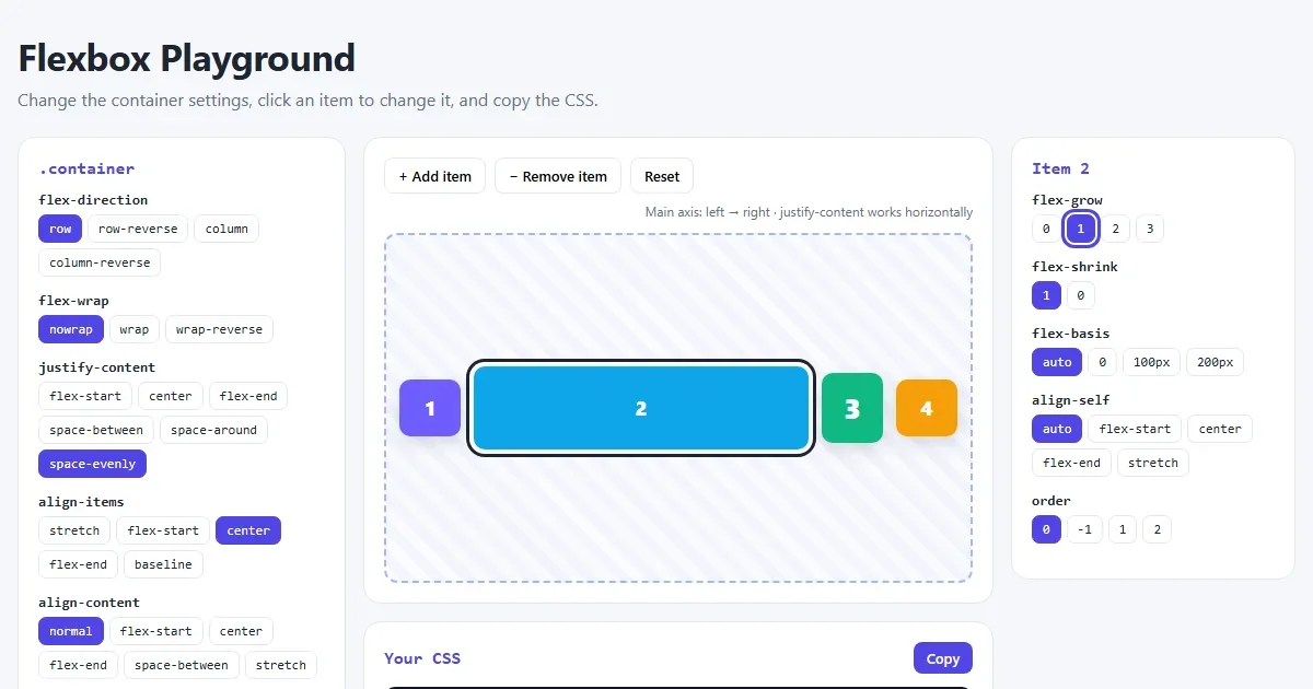
CSS Flexbox Explained: A Visual Guide with Examples
Every Flexbox property in pictures: direction, justify-content, align-items, wrap, gap, flex-grow, plus a navbar, equal-height cards and a sticky footer.
Read More →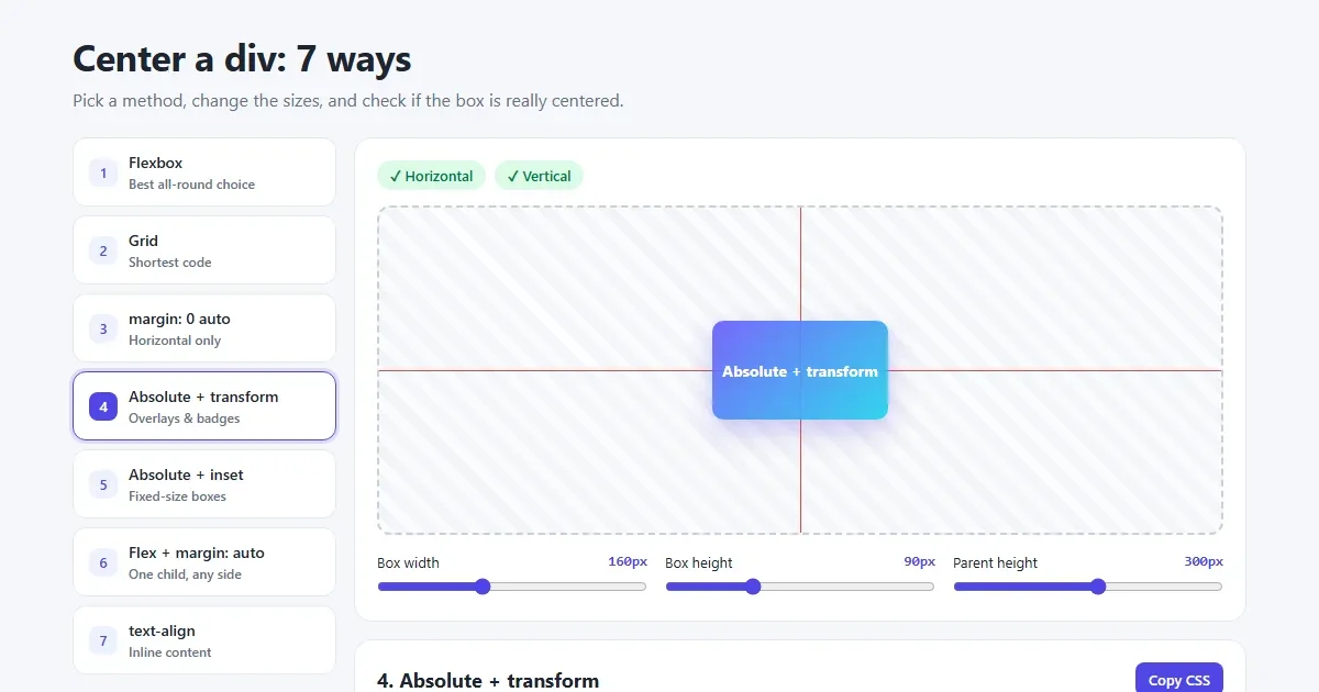
How to Center a Div in CSS: 7 Easy Ways (with Examples)
Center a div horizontally and vertically with Flexbox, Grid, margin auto and absolute positioning. Pictures of every method, copy-paste code and a live playground.
Read More →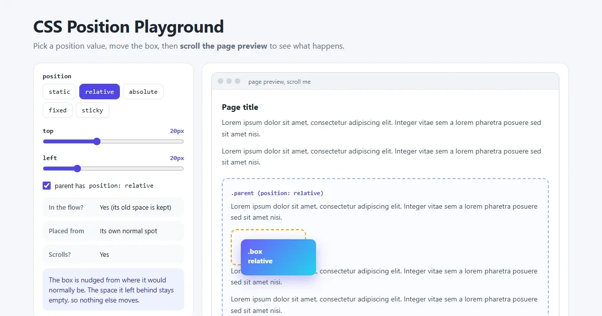
CSS Position Explained: static, relative, absolute, fixed and sticky
The five CSS position values with pictures: what each is placed from, whether it scrolls, z-index, and why sticky or absolute sometimes does not work.
Read More →